margin
margin可以改变容器的尺寸
margin改变可视尺寸
前提条件:
- 适用于没有设定 width/height 的普通 block 水平元素。(对于 float 元素,absolute/fixed 元素,inline 水平,table-cell 元素无效)
- 只适用于水平方向尺寸
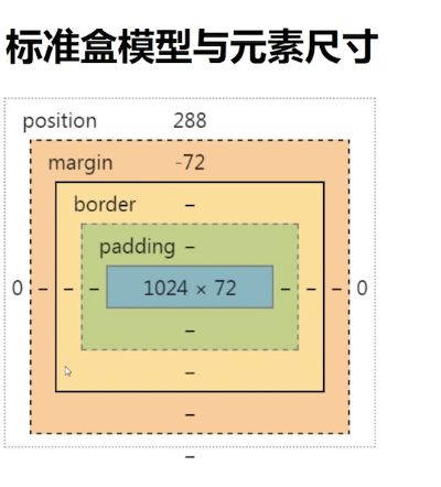
图中实线部分可理解为可视尺寸,虚线部分可理解为占据尺寸。
应用
一侧定宽的自适应布局
<img width="150" style="float:left;">
<p>...........p>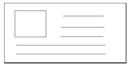
对 p 元素设置 margin-left 值
<img width="150" style="float:left;">
<p style="margin-left:170px">...........p>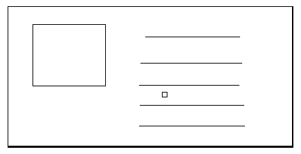
margin 改变占据尺寸
适用条件:
- block/inline-block 水平元素均适用
- 与有没有设定 width/height 值无关
- 适用于水平方向和垂直方向
应用
滚动容器内上下留白
<div style="height:100px;padding:50px 0;">
    <img height="300">
div>
<div style="height:200px;">
    <img height="300" style="margin :50px 0;" >
div>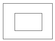
百分比 margin 的计算规则
普通元素的百分比 margin 都是相对于容器的宽度 计算的
绝对定位元素的百分比 margin 是相对于第一个定位祖先元素(relative/absolute/fixed) 的宽度计算的
应用:
宽高比 2:1 自适应矩形
.box{background-color:olive;overflow:hidden;}
.box > div{ margin:50%;}
margin 重叠特性
- block 水平元素(不包括 float 和 absolute 元素)
- 不考虑 writing-mode ,值发生在垂直方向(margin-top/margin-bottom )
margin 重叠的三种情景
- 相邻的兄弟元素
- 父级和第一个/最后一个子元素
- 空的 block 元素
相邻的兄弟元素 margin 重叠
p{ line-height:1em margin 1em 0;background:red;}<p>第一行p>
<p>第二行p>
父级和第一个/最后一个子元素margin 重叠
.father{background:red;}<div class="father">
<div class="son" style="margin-top:80px">嘿呦呦div>
div>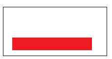
注意,以下三种情况效果一致
<div class="father">
    <div class="son" style="margin-top:80px">嘿呦呦div>
div><div class="father" style="margin-top:80px">
<div class="son">嘿呦呦div>
div><div class="father" style="margin-top:80px">
<div class="son" style="margin-top:80px">嘿呦呦div>
div>父子margin重叠其他条件
margin-top 重叠
- 父元素非块状格式化上下文元素
- 父元素没有 border-top 设置
- 父元素没有 padding-top 值
- 父元素和第一个子元素之间没有 inline 元素分隔
margin-bottom 重叠
- 父元素非块状格式化上下文元素
- 父元素没有 border-bottom 设置
- 父元素没有 padding-bottom 值
- 父元素和第一个子元素之间没有 inline 元素分隔
- 父元素没有 height,min-height,max-height 限制
避免 margin-top/margin-bottom 重叠可让上述情况不成立
如第四个条件:破坏父元素和第一个子元素之间没有 inline 元素分隔
<div class="father" style="">
    <div class="son" style="margin-top:80px">嘿呦呦div>
div>
空block元素margin重叠
.father{background:red; overflow:hidden;}
.son{margin:1em 0;}<div class="father">
<div class="son" style="margin-top:80px">div>
div>空 block 元素 margin 重叠其他条件
- 元素没有 border 设置
- 元素没有 padding 值
- 里面没有 inline 元素
- 没有 height,或者 min-height
margin 重叠的计算规则
- 两个均为正值时,取绝对值最大的值
- 两个均为负值时,取绝对值最大的值
- 一个为正值一个为负值时,取两值相加的值
margin 重叠产生的意义
- 连续段落或列表之类,如果没有 margin 重叠,首位项间距会和其他标签 1:2 关系,排版不自然;
- web 中任何地方嵌套或者直接放入任何裸 div,都 不会改变原来的布局;
- 遗落的空任意多个
元素,不会影响原来的阅读排版;
善用 margin 重叠
同时设置 margin-top 和 margin-bottom ,更具健壮性,最后一个元素移除或位置调换,均不会破坏原来的布局。
margin:auto
元素有时候,就算没有设置 width 或 height,也会自动填满整个容器;如果元素为绝对定位元素,那么它的宽度会自动填满第一个父级定位元素。
如果设置了 width 或者 height,自动填充特性就会被覆盖。
原本应该填充的尺寸被 width/height 强制变更,而 margin:auto 就算为了填充这个变更的尺寸设计的。
如果一侧定值,一侧 auto,auto 为剩余空间大小,如果两侧均为 auto,则平分剩余空间(即可实现居中)
img{width:150px;margin:0 auto;}
明明设置了 margin:0 auto; 为何图片布局中?
因为此时图片是 inline 水平,就算没有 width,它也不会占据整个容器
若对图片 display:block 就算没有设置 width 的值,也会占据整个容器,所以可以居中。
明明容器定高,元素定高,margin:auto 0 无法垂直居中?
解决方法:
.father { height:200px;width:100%;writing-mode:verical-lr;}
.son{ height:100px;width:500px;margin:auto;}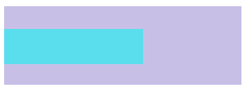
原因:更换流的方向为垂直方向,实现垂直方向的 margin:auto 居中。
绝对定位元素的 margin:auto 居中
.father { height:200px;position:relative;}
.son{position:absolute;top:0;right:0;bottom:0; left:0;}
此时,没有设定 width/height,absolute 元素自动填满了容器。
若在此时,设置元素的宽高,并 margin:auto 即:
.father { height:200px;position:relative;}
.son{position:absolute;top:0;right:0;bottom:0; left:0; width:500px;height:100px;margin :auto;}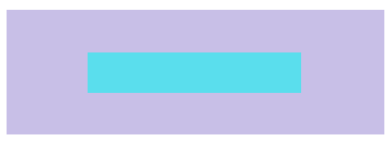
margin:auto 自动平分被变更的尺寸空间。注意,此时垂直和水平方向均居中。适用于IE8+浏览器
margin负值定位
margin负值下的两端对齐
原理:margin 改变元素尺寸
例子:
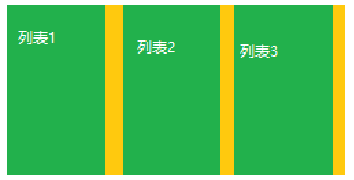
.box{width:1200px;margin:auto;background:orage;}
.ul{overflow:hidden;}
.li{width:380x;height:300px;margin-right:20px;background:green;float:left;}<div class="box">
<div class="ul">
<div class="li">列表1div>
<div class="li">列表2div>
<div class="li">列表3div>
div>
div>此时,最后一个元素右边有间隙,不能实现两端对齐,如下图:
.box{width:1200px;margin:auto;background:orage;}
.ul{overflow:hidden;margin-right:-20px;}
.li{width:386.66px;height:300px;margin-right:20px;background:green;float:left;}<div class="box">
<div class="ul">
<div class="li">列表1div>
<div class="li">列表2div>
<div class="li">列表3div>
div>
div>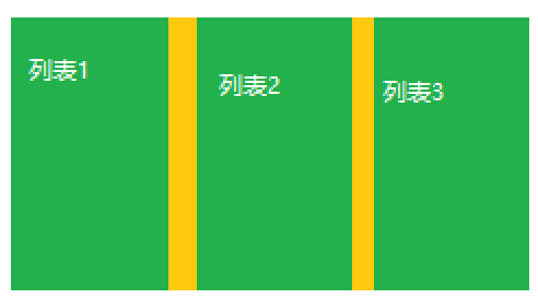
margin负值下的等高布局
原理:margin 改变元素占据空间
.box{overflow:hidden;resize:vertical;}
.child-orange{float:left;background:orange;}
.child-green{float:left;background:green}
.box{overflow:hidden;resize:vertical;}
.child-orange,
.child-green{margin-bottom:-600px;padding-bottom:-600px;}
.child-orange{float:left;background:orange;}
.child-green{float:left;background:green}
margin-bottom的作用是改变容器的大小,用 padding-bottom 把消失的部分补回来。
父级元素要设置overflow:hidden
margin 负值下的两栏自适应布局
原理:元素占据空间跟随 margin 移动
例子:
<img width="150" style="float:right;">
<p style="margin-right:170px">.....p>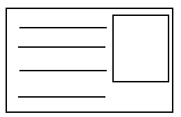
不足:DOM 顺序和最终视觉顺序不符
解决方法:用 margin 负值实现
<div style="float:left;width:100%;">
    <p style="margin-right:170px;">.....p>
div>
<img width="150" style="float:left;margin-left:-150px;">
img 标签设置的 margin-left 的绝对值,是 img 标签的宽度。
CSS margin 无效情形解析
1、inline 水平元素的垂直 margin 无效
两个前提:
- 非替代元素,例如,不是
、 元素;
- 正常书写模式(例如:没有设置 writing-mode 和 direction 等重置书写模式);
2、margin 重叠
3、display:table-cell/display:table-row 等声明的 margin 无效
4、position:absolute 绝对定位元素非定位方向的 margin 值是”无效“的。
实际上绝对定位的 margin 值一直有效,只是不像普通元素那样,可以影响兄弟元素。
5、如下
<div style="background-color:red;">
    <img src="xx.jpg" style="float:left;">
    <div style="overflow:hidden;margin-left:XX px">XXXXXXXX
div>
当 margin-left 的值小于 img 宽度时,margin 无效果。
内联特性导致的 margin 无效
<div style="height:200px;background:#f0f3f9;">
    <img src="xx.jpg" style="margin-top:-200px">
div>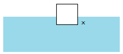
此时,margin-top 的绝对值继续增大,img 标签也不会继续向上移动。
在 img 标签后添加一个 “x” 做辅助,可以看出 img 与 “x” 的底部对齐。原因是内联元素默认基线对齐。
了解margin-start/end margin-before/after
margin-start/end
- 正常的流向,margin-start 等同于 margin-left ,两者重叠不累加;
- 如果水平流是从右往左,margin-start 等同于 margin-right ;
- 在垂直流下(writing-mode:vertical-*;),margin-start 等同于 margin-top ;
margin-before/after
只有在 webkit 下才兼容。如下:
img {
    -webkit-margin-before:100px;
}
默认流向的情况,margin-before 等同于 margin-top,margin-after 等同于 margin-bottom。
margin-collapse:控制 margin 重叠
-webkit-margin-collapse:<collapse> |<discard> | <separate>其中:
- collapse:默认值,重叠。
- discard:取消 margin 重叠
- separate:margin 不重叠
详细参考慕课网