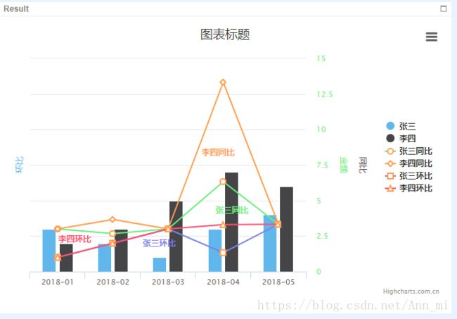
highcharts 多Y轴, 柱状、折现 混合图
这里是在官网的例子中改写的,可以把代码粘贴进去就可以看到效果。
var chart = Highcharts.chart('container', {
    // title: {
    //  text: '2010 ~ 2016 年太阳能行业就业人员发展情况'
    // },
    xAxis:{
        categories: ['2018-01', '2018-02', '2018-03', '2018-04', '2018-05']
    },
    yAxis:  [{ // 第一条Y轴
        labels: {
            // format: '{value}\xB0C',
            style: {
                color: Highcharts.getOptions().colors[2]
            }
        },
        title: {
            text: '金额',
            style: {
                color: Highcharts.getOptions().colors[2]
            }
        },
        opposite: true
    }, { // 第二条Y轴
        title: {
            text: '环比',
            style: {
                color: Highcharts.getOptions().colors[0]
            }
        },
        labels: {
            // format: '{value} mm',
            style: {
                color: Highcharts.getOptions().colors[0]
            }
        }
    }, { // 第三条Y轴
        gridLineWidth: 0,
        title: {
            text: '同比',
            style: {
                color: Highcharts.getOptions().colors[1]
            }
        },
        labels: {
            // format: '{value} mb',
            style: {
                color: Highcharts.getOptions().colors[1]
            }
        },
        opposite:true
    }],
    tooltip: {
        shared: true
    },
    legend: {
        layout: 'vertical',
        align: 'right',
        verticalAlign: 'middle'
    },
    series:[{
        type: 'column',
        name: '张三',
        data: [3, 2, 1, 3, 4],
    }, {
        type: 'column',
        name: '李四',
        data: [2, 3, 5, 7, 6]
    }, {
        type: 'line',
        name: '张三同比',
        data: [3, 2.67, 3, 6.33, 3.33],
        marker: {
            lineWidth: 2,
            lineColor: Highcharts.getOptions().colors[3],
            fillColor: 'white'
        }
    }, {
        type: 'line',
        name: '李四同比',
        data: [3, 3.67, 3, 13.33, 3.33],
        marker: {
            lineWidth: 2,
            lineColor: Highcharts.getOptions().colors[3],
            fillColor: 'white'
        }
    }, {
        type: 'line',
        name: '张三环比',
        data: [1, 2, 3, 1.33, 3.33],
        marker: {
            lineWidth: 2,
            lineColor: Highcharts.getOptions().colors[3],
            fillColor: 'white'
        }
    }, {
        type: 'line',
        name: '李四环比',
        data: [1, 2, 3, 3.3, 3.33],
        marker: {
            lineWidth: 2,
            lineColor: Highcharts.getOptions().colors[3],
            fillColor: 'white'
        }
    }],
    responsive: {
        rules: [{
            condition: {
                maxWidth: 500
            },
            chartOptions: {
                legend: {
                    layout: 'horizontal',
                    align: 'center',
                    verticalAlign: 'bottom'
                }
            }
        }]
    }
});