利用ggplot2的绘图
We learn this library "ggplot2" cos the ggplot2 can paint out a beautiful picture.
1. This means in the way that build a plot layer by layer.
2. Generally ggplot ( 'the main part' ) + geom_XXX(mapping, data, ..., geom, position) such as
#basic form "+" geom_XXX(mapping, data, ..., geom, position) + stat_XXX(mapping, data, ..., stat, position)
p = ggplot(dt, aes(x = A, y = B, color = C, group = factor(1))) +  ## the first layer
    geom_point(size = 3.8) +   ## the second layer
    geom_line(size = 0.8) +    ## the third layer
    geom_text(aes(label = B, vjust = 1.1, hjust = -0.5, angle = 45), show_guide = FALSE)
    ## the fourth layer
p   ## show this picture
① the first layer : ggplot ('the data you wanna to show' , aes () )
② the second layer : geom_point(size = 0.8 )
③ the third layer : geom_line(size = 0.8) Control line length ;
④ the fouth layer: #geom_text(aes(label = B, vjust = 1.1, hjust = -0.5, angle = 45), show_guide = FALSE)
For example
① Draw a picture for China's Money Supply and analysis it.
② The following xlsx is the data we need.
| Year | M0 | M1 | M2 |
| 2006 | 27072.62 | 126028.05 | 345577.91 |
| 2007 | 30334.3 | 152519.17 | 403401.3 |
| 2008 | 34218.96 | 166217.13 | 475166.6 |
| 2009 | 38246.97 | 221445.81 | 610224.52 |
| 2010 | 44628.17 | 266621.54 | 725851.79 |
| 2011 | 50748.46 | 289847.7 | 851590.9 |
| 2012 | 54659.77 | 308664.23 | 974148.8 |
| 2013 | 58574.44 | 337291.05 | 1106524.98 |
| 2014 | 58438.53 | 335114.13 | 1208605.95 |
transition
| Year | M | C |
| 2006 | 27072.62 | 1 |
| 2007 | 30334.3 | 1 |
| 2008 | 34218.96 | 1 |
| 2009 | 38246.97 | 1 |
| 2010 | 44628.17 | 1 |
| 2011 | 50748.46 | 1 |
| 2012 | 54659.77 | 1 |
| 2013 | 58574.44 | 1 |
| 2014 | 58438.53 | 1 |
| 2006 | 126028.05 | 2 |
| 2007 | 152519.17 | 2 |
| 2008 | 166217.13 | 2 |
| 2009 | 221445.81 | 2 |
| 2010 | 266621.54 | 2 |
| 2011 | 289847.7 | 2 |
| 2012 | 308664.23 | 2 |
| 2013 | 337291.05 | 2 |
| 2014 | 335114.13 | 2 |
| 2006 | 345577.91 | 3 |
| 2007 | 403401.3 | 3 |
| 2008 | 475166.6 | 3 |
| 2009 | 610224.52 | 3 |
| 2010 | 725851.79 | 3 |
| 2011 | 851590.9 | 3 |
| 2012 | 974148.8 | 3 |
| 2013 | 1106524.98 | 3 |
| 2014 | 1208605.95 | 3 |
z<-read.table(file=file.choose(),sep=",",header = T)   #Get the file and strictly control the beginning.
library(ggplot2)
x <- z$Year
y <- z$M
C <- z$C
p = ggplot(z, aes(x = x, y = y,colour = factor(C),group = factor(C))) + #ZHUYI
    geom_point(size = 2) +
    geom_line(size = 0.6) +
    geom_text(aes(label = M, vjust = -1, hjust = 0.5, angle = 0 ,fill=I("blue")), show_guide = FALSE) + #Add the value of the point
    scale_colour_discrete(labels = c('M0','M1','M2'))+  #Set legend labels
    guides(color = guide_legend(title='Money Supply',reverse=TRUE)) +
    xlab(" ") + ylab(" ") + ggtitle("China's Money Supply") #Add axis labels
p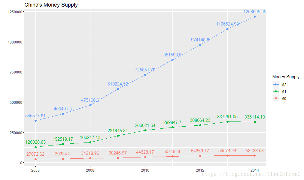
Note: It is easy to cause a mistake, the seemingly flat M0, in fact, its increase is quite large, but it is very flat under the large data of M2, so the vertical axis should be controlled the next time you read the graph or drawing!
3. Advanced R operation
ggplot(msleep, aes(sleep_rem / sleep_total, awake)) + geom_point() + geom_smooth()
#is equivalent to
plot = ggplot(msleep, aes(sleep_rem / sleep_total, awake)) #FIRST LAYER
plot = plot + geom_point() + geom_smooth() #SECOND LAYER
then we can use this as a mould to save space.
bestfit = geom_smooth(method = "lm",
                      se = T,
                      colour = "steelblue",
                      alpha=0.5,
                      size = 2)
——Written in BTBU