css 使用小技巧
1、混合模式

不久之前Firefox和Safari浏览器已经开始支持类似Photoshop的混合模式,但是在Chrome和Opera浏览器中需要添加前缀。举个栗子:
// 你也可以尝试不同的样式
.blend {
    background: #fff;
}
.blend img {
    mix-blend-mode: darken;
}
2、渐变边框

现在,你甚至可以在边框中使用渐变。 要使用渐变边框非常简单,只需要设置一个更低z-index的伪元素即可:
    .box {
  margin: 80px 30px;
  width: 200px;
  height: 200px;
  position: relative;
  background: #fff;
  float: left;
}
.box:before {
      content: '';
      z-index: -1;
      position: absolute;
      width: 220px;
      height: 220px;
      top: -10px;
      left: -10px;
      background-image: linear-gradient(90deg, yellow, gold);
}
或者使用background-clip和background-origin属性。在不久的将来,也许所有浏览器都将支持border-image属性,
最终的代码会和下面一样:
.box {
    border-image: linear-gradient(to bottom, #000000 0%, #FFFFFF 100%);
    border-image-slice: 1; /* set internal offset */
}
3、Object Fit
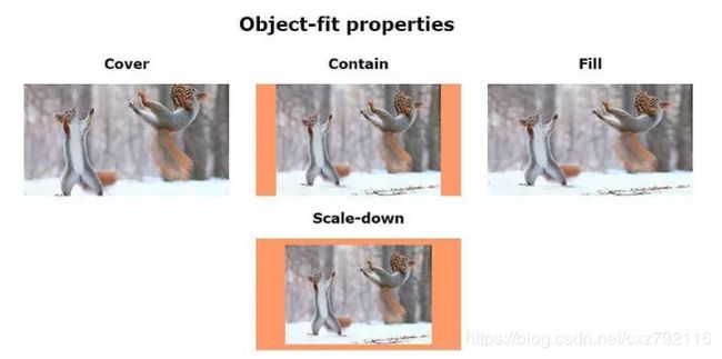
为了解决一些问题而给一幅背景图设置background-size属性的时刻呢?现在你可以使用object-fit属性啦,
webkit浏览器都支持它,Firefox也将在近期予以支持。
.image__contain {
  object-fit: contain;
}
.image__fill {
  object-fit: fill;
}
.image__cover {
  object-fit: cover;
}
.image__scale-down {
  object-fit: scale-down;
}
// 例子:
Object-fit properties
-
Cover

-
Contain
-
Fill
-
Scale-down
// css
.cover {
object-fit: cover;
}
.contain {
object-fit: contain;
}
.fill {
object-fit: fill;
}
.scale-down {
object-fit: scale-down;
}
body {
font-family: Verdana,sans-serif;
text-align: center;
}
.properties-list_item {
display: inline-block;
margin: 0 20px;
}
.properties-list_image {
background: rgba(255, 112, 42, .7);
height: 190px;
width: 350px;
}
4、单选框和复选框的样式
使用图片来设置复选框的样式:
input[type=checkbox] {display: none;}
input[type=checkbox] + label:before {
content: "";
border: 1px solid #000;
font-size: 11px;
line-height: 10px;
margin: 0 5px 0 0;
height: 10px;
width: 10px;
text-align: center;
vertical-align: middle;
}
input[type=checkbox]:checked + label:before {
content: "\2713";
}
// 复选框添加一些动画效果:
input[type=checkbox] + label:before {
content: "\2713";
color: transparent;
transition: color ease .3s;
}
input[type=checkbox]:checked + label:before {
color: #000;
}
input[type=radio] + label:before {
content: "\26AB";
border: 1px solid #000;
border-radius: 50%;
font-size: 0;
transition: font-size ease .3s;
}
input[type=radio]:checked + label:before {
font-size: 10px;
}
5、CSS中的计数器
- a
- b
- c
.list {
counter-reset: i; //reset conunter
}
.list > li {
counter-increment: i; //counter ID
}
.list li:after {
content: "[" counter(i) "]"; //print the result
}
6、高级CSS计数器
Total selected:
.languages {
counter-reset: characters;
}
input:checked {
counter-increment: characters;
}
.total:after {
content: counter(characters);
}
7、不使用图片的菜单图标
1.shadows

.shadow-icon {
  position: relative;
}
.shadow-icon:after {
  content: "";
  position: absolute;
  left: 0;
  top: -50px;
  height: 100%;
  width: 100%;
  box-shadow: 0 5px 0 #000, 0 15px 0 #fff, 0 25px 0 #000, 0 35px 0 #fff, 0 45px 0 #000;
}

2.Gradient
.gradient-icon {
    background: linear-gradient(to bottom, #000 0%, #000 20%, transparent 20%, transparent 40%, #000 40%, #000 60%, 		transparent 60%, transparent 80%, #000 80%, #000 100%);
}
8、文字修饰
通过几行代码修改文字被选中时的效果:
*::selection {
    color: #fff;
    background: #000;
}
*::-moz-selection {
    /*Only Firefox still needs a prefix*/
    color: #fff;
    background: #000;
}
9、使用硬件加速
有时候动画可能会导致用户的电脑卡顿,你可以在特定元素中使用硬件加速来避免这个问题:
.block {
    transform: translateZ(0);
}
更多信息请查看 https://juejin.im/post/5c1101875188257afc713809