matplotlib 使用简明教程(二)-常用图表
matplotlib 使用简明教程(二)-常用图表
- 点线图
- `plt.plot(x1, y1, '样式1', x2, y2, '样式2', x3, y3, '样式3', ...)`
- `plt.loglog(*args, **kwargs)`
- `plt.semilogx(*args, **kwargs)` 和 `plt.semilogy(*args, **kwargs)`
- `plt.step(x, y, *args, data=None, **kwargs)`
- `plt.plot_date(z, y, tz, xdate, ydate)`
- `plt.errorbar(x, y, yerr=None, xerr=None, lolims=False, uplims=False, xlolims=False, xuplims=False, **kwargs)`
- 柱状图、填充图
- `plt.bar(x, height, width=0.8, bottom=0, *args, **kwargs)`
- `plt.barh(*args, **kwargs)`
- `plt.fill_between(x, y1, y2=0, where=None, interpolate=False, step=None, hold=None, data=None, **kwargs)`
- `plt.fill_betweenx(y, x1, x2=0, where=None, step=None, interpolate=False, hold=None, data=None, **kwargs)`
- `stackplot(x, *args, **kwargs)`
- `plt.fill(*args, **kwargs)`
- 散点图、分布图
- `plt.scatter(x, y, s=None, c=None, cmap=None, norm=None, vmin=None, vmax=None, alpha=None, linewidths=None, verts=None, edgecolors=None, *, data=None, **kwargs)`
- `stem([x,] y, linefmt=None, markerfmt=None)`
- `plt.eventplot(positions, orientation='horizontal', lineoffsets=1, linelengths=1, linewidths=None, colors=None, linestyles='solid', hold=None, data=None, **kwargs)`
- `plt.broken_barh(xranges, yrange, hold=None, data=None, **kwargs)`
- 比例图
- `plt.pie(x, explode=None, labels=None, colors=None, autopct=None, pctdistance=0.6, shadow=False, labeldistance=1.1, startangle=None, radius=None, counterclock=True, wedgeprops=None, textprops=None, center=(0, 0), frame=False, rotatelabels=False, hold=None, data=None)`
Matplotlib 中最重要的一个模块应该就是 matplotlib.pyplot 了,里边包括了几乎所有普通用户需要调用的功能。
另外 numpy 作为一个多维数组/矩阵的模块,也经常和 Matplotlib 一起被使用
matplotlib 官方建议在引用这两个库的时候,使用如下语法:
import matplotlib.pyplot as plt
import numpy as np
点线图
plt.plot(x1, y1, '样式1', x2, y2, '样式2', x3, y3, '样式3', ...)
用于绘制折线图。
其中 xn、yn 为第 n 条曲线的 x、y 的值(n = 1, 2, 3, …)
样式n 为每个曲线的样式,本篇暂不做介绍。
返回值是一个数组,其中每个元素都是绘制的曲线。
plt.loglog(*args, **kwargs)
用于绘制折线图,与 plot 的区别在于 x 轴和 y 轴都是指数型的。
重要参数:
basex, basey: x、y 轴的底,需要大于 1
plt.semilogx(*args, **kwargs) 和 plt.semilogy(*args, **kwargs)
用于绘制折线图,两个函数的 x 轴、y 轴分别是指数型的。
支持 plot 函数的所有参数,分别有一个重要参数:
- basex: x 轴的底,需要大于 1
- basey: y 轴的底,需要大于 1
plt.step(x, y, *args, data=None, **kwargs)
类似 plot 函数,但是曲线是阶梯状的。
重要参数:
where: pre、post 或 mid,即数据点处于阶梯的右侧、左侧还是正中

plt.plot_date(z, y, tz, xdate, ydate)
与 plot 类似,可以把总坐标/横坐标当做 matplotlib.dates 类型数据来处理
- x, y: x、y 坐标对
- xdate, ydate: 是否将 x、y 轴作为 matplotlib.dates 类型来处理,默认 xdate 为 True,ydate 为 False
plt.errorbar(x, y, yerr=None, xerr=None, lolims=False, uplims=False, xlolims=False, xuplims=False, **kwargs)
用于绘制带有 误差线的折线图。
重要参数:
- yerr, xerr: 误差程度。
- 如果是一个数字,则所有数据点的误差是一个统一的数字;
- 如果是一个一维的数组(N),则数组表明了每个数据点正向、负向的误差程度
- 如果是一个二维的数组(2, N),则数组表明了每个数据点,正向以及负向各自的误差程度
- lolims, uplims, xlolims, xuplims: 误差方向,是否只有正向或负向的误差,布尔型
可以是一维数组,或一个单独的参数

柱状图、填充图
plt.bar(x, height, width=0.8, bottom=0, *args, **kwargs)
柱状图,重要参数:
- x:数据集的名称
- height:数据集中各个数据的高度
- width:柱体的宽度
- bottom:柱体底部的位置
height 一次为一个一维的数组。
如果柱状图希望叠加(如下图),可以多次调用 bar 函数。

plt.barh(*args, **kwargs)
与 plt.bar() 函数类似,不过是水平方向的。
重要参数:
- y:数据集的名称
- width:数据集中各个数据的高度
- height:柱体的宽度
- left:柱体底部的位置
plt.fill_between(x, y1, y2=0, where=None, interpolate=False, step=None, hold=None, data=None, **kwargs)
y1 和 y2 之间进行填充。
重要参数:
- x:横坐标的数组
- y1、y2:需要填充的 y 坐标的数组
- where:一个 bool 类型的数组,确定 x 数组哪些位置需要填充
- step:是否要采用柱状填充(默认采取曲线填充),可以为 ‘pre’、‘post’、‘mid’
plt.fill_betweenx(y, x1, x2=0, where=None, step=None, interpolate=False, hold=None, data=None, **kwargs)
与 plt.fill_betwwen() 函数类似,但是是进行水平方向,即 x1 和 x2 之间填充。
重要参数:
- y:纵坐标的数组
- x1、x2:需要填充的 x 坐标的数组
- where:一个 bool 类型的数组,确定 y 数组哪些位置需要填充
- step:是否要采用柱状填充(默认采取曲线填充),可以为 ‘pre’、‘post’、‘mid’
stackplot(x, *args, **kwargs)
绘制多层图,或称堆叠式图区。
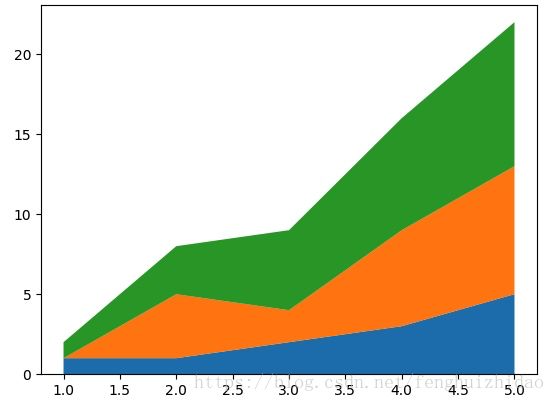
重要参数:
- x:横坐标数组
- y 或 y1, y2, y3, …:纵坐标数据的数组,可以用 y 作为多维数组,也可以用 y1, y2, y3, … 这样多个数组
- baseline:确定图表底线的方式。
- zero:固定 0 作为底线
- sym:堆栈对称的位置作为底线
- wiggle:我也不是很明白,似乎是希望让各个边界的曲线尽量平缓
- weighted_wiggle:同样不是很明白,看起来是上边缘固定为 0
plt.fill(*args, **kwargs)
填充一个个的多边形,调用方式如下:
ax.fill(x, y[, 样式描述字符串])    # x 和 y 分别是某一个多边形的横、纵坐标数组
ax.fill(x1, y2[, 样式描述字符串], x2, y2[, 样式描述字符串], x3, y3[, 样式描述字符串])
# 每对 xn、yn描述了一个多边形
散点图、分布图
plt.scatter(x, y, s=None, c=None, cmap=None, norm=None, vmin=None, vmax=None, alpha=None, linewidths=None, verts=None, edgecolors=None, *, data=None, **kwargs)
二维的散点图,重要参数:
- x, y: x、y 坐标序列
- s: 每个点的大小
- c: 颜色
- alpha: 透明度

stem([x,] y, linefmt=None, markerfmt=None)
散点的杆图
重要参数:
- x(可选):横坐标的数组
- y:纵坐标的数组
- linefmt:连线格式
- markderfmt:标记点格式

plt.eventplot(positions, orientation='horizontal', lineoffsets=1, linelengths=1, linewidths=None, colors=None, linestyles='solid', hold=None, data=None, **kwargs)
类似蛋白质电泳图,每个数据点将被绘制成一根数据线。

重要参数:
- orientation:分布的方向,‘horizontal’ 或 ‘vertical’。默认方向为水平,即上图方向
- positions:一维或二维数组,每一行都是一组数据。每组数据中各个成员是数据线的位置(无序的),例如上图,从上到下共 6 组数据,分别规定了数据线的水平位置
- lineleghths:每条数据线的长度,例如上图,数据线的高度
- lineoffsets:每组数据的偏移位置,例如上图中 6 组数据的垂直位置
plt.broken_barh(xranges, yrange, hold=None, data=None, **kwargs)
效果上和泳道图有类似之处。

重要参数:
- xranges:(xmin, xwidth) 组成的数组,其中 xmin 是每个块左端的 x 坐标,xwidth 是每个块的宽度
- yranges:(ymin, ymax)规定某一组方块的 y 坐标位置
比例图
plt.pie(x, explode=None, labels=None, colors=None, autopct=None, pctdistance=0.6, shadow=False, labeldistance=1.1, startangle=None, radius=None, counterclock=True, wedgeprops=None, textprops=None, center=(0, 0), frame=False, rotatelabels=False, hold=None, data=None)
绘制饼图。
重要参数:
- x:饼大小的数据
- explode:各个饼距离中心的距离,1 表示距离圆心一个半径的距离
- labels:各个饼的文字标签
- labeldistance:文字标签距离圆心的距离,1 表示距离圆心一个半径的距离
- autopct:定义百分比数据的格式,例如 ‘%.0f%%’ 表示不保留小数点,并且需要加上百分号
- pctdistance:百分比数据距离圆心的距离,1 表示距离圆心一个半径的距离
- startangle:开始角度,0-360 度
- radius:整个饼图的角度,默认 1
系列文章:
matplotlib 使用简明教程(一)-基础概念:
https://blog.csdn.net/fenghuizhidao/article/details/79352882
matplotlib 使用简明教程(二)-常用图表
https://blog.csdn.net/fenghuizhidao/article/details/83090043
matplotlib 使用简明教程(三)-一些专业图表简介
https://blog.csdn.net/fenghuizhidao/article/details/83090165
matplotlib 使用简明教程(四)-辅助性元件
https://blog.csdn.net/fenghuizhidao/article/details/83090249
matplotlib 使用简明教程(五)-画布、图表、元素基础操作
https://blog.csdn.net/fenghuizhidao/article/details/83090320
matplotlib 使用简明教程(六)-图像、动画相关
https://blog.csdn.net/fenghuizhidao/article/details/83090512
matplotlib 使用简明教程(七)-样式定义
https://blog.csdn.net/fenghuizhidao/article/details/83090553