JavaFX桌面应用开发-Button(按钮)与事件
1:Button样式的操作
原始代码:
package application;

import javafx.application.Application;
import javafx.scene.Group;
import javafx.scene.Scene;
import javafx.scene.control.Button;
import javafx.scene.paint.Paint;
import javafx.stage.Stage;

public class Main extends Application {

	@Override
	public void start(Stage primaryStage) throws Exception {

		//创建button类
		//注意:Group容器组会自适应调节node节点的高、宽 以容纳node节点的内容 例如:如果下面Button的text内容比较多 那么对应的Button会相应加长
		Button button = new Button("Button1");
		button.setLayoutX(10); //设置起始点的X轴坐标
		button.setLayoutY(10); //设置起始的Y轴坐标
		//设置button的宽度 高度
		button.setPrefWidth(100);
		button.setPrefHeight(100);

		//设置字体颜色
		button.setTextFill(Paint.valueOf("red"));
		//设置Button的风格
		//button.setStyle(" -fx-background-color: red;");

		//设置Group
		Group group = new Group();
		group.getChildren().add(button);

		//创建场景Scene
		Scene scene = new Scene(group);

		primaryStage.setScene(scene);
		//设置stage的宽度 高度
		primaryStage.setHeight(500);
		primaryStage.setWidth(500);
		primaryStage.show();


	}

	public static void main(String[] args) {
		launch(args);
	}
}
1.1:设置字体颜色
1.1.1:设置字体颜色的操作
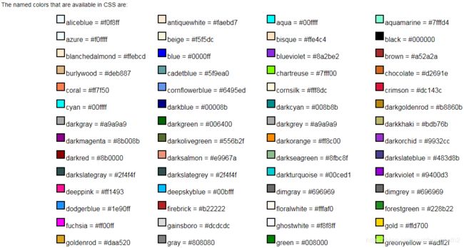
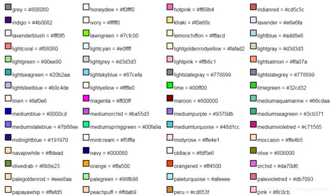
方法一:写颜色的名称
//设置字体颜色
button.setTextFill(Paint.valueOf("red"));
方法二:写颜色对应的代码(比如红色对应#ff0000)
//设置字体颜色
button.setTextFill(Paint.valueOf("#ff0000"));
运行结果:
1.1.2:颜色的Value值表
2:Button对象的setStyle方法设置CSS样式
官方参考文档:https://docs.oracle.com/javase/8/javafx/api/javafx/scene/doc-files/cssref.html#typefont
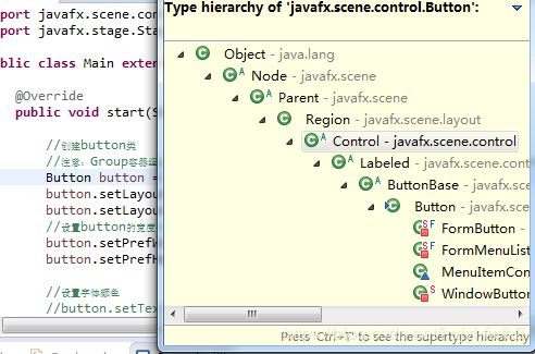
文档中对Button的CSS很少 我可以看Button父类Region(Ctrl+T可以看到Button的Tree继承关系)
2.1:查看文档 Region的CSS样式如下
Region
Style class: empty by default
A Region is a Node (extending from Parent) with backgrounds and borders that are styleable via CSS. A Region is typically a rounded rectangle, though this can be modified through CSS to be an arbitrary shape. Regions can contain other Region objects (sub-regions) or they can contain sub-controls. All Regions have the same set of CSS properties as described below.
Each Region consists of several layers, painted from bottom to top, in this order:
- background fills
- background images
- border strokes
- border images
- contents
The background and border mechanisms are patterned after the CSS 3 draft backgrounds and borders module. See [4] for a detailed description.
Background fills are specified with the properties -fx-background-color, -fx-background-radius and -fx-background-insets. The -fx-background-color property is a series of one or more comma-separated
Note also that properties such as -fx-background-radius and -fx-background-insets can contain a series of values or sets of four values. A set of values is separated by whitespace, whereas the values or sets-of-values in a series are separated by commas. For -fx-background-radius, a single value indicates that the value should be used for the radius of all four corners of the background rectangle. A set of four values indicates that different radius values are to be used for the top-left, top-right, bottom-right, and bottom-left corners, in that order. Similarly, the -fx-background-insets property can also contain a series of values or sets of values. A set of four values for -fx-background-insets indicates that different insets are to be used for the top, right, bottom, and left edges of the rectangle, in that order.
Background images are specified with the properties -fx-background-image, -fx-background-repeat, -fx-background-position and -fx-background-size. The number of images in the series of -fx-background-image values determines the number of background images that are painted. The -fx-background-repeat, -fx-background-position, and -fx-background-size properties each can contain a series of values. For each item in the -fx-background-image series, the corresponding items in the -fx-background-repeat, -fx-background-position, and -fx-background-size properties are applied to that background image.
Stroked borders are specified with the properties -fx-border-color, -fx-border-style, -fx-border-width, -fx-border-radius and -fx-border-insets. Each property contains a series of items. The maximum number of items in the -fx- border-color or -fx-border-style property determines the number of border layers that are painted.. Each border in the series is painted using information from the corresponding series item of the -fx-border-color, -fx-border-style, -fx-border-width, -fx-border-radius, and -fx-border-insets properties. If there is no -fx-border-color, the default color is black. if there is no -fx-border-style, the default style is solid.
Image borders are specified with the properties -fx-border-image-source, -fx-border-image-repeat, -fx-border-image-slice, -fx-border-image-width and -fx-border-image-insets. Each property contains a series of items. The number of items in the -fx-border-image-source property determines the number of images that are painted. Each image in the series is painted using information from the corresponding series items of the -fx-border-image-repeat, -fx-border-image-slice, -fx-border-image-width, and -fx-border-image-insets properties.
The region's contents are a sequence of nodes, like any other container. The contents are set programmatically and cannot be set via CSS.
| CSS Property | Values | Default | Comments |
|---|---|---|---|
| BACKGROUND FILLS (see CSS Backgrounds and Borders Module Level 3: Backgrounds) | |||
| -fx-region-background | javafx.scene.layout.Background | null | This cannot be set directly from CSS but is created from the property values of -fx-background-color, -fx-background-image, -fx-background-insets, -fx-background-position, -fx-background-radius, -fx-background-repeat, -fx-background-size |
| -fx-background-color | transparent | A series of paint values separated by commas. | |
| -fx-background-insets | 0 0 0 0 | A series of size values or sets of four size values, separated by commas. A single size value means all insets are the same. Otherwise, the four values for each inset are given in the order top, right, bottom, left. Each comma-separated value or set of values in the series applies to the corresponding background color. |
|
| -fx-background-radius | [ |
0 0 0 0 | The same syntax and semenatics as CSS Backgrounds and Borders Module Level 3: Curve Radii applies to -fx-background-radius. Note that JavaFX supports only the short-hand syntax. Each comma-separated value or set of values in the series applies to the corresponding background color. |
| BACKGROUND IMAGES (see CSS Backgrounds and Borders Module Level 3: Background Image) | |||
| -fx-background-image | null | A series of image URIs separated by commas. | |
| -fx-background-position |
|
0% 0% | A series of |
| -fx-background-repeat | where |
repeat repeat | A series of |
| -fx-background-size | auto auto | A series of |
|
| STROKED BORDERS (see CSS Backgrounds and Borders Module Level 3: Borders) BORDER IMAGES (see CSS Backgrounds and Borders Module Level 3: Border Images) |
|||
| -fx-region-border | javafx.scene.layout.Border | null | This cannot be set directly from CSS but is created from the property values of -fx-border-color, -fx-border-insets, -fx-border-radius, -fx-border-style, -fx-border-width, -fx-border-image-insets, -fx-border-image-repeat, -fx-border-image-slice, -fx-border-image-source, -fx-border-image-width |
| -fx-border-color | null | A series of paint values or sets of four paint values, separated by commas. For each item in the series, if a single paint value is specified, then that paint is used as the border for all sides of the region; and if a set of four paints is specified, they are used for the top, right, bottom, and left borders of the region, in that order. If the border is not rectangular, only the first paint value in the set is used. |
|
| -fx-border-insets | null | A series of inset or sets of four inset values, separated by commas. For each item in the series, a single inset value means that all insets are the same; and if a set of four inset values is specified, they are used for the top, right, bottom, and left edges of the region, in that order. Each item in the series of insets applies to the corresponding item in the series of border colors. |
|
| -fx-border-radius | [ |
null | Refer to CSS Backgrounds and Borders Module Level 3: Curve Radii. JavaFX supports only the short-hand syntax. Each comma-separated value or set of values in the series applies to the corresponding border color. |
| -fx-border-style |
|
null | A series of border style values, separated by commas. Each item in the series applies to the corresponding item in the series of border colors. The segments dash-style defines a sequence representing the lengths of the dash segments. Alternate entries in the sequence represent the lengths of the opaque and transparent segments of the dashes. This corresponds to the strokeDashArray variable of Shape. The optional phase parameter defines the point in the dashing pattern that will correspond to the beginning of the stroke. This corresponds to the strokeDashOffset variable of Shape. |
| -fx-border-width | null | A series of width or sets of four width values, separated by commas. For each item in the series, a single width value means that all border widths are the same; and if a set of four width values is specified, they are used for the top, right, bottom, and left border widths, in that order. If the border is not rectangular, only the first width value is used. Each item in the series of widths applies to the corresponding item in the series of border colors. |
|
| -fx-border-image-source | null | A series of image URIs, separated by commas. |
|
| -fx-border-image-insets | 0 0 0 0 | A series of inset or sets of four inset values, separated by commas. For each item in the series, a single inset value means that all insets are the same; and if a set of four inset values is specified, they are used for the top, right, bottom, and left edges of the region, in that order. Each item in the series of insets applies to the corresponding image in the series of border images. |
|
| -fx-border-image-repeat | where |
repeat repeat | A series of repeat-style values, separated by commas. Each item in the series applies to the corresponding image in the series of border images. |
| -fx-border-image-slice | [ |
100% | A series of image slice values or sets of four values, separated by commas. Each item in the series applies to the corresponding image in the series of border images. For each item in the series, if four values are given, they specify the size of the top, right, bottom, and left slices. This effectively divides the image into nine regions: an upper left corner, a top edge, an upper right corner, a right edge, a lower right corner, a bottom edge, a lower left corner, a left edge and a middle. If one value is specified, this value is used for the slice values for all four edges. If 'fill' is present, the middle slice is preserved, otherwise it is discarded. Percentage values may be used here, in which case the values are considered proportional to the source image. |
| -fx-border-image-width | 1 1 1 1 | A series of width or sets of four width values, separated by commas. For each item in the series, a single width value means that all border widths are the same; and if a set of four width values is specified, they are used for the top, right, bottom, and left border widths, in that order. If the border is not rectangular, only the first width value is used. Each item in the series of widths applies to the corresponding item in the series of border images. Percentage values may be used here, in which case the values are considered proportional to the border image area. |
|
| OTHER | |||
| -fx-padding | 0 0 0 0 | A sets of four padding values, separated by commas. For each item in the series, a single padding value means that all padding are the same; and if a set of four padding values is specified, they are used for the top, right, bottom, and left edges of the region, in that order. |
|
| -fx-position-shape | true | If true means the shape centered within the region's width and height, otherwise the shape is positioned at its source position. Has no effect if a shape string is not specified. | |
| -fx-scale-shape | true | If true means the shape is scaled to fit the size of the region, otherwise the shape is at its source size, and its position depends on the value of the position-shape property. Has no effect if a shape string is not specified. | |
| -fx-shape | " |
null | An SVG path string. By specifying a shape here the region takes on that shape instead of a rectangle or rounded rectangle. The syntax of this path string is specified in [3]. |
| -fx-snap-to-pixel | true | Defines whether this region rounds position/spacing and ceils size values to pixel boundaries when laying out its children. | |
| -fx-region-background | null | This property is set by specifying -fx-background-color and/or -fx-background-image. Optionally, the properties -fx-background-insets, -fx-background-radius, -fx-background-position, -fx-background-repeat, and -fx-background-size may also be set. In order to set the Region background to null, specify the style "-fx-background-color: null; -fx-background-image: null;". There is no shorthand notation for -fx-region-background at this time. | |
| -fx-region-border | null | This property is set by specifying -fx-border-color and/or -fx-border-image. Optionally -fx-border-insets, -fx-border-radius, -fx-border-style, -fx-border-width, -fx-border-image-insets, -fx-border-image-repeat, -fx-border-image-slice and -fx-border-image-width may be specified. In order to set the Region background to null, specify the style "-fx-border-color: null; -fx-border-image: null;". There is no shorthand notation for -fx-region-border at this time. | |
| -fx-min-height, -fx-pref-height, -fx-max-height | -1 | Percentage values are not useful since the actual value would be computed from the width and/or height of the Regions's parent before the parent is laid out. | |
| -fx-min-width, -fx-pref-width, -fx-max-width | -1 | Percentage values are not useful since the actual value would be computed from the width and/or height of the Region's parent before the parent is laid out. | |
| Also has all properties of Parent | |||
2.2:编写Button的样式
原始代码在本文的开始已经附上了
button的样式需要以拼接字符串的方式拼接起来
//设置Button的风格
button.setStyle("-fx-background-color:Green;"+
			"-fx-background-insets:5;"+
			"-fx-border-color:Red;");
3:Button的点击事件
3.1:setOnAction对与button的基本操作事件
运行想象就是我们鼠标点击一下button按钮 控制台打印一句 Buttion点击一下 打印一下
//button的点击事件
button.setOnAction(new EventHandler() {

	@Override
	public void handle(ActionEvent event) {

		System.out.println("Buttion点击一下 打印一下");

	}
});
3.2:event对象获取button对象
3.2.1:点击button打印button上的text文本
//button的点击事件
button.setOnAction(new EventHandler() {

	@Override
	public void handle(ActionEvent event) {
		//event.getSource()获取一个Object对象 实际就是这个button 这里我们需要强制转行
		Button bu = (Button) event.getSource();
		//打印button的text文本信息可以验证
		System.out.println(bu.getText());

	}
});
3.2.2:点击button对button进行修改
//button的点击事件
button.setOnAction(new EventHandler() {

	@Override
	public void handle(ActionEvent event) {
		//event.getSource()获取一个Object对象 实际就是这个button 这里我们需要强制转行
		Button bu = (Button) event.getSource();
		bu.setText("点点点");
		bu.setPrefHeight(200);

	}
});


