R语言绘图篇(三)
R语言中有关绘图的包:base、grid、lattice及ggplot2
1.lattice包
可生成栅栏图形
library(lattice)
histogram(~height|voice.part,data=singer,
          main="Distribution of Heights by Voice Pitch",
          xlab="Height(inches)")
height是因变量,voice.part被称作条件变量(conditioning variable)
该代码对八个声部的每一个都创建一个直方图

2.lattice绘图示例
install.packages("lattice")
library(lattice)
attach(mtcars)
gear<-factor(gear,levels=c(3,4,5),labels=c("3 gears","4 gears","5 gears"))
cyl<-factor(cyl,levels=c(4,6,8),labels=c("4 cylinders","6 cylinders","8 cylinders"))
densityplot(~mpg,main="Density Plot",xlab="Miles per Gallon")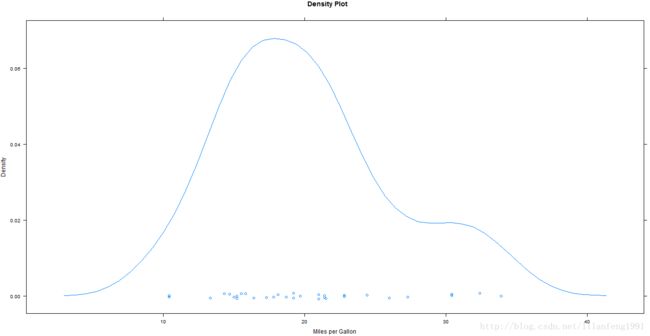
densityplot(~mpg|cyl,main="Density Plot by Number of Cylinders")
bwplot(cyl~mpg|gear,main="Box Plots by Cylinders and Gears",xlab="Miles per Gallon",ylab="cylinders")
xyplot(mpg~wt|cyl*gear,main="Scatter Plots by Cylinders and Gears",xlab="Car Weight",ylab="Miles per Gallon")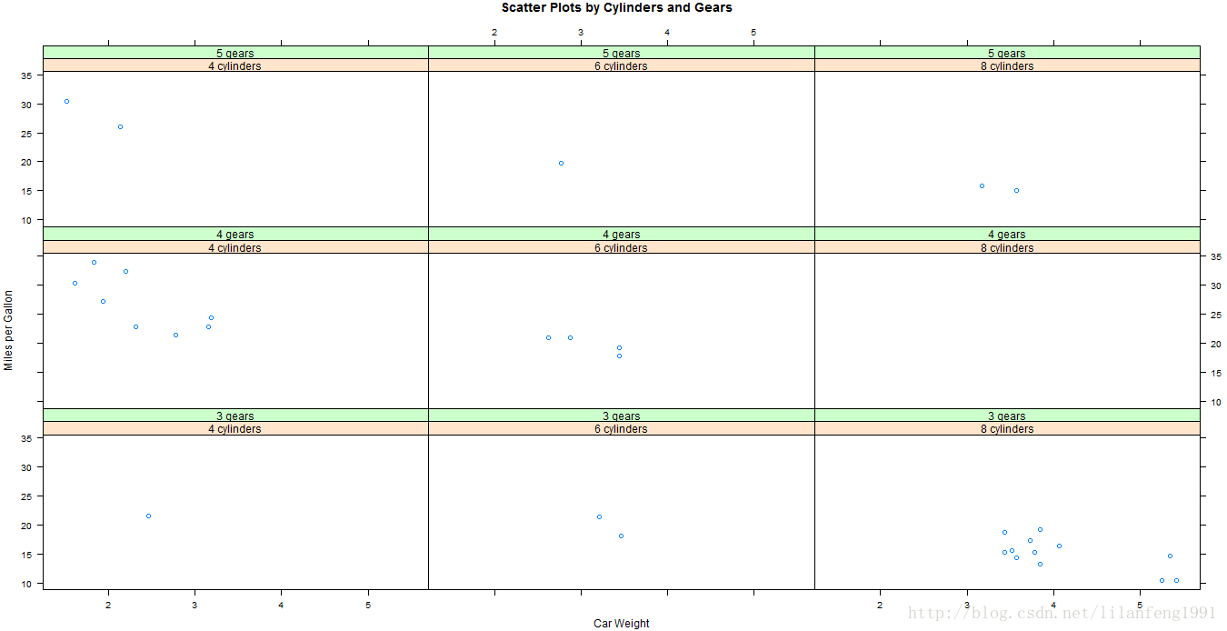
cloud(mpg~wt*qsec|cyl,main="3D Scatter Plots by Cylinders")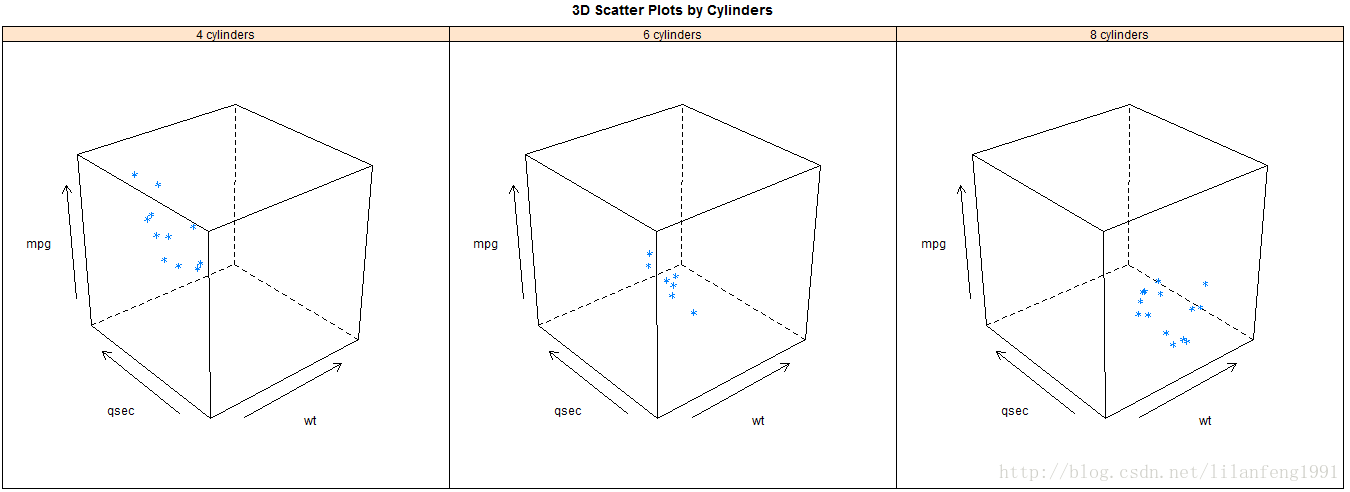
dotplot(cyl~mpg|gear,main="Dot Plots by Number of Gears and Cylinders",xlab="Miles Per Gallon")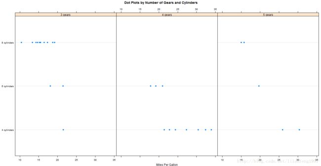
3.条件变量
通常条件变量是因子,但若想以连续变量为条件,一种方法是利用R中的cut()函数将连续型变量转换为离散变量;另外,lattice包提供了一些将连续型变量转化为瓦块(shingle)数据结构的函数。各连续变量会被分割到一系列(可能)重叠的数值范围内。
library(lattice)
displacement<-equal.count(mtcars$disp,number=3,overlap=0)
xyplot(mpg~wt|displacement,data=mtcars,
       main="Miles per Gallon vs.Weight by Engine Displacement",
       xlab="Weight",ylab="Miles per Gallon",
       layout=c(3,1),aspect=1.5)
4.面板函数
默认的面板函数服从如下命名惯例:panel.graph_function,其中graph_function是该水平绘图函数,
如xyplot(mpg~wt|displacement,data=mtcars)也可写为xyplot(mpg~wt|displacement,data=mtcars,panel=panel.xyplot)
可以使用自定义函数替换默认的面板函数,也可将lattice包中的50多个默认面板中的某个或多个整合到自定义的函数中。自定义面板函数具有极大的灵活性,可随意设计输出结果以满足要求。
Eg:
displacement<-equal.count(mtcars$disp,number=3,overlap=0)
mypanel<-function(x,y){
  panel.xyplot(x,y,pch=19)
  panel.rug(x,y)
  panel.grid(h=-1,v=1)
  panel.lmline(x,y,col="red",lwd=1,lty=2)
}
xyplot(mpg~wt|displacement,data=mtcars,
       laycout=c(3,1),
       aspect=1.5,
       main="Miles per Gallon vs.Weight by Engine Displacement",
       xlab="Weight",
       ylab="Miles per Gallon",
       panel=mypanel)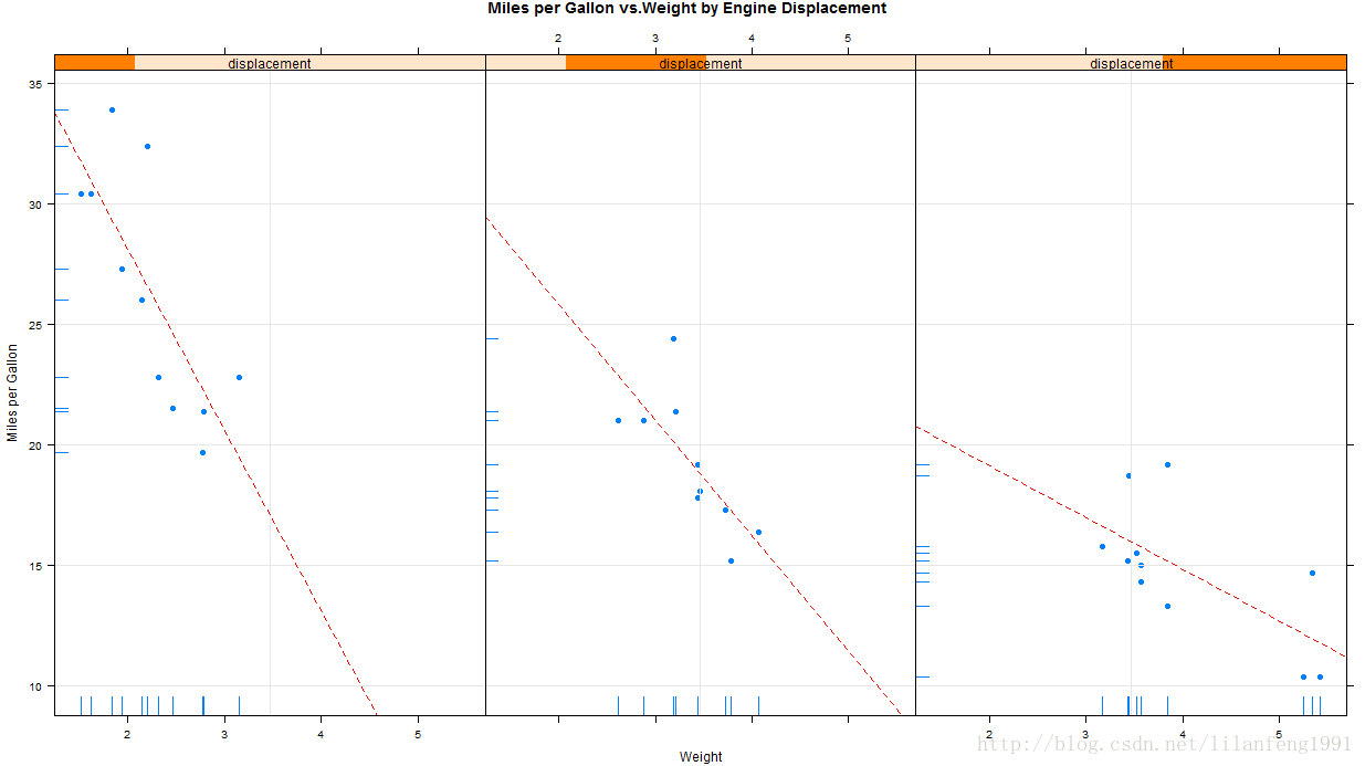
自定义面板函数和额外选项的xyplot
library(lattice)
mtcars$transmission<-factor(mtcars$am,levels=c(0,1),
                            labels=c("Automatic","Manual"))
panel.smoother<-function(x,y){
  panel.grid(h=-1,v=-1)
  panel.xyplot(x,y)
  panel.loess(x,y)
  panel.abline(h=mean(y),lwd=2,lty=2,col="green")
}
xyplot(mpg~disp|transmission,data=mtcars,
       scales=list(cex=.8,col="red"),
       panel=panel.smoother,
       xlab="Displacement",ylab="Miles per Gallon",
       main="MGP vs Displacement by Transmission Type",
       sub="Dotted lines are Group Means",aspect=1)
5.分组变量
若一个lattice图形表达式含有条件变量时,将会生成在该变量各个水平下的面板,若想将结果叠加到一起,则可以将变量设定为分组变量(grouping variable)。
library(lattice)
mtcars$transmission<-factor(mtcars$am,levels=c(0,1),
                            labels=c("Automatic","Manual"))
densityplot(~mpg,data=mtcars,
            group=transmission,
            main="MPG Distribution by Transmission Type",
            xlab="Miles per Gallon",
            auto.key=TRUE)

可以修改auto.key的值来更改图例的位置
auto.key=list(space="right",columns=1,title="Transmission")
自定义图例并含有分组变量的核密度曲线图
library(lattice)
mtcars$transimission<-factor(mtcars$am,levels=c(0,1),
                             labels=c("Automatic","Manual"))
colors=c("red","green")
lines=c(1,2)
points=c(16,17)
key.trans<-list(title="Transimission",
                space="botton",columns=2,
                text=list(levels(mtcars$transimission)),
                points=list(pch=points,col=colors),
                lines=list(col=colors,lty=lines),
                cex.title=1,cex=.9)
densityplot(~mpg,data=mtcars,
            group=transimission,
            main="MPG Distribution by Tranmission Type",
            xlab="Miles per Gallon",
            pch=points,lty=lines,col=colors,
            lwd=2,jitter=.005,
            key=key.trans)
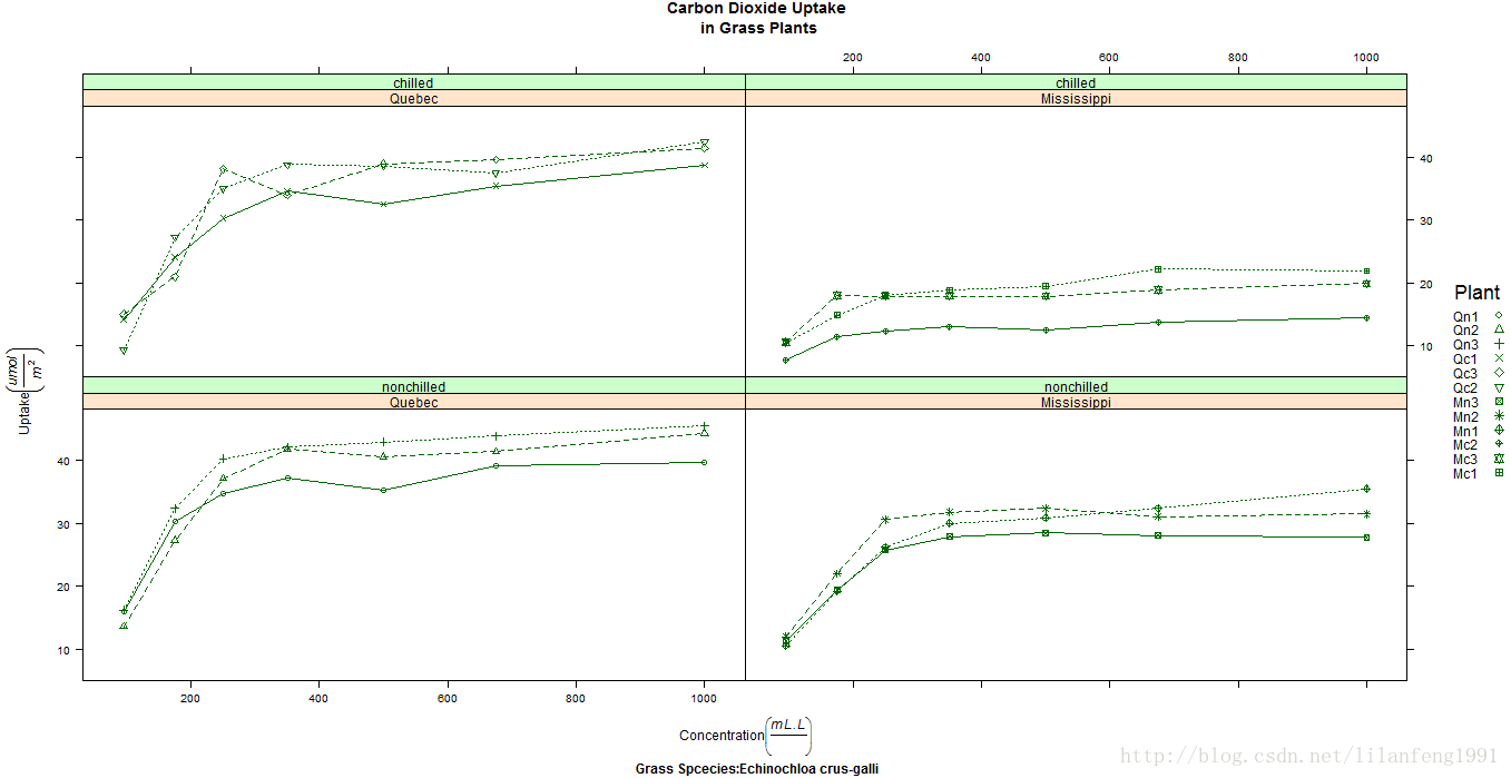
分组变量和条件变量同时包含在一幅图形中的eg:
library(lattice)
colors<-"darkgreen"
symbols<-c(1:12)
linetype<-c(1:3)
key.species<-list(title="Plant",
                  space="right",
                  text=list(levels(CO2$Plant)),
                  points=list(pch=symbols,col=colors))
xyplot(uptake~conc|Type*Treatment,data=CO2,
       group=Plant,
       type="o",
       pch=symbols,col=colors,lty=linetype,
       main="Carbon Dioxide Uptake\n in Grass Plants",
       ylab=expression(paste("Uptake",bgroup("(",italic(frac("umol","m"^2)),")"))),
       xlab=expression(paste("Concentration",bgroup("(",italic(frac(mL.L)),")"))),
       sub="Grass Spcecies:Echinochloa crus-galli",
       key=key.species)
6.图形参数
par()函数仅对R中简单的图形系统生成的图形有效,对于lattice图形来说这些设置是无效的。
在lattice图形中,lattice函数默认的图形参数包含在一个很大的列表对象中,可通过trellis.par.get()函数来获取
trellis.par.set()函数来修改
show.settings()函数可展示当前的图形设置情况
eg:
show.settings()
mysettings<-trellis.par.get()
mysettings$superpose.symbol
mysettings$superpose.symbol$pch<-c(1:10)
trellis.par.set(mysettings)
show.settings()
7.页面摆放
par()函数可在一个页面上摆放多个图形,因lattice函数不识别par()设置,故需要新方法。可将lattice图形存储到对象中,然后利用plot()函数中的split=或position=选项来进行控制。
split选项的格式为:
split=c(placement row,placementcolumn,total number of rows,total number of columns)
eg1 :
library(lattice)
graph1<-histogram(~height|voice.part,data=singer,
                  main="Height of Choral Singers by Voice Part")
graph2<-densityplot(~height,data=singer,group=voice.part,plot.points=FALSE,auto.key=list(columns=4))
plot(graph1,split=c(1,1,1,2))
plot(graph2,split=c(1,2,1,2),newpage=FALSE)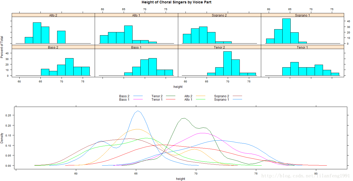
eg2:
library(lattice)
graph1<-histogram(~height|voice.part,data=singer,
                  main="Height of Choral Singers by Voice Part")
graph2<-densityplot(~height,data=singer,group=voice.part,plot.points=FALSE,auto.key=list(columns=4))
plot(graph1,postion=c(0,.3,1,1))
plot(graph2,postion=c(0,0,1,.3),newpage=FALSE)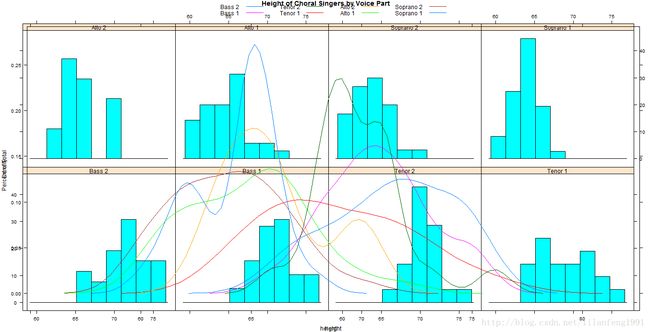
使用position=选项可以对大小和摆放方式进行更多的控制
positon=c(xlim,ylim,xmax,ymax)
index.cond=选项可设定条件水平的顺序
8.ggplot2包
qplot(x,y,data=,color=,shape=,size=,alpha=,geom=,method=,formula=,facets=,xlim=,ylim=,xlab=,ylab=,main=,sub=)
color把变量的水平与符号颜色、形状或大小联系起来。对于直线图,colo将把线条颜色与变量水平联系起来,对于密度图和箱线图fill将把填充颜色与变量联系起来。图例会被自动绘制。
geom设定定义图形类型的几何形状,geom选项是一个单条目或多条目的字符向量,包括“point”、“smooth”、“boxplot”、“line”、“histogram”、“density”、“bar”和“jitter”。
Eg:
library(ggplot2)
mtcars$cylinder<-as.factor(mtcars$cyl)
qplot(mtcars$cylinder,mtcars$mpg,geom=c("boxplot","jitter"),
      fill=mtcars$cylinder,
      main="Box plots with superimposed data points",
      xlab="Number of Cylinders",
      ylab="Miles per Gallon")
library(ggplot2)
transimission<-factor(mtcars$am,levels=c(0,1),
                      labels=c("Automatic","Manual"))
qplot(mtcars$wt,mtcars$mpg,
      color=transimission,shape=transimission,
      geom=c("point","smooth"),
      method="lm",formula=y~x,
      xlab="Weight",ylab="Miles Per Gallon",
      main="Regression Example")
创建一个分面(栅栏)图
library(ggplot2)
mtcars$cyl<-factor(mtcars$cyl,levels=c(4,6,8),
                   labels=c("4 cylinders","6 cylinders","8 cylinders"))
mtcars$am<-factor(mtcars$am,levels=c(0,1),
                  labels=c("Automatic","Manual"))
qplot(mtcars$wt,mtcars$mpg,facets=mtcars$am~mtcars$cyl,size=mtcars$hp)
对lattice包中的singer数据进行绘图
library(ggplot2)
data(singer,package="lattice")
qplot(height,data=singer,geom=c("density"),
      facets=voice.part~.,fill=voice.part)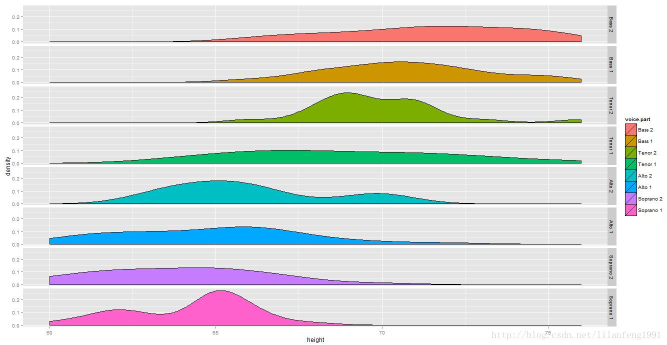
9.交互式图形
与图形交互:鉴别点
eg:
plot(mtcars$wt,mtcars$mpg)
identify(mtcars$wt,mtcars$mpg,labels=row.names(mtcars))
playwith包:
install.packages("playwith",depend=TRUE)
library(playwith)
library(lattice)
playwith(
  xyplot(mpg~wt|factor(cyl)*factor(am),
         data=mtcars,subscripts=TRUE,
         type=c("r","p")))
playwith()既对R基础图形有效,也对lattice和ggplot2图形有效
使用latticist包,可通过栅栏图方式探索数据集,该包不仅提供了一个图形的用户界面,也可通过vcd包来创建新的图形,可与playwith整合到一起。
library(latticist)
mtcars$cyl<-factor(mtcars$cyl)
mtcars$gear<-factor(mtcars$gear)
latticist(mtcars,use.playwith=TRUE)
9.iplots的交互图形
playwith和latticist包只能与单幅图形交互,而iplots包提供的交互方式则有所不同。
该包提供了交互式马赛克图、柱状图、箱线图、平行坐标图、散点图和直方图,以及颜色刷,并可将它们结合在一起绘制。即可通过鼠标对观测点进行选择和识别,且对其中一幅图形的观测点突出显示时,其他被打开的图形将会自动突出显示相同的观测点。另外,可通过鼠标来收集图形对象(诸如点、条、线)和箱线图的信息。
iplot函数
ibar() 交互式柱状图
ibox() 交互式箱线图
ihist() 交互式直方图
imap() 交互式地图
imosaic() 交互式马赛克图
ipcp() 交互式平等坐标图
iplot() 交互式散点图
iplots展示
library(iplots)
attach(mtcars)
cylinders<-factor(cyl)
gears<-factor(gear)
transimission<-factor(am)
ihist(mpg)
ibar(gears)
iplot(mpg,wt)
ibox(mtcars[c("mpg","wt","qsec","disp","hp")])
ipcp(mtcars[c("mpg","wt","qsec","disp","hp")])
imosaic(transimiission,cylinders)
detach(mtcars)

rggobi
GGobi界面
install.packages("rggobi",depend=TRUE)
libary(rggobi)
g<-ggobi(mtcars)