Stylish CSS Tables Tutorial
原文
CSS Tables. Veteran developers may cringe upon hearing those words, remembering the times when the typical site layout was created using them. Perhaps it invokes the pains of theming your old Myspace page with nested tablet after table. Maybe you're a dedicated HTML e-mail maker, and you're so desensitized to tables that there's no more hope for you. Whatever it may be, there is still one thing tables excel at above all HTML elements: presenting tabular data.
To make it clear, tabular data is information you'd normally represent in a column & row style fashion. If you were presenting it in any other medium, you'd probably end up using Excel for that data. However, the thought may already be creeping into your mind, "Oh yea, but tables are ugly!" That may be so, however, with some CSS magic we are capable of making some stylish tables. Let's see how.
Demo
| One | Two | Three |
|---|---|---|
| Apples | Carrots | Steak |
| Oranges | Potato | Pork |
| Pears | Peas | Chicken |
Basic CSS Table Structure
Let's make a simple 3x4 table containing columns for different food groups. Our HTML would look something like:
| One | Two | Three |
|---|---|---|
| Apples | Carrots | Steak |
| Oranges | Potato | Pork |
| Pears | Peas | Chicken |
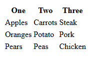
Within a brand new HTML document, before any resets or CSS, you'd probably have something like this on your hands:
We want stylish CSS tables though, so it's time to call our buddy CSS and work some magic on this table!
Borders
When you're styling tables, you can obviously take some different approaches. You may want borders on a per-cell basis, or maybe just on the table itself. Let's do a quick test here. First, I'm going to make the table slightly bigger for the example's sale. Now, if I were to add a light grey border to all my cells (both and ) with this CSS:
table { width: 640px; } /* Make table wider /
 td, th { border: 1px solid #CCC; } / Add borders to cells */
Your CSS table will appear as so:
You'll notice the cells have some weird spacing between themselves. This may not concern you if you decided to not use borders, but we want full control of these things (and to avoid browser differences). A normal reset will add some extra properties to our table:
table {
 width: 640px;
 border-collapse: collapse;
 border-spacing: 0;
 }
 td, th { border: 1px solid #CCC; }
Which in turn will give us a better looking, but still totally basic table.
A Better CSS Table
Let's improve on this and add some visual improvements to our table:
table {
color: #333; /* Lighten up font color /
font-family: Helvetica, Arial, sans-serif; / Nicer font /
width: 640px;
border-collapse:
collapse; border-spacing: 0;
}
td, th { border: 1px solid #CCC; height: 30px; } / Make cells a bit taller /
th {
background: #F3F3F3; / Light grey background /
font-weight: bold; / Make sure they're bold /
}
td {
background: #FAFAFA; / Lighter grey background /
text-align: center; / Center our text */
}
Now have a much nicer table!
This table is styled, but it's not quite a "stylish" table just yet. You'll notice it's very static, and still bland. With the power of the nth-child pseudo selector, watch what we can do!
table {
color: #333;
font-family: Helvetica, Arial, sans-serif;
width: 640px;
border-collapse:
collapse; border-spacing: 0;
}
td, th {
border: 1px solid transparent; /* No more visible border /
height: 30px;
transition: all 0.3s; / Simple transition for hover effect /
}
th {
background: #DFDFDF; / Darken header a bit /
font-weight: bold;
}
td {
background: #FAFAFA;
text-align: center;
}
/ Cells in even rows (2,4,6...) are one color /
tr:nth-child(even) td { background: #F1F1F1; }
/ Cells in odd rows (1,3,5...) are another (excludes header cells) /
tr:nth-child(odd) td { background: #FEFEFE; }
tr td:hover { background: #666; color: #FFF; }
/ Hover cell effect! */
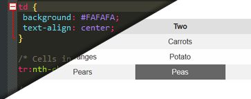
Much fancier! In particular notice the last 3 rules we added. "nth-child()" allows us to choose the odd and even rows and style those cells however we want. You can also use :first-child or :last-child to, unsurprisingly, only style the first or last of a certain element. These are incredibly powerful selectors, however do note, in versions of Internet Explorer before 9 you'll need to use something like Selectivizr for your CSS to work properly. The darker cell (Peas) is what it would look like thanks to that hover property, and since we applied transition to our cell (which still needs prefixes for older webkit browser) it does a nice fade on our table. As a fun exercise, why don't you try to figure out how to make a table like this? (Answer can be found here, but no cheating!)


