Cards - 卡片
A card is a sheet of material that serves as an entry point to more detailed information.
【翻译】
卡片是一张材料,作为更详细信息的入口点。
Cards may contain a photo, text, and a link about a single subject. They may display content containing elements of varying size, such as photos with captions of variable length.
A card collection is a layout of cards on the same plane.
【翻译】
卡片可能包含有关单个主题的照片,文字和链接。它们可以显示包含不同尺寸的元素的内容,诸如具有可变长度的标题的照片。
卡集合是在同一平面上的卡的布局。
Usage - 用法
Cards display content composed of different elements whose size or supported actions vary.
【翻译】
卡片显示由不同元素组成的内容,其大小或支持的操作不同。
Supported gestures - 支持的手势
Swipe
Pick-up-and-move
【翻译】
滑动
拾起移动
Related components - 相关组件
Grid lists
【翻译】
网格列表
For developers - 对于开发人员
Android cardsPolymer cards
【翻译】
Android卡
聚合物卡

Usage - 用法
Cards are a convenient means of displaying content composed of different elements. They’re also well-suited for showcasing elements whose size or supported actions vary, like photos with captions of variable length.
【翻译】
卡是显示由不同元素组成的内容的方便手段。它们也非常适合展示尺寸或支持的操作变化的元素,例如带有可变长度标题的照片。

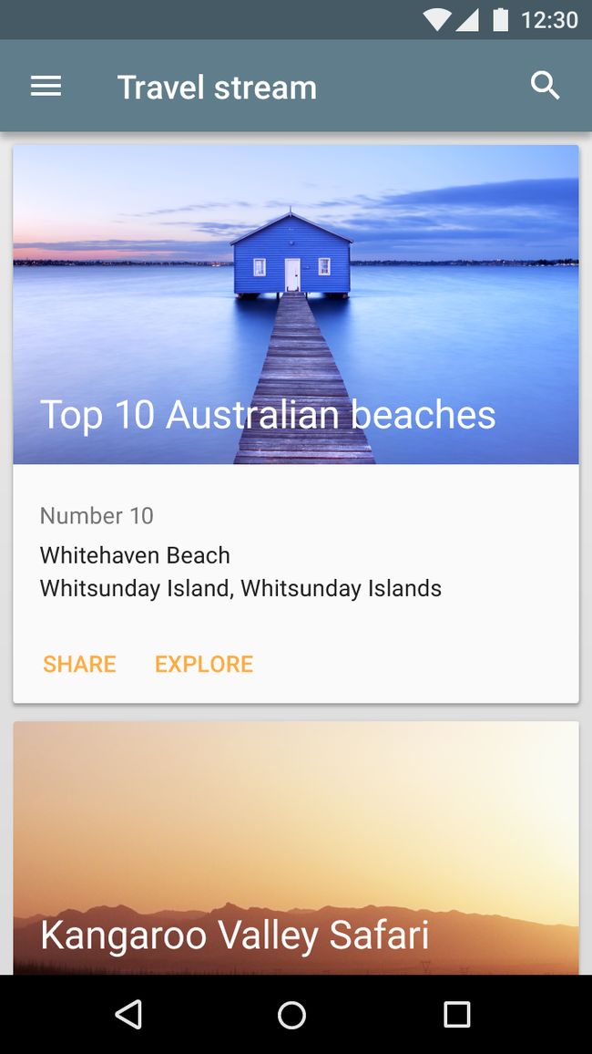
Example of a card
【翻译】
卡的示例
A card collection is coplanar, or a layout of cards on the same plane.
【翻译】
卡集合是共面的,或在同一平面上的卡布局。
Example of a card collection
【翻译】
卡集合的示例
[图片上传失败...(image-b047a0-1552295986558)]
Example of a card collection
【翻译】
卡集合的示例
When to use
Use a card layout when displaying content that:
As a collection, comprises multiple data types, such as images, movies, and text
Does not require direct comparison (a user is not directly comparing images or text)
Supports content of highly variable length, such as comments
Contains interactive content, such as +1 buttons or comments
Would otherwise be in a grid list but needs to display more content to supplement the image
【翻译】
何时使用
使用卡布局显示内容时:
作为集合,包括多个数据类型,如图像,电影和文本
不需要直接比较(用户不直接比较图像或文本)
支持高度可变长度的内容,例如注释
包含互动式内容,例如+1按钮或评论
否则将在网格列表中,但需要显示更多的内容来补充图像
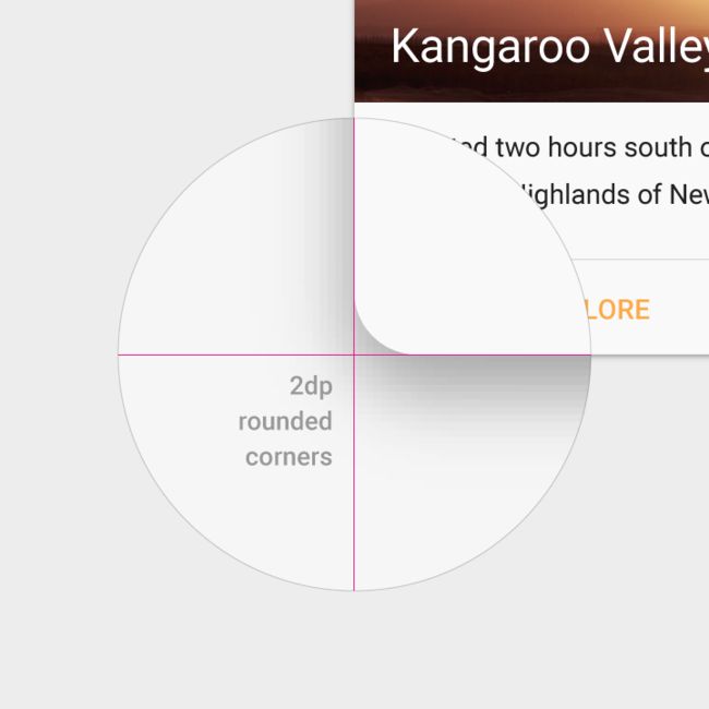
Do.
- Cards have rounded corners.
- Cards can have multiple actions.
- Cards can be dismissible and rearranged.
【翻译】
正确的示范
卡片有圆角。
卡片可以有多个动作。
卡片可以被拆除和重新排列。

Don't.
This is a tile, not a card.
- Tiles have square corners.
- Tiles have no more than two actions.
【翻译】
错误的示范
这是一个瓷砖,而不是一张卡。
瓷砖有方角。
不会超过2个动作。
[图片上传失败...(image-c56625-1552295986558)]
Do.
A quickly scannable list, instead of cards, is an appropriate way to represent homogeneous content that doesn't have many actions.
【翻译】
正确的示范
一个快速可扫描的列表,而不是卡,是一种适当的方式来表示没有很多动作的同质内容。

Don't.
The use of cards here distracts the user from being able to quickly scan. These list items are also not dismissable, so having them on separate cards is confusing.
【翻译】
错误的示范
使用卡在这里分散了用户能够快速扫描。这些列表项也不能被忽略,因此将它们放在单独的卡上是混乱的。
[图片上传失败...(image-5681a6-1552295986558)]
Do.
Grid tiles are a clean and lightweight way to present a gallery of images.
【翻译】
正确的示范
网格瓷砖是一种干净轻巧的方式来呈现图像库。
Don't.
Cards are unnecessary in a gallery of images (homogeneous content).
【翻译】
错误的示范
在图像库(同质内容)中不需要卡片。
Content - 内容
Cards provide context and an entry point to more robust information and views, and their content and quantity can vary greatly. Cards within a card collection can each contain a unique data set, such as a checklist with an action, a note with an action, and a note with a photo.
Don't overload cards with extraneous information or actions.
【翻译】
卡片提供上下文和一个入口点,以获得更强大的信息和视图,它们的内容和数量可以有很大的不同。 卡集合中的卡片可以包含唯一的数据集,例如带有操作的清单,带有操作的注释和带有照片的注释。
不要使卡片带有无关的信息或操作。
****Content hierarchy - 内容层次结构****
Use hierarchy within the card to direct users’ attention to the most important information. For example, place primary content at the top of the card, or use typography to emphasize primary content.
Images can reinforce other content in a card. However, their size and placement within the card depends on whether images are the primary content or are being used to supplement other content on the card.
【翻译】
使用卡内的层次结构来引导用户注意最重要的信息。 例如,将主要内容放置在卡的顶部,或使用排版来强调主要内容。
图像可以加强卡中的其他内容。 然而,它们在卡内的大小和位置取决于图像是主要内容还是用于补充卡上的其他内容。
Background images - 背景图片
Text is most legible when placed on a solid color background with a sufficient contrast ratio to the text. Text placed on image backgrounds should preserve text legibility.
【翻译】
当放置在与文本具有足够对比度的纯色背景上时,文本最清晰。放置在图像背景上的文本应保持文本可读性。

This card collection contains cards with varied layouts.
【翻译】
此卡集合包含具有不同布局的卡片。

Typography can emphasize primary content.
【翻译】
排版可以强调主要内容。

This card collection contains cards with varied content types and layouts.
【翻译】
此卡片集包含内容类型和布局各异的卡片。
[图片上传失败...(image-7d4cdf-1552295986558)]
This card collection contains cards with varied layouts and content hierarchy.
【翻译】
此卡片集包含具有各种布局和内容层次结构的卡片。
Behavior - 行为
Cards have a constant width and variable height. The maximum height is limited to the height of the available space on a platform, but it can temporarily expand (for example, to display a comment field).
Cards do not flip over to reveal information on the back.
【翻译】
卡片具有恒定的宽度和可变的高度。 最大高度限制为平台上可用空间的高度,但它可以暂时扩展(例如,显示注释字段)。
卡片不会翻转以显示背面的信息。
Supported gestures - 支持的手势
Card gestures should be consistently implemented within a card collection.
Supported gestures include:
The swipe gesture may be used on a per-card basis. Limit swipe gestures within a view so that they don’t overlap with one another. For example, a swipeable card should not contain a swipeable image carousel, so that only a single action occurs when the card is swiped.
The pick-up-and-move gesture may be used if it is important for the user to be able to sort cards within a collection. But consider if filtering or sorting would better organize the content.
【翻译】
手势应该在卡集合中持续实施。
支持的手势包括:
可以在每张卡的基础上使用滑动手势。 在视图中限制滑动手势,以使它们不会相互重叠。 例如,可滑动卡不应包含可滑动的图像轮播,以便在滑动卡片时只发生单个动作。
如果对于用户能够对集合中的卡进行排序是重要的,则可以使用拾取移动手势。 但是,考虑如果过滤或排序会更好地组织内容。
Card collection filtering and sorting - 卡片集合的过滤和排序
Card collections can be programmatically sorted or filtered by date, file size, alphabetical order, or other parameters.
The first item in the collection is positioned at the top left.
The order proceeds left to right and top to bottom.
【翻译】
卡集合可以按日期,文件大小,字母顺序或其他参数以编程方式排序或过滤。
集合中的第一个项目位于左上角。
顺序从左到右,从上到下。

Card sorting from left to right, top to bottom.
【翻译】
卡片从左到右,从上到下排序。
Scrolling - 滚动
Card collections only scroll vertically.
Card content that exceeds the maximum card height is truncated and does not scroll, but the card can be expanded. Once expanded, the card may exceed the maximum height of the view. In this case, the card will scroll with the card collection.
【翻译】
卡片集合只能垂直滚动。
超过卡片最大高度的卡片内容将被截断,不会滚动,但卡片可以展开。 展开后,卡片可能会超出视图的最大高度。 在这种情况下,卡片将与卡片集合一起滚动。

Card content that exceeds the maximum card height is truncated and does not scroll
【翻译】
超过卡片最大高度的卡片内容将被截断,不会滚动

Do.
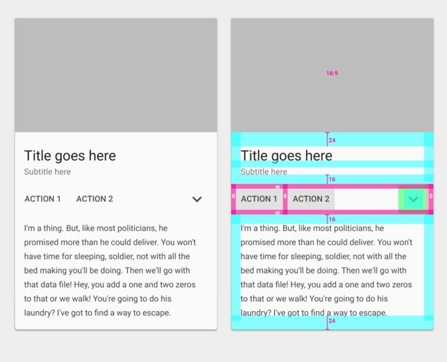
Cards may be expanded to reveal more content, without using scrolling.
【翻译】
正确的示范
卡片可以展开以显示更多内容,而无需使用滚动。
[图片上传失败...(image-146e3c-1552295986558)]
Don't.
On mobile, avoid placing scrollable space within a card, as it could cause two sets of scroll bars to be displayed, if one is already present.
【翻译】
错误的示范
在移动设备上,避免在卡内放置可滚动空间,因为它可能会导致显示两组滚动条(如果已经存在)。
[图片上传失败...(image-a0754b-1552295986558)]
On desktop, card content can expand and scroll internally
【翻译】
在桌面上,卡片内容可以在内部展开和滚动
Card focus - 卡片焦点
When traversing through focus points on a card, all focusable elements are visited before moving to the next card.
For interfaces that depend on focus traversal for navigation (D-pad and keyboard), cards should have either a primary action or open a new view containing primary and supplemental actions.
【翻译】
当遍历卡上的焦点时,在移动到下一张卡之前访问所有可聚焦元素。
对于依赖于焦点遍历导航的界面(D-pad和键盘),卡片应该具有主要操作或打开包含主要操作和补充操作的新视图。
Action selected during focus traversal
【翻译】
聚焦遍历期间选择的操作
[图片上传失败...(image-da543a-1552295986558)]
Expanded supporting text made visible, with the focus then placed on a supplemental action
【翻译】
扩展的支持文本变得可见,重点放在补充行动上
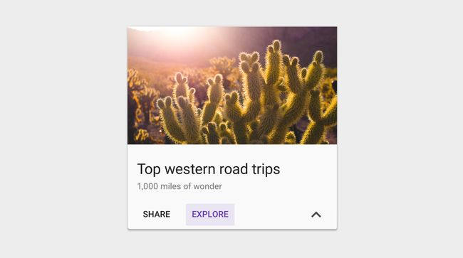
Actions - 操作
The primary action in a card is typically the card itself.
Supplemental actions can vary from card to card in a collection, depending on the content type and expected outcome; for example, playing a movie versus opening a book. Within cards in a collection, position actions consistently.
【翻译】
卡片中的主要动作通常是卡片本身。
根据内容类型和预期结果,补充动作可能因集合中的卡片到卡片而异; 例如,打电影和打开书。
****Supplemental actions - 补充行动****
Supplemental actions within the card are explicitly called out using icons, text, and UI controls, typically placed at the bottom of the card.
Limit supplemental actions to two actions, in addition to an overflow menu.
【翻译】
使用图标,文本和UI控件(通常位于卡的底部)显式调用卡内的补充动作。 除了溢出菜单之外,还可以对两个操作限制补充操作。

Card with action area, rich media and supporting text
【翻译】
卡片与行动区,富媒体和支持文本

Card with action areas 1 and 2, optional header, rich media, supporting text, and supplemental actions
【翻译】
具有操作区域1和2的卡,可选标题,富媒体,支持文本和补充操作
[图片上传失败...(image-6b5032-1552295986558)]
Card with action areas 1, 2, 3 and 4, optional header, rich media, and supplemental actions
【翻译】
具有操作区域1,2,3和4的卡,可选标题,富媒体和补充操作
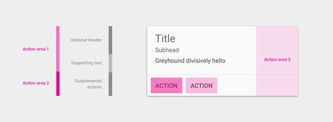
Card with action areas 1 and 2, optional header, supporting text and supplemental actions
【翻译】
具有操作区域1和2的卡,可选标题,支持文本和补充操作
UI controls - UI控件
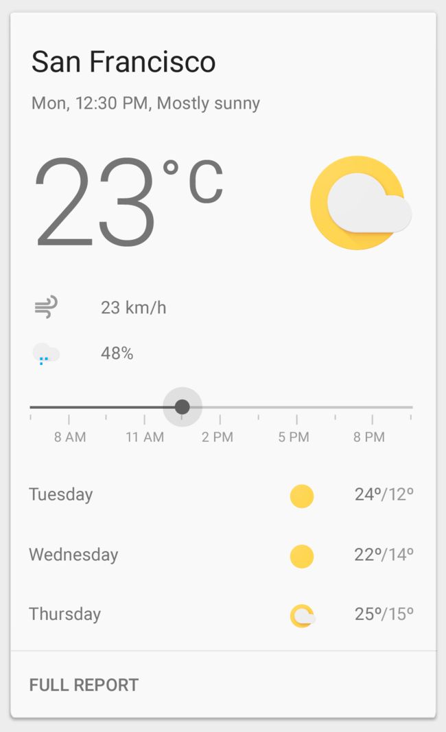
UI controls, like a slider, placed inline with primary content can modify the view of the primary content. For example, a slider to choose a day, stars to rate content, or a segmented button to select a date range.
【翻译】
UI控件(如滑块)与主内容一起放置,可以修改主内容的视图。例如,选择一个日期的滑块,星标率内容,或分段按钮以选择日期范围。

This card contains UI controls within the action area block
【翻译】
此卡包含操作区域块中的UI控件
[图片上传失败...(image-fd4fa6-1552295986558)]
This card contains segmented buttons within the action area block.
【翻译】
此卡包含操作区域块中的分段按钮。
[图片上传失败...(image-11f41a-1552295986558)]
This card contains a slider control within the action area block.
【翻译】
此卡包含操作区域块中的UI控件 此卡包含操作区域块中的分段按钮。 此卡在操作区域块中包含滑块控件。
[图片上传失败...(image-911e8c-1552295986558)]
This card contains tabs within the action area block.
【翻译】
此卡包含操作区域块中的选项卡。
Overflow menu (optional) - 溢出菜单(可选)
An overflow menu is typically placed in the upper-right corner of a card, but can be placed in the lower-right corner if doing so improves content layout and legibility.
Take care not to overload an overflow menu with too many actions.
【翻译】
溢出菜单通常放置在卡的右上角,但是如果这样做可以改进内容布局和可读性,则可以放置在右下角。
注意不要超载带有太多操作的溢出菜单。
This card contains an overflow menu in the top right.
【翻译】
此卡在右上角有一个溢出菜单。
****Additional actions - 其他操作****
Inline links within text content are strongly discouraged.
Although cards can support multiple actions, UI controls, and an overflow menu, use restraint and remember that cards are entry points to more complex and detailed information.
【翻译】
强烈反对文本内容中的内联链接。
虽然卡可以支持多个操作,UI控件和溢出菜单,但使用约束并记住卡是更复杂和详细信息的入口点。

Do.
Use cards as an entry point to more detailed information.
【翻译】
正确的示范
使用卡片作为更详细信息的入口点。
[图片上传失败...(image-e51aa4-1552295986558)]
Don't.
Cards provide context and an entry point to more robust information and views. Don't overload cards with extraneous information or actions. Inline links within text content are strongly discouraged.
【翻译】
错误的示范
卡片提供上下文和一个入口点,以获得更强大的信息和视图。不要使卡片带有无关的信息或操作。强烈反对文本内容中的内联链接。
Content blocks - 内容块
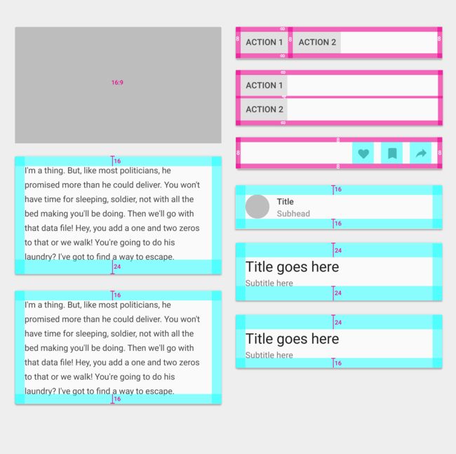
Cards can be constructed using blocks of content which include:
An optional header
A primary title
Rich media
Supporting text
Actions
These blocks can be organized to promote different types of content. For example, numbers may be emphasized by increasing their typographic scale.
On tablet/desktop**, **cards should follow the 24dp keyline. SeeMetrics & Keylines for more information.
【翻译】
卡可以使用内容块来构造,包括:
可选标题
主要标题
富媒体
支持文本
操作
这些块可以被组织以促进不同类型的内容。 例如,可以通过增加数字的排版尺度来强调数字。
在平板电脑/桌面上,卡应该遵循24dp keyline。 有关详细信息,请参阅度量标准和键。
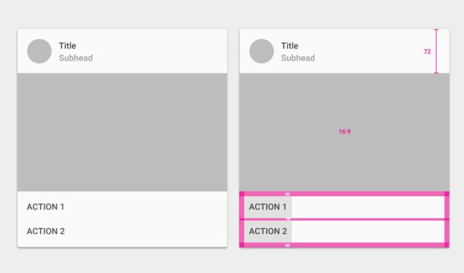
[图片上传失败...(image-b5ffec-1552295986558)]
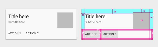
Primary title top padding: 24dp
Primary title bottom padding: 16dp
Action button row padding: 8dp
Supporting text top padding: 16dp
Supporting text bottom padding: 24dp
【翻译】
主标题顶部填充:24dp
主标题底部填充:16dp
动作按钮行填充:8dp
支持文本顶部填充:16dp
支持文本底部填充:24dp
Content block types - 内容块类型
Rich media - 富媒体
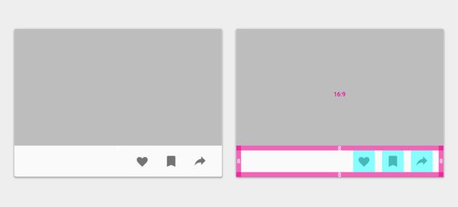
16:9 or 1:1 aspect ratio (recommended)
【翻译】
16:9或1:1宽高比(推荐)
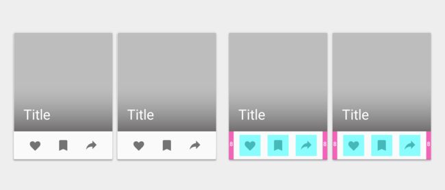
Actions - 操作
Padding: 8dp
【翻译】
填充:8dp
Primary title/text - 主标题/文本
Title: 24sp or 14sp
Subtitle: 14sp
Left and right padding: 16dp on mobile
【翻译】
标题:24sp或14sp
字幕:14sp
左右填充:16dp移动
On tablet/desktop**, **cards should follow the 24dp keyline. SeeMetrics & Keylines for more information.
Top padding: 16dp or 24dp (when a large primary title is present)Bottom padding: 16dp (if there are additional actions or supporting text) or 24dp (no actions or supporting text)
【翻译】
在平板电脑/桌面上,卡应该遵循24dp keyline。 有关详细信息,请参阅度量标准和键。
顶部填充:16dp或24dp(当存在大的主标题时)
底部填充:16dp(如果有其他操作或支持文本)或24dp(无操作或支持文本)
Supporting text - 支持文本
Supporting text: 14spLeft and right padding: 16dp on mobile
On tablet/desktop**, **cards should follow the 24dp keyline. SeeMetrics & Keylines for more information.Top padding: 16dpBottom padding: 24dp (16dp if there are additional actions or text below)
Bullet points (but not their text), images, and buttons may extend outside of the 16dp padding.
【翻译】
支持文本:14sp
左右填充:16dp移动
在平板电脑/桌面上,卡应该遵循24dp keyline。 有关详细信息,请参阅度量标准和键。
顶部填充:16dp
底部填充:24dp(如果有其他操作或文本,则为16dp)
项目符号点(但不是它们的文本),图像和按钮可以扩展到16dp填充之外。
Card collections - 卡片集合
Card margins on mobile - 移动设备上的卡片边距
Padding from edge of screen to card: 8dp
Space between cards: 8dp
【翻译】
从屏幕边缘到卡的填充:8dp
卡之间的距离:8dp
Responsive UI - 响应UI
Card gutters and margins may vary on larger screen sizes, as long as they follow Material Design 8dp grid. Card margins and gutters can be 8, 16, 24, or 40dp wide.
Margins and gutters don’t need to be equal. For example, both 40dp margins and 24dp gutters can be used in the same layout.
【翻译】
卡槽和边距可能因较大的屏幕尺寸而异,只要它们遵循材料设计8dp网格。 卡边距和槽可以是8,16,24或40dp宽。
边距和沟槽不需要相等。 例如,在同一布局中可以使用40dp边距和24dp水平线。
This animation shows interactions of the following margin and gutter width variations:
8dp margins and gutters
16dp margins and gutters
24dp margins and gutters
40dp margins and gutters
40dp margins and 24dp gutters
【翻译】
此动画显示以下边距和装订线宽度变化的交互:
8dp边距和槽
16dp边距和槽
24dp边距和槽
40dp边距和槽
40dp边距和24dp槽
Elevation - 高度
Card resting elevation: 2dpCard raised elevation: 8dp
Cards have a default elevation of 2dp.
On desktop, cards can have a resting elevation of 0dp and gain an elevation of 8dp on hover.
【翻译】
卡片静止高度:2dp
卡升高:8dp
卡片的默认高度为2dp。
在桌面上,卡片可以具有0dp的静止高度,并在悬停时获得8dp的高度。
[图片上传失败...(image-74f994-1552295986558)]
Card resting elevation of 2dp, and raised elevation of 8dp
【翻译】
卡片静止高度2dp,并升高8dp

On desktop, cards have a resting elevation of 0dp (left), and an elevation of 8dp on hover (right)
(desktop only)
【翻译】
在桌面上,卡片具有0dp的静止高度(左)和悬停时的8dp的高度(右) (仅限桌面)
Content block combinations - 内容块组合
The following examples illustrate some possible combinations of content blocks.
【翻译】
以下示例示出了内容块的一些可能组合。
Media area - 媒体区
16:9 ratio
【翻译】
16:9比率
Supporting text - 支持文本
Text: 14sp
Left and right padding: 16dp
Top padding: 16dp or 24dp (when a primary title is present)
Bottom padding: 16dp (if there are additional actions or supporting text) or 24dp (if there are no actions or supporting text)
【翻译】
文字:14sp
左右填充:16dp
顶部填充:16dp或24dp(当存在主标题时)
底部填充:16dp(如果有其他操作或支持文本)或24dp(如果没有操作或支持文本)

Avatar, Title, and Subtitle area - 头像,标题和子标题区域
Height: 72dp
Left and right padding: 16dp
Top and bottom padding: 16dp
【翻译】
高:72dp
左右填充:16dp
顶部和底部填充:16dp
Media area - 媒体区
16:9 ratio
【翻译】
16:9比率
Supporting text - 支持文本
Text: 14sp
Left and right padding: 16dp
Top and bottom padding: 16dp
【翻译】
文字:14sp
左右填充:16dp
顶部和底部填充:16dp
Actions - 操作
Padding: 8dp
【翻译】
填充:8dp

Avatar, Title, and Subtitle area - 头像,标题和子标题区域
Height: 72dp
Left and right padding: 16dp
Top and bottom padding: 16dp
【翻译】
高:72dp
左右填充:16dp
顶部和底部填充:16dp
Media area - 媒体区
16:9 ratio
【翻译】
16:9比率
Actions - 操作
Padding: 8dp
Padding between actions: 4dp
【翻译】
填充:8dp
动作之间的填充:4dp
Media area - 媒体区
16:9 ratio
【翻译】
16:9比率
Primary text - 主文本
Text: 24sp
Top padding: 24dp
Bottom padding: 16dp
Right and left padding: 16dp
【翻译】
文字:24sp
顶部填充:24dp
底部填充:16dp
左右填充:16dp
Subtext - 子文本
Text: 14sp
Bottom padding: 16dp
Right and left padding: 16dp
【翻译】
文字:14sp
底部填充:16dp
左右填充:16dp
Actions - 操作
Padding: 8dp
【翻译】
填充:8dp

Media area - 媒体区域
16:9 ratio
【翻译】
16:9比率
Primary text - 主文本
Text: 24sp
Top padding: 24dp
Bottom padding: 16dp
Right and left padding: 16dp
【翻译】
文字:24sp
顶部填充:24dp
底部填充:16dp
左右填充:16dp
Subtext - 子文本
Text: 14sp
Bottom padding: 16dp
Right and left padding: 16dp
【翻译】
文字:14sp
底部填充:16dp
左右填充:16dp
Actions - 操作
Padding: 8dp
【翻译】
填充:8dp
Expanded supporting text - 扩展支持文本
Text: 14sp
Top padding: 16dp
Bottom padding: 24dp
Right and left padding: 16dp
【翻译】
文字:14sp
顶部填充:16dp
底部填充:24dp
左右填充:16dp
Primary text -主文本
Text: 24sp
Top padding: 24dp
Bottom padding: 16dp
Right and left padding: 16dp
【翻译】
文字:24sp
顶部填充:24dp
底部填充:16dp
左右填充:16dp
Subtitle - 子标题
Top padding: 12dp
Right and left padding: 16dp
【翻译】
顶部填充:12dp
左右填充:16dp
Subtext - 子文本
Text: 14sp
Bottom padding: 16dp
Right and left padding: 16dp
【翻译】
文字:14sp
底部填充:16dp
左右填充:16dp
Supporting text - 支持文本
Text: 14sp
Top padding: 16dp
Bottom padding: 16dp
Right and left padding: 16dp
【翻译】
文字:14sp
顶部填充:16dp
底部填充:16dp
左右填充:16dp
Actions - 操作
Padding: 8dp
【翻译】
填充:8dp

Media area - 媒体区
16:9 ratio
【翻译】
16:9比率
Actions - 操作
Padding: 8dp
【翻译】
填充:8dp
Media area - 媒体区域
1:1 ratio
【翻译】
1:1比率
Primary text - 主文本
Text: 24sp
Top padding: 24dp
Right and left padding: 16dp
【翻译】
文字:24sp
顶部填充:24dp
左右填充:16dp
Subtext - 子文本
Text: 14sp
Bottom padding: 16dp
Right and left padding: 16dp
【翻译】
文字:14sp
底部填充:16dp
左右填充:16dp
Actions - 操作
Padding: 8dp
【翻译】
填充:8dp

Media area - 媒体区
1:1 ratio
【翻译】
1:1比率
Primary text - 主文本
Text: 24sp
【翻译】
文字:24sp
**Actions - 操作 **
Padding: 8dp
【翻译】
填充:8dp
Media area - 媒体区域
80dp
1x
Top padding: 16dp
【翻译】
80dp
1x
顶部填充:16dp
Primary text - 主文本
Text: 24sp
Top padding: 24dp
Right and left padding: 16dp
【翻译】
文字:24sp
顶部填充:24dp
左右填充:16dp
Subtext - 子文本
Text: 14sp
Right and left padding: 16dp
【翻译】
文字:14sp
左右填充:16dp
Actions - 操作
Padding: 8dp
【翻译】
填充:8dp
Media area - 媒体区域
1.5x (Increment size based on 80dp media area)
Top padding: 16dp
【翻译】
1.5x(基于80dp介质区域的增量大小)
顶部填充:16dp
Primary text - 主文本
Text: 24sp
Top padding: 24dp
Right and left padding: 16dp
【翻译】
文字:24sp
顶部填充:24dp
左右填充:16dp
Subtext - 子文本
Text: 14sp
Right and left padding: 16dp
【翻译】
文字:14sp
左右填充:16dp
Actions - 操作
Padding: 8dp
【翻译】
填充:8dp

Media area - 媒体区域
2x (Increment size based on 80dp media area)
Top padding: 16dp
【翻译】
2x(基于80dp介质区域的增量大小)
顶部填充:16dp
Primary text - 主文本
Text: 24sp
Top padding: 24dp
Right and left padding: 16dp
【翻译】
文字:24sp
顶部填充:24dp
左右填充:16dp
Subtext - 子文本
Text: 14sp
Right and left padding: 16dp
【翻译】
文字:14sp
左右填充:16dp
Actions - 操作
Padding: 8dp
【翻译】
填充:8dp

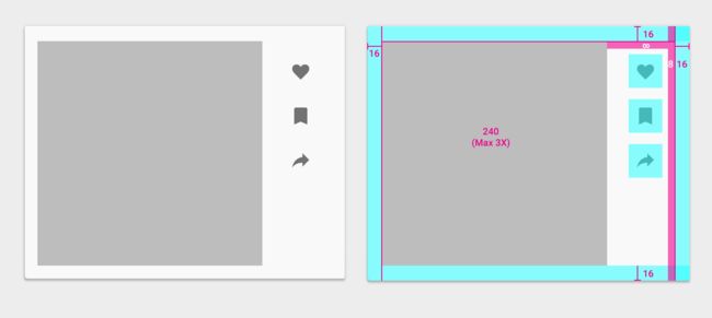
Media area - 媒体区域
3x (Increment size based on 80dp media area)
Padding: 16dp
【翻译】
3x(基于80dp介质区域的增量大小)
填充:16dp
Actions - 操作
All around padding: 8dp + 16dp
【翻译】
周围填充:8dp + 16dp
Dividers in cards - 卡片中的分隔线
Dividers may be used to separate content areas in cards that require distinct visual separation. Dividers may also indicate seams in places where material may expand.
Content areas that can be expanded should use full-width dividers. Dividers can indicate seams in material where the material will expand when content is expanded.
【翻译】
分隔符可以用于分离需要不同视觉分离的卡中的内容区域。 分隔件还可以指示材料可能膨胀的位置处的接缝。
可以扩展的内容区域应使用全宽度分隔符。 分隔件可以指示材料在材料将在内容膨胀时膨胀的接缝。

This example uses a full-bleed divider. Similar to expansion of lists, this card uses a full-width divider to denote expansion.
【翻译】
此示例使用全出血分压器。与列表的扩展类似,此卡使用全宽度分隔符表示扩展。
Content areas that need more distinct visual separation should use dividers.
【翻译】
需要更清晰视觉分离的内容区域应使用分隔线。
This example uses a full-bleed divider as a way to visually separate the slider content and list from the action below.
【翻译】
此示例使用全分隔符作为将滑块内容和列表与下面的操作可视化分离的一种方法。
Use inset dividers to separate related content.
【翻译】
使用插入分隔符分隔相关内容。

This example uses an inset divider to separate related the restaurant information from the booking section.
【翻译】
此示例使用插入分隔符将相关的餐厅信息与预订部分分离。