背景
在早期的版本中,Material-UI使用LESS,然后是自定义的内联样式解决方案来编写组件样式,但是事实证明,这些方法是有限的。 CSS-in-JS解决方案克服了许多这些限制,并解锁了许多出色的功能(主题嵌套,动态样式,自我支持等)。
Material-UI的样式解决方案受到许多其他样式库的启发,例如 styled-components 和 emotion。
为什么要使用Material-UI的样式解决方案?
- 拥有与
styled-components相同的优点。 - 编译速度很快。
- 可通过插件API进行扩展。
- 以JSS为核心——一种高性能的JavaScript到CSS编译器,可在运行时和服务器端使用。
- 压缩后少于15 KB,如果与Material-UI一起使用,则捆绑包的大小不会增加。
withStyles的用法
在TypeScript中使用withStyles可能会有些棘手,但是有些工具方法让你使用起来更加轻松。
使用 createStyles来杜绝类型扩展
常见的混淆是TypeScript的类型扩展,这导致此示例无法按预期工作:
const styles = {
  root: {
    display: 'flex',
    flexDirection: 'column',
  }
};

withStyles(styles);
//         ^^^^^^
//         Types of property 'flexDirection' are incompatible.
//           Type 'string' is not assignable to type '"-moz-initial" | "inherit" | "initial" | "revert" | "unset" | "column" | "column-reverse" | "row"...'.
导致上面报错的原因是flexDirection属性的类型被推断为字符串,有两种方式可以解决上面的问题:
- 将styles对象直接传递给
withStyles来解决此问题。
withStyles({
  root: {
    display: 'flex',
    flexDirection: 'column',
  },
});
- 建议使用
createStyles辅助型函数来构造样式规则对象。
// Non-dependent styles
const styles = createStyles({
  root: {
    display: 'flex',
    flexDirection: 'column',
  },
});

// Theme-dependent styles
const styles = ({ palette, spacing }: Theme) => createStyles({
  root: {
    display: 'flex',
    flexDirection: 'column',
    padding: spacing.unit,
    backgroundColor: palette.background.default,
    color: palette.primary.main,
  },
});
createStyles只是特性函数,它在运行时不会“做任何事情”,只是有助于在编译时指导类型推断。
Media queries(媒体查询)
withStyles允许样式对象具有顶级媒体查询,如下所示:
const styles = createStyles({
  root: {
    minHeight: '100vh',
  },
  '@media (min-width: 960px)': {
    root: {
      display: 'flex',
    },
  },
});
但是,要允许这些样式传递TypeScript,应避免使用与CSS属性相同的名称:
// error TypeScript会认为 `@media (min-width: 960px)` 是个类名,属性content是css 属性
const ambiguousStyles = createStyles({
  content: {
    minHeight: '100vh',
  },
  '@media (min-width: 960px)': {
    content: {
      display: 'flex',
    },
  },
});

// success
const ambiguousStyles = createStyles({
  contentClass: {
    minHeight: '100vh',
  },
  '@media (min-width: 960px)': {
    contentClass: {
      display: 'flex',
    },
  },
});
使用 WithStyles 来扩充你的属性
使用装饰器withStyles装饰,如withStyles(styles)(Comp)的组件将被注入classes属性,因此你需要相应地定义其属性,幸运的是Material-UI提供了类型运算符WithStyles来帮助解决这个问题,因此你可以这样定义:
import { WithStyles, createStyles } from '@material-ui/core';

const styles = (theme: Theme) => createStyles({
  root: { /* ... */ },
  paper: { /* ... */ },
  button: { /* ... */ },
});

interface Props extends WithStyles {
  foo: number;
  bar: boolean;
}
装饰组件
将withStyles(styles)用作函数可以按预期工作:
const DecoratedSFC = withStyles(styles)(({ text, type, color, classes }: Props) => (

    {text}

));

const DecoratedClass = withStyles(styles)(
  class extends React.Component {
    render() {
      const { text, type, color, classes } = this.props
      return (

          {text}

      );
    }
  }
);
注意:由于TypeScript装饰器的当前限制,withStyles(styles)整体不能用作TypeScript中的装饰器。
自定义主题(Theme)
将自定义属性添加到主题时,你可以通过利用TypeScript的模块增强功能以强类型化的方式继续使用它。
以下示例添加了一个appDrawer属性,该属性已合并到material-ui导出的属性中:
import createMuiTheme from "@material-ui/core/styles/createMuiTheme";
import { PaletteColor, PaletteColorOptions } from "@material-ui/core/styles/createPalette";

declare module "@material-ui/core/styles/createPalette" {
  interface Palette {
    blue: PaletteColor;
  }

  interface PaletteOptions {
    blue: PaletteColorOptions;
  }
}

export default createMuiTheme({
  palette: {
    blue: {
      main: "blue"
    }
  }
});
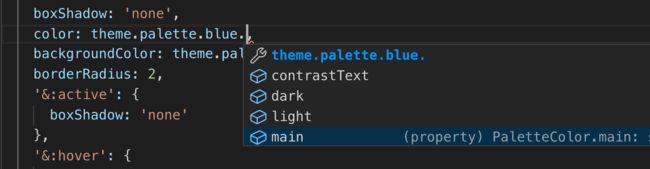
使用如下:
const styles = makeStyles((theme: Theme) => ({
  root: {
    /** ... */
    color: theme.palette.blue.main
 }
}))
参考
Typescript Guides