Flexbox
在React Native中使用flexbox规则来指定某个组件的子元素的布局。Flexbox可以在不同屏幕尺寸上提供一致的布局结构。一般来说,使用flexDirection、alignItems和 justifyContent三个样式属性就已经能满足大多数布局需求。
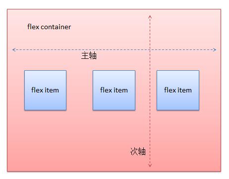
注:这里有一份简易布局图解,可以给你一个大概的印象。
React Native中的 Flexbox 的工作原理和 web 上的 CSS 基本一致,当然也存在少许差异。首先是默认值不同:flexDirection的默认值是column而不是row,而flex也只能指定一个数字值。
Flex
flex键的类型是数值,它的默认值为0,它可以取值为-1、0、或者任意正数值。当它的值为非零时,在父组件的弹性方向上(flexDirection键定义的方向),组件将自动缩放以适应剩下的空白空间。如果父组件的弹性方向是列,则组件的height键即使有值也会失效。如果父组件的弹性方向是行,则组件的width键即使有值也会失效
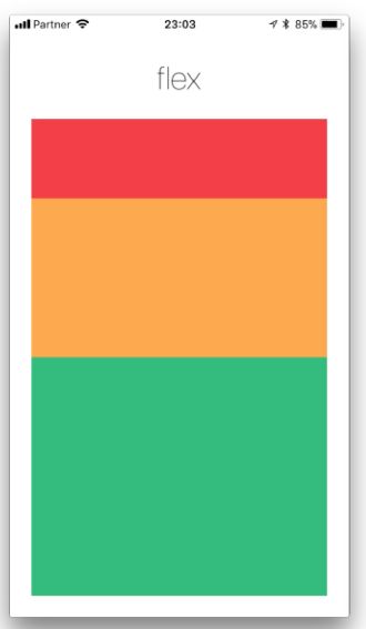
下面使用了flex属性进行布局,红、黄、绿等视图是容器视图的子视图。其flex属性值分别为1、2、3。这意味着红色视图为容器视图的1/6,黄色视图2/6,绿色视图3/6.
Flex Direction
在组件的style属性中指定flexDirection可以决定布局的主轴方向。子元素是应该沿着水平轴(row)方向排列,还是沿着竖直轴(column)方向排列呢?默认值是竖直轴(column)方向。

import React, { Component } from 'react';
import { AppRegistry, View } from 'react-native';

export default class FlexDirectionBasics extends Component {
  render() {
    return (
      // 尝试把`flexDirection`改为`column`看看


    );
  }
};

Justify Content
在组件的style属性中指定justifyContent可以决定其子元素沿着主轴的排列方式。子元素是应该靠近主轴的起始端还是末尾段分布呢?亦或应该均匀分布?对应的这些可选项有:flex-start、center、flex-end、space-around、space-between以及space-evenly。
主轴水平方向

主轴垂直方向

import React, { Component } from 'react';
import { AppRegistry, View } from 'react-native';

export default class JustifyContentBasics extends Component {
  render() {
    return (
      // 尝试把`justifyContent`改为`center`看看
      // 尝试把`flexDirection`改为`row`看看


    );
  }
};
Align Items
在组件的style数中指定alignItems可以决定其子元素沿着次轴(与主轴垂直的轴,比如若主轴方向为row,则次轴方向为column)的排列方式。子元素是应该靠近次轴的起始端还是末尾段分布呢?亦或应该均匀分布?对应的这些可选项有:flex-start、center、flex-end以及stretch。
注意:要使stretch选项生效的话,子元素在次轴方向上不能有固定的尺寸。以下面的代码为例:只有将子元素样式中的width: 50去掉之后,alignItems: 'stretch'才能生效。
import React, { Component } from 'react';
import { View } from 'react-native';

export default class AlignItemsBasics extends Component {
  render() {
    return (
      // 尝试把`alignItems`改为`flex-start`看看
      // 尝试把`justifyContent`改为`flex-end`看看
      // 尝试把`flexDirection`改为`row`看看


    );
  }
};

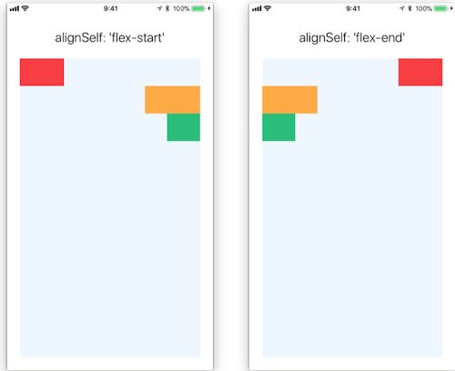
Align Self
alignSelf键有5种可能的字符串类型:auto、flex-start、flex-end、 center、 stretch。其用途是让组件忽略它的父组件样式中的alignItems键的取值,并使用alignSelf键对应的值
当取值为auto,表示使用父组件样式中的alignItems键,其余如下图


import React, { Component } from 'react';
import { AppRegistry, View } from 'react-native';

export default class AlignItemsBasics extends Component {
  render() {
    return (
      // 尝试把`alignItems`改为`flex-start`看看
      // 尝试把`justifyContent`改为`flex-end`看看
      // 尝试把`flexDirection`改为`row`看看


    );
  }
};
Flex Wrap
在默认情况下,组件中的子组件按照flexDirection键决定的方向一值排列下去,即使超出了该方向的宽度和高度也不管。
对flexWrap赋值可以改变这种情况,取值为:wrap和nowarp,默认是nowarp,表示不自动换行(或者换列)排列,设置wrap之后子组件会换行

Flex Basis, Grow, and Shrink
flexGrow
描述主轴方向上,子组件对于容器剩余空间的处理。设置子组件的放大比例,类似于flex,空间充足时自动按比例放大,默认为0,设置值应该大于等于0
import React, {Component} from 'react';
import {AppRegistry, View} from 'react-native';

class FlexDirection extends Component {
    render() {
        return (


        );
    }
}
flexShrink
描述主轴方向上,子组件对于容器剩余空间的处理。设置子组件的缩放比例,空间不足时自动按比例缩小,默认为1,设置值大于等于0
import React, {Component} from 'react';
import {AppRegistry, View} from 'react-native';

class FlexDirection extends Component {
    render() {
        return (


        );
    }
}
flexBasis
设置主轴方向上的初始值,默认为auto。如果与width或者height同时存在,则会覆盖它们的值
import React, {Component} from 'react';
import {AppRegistry, View} from 'react-native';

class FlexDirection extends Component {
    render() {
        return (


        );
    }
}
Align Content
alignContent defines the distribution of lines along the cross-axis. This only has effect when items are wrapped to multiple lines using flexWrap.
flex-start(default value) Align wrapped lines to the start of the container's cross axis.flex-endAlign wrapped lines to the end of the container's cross axis.stretchwrapped lines to match the height of the container's cross axis.centerAlign wrapped lines in the center of the container's cross axis.space-betweenEvenly space wrapped lines across the container's main axis, distributing remaining space between the lines.space-aroundEvenly space wrapped lines across the container's main axis, distributing remaining space around the lines. Compared to space between using space around will result in space being distributed to the begining of the first lines and end of the last line.space-evenlyEvenly distributed within the alignment container along the main axis. The spacing between each pair of adjacent items, the main-start edge and the first item, and the main-end edge and the last item, are all exactly the same.
LEARN MORE HERE

位置及宽、高相关样式键
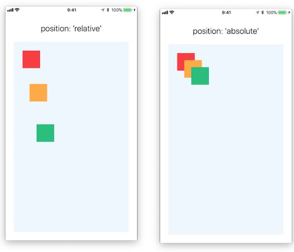
对于位置,首先要讨论的是position键,它是字符串类型,可以取值为relative(默认值),或者absolute,表示当前描述的位置是相对定位还是决定定位的。
与位置相关的样式设置还有:top、bottom、left、right。它们都是数值类型,表示描述的位置从左或右多少位置开始,还有从上或下多少位置开始
当position的值为relative时,不可以使用bottom和right描述位置。top和left键的默认值为0。top和left键表示当前组件距离上一个同级组件的最上(左)沿有多少pt
与宽、高相关的数值类型键有:width、height、maxHeight、maxWidth、minHeight、minWidth,因为使用flexbox布局,组件的宽和高是可以动态改变的,所以可以设置宽和高的最大值和最小值
在flexbox布局中,允许存在宽、高动态改变的组件,所以有些组件可以不指定宽、高和最大/最小宽、高,这时这些组件的宽、高由它们内部的内容动态决定,
对于布局有影响的完整样式列表记录在这篇文档中。
边框、空隙与填充
可以指定组件的边框(border)、空隙(margin)和填充(padding)的各种属性

实战
- 简单布局
 import React, {Component} from 'react';
 import {
     AppRegistry, StyleSheet, View
 } from 'react-native';

 export default class FlexLayout extends Component {

    render(){
        return (


        );
    }
 }

 var styles = StyleSheet.create({
     container: { // 根view样式
         flex: 1,
         backgroundColor: 'white',
     },
     firstRow: {
         height: 40,
         top:100,
         backgroundColor: `black`,
         flexDirection: "row",
         alignItems: "center",
     },
     test1: {
         width: 68,
         height: 24,
         left: 10,
         backgroundColor: `white`,
     },
     test2: {
         width: 40,
         height: 24,
         left: 5,
         backgroundColor: `red`,
     },
     test3: {
         width: 100,
         height: 24,
         left: 2,
         backgroundColor: `blue`,
     },
     textPosition: {
         backgroundColor: `gray`,
         height: 60,
         width: 60,
         position: "absolute",
         top: 150,
         right: 50,
     },
 });
实现效果

参考
使用Flexbox布局
Flex 布局教程:语法篇