MarkDown支持有点问题,请跳转到我博客查看该篇博客:http://weiyf.cn/2017/03/10/Build%20a%20Responsive%20UI%20with%20ConstraintLayout/
ConstraintLayout允许你使用平面view层次结构去创建一个大而复杂的布局(没有嵌套的view groups)。它类似于RelativeLayout,其中所有的view都是根据兄弟views和父布局之间的关系来布局的,但是它比RelativeLayout更灵活,并且更容易与Android Studio的布局编辑器一起使用。
ConstraintLayout allows you to create large and complex layouts with a flat view hierarchy (no nested view groups). It's similar to RelativeLayout in that all views are laid out according to relationships between sibling views and the parent layout, but it's more flexible than RelativeLayout and easier to use with Android Studio's Layout Editor.
ConstraintLayout的所有功能都可以从布局编辑器的可视化工具中直接获得,因为布局API和布局编辑器是专为彼此构建的。因此,你可以通过更容易的拖放来代替编辑XML使用ConstraintLayout构建你的布局。
All the power of ConstraintLayout is available directly from the Layout Editor's visual tools, because the layout API and the Layout Editor were specially built for each other. So you can build your layout with ConstraintLayout entirely by drag-and-dropping instead of editing the XML.
ConstraintLayout可在兼容Android Studio2.3(API level 9)及更高版本的API库中使用。本页提供了再Android Sutdio2.3或更高版本中使用ConstraintLayout构建布局的指南。如果你想了解有关布局编辑器本身的更多信息,请参阅Android Studio指南使用布局编辑器构建UI。
ConstraintLayout is available in an API library that's compatible with Android 2.3 (API level 9) and higher. This page provides a guide to building a layout with ConstraintLayout in Android Studio 2.3 or higher. If you'd like more information about the Layout Editor itself, see the Android Studio guide to Build a UI with Layout Editor.
要查看使用ConstraintLayout创建的各种布局,请查看GitHub上的约束布局示例项目
To see a variety of layouts you can create with ConstraintLayout, check out the Constraint Layout Examples project on GitHub.
约束布局概述(Constraints overview)
要在ConstraintLayout中定义view的位置,你必须为view至少添加一个水平和垂直的约束。每一个约束表示到另一个view,父布局,或者不可见的参考线的连接或者对齐。每个约束定义view沿垂直或水平轴的位置;因此没衣蛾view必须对每一个轴至少有一个约束,但是通常需要更多是很必要的。
To define a view's position in ConstraintLayout, you must add at least one horizontal and one vertical constraint for the view. Each constraint represents a connection or alignment to another view, the parent layout, or an invisible guideline. Each constraint defines the view's position along either the vertical or horizontal axis; so each view must have a minimum of one constraint for each axis, but often more are necessary.
当你拖动一个view到布局编辑器中,它会停留在你放开它的地方,即使它没有任何约束。然而,这只是为了更容易编辑;如果当你在设备上运行你的布局时,一个view没有任何约束,则会在位置【0, 0】(左上角)绘制它。
When you drop a view into the Layout Editor, it stays where you leave it even if it has no constraints. However, this is only to make editing easier; if a view has no constraints when you run your layout on a device, it is drawn at position [0,0] (the top-left corner).
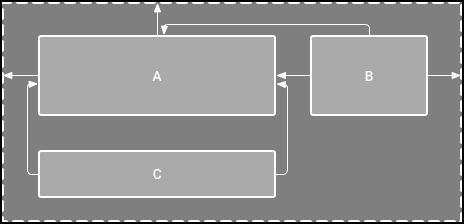
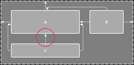
在图1,在布局编辑器上看起来不错,但是在view C上没有垂直约束。当这个布局在设备上绘制的时候,view C与view A的左边缘和右边缘水平对齐,但它会出现在屏幕的顶部,因为它没有垂直约束。
In figure 1, the layout looks good in the editor, but there's no vertical constraint on view C. When this layout draws on a device, view C horizontally aligns with the left and right edges of view A, but appears at the top of the screen because it has no vertical constraint.
虽然缺少约束,但不会导致编译错误,布局编辑器会将缺少的约束作为一个错误显示在工具栏中。要查看错误和其他警告,点击 Show Warnings and Errors
Although a missing constraint won't cause a compilation error, the Layout Editor indicates missing constraints as an error in the toolbar. To view the errors and other warnings, click Show Warnings and Errors
. To help you avoid missing constraints, the Layout Editor can automatically add constraints for you with the Autoconnect and infer constraints features.
将ConstraintLayout添加到您的项目(Add ConstraintLayout to your project)
要在你的项目中使用ConstraintLayout,操作如下:
To use ConstraintLayout in your project, proceed as follows:
- 确认你拥有最新版本的Constraint Layout库。
- 点击 Tools > Android > SDK Manager。
- 点击 SDK Tools 选项卡。
- 展开 Support Repository 然后检查 ConstraintLayout For Android 和 Solver for ConstraintLayout。选中 Show Package Details 并记下你要下载的版本。(下面步骤需要)。
- 点击OK。
- 将该库作为依赖关系添加到模块机的
build.gradle文件中:
dependencies {
  compile 'com.android.support.constraint:constraint-layout:1.0.1'
}
你下载的库版本可能会更高,因此请确保此处指定的值与你第3步中的版本相匹配。
- 在工具栏或者同步通知中,点击 Sync Project with Gradle Files。
现在你已经准备好实用ConstraintLayout来构建布局了。
- Ensure you have the latest Constraint Layout library:
1. Click Tools > Android > SDK Manager.
2. Click the SDK Tools tab.
3. Expand Support Repository and then check ConstraintLayout for Android and Solver for ConstraintLayout. Check Show Package Details and take note of the version you're downloading (you'll need this below).
4. Click OK.
5. Add the library as a dependency in your module-level build.gradle file:
`dependencies {`
    `compile 'com.android.support.constraint:constraint-layout:1.0.1'`
`}`
The library version you download may be higher, so be sure the value you specify here matches the version from step 3.
6. In the toolbar or sync notification, click Sync Project with Gradle Files.
Now you're ready to build your layout with ConstraintLayout
转换布局(Convert a layout)
要将现有布局转换为约束布局,请按照下列步骤操作:
- 在Android Sutdio打开你的布局然后点击在编辑器窗口底部的 Design 选项卡。
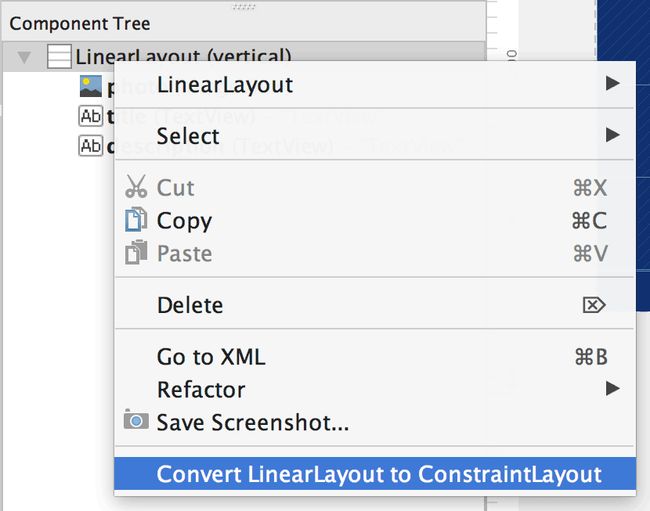
- 在 Component Tree 窗口,右击布局然后点击 Convert layout to ConstraintLayout。
To convert an existing layout to a constraint layout, follow these steps:
- Open your layout in Android Studio and click the Design tab at the bottom of the editor window.
- In the Component Tree window, right-click the layout and click Convert layout to ConstraintLayout.
创建新的布局(Create a new layout)
要启动新的约束布局文件,请按照下列步骤操作:
- 在 Porject 窗口右击模块文件夹然后选择 File > New > XML > Layout XML。
- 为这个布局文件输入一个名字和在** Root Tag** 输入"android.support.constraint.ConstraintLayout"。
- 点击 Finish。
To start a new constraint layout file, follow these steps:
- In the Project window, click the module folder and then select File > New > XML > Layout XML.
- Enter a name for the layout file and enter "android.support.constraint.ConstraintLayout" for the Root Tag.
- Click Finish
添加约束(Add a constraint)
通过将view从布局编辑器选项板中拖动到编辑器中开始。当你添加一个view到ConstraintLayout,它会显示一个边框,每个角上都有方形调整大小的手柄,每边都有圆形的约束手柄。
Start by dragging a view from the Palette window into the editor. When you add a view in a ConstraintLayout, it displays a bounding box with square resizing handles on each corner and circular constraint handles on each side.
单击view选中它,然后单击并按住其中一个约束句柄,并将该线拖动到可用的定位点(另一个view的边缘,布局的边缘或者参考线)。当你释放的时候,就会建立约束,使用默认的边距来分隔两个view。
Click the view to select it. Then click-and-hold one of the constraint handles and drag the line to an available anchor point (the edge of another view, the edge of the layout, or a guideline). When you release, the constraint is made, with a default margin separating the two views.
创建约束时,请记住以下规则:
- 每一个view必须至少有两个约束:一个水平和一个垂直约束。
- 只能在共享的同一平面的约束句柄和锚点之间创建约束。因此,view的垂直平面(左侧和右侧)可以仅被约束到另一个垂直平面;并且基线只可以约束其他基线。
- 每个约束句柄只能用于一个约束,但你可以创建多个约束(从不同的view)到同一个定位点。
When creating constraints, remember the following rules:
- Every view must have at least two constraints: one horizontal and one vertical.
- You can create constraints only between a constraint handle and an anchor point that share the same plane. So a vertical plane (the left and right sides) of a view can be constrained only to another vertical plane; and baselines can constrain only to other baselines.
- Each constraint handle can be used for just one constraint, but you can create multiple constraints (from different views) to the same anchor point.
要删除约束,选中view然后点击约束句柄。或者通过选择view,然后单击 清除约束
To remove a constraint, select the view and then click the constraint handle. Or remove all the constraints by selecting the view and then clicking Clear Constraints
如果爱view上添加了相反的约束,约束线会变成像弹簧一样扭曲来表示相反的力,就像视频2。当view大小设置为“Fixed”或“Wrap Content”时,效果最明显,在这种情况下view在约束之间居中。如果你想让view扩展其大小以满足约束,切换大小为“match constraints”;或者如果要保留当前大小,但移动view以使其不居中,调整约束偏差。
If you add opposing constraints on a view, the constraint lines become squiggly like a spring to indicate the opposing forces, as shown in video 2. The effect is most visible when the view size is set to "fixed" or "wrap content," in which case the view is centered between the constraints. If you instead want the view to stretch its size to meet the constraints, switch the size to "match constraints"; or if you want to keep the current size but move the view so that it is not centered, adjust the constraint bias.
你可以使用约束来实现不同类型的布局行为,如一下各章节所述。
You can use constraints to achieve different types of layout behavior, as described in the following sections.
视频1.view的左侧被约束到父布局的左侧
视频2.添加一个与现有约束相反的约束
父布局位置(Parent position)
将view的边限制到布局的相应边。
Constrain the side of a view to the corresponding edge of the layout.
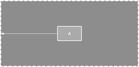
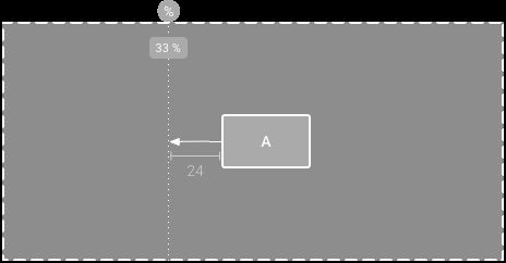
在图4,view的左侧连接到父布局的左边缘。你可以定义从边缘到边缘的距离。
In figure 4, the left side of the view is connected to the left edge of the parent layout. You can define the distance from the edge with margin.
规则位置(Order position)
定义两个view的垂直或水平出现的规则。
Define the order of appearance for two views, either vertically or horizontally.
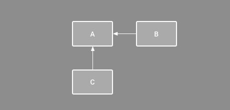
在图5,B被约束为总是在A的右边,并且C被约束在A的下面。然而,这些约束并不意味着对齐,所以B仍然可以上下移动。
In figure 5, B is constrained to always be to the right of A, and C is constrained below A. However, these constraints do not imply alignment, so B can still move up and down.
对齐(Alignment)
将view的边缘与另一个view的相同边缘对齐。
Align the edge of a view to the same edge of another view.
在图6,B的左侧与A的左侧对齐。如果你要对齐view的中心,请在两侧分别创建约束。
In figure 6, the left side of B is aligned to the left side of A. If you want to align the view centers, create a constraint on both sides.
你可以通过从约束想内拖动view来偏移对齐。例如,图7示出了具有24dp偏移量对齐的B。偏移由约束view的边距定义。
You can offset the alignment by dragging the view inward from the constraint. For example, figure 7 shows B with a 24dp offset alignment. The offset is defined by the constrained view's margin.
你还可以选择所有要对齐的view,然后单击工具栏中的 对齐
You can also select all the views you want to align, and then click Align
in the toolbar to select the alignment type.
基线对齐(Baseline alignment)
将view的文本基线与另一个view的文本基线对齐。
Align the text baseline of a view to the text baseline of another view.
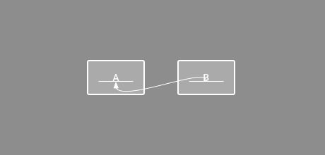
在图8,B的第一行与A中的文本对齐。
要创建基线约束,请选择要限制的文本view,然后单击显示在view下方的基线按钮In figure 8, the first line of B is aligned with the text in A.
。然后点击本文基线并将该线拖动到另外一个基线。
To create a baseline constraint, select the text view you want to constrain and then click the baseline button
that appears below the view. Then click the text baseline and drag the line to another baseline.
参考线约束(Constrain to a guideline)
你可以添加可以约束view的垂直或者水平的参考线,并且该参考线对于应用用户而言是不可见的。你可以根据相对于布局边缘的dp单位或者百分百在布局中定位参考线。
You can add a vertical or horizontal guideline to which you can constrain views, and the guideline will be invisible to app users. You can position the guideline within the layout based on either dp units or percent, relative to the layout's edge.
要创建参考线,请单击工具栏中的 参考线
To create a guideline, click Guidelines
in the toolbar, and then click either Add Vertical Guideline or Add Horizontal Guideline.
拖动虚线来重新定位它,并单击参考线边缘处的圆圈来切换测量模式。
Drag the dotted line to reposition it and click the circle at the edge of the guideline to toggle the measurement mode.
调整约束偏差(Adjust the constraint bias)
当向view的两侧添加约束时(并且相同尺寸的view的大小为“Fixed”或“Wrap Content”),默认情况下,view将在两个约束之间居中,偏差为50%。你可以通过拖动“属性”窗口中的偏移滑块或拖动view来调整偏移,如视频5所示。
When you add a constraint to both sides of a view (and the view size for the same dimension is either "fixed" or "wrap content"), the view becomes centered between the two constraints with a bias of 50% by default. You can adjust the bias by dragging the bias slider in the Properties window or by dragging the view, as shown in video 5.
视频5.调整约束偏差
调整view大小(Adjust the view size)
你可以使用拐角手柄来调整view大小,但这样会硬编码大小,因此view不会调整为不同的内容或屏幕尺寸大小。要选择不同的大小调整模式,请单击view并打开编辑器右侧的 属性
You can use the corner handles to resize a view, but this hard codes the size so the view will not resize for different content or screen sizes. To select a different sizing mode, click a view and open the Properties
window on the right side of the editor.
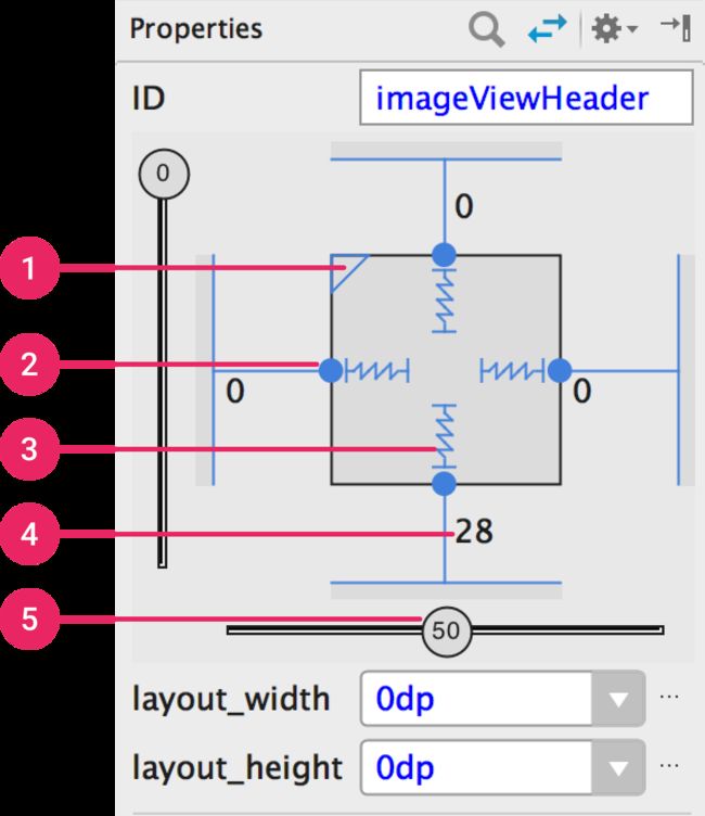
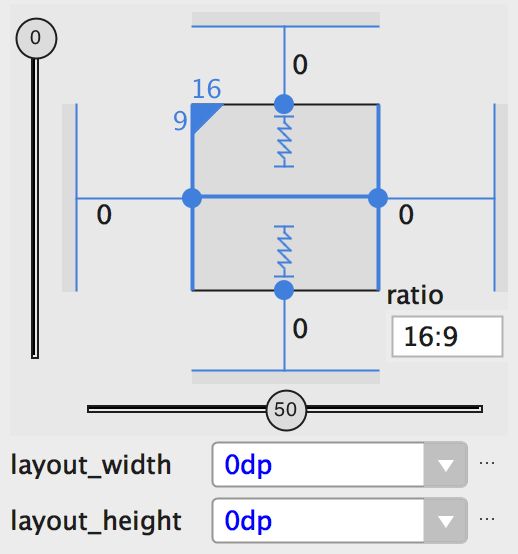
在属性窗口顶部附近是view检查器,他包括多个布局属性的控件,如图10所示(这仅适用于约束布局中的view)。
Near the top of the Properties window is the view inspector, which includes controls for several layout properties, as shown in figure 10 (this is available only for views in a constraint layout).
你可以通过单击图10中标注3所示的符号来更改计算高度和宽度的方式。这些符号表示尺寸模式如下:
-
Wrap Content: view根据需要进行扩展以适合其内容。

-
Match Constraints: 该view根据需要扩展以满足其在考虑边际之后的约束的定义。但是,如果给定尺寸只有一个约束,则view将扩展以适合其内容。在高度或宽度上使用此模式也允许您设置尺寸比例。

-
Fixed: 您可以在下面的文本框中指定特定的尺寸,也可以在编辑器中调整view大小。

You can change the way the height and width are calculated by clicking the symbols indicated with callout 3 in figure 10. These symbols represent the size mode as follows:
-

Wrap Content: The view expands as needed to fit its contents.
-

Match Constraints: The view expands as needed to meet the definition of its constraints after accounting for margins. However, if the given dimension has only one constraint, then the view expands to fit its contents. Using this mode on either the height or width also allows you to set a size ratio.
-

Fixed: You specify a specific dimension in the text box below or by resizing the view in the editor.
要在这些设置之间切换,请单击视图检查器中的符号。
To toggle between these settings, click the symbol in the view inspector.
注意:对于ConstraintLayout中任何view,不应使用match_parent。而是使用“match constraints”(0dp)。
Note: You should not use match_parent for any view in a ConstraintLayout. Instead use "match constraints" (0dp)
“属性”窗口包括1大小比例,2删除约束,3高度/宽度模式,4边距和5约束偏差的控件。
将大小设置为比率(Set size as a ratio)
如果至少有一个view尺寸设置为“match constraints”(0dp),则可以将view大小设置为比例,例如16:9。要启用比率,请单击“切换长宽比约束”(图10中的编号1),然后在出现的输入框中输入 width:height 比例。
You can set the view size to a ratio such as 16:9 if at least one of the view dimensions is set to "match constraints" (0dp). To enable the ratio, click Toggle Aspect Ratio Constraint (callout 1 in figure 10), and then enter the width:height ratio in the input that appears.
如果宽度和高度都设置为match constraints,你可以单击 切换长宽比约束 来选择哪个尺寸基于另一个比率。视图检查器通过用实线链接相应的边来指示设置为比率。
If both the width and height are set to match constraints, you can click Toggle Aspect Ratio Constraint to select which dimension is based on a ratio of the other. The view inspector indicates which is set as a ratio by connecting the corresponding edges with a solid line.
例如,如果你将两边设置为“match constraints”,点击 切换长宽比约束 两次来将宽度设置为高度的比率。现在整个尺寸由view的高度(其可以以任何方式定义)来决定,如图11所示。
For example, if you set both sides to "match constraints", click Toggle Aspect Ratio Constraint twice to set the width be a ratio of the height. Now the entire size is dictated by the height of the view (which can be defined in any way) as shown in figure 11
调整view边距(Adjust the view margins)
要确保所有view均匀分布,请单击工具栏中的边距,为添加到布局的每个view选择默认边距。你对默认边距所做的任何更改仅适用于你之后添加的view。
To ensure that all your views are evenly spaced, click Margin in the toolbar to select the default margin for each view that you add to the layout. Any change you make to the default margin applies only to the views you add from then on.
您可以通过单击表示每个约束的线上的数字(在图10中,标注4显示底部边距设置为28dp),在 属性 窗口中控制每个view的边距。
You can control the margin for each view in the Properties window by clicking the number on the line that represents each constraint (in figure 10, callout 4 shows the bottom margin is set to 28dp).
该工具提供的所有边距默认是8dp,以帮助你的view符合Material Design的8dp方形网格建议。
All margins offered by the tool are factors of 8dp to help your views align to Material Design's 8dp square grid recommendations.
用一个链控制线性组(Control linear groups with a chain)
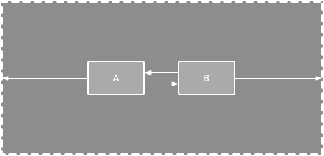
链是用双向位置约束彼此链接的一组view。例如,图13示出了两个view,它们都具有彼此的约束,从而创建水平链。
A chain is a group of views that are linked to each other with bi-directional position constraints. For example, figure 13 shows two views that both have a constraint to each other, thus creating a horizontal chain.
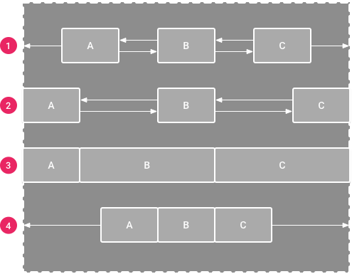
链允许您使用以下样式水平或垂直分发一组view(如图14所示):
- 1 Spread: view均匀分布(在考虑边距之后)。这是默认值。
- 2 Spread inside: 第一个和最后一个view被附加到链的每个端部上的约束,并且其余的是均匀分布的。
- 3 Weighted: 当链被设置为 Spread 或 Spread inside 时,您可以通过将一个或多个view设置为“match constraints”(0dp)来填充剩余空间。默认情况下,空间均匀分布在设置为“match constraints”的每个view之间,但是你可以使用
layout_constraintHorizontal_weight和layout_constraintVertical_weight属性为每个view分配一个重要性权重。如果你熟悉layout_weight在一个linear layout,它们的工作方式是相同的。因此,具有最高权重值的view获得最大的空间量;具有相同重量的view获得相同的空间量。 - 4 Packed: view被打包在一起(在考虑边距之后)。然后,您可以通过更改链的头view偏差来调整整个链的偏差(左/右或上/下)。
A chain allows you to distribute a group of views horizontally or vertically with the following styles (as shown in figure 14):
- 1 Spread: The views are evenly distributed (after margins are accounted for). This is the default.
- 2 Spread inside: The first and last view are affixed to the constraints on each end of the chain and the rest are evenly distributed.
- 3 Weighted: When the chain is set to either spread or spread inside, you can fill the remaining space by setting one or more views to "match constraints" (0dp). By default, the space is evenly distributed between each view that's set to "match constraints," but you can assign a weight of importance to each view using the layout_constraintHorizontal_weight and layout_constraintVertical_weight attributes. If you're familiar with layout_weight in a linear layout, this works the same way. So the view with the highest weight value gets the most amount of space; views that have the same weight get the same amount of space.
- 4 Packed: The views are packed together (after margins are accounted for). You can then adjust the whole chain's bias (left/right or up/down) by changing the chain's head view bias.
链的“头部”view(水平链中最左侧的view和垂直链中最顶部的view)在XML中定义为链的样式。但是,您可以通过选择链中的任何view,然后单击view下方显示的链按钮
The chain's "head" view (the left-most view in a horizontal chain and the top-most view in a vertical chain) defines the chain's style in XML. However, you can toggle between spread, spread inside, and packed by selecting any view in the chain and then clicking the chain button
that appears below the view.
要快速创建view链,全选它们,右键单击其中一个view,然后选择 Center Horizontally 或 Center Vertically,来分别创建水平或垂直链(参见视频4)。
To create a chain of views quickly, select them all, right-click one of the views, and then select either Center Horizontally or Center Vertically, to create either a horizontal or vertical chain, respectively (see video 4).
使用链时要考虑的其他几件事:
- view可以是水平和垂直链的一部分,使得构建灵活的网格布局变得容易。
- 只有链的每一端都被约束到同一轴上的另一个对象,链才能正常工作,如图13所示。
- 虽然链的取向是垂直或水平的,无论使用哪一个一个方向都不会使该方向上的视图对齐。因此,请确保包括其他约束,以实现链中每个view的正确位置,例如对齐约束。
A few other things to consider when using chains:
- A view can be a part of both a horizontal and a vertical chain, making it easy to build flexible grid layouts.
- A chain works properly only if each end of the chain is constrained to another object on the same axis, as shown in figure 13.
- Although the orientation of a chain is either vertical or horizontal, using one does not align the views in that direction. So be sure you include other constraints to achieve the proper position for each view in the chain, such as alignment constraints.
视频4.从操作菜单创建链
自动创建约束(Automatically create constraints)
当您将它们放置在布局中时,不会向每个view添加约束,您可以将每个view移动到所需的位置,然后单击 Infer Constraints
Instead of adding constraints to every view as you place them in the layout, you can move each view into the positions you desire, and then click Infer Constraints
to automatically create constraints.
Infer Constraints扫描布局以确定所有view的最有效的约束集合。它尽最大努力将view限制在当前位置,同时允许灵活性。你可能需要进行一些调整,以确保布局响应为你在不同的屏幕大小和方向想要的效果。
Infer Constraints scans the layout to determine the most effective set of constraints for all views. It makes a best effort to constrain the views to their current positions while allowing flexibility. You might need to make some adjustments to be sure the layout responds as you intend for different screen sizes and orientations.
自动连接是一个单独的功能,可以打开或关闭。打开时,它会在您将每个view添加到布局时自动为其创建两个或多个约束,但只有在适当时才将view约束到父布局。Autoconnect不会对布局中的其他views创建约束。
Autoconnect is a separate feature that is either on or off. When turned on, it automatically creates two or more constraints for each view as you add them to the layout, but only when appropriate to constrain the view to the parent layout. Autoconnect does not create constraints to other views in the layout.
默认情况下禁用Autoconnect。您可以通过在布局编辑器工具栏中单击 Autoconnect
Autoconnect is disabled by default. You can enable it by clicking Turn on Autoconnect
in the Layout Editor toolbar.
