How to map cell fate to branches?
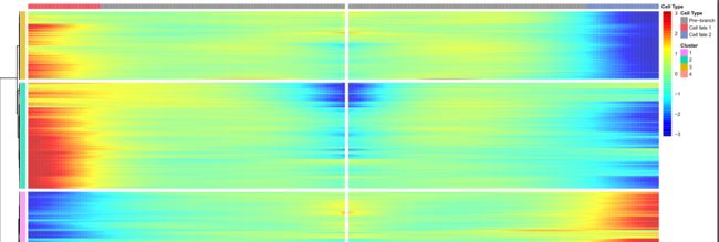
拟时间分析结果有很多重要的结果,但是这些结果如何解读?比如下图的分支点分析结果:
从图中可以看到,行代表基因,这个好说,热图的列主要分为三方面:Pre−branch、Cell fate 1、Cell fate 2,这三个列代表什么含义?
Pre−branch
为了解读结果,我们看一下拟时间分析分的state结果图,然后我们对应的Pre−branch包含哪些细胞?
这里,我们想比较state7和state1的差异,也就是想分析branch point 3的分支点(identify genes expressed in a branch-dependent ),那这里Pre−branch到底包含哪些细胞?
In fact, BEAM tries to traverse backward from the cell on the branch point all the way back to the root cell (the cell with pseudotime 0) and use all those cells as the the pre-branch.
从结果说明可以看到,Pre−branch包含的细胞为 2, 3, 5。
'cell fate 1' and 'cell fate 2'
cell fate 1和cell fate 2到底指什么?比如还是这里的branch point 3为例:
Cell fate 1 corresponds to the state with small id (in this case, state 1) while cell fate 2 corresponds to sate with bigger id (in this case, state 2)
从说明文档中可以看出:
- [x] Cell fate 1:state 1
- [x] Cell fate 2:state 7
其他场景Pre−branch说明
如果比较state4和state7,Pre−branch又是哪些细胞?
this is a very good question since state 4 relates to branch point 2 while state 7 relates to branch point 3. For this test, the pre-branch will only include cells from state 2.
这里的Pre−branch仅仅包含state2细胞。
后记
此文仅仅记录了分支点依赖相关基因的解读,其他的解读后续在说明。
plot_multiple_branches_pseudotime函数说明
plot_multiple_branches_pseudotime:Create a kinetic curves to demonstrate the bifurcation of gene expression along multiple branches。
此函数可以进行多个分支点进行比较分析。
plot_multiple_branches_pseudotime(cds, branches, branches_name = NULL,min_expr = NULL, cell_size = 0.75, norm_method = c("vstExprs", "log"),nrow = NULL, ncol = 1, panel_order = NULL, color_by = "Branch",
trend_formula = "~sm.ns(Pseudotime, df=3)", label_by_short_name = TRUE,TPM = FALSE, cores = 1)
#示范命令
plot_multiple_branches_heatmap(celltrajectory.monocle, branches = c(6,7),
cluster_rows = TRUE, hclust_method = "ward.D2", num_clusters = 6,
hmcols = NULL, add_annotation_row = NULL, add_annotation_col = NULL,
show_rownames = FALSE, use_gene_short_name = TRUE,
norm_method = c("vstExprs", "log"), scale_max = 3, scale_min = -3,
trend_formula = "~sm.ns(Pseudotime, df=3)", return_heatmap = FALSE,
cores = 1)
热图的每一列代表什么?
If you're looking for a deeper understanding of what the function is doing, I'd recommend digging into the source code for the function. The plot_genes_branched_heatmap function is in R/plotting.R, but it calls a nested function (buildBranchCellDataSet) that's contained in R/BEAM.R. I found it valuable to run through the code line by line and see what variables get made/changed.
But to briefly answer your question, monocle orders your cells along the trajectory, giving each cell a pseudotime value. Now, with expression values for each gene at different points in pseudotime (ie. each cell), it uses a VGLM with splines to fit non-linear expression dynamics as a function of pseudotime. This model can then directly be used for differential expression if desired (eg. using a likelihood ratio test against a reduced model that doesn't incorporate pseudotime). For plotting a heatmap though, there's a problem: the pseudotime values for your cells do not increase by sequential integers (ie. 1,2,3,..,n). This is because monocle was designed, recognizing that the jump between cells along a trajectory aren't always the same distance. So if you were to make a heatmap, your column representation of pseudotime wouldn't be linear--it will depend on your sampling density along the trajectory. It could go, for example, 1,1.15,1.25,5,6,6.25,10 (see the problem?). So what the plotting function does (more specifically, a function called genSmoothCurves) is use the constructed models from before to predict gene expression of all genes along 100 evenly spaced pseudotime values spanning the range, and then makes a heatmap of those predictions rather than your scRNA-Seq measurements themselves. Each column represents those one of those 100 pseudotime values.
The branched heatmap function is similar, except things are ordered differently. Those modelled values are ordered from the middle of the heatmap outwards. The left and right directions represent the modelled expression for two separate branches of the trajectory. The small region in the middle that is symmetrical represents the "progenitors" (the nomenclature used by the devs) prior to the branchpoint, and the point moving outwards where that symmetry breaks is the bifurcation point of the two independent branches. Going through the source code for this would really help make this clear.
简而言之,就是根据的拟时间值的范围,分成100个bin,每个bin中代表一个拟时间值。
参考资料
官方说明:How to map cell fate to branches?
plot_multiple_branches_pseudotime源代码
Understanding plot_genes_branched_heatmap columns

