最近学习Tableau, 感觉老师的一些可视化观念很好,现粗浅的翻译一下,分享给大家:
课程Coursera 杜克大学Duke University
Using visualization science to influence business decision
使用可视化科学影响商务决策
what people look tight to what people decide
“人们看到的与他们所决定的密切相关”(百闻不如一见)
guide audience's eyes to where we want them to be
(用可视化)引导观众的目光到我们想它们所在的地方
first we need to figure out what story we want to tell
首先我们需要解决我们想要告诉观众什么样的故事
Storyboarding Your Data Story
用故事板讲你的数据
the storyboarding hourglass
故事板沙漏图
big picture -- details -- big picture
从蓝图---细节---蓝图
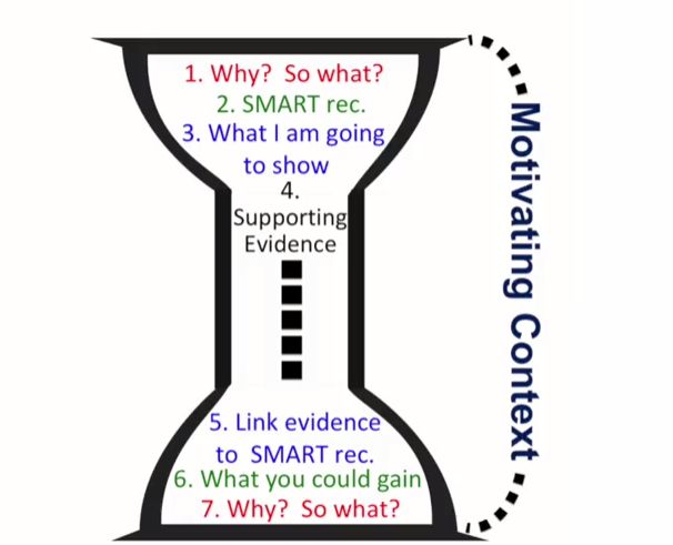
- WHY? SO WHAT?
1.为什么?那又怎样?
为什么观众要听你的?如果不听的话那又怎么样?
motivate audience to listen to what you say is the first important thing you need to do
首先要做的最重要的是激发观众听你所说的的激情
("so what" is more important than "what")
(“那又怎么”比“什么”更重要)
来引出你要解决的问题
2.Use "SMART" redcommendation to tell audience the detail
3.Summarize the main point you are going to support your recommendation
4.supporting evidence
5.link evidence to SMART rec.
- What you could gain
- WHY? SO WHAT?
Make your data story come alive
让你的故事栩栩如生
story:Characters; Location; Confinct; Resolution
讲一个故事:角色,地点,矛盾,解决
Storyboarding your presentation
用故事板来做演示
**more companies need storyboard presentation than traditional dashboard **
”越来越多的公司需要故事板式的演示,而不是传统的仪表盘
"post-insight" to compile your storypoints
1.all insights summarize in one sentance
2.figure out three main points and three subpoints
3.organize your story points:if not controversial, most compelling storypoint first
4.draw a quick sketch what kind of visualization for each post-it
Stress-testing your story
给你的故事做压力测试
The best stress-testers are teams
get feedback from your data analytics team, and stakeholder
你会出现的问题:
Overgeneralization and sample bias
过泛化和样本偏差
we'll overgeneralize because of the lack data, bias data, and big data won't resolve it
tips:1.Always ask questions about collection methods
- Always check number of data points
- test subsets of data for consistency(random split subset)
- look for common characteristics of outlier and missing data
Misinterpretations Due to Lack of controls
由于缺少控制导致的误解
control group and treatment group, it should be random
avoid:1.overgeneralization and sample bias 2.conclusion without controls
Correlation does not equal causation
相关性不等于因果性
it's very dangerous for business analysis
How correlations impact business decisions
相关性是如何影响商务决策的
if you see correlation between two variables , you should do A/B test
if not test condition:
- always think if there's a third or fourth variable that explain the relationship you see
- examine whether the correlation you're basing your business recommendation on exists in other contexts or datasets.
- come up different complementary angles to assess the relationship
eg: google flu predict
if you miss the notice, it will cost you and your company a lot of money.
Tools for Conveying Your Data Story
转化数据故事的工具
Choosing visualization for story points
为故事要点选择可视化
complicated graphs may have risks ,so stick to line charts and bar charts
复杂的图片是有风险的,所以专注于线图和柱图
when use line chart(change over time or ordered category)
线图(随时间或有顺序的类别而改变)
when use bar chart (compare categories)
柱图(比较类别)
pie chart(4 or fewer)
饼图(少于4个分类或两个分类)
don't use
不要用
scatter plot(for technical audience)
散点图
3D chart
3D图
the Neuroscience of visual Perception can make or break your visualization
视觉捕获的神经学研究
human are good at measure position and length(that's why us bar and lines)
科学研究人的视觉对高度和位置最为敏感,而对大小颜色等相对较弱
因此我们要用柱图和线图
Misinterpretations caused by Colorbars
对颜色图的使用事项:
don't use color to convey detailed quantitative differences in the values of continuous variables
do use color to illustrate general patterns
code for different categories of categorical variables(to draw attention)
draw attention to something
Visual contrast directs where your audience looks
use color to strength when you want your audience to look
Putting compelling data visualizations into persuasive business presentations
把数据视觉引入商务演示
Formatting slides to communicate data stories
1.Max data ink ratio(data ink:ink that represent the actual data; Non-data ink:everything else)
let audience focus on the data
- understanding at a glance
- fonts
- make sure everyone in the room can see the slide(when u finish the slide,zoom to 66% to check if can see)
- Don't make your audience do visual math
- Use titles to convey take-home messages
Formatting presentations to communicate data stories
转换演示为交流数据故事
- uniform the presentations, but you can different background font ~ in transition slide or summary slide
- people's attention is 10 mins, so use transitions slide
the key is to make sure the transitions are smooth, not disruptive - animations
1.check for typos!! then check again!
2.bold is more readable that italics or underlining
- No distorted or fuzzy pictures!
4.use 2-3 colors.
Delivering your data story
传递你的数据故事
what you say: the best to call audience is to interact with them.
how you say: voice and tone
what you will do before the presentation: practice,practice,practice.
what you will do during the presentation.
what you will after the presentation: give feedback and receive feedback.