视觉增强
注释用于向绘图添加补充信息,例如标题,图例和彩色地图等。
Widget通过按钮,下拉菜单,滑块和提供交互性支持。
视觉属性为绘图提供了广泛的视觉增强,例如线条和文字的颜色和填充,以及诸如的交互增强
将鼠标悬停在工具上并选择兴趣点。
添加标题(title)
#Setting up the data for chapter
#Import the required packages
import pandas as pd
from bokeh.sampledata.stocks import AAPL

df_apple = pd.DataFrame(AAPL)
df_apple['date'] = pd.to_datetime(df_apple['date'])

#Import the required packages
from bokeh.io import output_file, show
from bokeh.plotting import figure
from bokeh.plotting import ColumnDataSource

#Create the ColumnDataSource object
data = ColumnDataSource(data = {
    'x' : df_apple['high'],
    'y' : df_apple['low'],
    'x1': df_apple['open'],
    'y1': df_apple['close'],
    'x2': df_apple['date'],
    'y2': df_apple['volume'],
})

#Adding titles to plots
#Import the required packages
from bokeh.plotting import figure, show, output_file

#Create the plot with the title
plot3 = figure(title = "5 year time series distribution of volumn of Apple stocks traded", title_location = "above",
               x_axis_type = 'datetime', x_axis_label = 'date', y_axis_label = 'Volume Traded')

#Create the time series plot
plot3.line(x = 'x2', y = 'y2', source = data, color = 'red')
plot3.circle(x = 'x2', y = 'y2', source = data, fill_color = 'white', size = 3)

#Output the plot
output_file('title.html')
show(plot3)
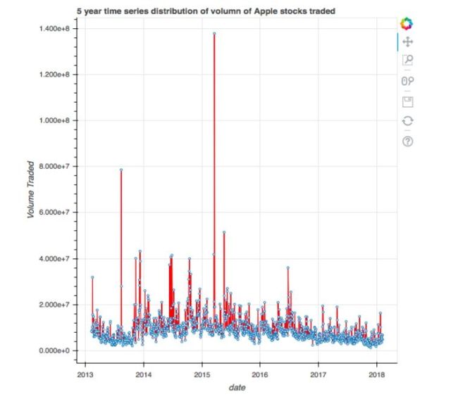
image.png
添加图例(legend)
#Setting up the data for chapter
#Import the required packages
import pandas as pd
from bokeh.sampledata.stocks import AAPL

df_apple = pd.DataFrame(AAPL)
df_apple['date'] = pd.to_datetime(df_apple['date'])

#Import the required packages
from bokeh.io import output_file, show
from bokeh.plotting import figure
from bokeh.plotting import ColumnDataSource

#Create the ColumnDataSource object
data = ColumnDataSource(data = {
    'x' : df_apple['high'],
    'y' : df_apple['low'],
    'x1': df_apple['open'],
    'y1': df_apple['close'],
    'x2': df_apple['date'],
    'y2': df_apple['volume'],
})

#Adding legends to plots
#Import the required packages
from bokeh.plotting import figure, show, output_file

#Create the two scatter plots
plot = figure()

#Create the legends
plot.cross(x = 'x', y = 'y', source = data, color = 'red', size = 10, alpha = 0.8, legend = "High Vs. Low")
plot.circle(x = 'x1', y = 'y1', source = data, color = 'green', size = 10, alpha = 0.3, legend = "Open Vs. Close")

#Output the plot
output_file('5.html')
show(plot)
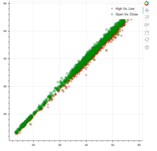
image.png
颜色映射
#Setting up the data for chapter
import pandas as pd

#Read in the data
df = pd.read_csv('/home/andrew/code/kaggle-code/stock_data/all_stocks_5yr.csv')

df_multiple = df[(df['Name'] == 'GOOGL') | (df['Name'] == 'USB')]

#Import the required packages
from bokeh.models import CategoricalColorMapper
from bokeh.io import output_file, show
from bokeh.plotting import figure
from bokeh.plotting import ColumnDataSource

#Store the data in the ColumnDataSource object
data = ColumnDataSource(df_multiple)

#Create the mapper
category_map = CategoricalColorMapper(
    factors = ['GOOGL', 'USB'], palette = ['blue', 'red'])

#Plot the figure
plot = figure()
plot.circle('high', 'low', size = 8, source = data, color = {'field': 'Name', 'transform': category_map})

#Output the plot
output_file('category.html')
show(plot)
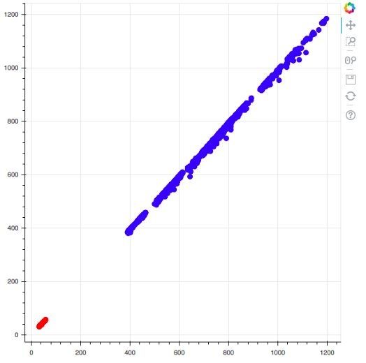
image.png
创建按钮(button)
from bokeh.io import output_file, show
from bokeh.layouts import widgetbox
from bokeh.models.widgets import Button

#Create the button
button = Button(label="Click me", button_type = "success")

#Output the button
output_file("button.html")
show(widgetbox(button))

image.png
复选框(checkbox)
from bokeh.io import output_file, show
from bokeh.layouts import widgetbox
from bokeh.models.widgets import CheckboxGroup

#Create the checkbox
checkbox = CheckboxGroup(
        labels=["box: 1", "box: 2", "box: 3"], active=[1, 2])

#Output the checkbox
output_file("checkbox.html")
show(widgetbox(checkbox))
image.png
下拉菜单(Dropdown)
from bokeh.io import output_file, show
from bokeh.layouts import widgetbox
from bokeh.models.widgets import Dropdown

#Create the menu
menu = [("Option 1", "item_1"), ("Option 2", "item_2")]

#Create the Dropdown
dropdown = Dropdown(label="Dropdown Menu", button_type="warning", menu=menu)

#Output the dropdown menu
output_file("dropdown.html")
show(widgetbox(dropdown))
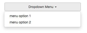
image.png
单选按钮(radio)
from bokeh.io import output_file, show
from bokeh.layouts import widgetbox
from bokeh.models.widgets import RadioGroup

#Create the radio button
radio_button = RadioGroup(
        labels=["Option 1", "Option 2"], active=0)

#Output the radio button widget
output_file("radiobutton.html")
show(widgetbox(radio_button))

image.png
滑动条(slider)
from bokeh.io import output_file, show
from bokeh.layouts import widgetbox
from bokeh.models.widgets import Slider

#Create the slider widget
slider = Slider(start=0, end=50, value=0, step= 5, title="Simple Slider")

#Output the slider
output_file("slider.html")
show(widgetbox(slider))
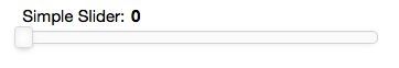
image.png
文本输入
from bokeh.io import output_file, show
from bokeh.layouts import widgetbox
from bokeh.models.widgets import TextInput

#Create the text input widget
text_widget = TextInput(value="", title="Type your text here")

#Output the text input widget
output_file("text_input.html")
show(widgetbox(text_widget))

image.png
悬停提示
from bokeh.models import CategoricalColorMapper
from bokeh.models import HoverTool
from bokeh.io import output_file, show
from bokeh.plotting import ColumnDataSource
from bokeh.plotting import figure
import pandas as pd

#Read in the data and filter for Google and USB stocks
import pandas as pd

#Read in the data
df = pd.read_csv('/home/andrew/code/kaggle-code/stock_data/all_stocks_5yr.csv')
df_multiple = df[(df['Name'] == 'GOOGL') | (df['Name'] == 'USB')]

#Create the hover tooltip
hover_tool = HoverTool(tooltips = [
    ('Stock Ticker', '@Name'),
    ('High Price', '@high'),
    ('Low Price', '@low')
])

#Save the data in a ColumnDataSource object
data = ColumnDataSource(df_multiple)

#Create the categorical color mapper
category_map = CategoricalColorMapper(
    factors = ['GOOGL', 'USB'], palette = ['blue', 'red'])

#Create the plot with the hover tooltip
plot = figure(tools = [hover_tool])
plot.circle('high', 'low', size = 8, source = data, color = {'field': 'Name', 'transform': category_map})

#Output the plot
output_file('hover.html')
show(plot)
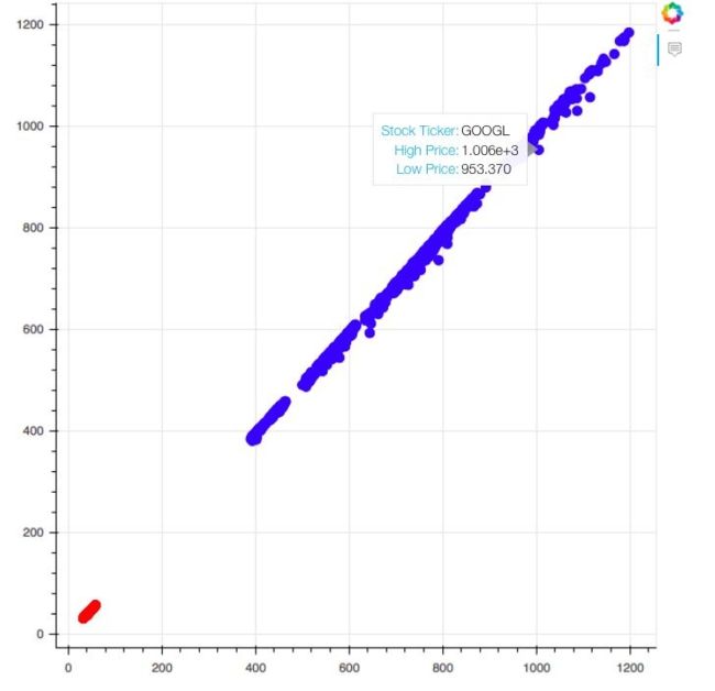
image.png
选择
from bokeh.models import CategoricalColorMapper
from bokeh.models import HoverTool
from bokeh.io import output_file, show
from bokeh.plotting import ColumnDataSource
from bokeh.plotting import figure
import pandas as pd

#Read in the data and filter for Google and USB stocks
import pandas as pd

#Read in the data
df = pd.read_csv('/home/andrew/code/kaggle-code/stock_data/all_stocks_5yr.csv')
df_multiple = df[(df['Name'] == 'GOOGL') | (df['Name'] == 'USB')]

#Save the data in a ColumnDataSource object
data = ColumnDataSource(df_multiple)

category_map = CategoricalColorMapper(
    factors = ['GOOGL', 'USB'], palette = ['blue', 'red'])

#Create the plot with the selection tool

plot = figure(tools = 'box_select')

plot.circle('high', 'low', size = 8, source = data,
            color = {'field': 'Name', 'transform': category_map}, selection_color = 'green',
           nonselection_fill_alpha = 0.3, nonselection_fill_color = 'grey')

#Output the plot
output_file('selection.html')
show(plot)
image.png
标题样式
from bokeh.models import CategoricalColorMapper
from bokeh.models import HoverTool
from bokeh.io import output_file, show
from bokeh.plotting import ColumnDataSource
from bokeh.plotting import figure
import pandas as pd

#Read in the data and filter for Google and USB stocks
import pandas as pd

#Read in the data
df = pd.read_csv('/home/andrew/code/kaggle-code/stock_data/all_stocks_5yr.csv')
df_multiple = df[(df['Name'] == 'GOOGL') | (df['Name'] == 'USB')]

#Save the data in a ColumnDataSource object
data = ColumnDataSource(df_multiple)

category_map = CategoricalColorMapper(
    factors = ['GOOGL', 'USB'], palette = ['blue', 'red'])

plot = figure(title = "High Vs. Low Prices (Google & USB)")
plot.title.text_color = "red"
plot.title.text_font = "times"
plot.title.text_font_style = "bold"
plot.circle('high', 'low', size = 8, source = data,
            color = {'field': 'Name', 'transform': category_map})

#Output the plot
output_file('title.html')
show(plot)
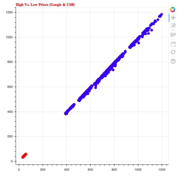
image.png
轮廓样式
from bokeh.models import CategoricalColorMapper
from bokeh.models import HoverTool
from bokeh.io import output_file, show
from bokeh.plotting import ColumnDataSource
from bokeh.plotting import figure
import pandas as pd

#Read in the data and filter for Google and USB stocks
import pandas as pd

#Read in the data
df = pd.read_csv('/home/andrew/code/kaggle-code/stock_data/all_stocks_5yr.csv')
df_multiple = df[(df['Name'] == 'GOOGL') | (df['Name'] == 'USB')]

#Save the data in a ColumnDataSource object
data = ColumnDataSource(df_multiple)

category_map = CategoricalColorMapper(
    factors = ['GOOGL', 'USB'], palette = ['blue', 'red'])

plot = figure(title = "High Vs. Low Prices (Google & USB)")
#Configure the outline of the plot
plot.outline_line_width = 8
plot.outline_line_alpha = 0.8
plot.outline_line_color = "black"

#Create and output the plot
plot.circle('high', 'low', size = 8, source = data,
            color = {'field': 'Name', 'transform': category_map})

output_file('outline.html')
show(plot)
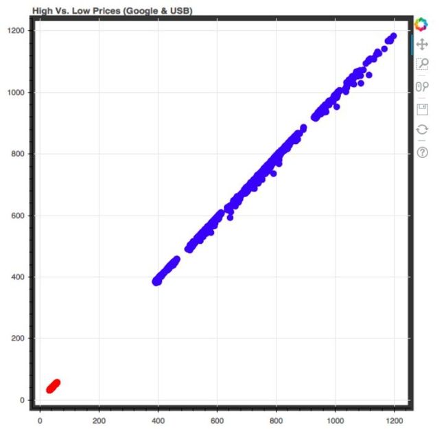
image.png
标签样式
from bokeh.models import CategoricalColorMapper
from bokeh.models import HoverTool
from bokeh.io import output_file, show
from bokeh.plotting import ColumnDataSource
from bokeh.plotting import figure
import pandas as pd

#Read in the data and filter for Google and USB stocks
import pandas as pd

#Read in the data
df = pd.read_csv('/home/andrew/code/kaggle-code/stock_data/all_stocks_5yr.csv')
df_multiple = df[(df['Name'] == 'GOOGL') | (df['Name'] == 'USB')]

#Save the data in a ColumnDataSource object
data = ColumnDataSource(df_multiple)

category_map = CategoricalColorMapper(
    factors = ['GOOGL', 'USB'], palette = ['blue', 'red'])

plot = figure(title = "High Vs. Low Prices (Google & USB)")

plot.xaxis.axis_label = "High Prices"
plot.xaxis.axis_label_text_color = "green"
plot.yaxis.axis_label = "Low Prices"
plot.yaxis.axis_label_text_font_style = "bold"

plot.circle('high', 'low', size = 8, source = data,
            color = {'field': 'Name', 'transform': category_map})

#Output the plot
output_file('label.html')
show(plot)
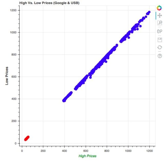
image.png
服务器

image.png
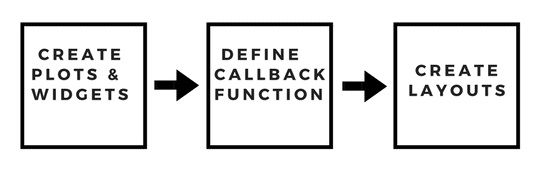
image.png
from bokeh.layouts import widgetbox
from bokeh.models import Slider
from bokeh.io import curdoc

#Create a slider widget
slider_widget = Slider(start = 0, end = 100, step = 10, title = 'Single Slider')

#Create a layout for the widget
slider_layout = widgetbox(slider_widget)

#Add the slider widget to the application
curdoc().add_root(slider_layout)
$ bokeh serve --show 6_single_slider.py
2018-08-07 22:31:08,152 Starting Bokeh server version 0.13.0 (running on Tornado 5.0.2)
2018-08-07 22:31:08,157 Bokeh app running at: http://localhost:5006/6_single_slider
2018-08-07 22:31:08,157 Starting Bokeh server with process id: 4004
[4014:4042:0807/223108.727386:ERROR:browser_gpu_channel_host_factory.cc(120)] Failed to launch GPU process.
2018-08-07 22:31:08,734 200 GET /6_single_slider (::1) 25.01ms
2018-08-07 22:31:09,235 101 GET /6_single_slider/ws?bokeh-protocol-version=1.0&bokeh-session-id=DIPJXgIOQBG65IwoBU8WsZ2dCevD8Ex0mrEfG9hKs1Gm (::1) 1.09ms
2018-08-07 22:31:09,236 WebSocket connection opened
2018-08-07 22:31:09,236 ServerConnection created

image.png
from bokeh.layouts import widgetbox
from bokeh.models import Slider
from bokeh.io import curdoc

#Create multiple slider widgets
slider_widget1 = Slider(start = 0, end = 100, step = 10, title = 'Slider 1')
slider_widget2 = Slider(start = 0, end = 50, step = 5, title = 'Slider 2')
slider_widget3 = Slider(start = 50, end = 100, step = 5, title = 'Slider 3')

#Create a layout for the widget
slider_layout = widgetbox(slider_widget1, slider_widget2, slider_widget3)

#Add the slider widget to the application
curdoc().add_root(slider_layout)
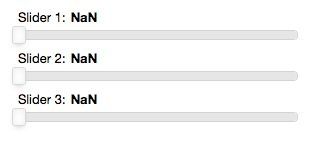
image.png
from bokeh.models import Slider, ColumnDataSource
from bokeh.io import curdoc
from bokeh.layouts import row
from bokeh.plotting import figure
from numpy.random import random

#Create data for the plot
initial_points = 500
data_points = ColumnDataSource(data = {'x': random(initial_points), 'y': random(initial_points)})

#Create the plot
plot = figure(title = "Random scatter plot generator")
plot.diamond(x = 'x', y = 'y', source = data_points, color = 'red')

#Create the slider widget
slider_widget = Slider(start = 0, end = 10000, step = 10, value = initial_points, title = 'Slide right to increase number of points')

#Define the callback function
def callback(attr, old, new):
    points = slider_widget.value
    data_points.data = {'x': random(points), 'y': random(points)}

slider_widget.on_change('value', callback)

#Create a layout for the application
layout = row(slider_widget, plot)

#Add the layout to the application
curdoc().add_root(layout)
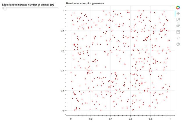
image.png
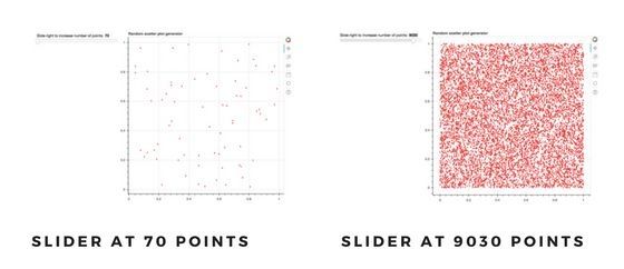
image.png
参考资料
- 本文涉及的python测试开发库 请在github上点赞,谢谢!
- 讨论qq群144081101 591302926 567351477 钉钉免费群21745728
- 本文相关书籍下载
- 代码仓库