当构造一个类需要大量的参数时候,提供一个良好的接口来弹性的构造自己需要的参数时,那么可以用Builder模式来构造这个类.
android 中AlertDialog就用Builder模式来设计,平常我们用Dialog如下
AlertDialog.Builder builder = new AlertDialog.Builder(this);
builder.setTitle("简单对话框");
builder.setMessage("Just Test it");
上面的只是设置了AlertDialog.Builder中的对应的属性。设置到了对应的AlertController.AlertParams 属性中。
下面是Builder中的部分代码
public Builder setMessage(CharSequence message) {
            P.mMessage = message;
            return this;
}
注意这里的return this.所有builder中的属性设置都要return this.这样才能返回设置好参数的Builder.
new AlertDialog.Builder(this).setTitle("xx").setMessage("xxx");
这样才能链式的调用.
public class AlertDialog extends Dialog implements DialogInterface {
    private AlertController mAlert;

  public static class Builder {
        private final AlertController.AlertParams P;
    ....
  }
....
}
静态类Builder里面的AlertController.AlertParams的参数设定之后都是和外面AllertDialog中AlertController mAlert所对应的参数是一一对应的.
上面创建的Builder必须要调用show()方法才能显示到屏幕中。
builder.show();
可以查看源码show()方法得知:show方法调用后会初始化一个新的AlertDailog对象,而这个AlertDailog对象构造函数中的参数就是Builder中的AlertController.AlertParams P对象,P对象是Builder设置属性后持有的对象,这样调用Builder.show()方法,其实就是初始化了AlertDailog .并且这个Dailog的mAlert对应的参数就是Builder所持有的P对象.
下面是Builder的源码如下:
public static class Builder {
private final AlertController.AlertParams P;
/**
* Creates a builder for an alert dialog that uses the default alert
* dialog theme.
*
* The default alert dialog theme is defined by
* {@link android.R.attr#alertDialogTheme} within the parent
* {@code context}'s theme.
*
* @param context the parent context
*/
public Builder(Context context) {
this(context, resolveDialogTheme(context, 0));
}
/**
* Creates a builder for an alert dialog that uses an explicit theme
* resource.
*
* The specified theme resource ({@code themeResId}) is applied on top
* of the parent {@code context}'s theme. It may be specified as a
* style resource containing a fully-populated theme, such as
* {@link android.R.style#Theme_Material_Dialog}, to replace all
* attributes in the parent {@code context}'s theme including primary
* and accent colors.
*
* To preserve attributes such as primary and accent colors, the
* {@code themeResId} may instead be specified as an overlay theme such
* as {@link android.R.style#ThemeOverlay_Material_Dialog}. This will
* override only the window attributes necessary to style the alert
* window as a dialog.
*
* Alternatively, the {@code themeResId} may be specified as {@code 0}
* to use the parent {@code context}'s resolved value for
* {@link android.R.attr#alertDialogTheme}.
*
* @param context the parent context
* @param themeResId the resource ID of the theme against which to inflate
* this dialog, or {@code 0} to use the parent
* {@code context}'s default alert dialog theme
*/
public Builder(Context context, int themeResId) {
P = new AlertController.AlertParams(new ContextThemeWrapper(
context, resolveDialogTheme(context, themeResId)));
}
/**
* Returns a {@link Context} with the appropriate theme for dialogs created by this Builder.
* Applications should use this Context for obtaining LayoutInflaters for inflating views
* that will be used in the resulting dialogs, as it will cause views to be inflated with
* the correct theme.
*
* @return A Context for built Dialogs.
*/
public Context getContext() {
return P.mContext;
}
/**
* Set the title using the given resource id.
*
* @return This Builder object to allow for chaining of calls to set methods
*/
public Builder setTitle(@StringRes int titleId) {
P.mTitle = P.mContext.getText(titleId);
return this;
}
/**
* Set the title displayed in the {@link Dialog}.
*
* @return This Builder object to allow for chaining of calls to set methods
*/
public Builder setTitle(CharSequence title) {
P.mTitle = title;
return this;
}
/**
* Set the title using the custom view {@code customTitleView}.
*
* The methods {@link #setTitle(int)} and {@link #setIcon(int)} should
* be sufficient for most titles, but this is provided if the title
* needs more customization. Using this will replace the title and icon
* set via the other methods.
*
* Note: To ensure consistent styling, the custom view
* should be inflated or constructed using the alert dialog's themed
* context obtained via {@link #getContext()}.
*
* @param customTitleView the custom view to use as the title
* @return this Builder object to allow for chaining of calls to set
* methods
*/
public Builder setCustomTitle(View customTitleView) {
P.mCustomTitleView = customTitleView;
return this;
}
/**
* Set the message to display using the given resource id.
*
* @return This Builder object to allow for chaining of calls to set methods
*/
public Builder setMessage(@StringRes int messageId) {
P.mMessage = P.mContext.getText(messageId);
return this;
}
/**
* Set the message to display.
*
* @return This Builder object to allow for chaining of calls to set methods
*/
public Builder setMessage(CharSequence message) {
P.mMessage = message;
return this;
}
/**
* Set the resource id of the {@link Drawable} to be used in the title.
*
* Takes precedence over values set using {@link #setIcon(Drawable)}.
*
* @return This Builder object to allow for chaining of calls to set methods
*/
public Builder setIcon(@DrawableRes int iconId) {
P.mIconId = iconId;
return this;
}
/**
* Set the {@link Drawable} to be used in the title.
*
* Note: To ensure consistent styling, the drawable
* should be inflated or constructed using the alert dialog's themed
* context obtained via {@link #getContext()}.
*
* @return this Builder object to allow for chaining of calls to set
* methods
*/
public Builder setIcon(Drawable icon) {
P.mIcon = icon;
return this;
}
/**
* Set an icon as supplied by a theme attribute. e.g.
* {@link android.R.attr#alertDialogIcon}.
*
* Takes precedence over values set using {@link #setIcon(int)} or
* {@link #setIcon(Drawable)}.
*
* @param attrId ID of a theme attribute that points to a drawable resource.
*/
public Builder setIconAttribute(@AttrRes int attrId) {
TypedValue out = new TypedValue();
P.mContext.getTheme().resolveAttribute(attrId, out, true);
P.mIconId = out.resourceId;
return this;
}
/**
* Set a listener to be invoked when the positive button of the dialog is pressed.
* @param textId The resource id of the text to display in the positive button
* @param listener The {@link DialogInterface.OnClickListener} to use.
*
* @return This Builder object to allow for chaining of calls to set methods
*/
public Builder setPositiveButton(@StringRes int textId, final OnClickListener listener) {
P.mPositiveButtonText = P.mContext.getText(textId);
P.mPositiveButtonListener = listener;
return this;
}
/**
* Set a listener to be invoked when the positive button of the dialog is pressed.
* @param text The text to display in the positive button
* @param listener The {@link DialogInterface.OnClickListener} to use.
*
* @return This Builder object to allow for chaining of calls to set methods
*/
public Builder setPositiveButton(CharSequence text, final OnClickListener listener) {
P.mPositiveButtonText = text;
P.mPositiveButtonListener = listener;
return this;
}
/**
* Set a listener to be invoked when the negative button of the dialog is pressed.
* @param textId The resource id of the text to display in the negative button
* @param listener The {@link DialogInterface.OnClickListener} to use.
*
* @return This Builder object to allow for chaining of calls to set methods
*/
public Builder setNegativeButton(@StringRes int textId, final OnClickListener listener) {
P.mNegativeButtonText = P.mContext.getText(textId);
P.mNegativeButtonListener = listener;
return this;
}
/**
* Set a listener to be invoked when the negative button of the dialog is pressed.
* @param text The text to display in the negative button
* @param listener The {@link DialogInterface.OnClickListener} to use.
*
* @return This Builder object to allow for chaining of calls to set methods
*/
public Builder setNegativeButton(CharSequence text, final OnClickListener listener) {
P.mNegativeButtonText = text;
P.mNegativeButtonListener = listener;
return this;
}
/**
* Set a listener to be invoked when the neutral button of the dialog is pressed.
* @param textId The resource id of the text to display in the neutral button
* @param listener The {@link DialogInterface.OnClickListener} to use.
*
* @return This Builder object to allow for chaining of calls to set methods
*/
public Builder setNeutralButton(@StringRes int textId, final OnClickListener listener) {
P.mNeutralButtonText = P.mContext.getText(textId);
P.mNeutralButtonListener = listener;
return this;
}
/**
* Set a listener to be invoked when the neutral button of the dialog is pressed.
* @param text The text to display in the neutral button
* @param listener The {@link DialogInterface.OnClickListener} to use.
*
* @return This Builder object to allow for chaining of calls to set methods
*/
public Builder setNeutralButton(CharSequence text, final OnClickListener listener) {
P.mNeutralButtonText = text;
P.mNeutralButtonListener = listener;
return this;
}
/**
* Sets whether the dialog is cancelable or not. Default is true.
*
* @return This Builder object to allow for chaining of calls to set methods
*/
public Builder setCancelable(boolean cancelable) {
P.mCancelable = cancelable;
return this;
}
/**
* Sets the callback that will be called if the dialog is canceled.
*
*
Even in a cancelable dialog, the dialog may be dismissed for reasons other than
* being canceled or one of the supplied choices being selected.
* If you are interested in listening for all cases where the dialog is dismissed
* and not just when it is canceled, see
* {@link #setOnDismissListener(android.content.DialogInterface.OnDismissListener) setOnDismissListener}.
* @see #setCancelable(boolean)
* @see #setOnDismissListener(android.content.DialogInterface.OnDismissListener)
*
* @return This Builder object to allow for chaining of calls to set methods
*/
public Builder setOnCancelListener(OnCancelListener onCancelListener) {
P.mOnCancelListener = onCancelListener;
return this;
}
/**
* Sets the callback that will be called when the dialog is dismissed for any reason.
*
* @return This Builder object to allow for chaining of calls to set methods
*/
public Builder setOnDismissListener(OnDismissListener onDismissListener) {
P.mOnDismissListener = onDismissListener;
return this;
}
/**
* Sets the callback that will be called if a key is dispatched to the dialog.
*
* @return This Builder object to allow for chaining of calls to set methods
*/
public Builder setOnKeyListener(OnKeyListener onKeyListener) {
P.mOnKeyListener = onKeyListener;
return this;
}
/**
* Set a list of items to be displayed in the dialog as the content, you will be notified of the
* selected item via the supplied listener. This should be an array type i.e. R.array.foo
*
* @return This Builder object to allow for chaining of calls to set methods
*/
public Builder setItems(@ArrayRes int itemsId, final OnClickListener listener) {
P.mItems = P.mContext.getResources().getTextArray(itemsId);
P.mOnClickListener = listener;
return this;
}
/**
* Set a list of items to be displayed in the dialog as the content, you will be notified of the
* selected item via the supplied listener.
*
* @return This Builder object to allow for chaining of calls to set methods
*/
public Builder setItems(CharSequence[] items, final OnClickListener listener) {
P.mItems = items;
P.mOnClickListener = listener;
return this;
}
/**
* Set a list of items, which are supplied by the given {@link ListAdapter}, to be
* displayed in the dialog as the content, you will be notified of the
* selected item via the supplied listener.
*
* @param adapter The {@link ListAdapter} to supply the list of items
* @param listener The listener that will be called when an item is clicked.
*
* @return This Builder object to allow for chaining of calls to set methods
*/
public Builder setAdapter(final ListAdapter adapter, final OnClickListener listener) {
P.mAdapter = adapter;
P.mOnClickListener = listener;
return this;
}
/**
* Set a list of items, which are supplied by the given {@link Cursor}, to be
* displayed in the dialog as the content, you will be notified of the
* selected item via the supplied listener.
*
* @param cursor The {@link Cursor} to supply the list of items
* @param listener The listener that will be called when an item is clicked.
* @param labelColumn The column name on the cursor containing the string to display
* in the label.
*
* @return This Builder object to allow for chaining of calls to set methods
*/
public Builder setCursor(final Cursor cursor, final OnClickListener listener,
String labelColumn) {
P.mCursor = cursor;
P.mLabelColumn = labelColumn;
P.mOnClickListener = listener;
return this;
}
/**
* Set a list of items to be displayed in the dialog as the content,
* you will be notified of the selected item via the supplied listener.
* This should be an array type, e.g. R.array.foo. The list will have
* a check mark displayed to the right of the text for each checked
* item. Clicking on an item in the list will not dismiss the dialog.
* Clicking on a button will dismiss the dialog.
*
* @param itemsId the resource id of an array i.e. R.array.foo
* @param checkedItems specifies which items are checked. It should be null in which case no
* items are checked. If non null it must be exactly the same length as the array of
* items.
* @param listener notified when an item on the list is clicked. The dialog will not be
* dismissed when an item is clicked. It will only be dismissed if clicked on a
* button, if no buttons are supplied it's up to the user to dismiss the dialog.
*
* @return This Builder object to allow for chaining of calls to set methods
*/
public Builder setMultiChoiceItems(@ArrayRes int itemsId, boolean[] checkedItems,
final OnMultiChoiceClickListener listener) {
P.mItems = P.mContext.getResources().getTextArray(itemsId);
P.mOnCheckboxClickListener = listener;
P.mCheckedItems = checkedItems;
P.mIsMultiChoice = true;
return this;
}
/**
* Set a list of items to be displayed in the dialog as the content,
* you will be notified of the selected item via the supplied listener.
* The list will have a check mark displayed to the right of the text
* for each checked item. Clicking on an item in the list will not
* dismiss the dialog. Clicking on a button will dismiss the dialog.
*
* @param items the text of the items to be displayed in the list.
* @param checkedItems specifies which items are checked. It should be null in which case no
* items are checked. If non null it must be exactly the same length as the array of
* items.
* @param listener notified when an item on the list is clicked. The dialog will not be
* dismissed when an item is clicked. It will only be dismissed if clicked on a
* button, if no buttons are supplied it's up to the user to dismiss the dialog.
*
* @return This Builder object to allow for chaining of calls to set methods
*/
public Builder setMultiChoiceItems(CharSequence[] items, boolean[] checkedItems,
final OnMultiChoiceClickListener listener) {
P.mItems = items;
P.mOnCheckboxClickListener = listener;
P.mCheckedItems = checkedItems;
P.mIsMultiChoice = true;
return this;
}
/**
* Set a list of items to be displayed in the dialog as the content,
* you will be notified of the selected item via the supplied listener.
* The list will have a check mark displayed to the right of the text
* for each checked item. Clicking on an item in the list will not
* dismiss the dialog. Clicking on a button will dismiss the dialog.
*
* @param cursor the cursor used to provide the items.
* @param isCheckedColumn specifies the column name on the cursor to use to determine
* whether a checkbox is checked or not. It must return an integer value where 1
* means checked and 0 means unchecked.
* @param labelColumn The column name on the cursor containing the string to display in the
* label.
* @param listener notified when an item on the list is clicked. The dialog will not be
* dismissed when an item is clicked. It will only be dismissed if clicked on a
* button, if no buttons are supplied it's up to the user to dismiss the dialog.
*
* @return This Builder object to allow for chaining of calls to set methods
*/
public Builder setMultiChoiceItems(Cursor cursor, String isCheckedColumn, String labelColumn,
final OnMultiChoiceClickListener listener) {
P.mCursor = cursor;
P.mOnCheckboxClickListener = listener;
P.mIsCheckedColumn = isCheckedColumn;
P.mLabelColumn = labelColumn;
P.mIsMultiChoice = true;
return this;
}
/**
* Set a list of items to be displayed in the dialog as the content, you will be notified of
* the selected item via the supplied listener. This should be an array type i.e.
* R.array.foo The list will have a check mark displayed to the right of the text for the
* checked item. Clicking on an item in the list will not dismiss the dialog. Clicking on a
* button will dismiss the dialog.
*
* @param itemsId the resource id of an array i.e. R.array.foo
* @param checkedItem specifies which item is checked. If -1 no items are checked.
* @param listener notified when an item on the list is clicked. The dialog will not be
* dismissed when an item is clicked. It will only be dismissed if clicked on a
* button, if no buttons are supplied it's up to the user to dismiss the dialog.
*
* @return This Builder object to allow for chaining of calls to set methods
*/
public Builder setSingleChoiceItems(@ArrayRes int itemsId, int checkedItem,
final OnClickListener listener) {
P.mItems = P.mContext.getResources().getTextArray(itemsId);
P.mOnClickListener = listener;
P.mCheckedItem = checkedItem;
P.mIsSingleChoice = true;
return this;
}
/**
* Set a list of items to be displayed in the dialog as the content, you will be notified of
* the selected item via the supplied listener. The list will have a check mark displayed to
* the right of the text for the checked item. Clicking on an item in the list will not
* dismiss the dialog. Clicking on a button will dismiss the dialog.
*
* @param cursor the cursor to retrieve the items from.
* @param checkedItem specifies which item is checked. If -1 no items are checked.
* @param labelColumn The column name on the cursor containing the string to display in the
* label.
* @param listener notified when an item on the list is clicked. The dialog will not be
* dismissed when an item is clicked. It will only be dismissed if clicked on a
* button, if no buttons are supplied it's up to the user to dismiss the dialog.
*
* @return This Builder object to allow for chaining of calls to set methods
*/
public Builder setSingleChoiceItems(Cursor cursor, int checkedItem, String labelColumn,
final OnClickListener listener) {
P.mCursor = cursor;
P.mOnClickListener = listener;
P.mCheckedItem = checkedItem;
P.mLabelColumn = labelColumn;
P.mIsSingleChoice = true;
return this;
}
/**
* Set a list of items to be displayed in the dialog as the content, you will be notified of
* the selected item via the supplied listener. The list will have a check mark displayed to
* the right of the text for the checked item. Clicking on an item in the list will not
* dismiss the dialog. Clicking on a button will dismiss the dialog.
*
* @param items the items to be displayed.
* @param checkedItem specifies which item is checked. If -1 no items are checked.
* @param listener notified when an item on the list is clicked. The dialog will not be
* dismissed when an item is clicked. It will only be dismissed if clicked on a
* button, if no buttons are supplied it's up to the user to dismiss the dialog.
*
* @return This Builder object to allow for chaining of calls to set methods
*/
public Builder setSingleChoiceItems(CharSequence[] items, int checkedItem, final OnClickListener listener) {
P.mItems = items;
P.mOnClickListener = listener;
P.mCheckedItem = checkedItem;
P.mIsSingleChoice = true;
return this;
}
/**
* Set a list of items to be displayed in the dialog as the content, you will be notified of
* the selected item via the supplied listener. The list will have a check mark displayed to
* the right of the text for the checked item. Clicking on an item in the list will not
* dismiss the dialog. Clicking on a button will dismiss the dialog.
*
* @param adapter The {@link ListAdapter} to supply the list of items
* @param checkedItem specifies which item is checked. If -1 no items are checked.
* @param listener notified when an item on the list is clicked. The dialog will not be
* dismissed when an item is clicked. It will only be dismissed if clicked on a
* button, if no buttons are supplied it's up to the user to dismiss the dialog.
*
* @return This Builder object to allow for chaining of calls to set methods
*/
public Builder setSingleChoiceItems(ListAdapter adapter, int checkedItem, final OnClickListener listener) {
P.mAdapter = adapter;
P.mOnClickListener = listener;
P.mCheckedItem = checkedItem;
P.mIsSingleChoice = true;
return this;
}
/**
* Sets a listener to be invoked when an item in the list is selected.
*
* @param listener the listener to be invoked
* @return this Builder object to allow for chaining of calls to set methods
* @see AdapterView#setOnItemSelectedListener(android.widget.AdapterView.OnItemSelectedListener)
*/
public Builder setOnItemSelectedListener(final AdapterView.OnItemSelectedListener listener) {
P.mOnItemSelectedListener = listener;
return this;
}
/**
* Set a custom view resource to be the contents of the Dialog. The
* resource will be inflated, adding all top-level views to the screen.
*
* @param layoutResId Resource ID to be inflated.
* @return this Builder object to allow for chaining of calls to set
* methods
*/
public Builder setView(int layoutResId) {
P.mView = null;
P.mViewLayoutResId = layoutResId;
P.mViewSpacingSpecified = false;
return this;
}
/**
* Sets a custom view to be the contents of the alert dialog.
*
* When using a pre-Holo theme, if the supplied view is an instance of
* a {@link ListView} then the light background will be used.
*
* Note: To ensure consistent styling, the custom view
* should be inflated or constructed using the alert dialog's themed
* context obtained via {@link #getContext()}.
*
* @param view the view to use as the contents of the alert dialog
* @return this Builder object to allow for chaining of calls to set
* methods
*/
public Builder setView(View view) {
P.mView = view;
P.mViewLayoutResId = 0;
P.mViewSpacingSpecified = false;
return this;
}
/**
* Sets a custom view to be the contents of the alert dialog and
* specifies additional padding around that view.
*
* When using a pre-Holo theme, if the supplied view is an instance of
* a {@link ListView} then the light background will be used.
*
* Note: To ensure consistent styling, the custom view
* should be inflated or constructed using the alert dialog's themed
* context obtained via {@link #getContext()}.
*
* @param view the view to use as the contents of the alert dialog
* @param viewSpacingLeft spacing between the left edge of the view and
* the dialog frame
* @param viewSpacingTop spacing between the top edge of the view and
* the dialog frame
* @param viewSpacingRight spacing between the right edge of the view
* and the dialog frame
* @param viewSpacingBottom spacing between the bottom edge of the view
* and the dialog frame
* @return this Builder object to allow for chaining of calls to set
* methods
*
* @hide Remove once the framework usages have been replaced.
* @deprecated Set the padding on the view itself.
*/
@Deprecated
public Builder setView(View view, int viewSpacingLeft, int viewSpacingTop,
int viewSpacingRight, int viewSpacingBottom) {
P.mView = view;
P.mViewLayoutResId = 0;
P.mViewSpacingSpecified = true;
P.mViewSpacingLeft = viewSpacingLeft;
P.mViewSpacingTop = viewSpacingTop;
P.mViewSpacingRight = viewSpacingRight;
P.mViewSpacingBottom = viewSpacingBottom;
return this;
}
/**
* Sets the alert dialog to use the inverse background, regardless of
* what the contents is.
*
* @param useInverseBackground whether to use the inverse background
* @return this Builder object to allow for chaining of calls to set methods
* @deprecated This flag is only used for pre-Material themes. Instead,
* specify the window background using on the alert dialog
* theme.
*/
@Deprecated
public Builder setInverseBackgroundForced(boolean useInverseBackground) {
P.mForceInverseBackground = useInverseBackground;
return this;
}
/**
* @hide
*/
public Builder setRecycleOnMeasureEnabled(boolean enabled) {
P.mRecycleOnMeasure = enabled;
return this;
}
/**
* Creates an {@link AlertDialog} with the arguments supplied to this
* builder.
*
* Calling this method does not display the dialog. If no additional
* processing is needed, {@link #show()} may be called instead to both
* create and display the dialog.
*/
public AlertDialog create() {
// Context has already been wrapped with the appropriate theme.
final AlertDialog dialog = new AlertDialog(P.mContext, 0, false);
P.apply(dialog.mAlert);
dialog.setCancelable(P.mCancelable);
if (P.mCancelable) {
dialog.setCanceledOnTouchOutside(true);
}
dialog.setOnCancelListener(P.mOnCancelListener);
dialog.setOnDismissListener(P.mOnDismissListener);
if (P.mOnKeyListener != null) {
dialog.setOnKeyListener(P.mOnKeyListener);
}
return dialog;
}
/**
* Creates an {@link AlertDialog} with the arguments supplied to this
* builder and immediately displays the dialog.
*
* Calling this method is functionally identical to:
*
* AlertDialog dialog = builder.create();
* dialog.show();
*
*/
public AlertDialog show() {
final AlertDialog dialog = create();
dialog.show();
return dialog;
}
}
总结:
1)运用场景:
Builder模式是一种创造性的设计模式,
通常用来将一个复杂的对象的构造过程分离, 让使用者可以根据需要选择创建过程.
另外, 当这个复杂的对象的构造包含很多可选参数时, 那Builder模式可以说是不二之选了.
2)构建模板:
Builder一般是某个Product实际产品的内部静态类(提供内聚性).比如下面的类型
Class Product{
  public String name;
  ....


public Product(Builder b){
 this. name = b. name;
 ....
}
  public static Class Builder{
     public String name;
     ....

  //注意return this.
   public Builder setName(String name){
    this.name=name;
    return this;
  }
//build的时候 外面A就能实例化对应Builder中设置的参数。
 public Product build(){
      return new Product(this);
  }
}
3)Builder UML图
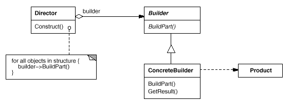
如上图的UML图所示,Director的构造函数中有Builder 传过来的builder参数。