ggplot2-为折线图和条形图添加误差线
以ToothGrowth数据为例,进行处理
tg <- ToothGrowth
head(tg)
library(ggplot2), library(Rmisc)
数据预处理
tgc <- summarySE(tg, measurevar="len", groupvars=c("supp","dose"))
tgc
折线图
ggplot(tgc, aes(x=dose, y=len, colour=supp)) +
geom_errorbar(aes(ymin=len-se, ymax=len+se), width=.1) +
geom_line() +
geom_point()
对重叠的点,进行偏移处理(尽管这样可以将点分开便于观看,但是个人认为这并不科学)
pd <- position_dodge(0.1) # move them .05 to the left and right
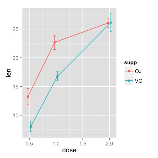
绘制带有95%置信区间的折线图
ggplot(tgc, aes(x=dose, y=len, colour=supp)) +
geom_errorbar(aes(ymin=len-se, ymax=len+se), width=.1, position=pd) +
geom_line(position=pd) +
geom_point(position=pd)
设置误差线的颜色,特别注意如果没有 group=supp,这个重合的误差线将不会偏移.
ggplot(tgc, aes(x=dose, y=len, colour=supp)) +
geom_errorbar(aes(ymin=len-ci, ymax=len+ci), width=.1, position=pd) +
geom_line(position=pd) +
geom_point(position=pd)
下面是一个完整的带有标准误差线的图,geom_point 放在 geom_line之后,可以保证点被最后绘制,填充为白色.
ggplot(tgc, aes(x=dose, y=len, colour=supp, group=supp)) +
geom_errorbar(aes(ymin=len-se, ymax=len+se), colour="black", width=.1, position=pd) +
geom_line(position=pd) +
geom_point(position=pd, size=3, shape=21, fill="white") + # 21 is filled circle
xlab("Dose (mg)") +
ylab("Tooth length") +
scale_colour_hue(name="Supplement type",    # Legend label, use darker colors
                 breaks=c("OJ", "VC"),
                 labels=c("Orange juice", "Ascorbic acid"),
                 l=40) +                    # Use darker colors, lightness=40
ggtitle("The Effect of Vitamin C on\nTooth Growth in Guinea Pigs") +
expand_limits(y=0) +                        # Expand y range
scale_y_continuous(breaks=0:20*4) +         # Set tick every 4
theme_bw() +
theme(legend.justification=c(1,0),# 这一项很关键,如果没有这个参数,图例会偏移,读者可以试一试
      legend.position=c(1,0))               # Position legend in bottom right
条形图
# 转换为因子类型
tgc2 <- tgc
tgc2$dose <- factor(tgc2$dose)
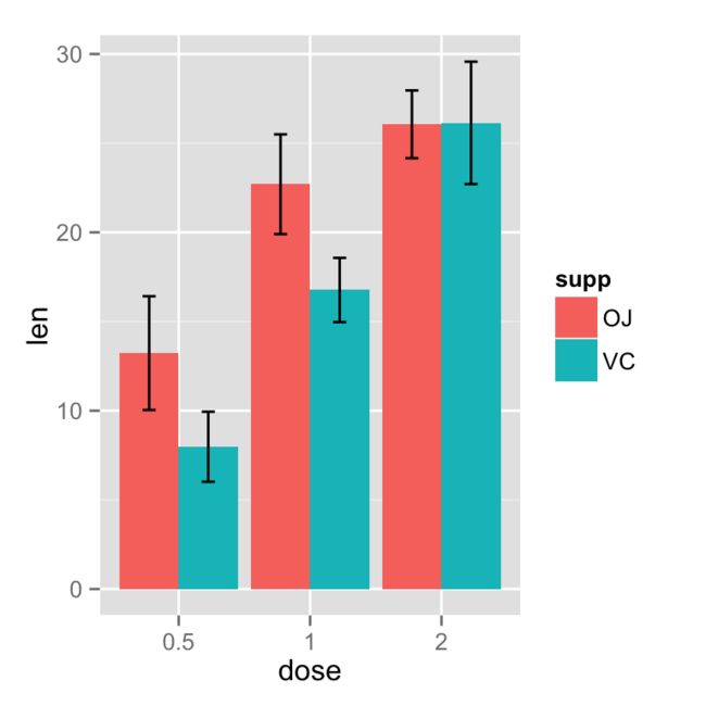
# Error bars represent standard error of the mean
ggplot(tgc2, aes(x=dose, y=len, fill=supp)) +
geom_bar(position=position_dodge(), stat="identity") +
geom_errorbar(aes(ymin=len-se, ymax=len+se),
width=.2, # 设置误差线的宽度
position=position_dodge(.9))
`# 使用95%置信区间
ggplot(tgc2, aes(x=dose, y=len, fill=supp)) +
geom_bar(position=position_dodge(), stat="identity") +
geom_errorbar(aes(ymin=len-ci, ymax=len+ci),
width=.2, # Width of the error bars
position=position_dodge(.9))`
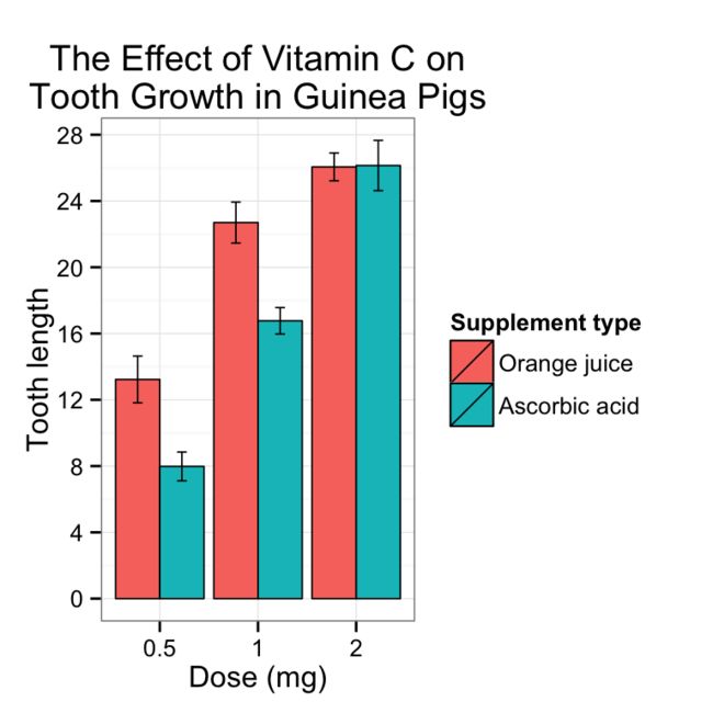
完整的条形图
ggplot(tgc2, aes(x=dose, y=len, fill=supp)) +
geom_bar(position=position_dodge(), stat="identity",
         colour="black", # Use black outlines,
         size=.3) +      # Thinner lines
geom_errorbar(aes(ymin=len-se, ymax=len+se),
              size=.3,    # Thinner lines
              width=.2,
              position=position_dodge(.9)) +
xlab("Dose (mg)") +
ylab("Tooth length") +
scale_fill_hue(name="Supplement type", # Legend label, use darker colors
               breaks=c("OJ", "VC"),
               labels=c("Orange juice", "Ascorbic acid")) +
ggtitle("The Effect of Vitamin C on\nTooth Growth in Guinea Pigs") +
scale_y_continuous(breaks=0:20*4) +
theme_bw()
## Gives count, mean, standard deviation, standard error of the mean, and confidence interval (default 95%).
##   data: a data frame.
##   measurevar: the name of a column that contains the variable to be summariezed
##   groupvars: a vector containing names of columns that contain grouping variables
##   na.rm: a boolean that indicates whether to ignore NA's
##   conf.interval: the percent range of the confidence interval (default is 95%)
summarySE <- function(data=NULL, measurevar, groupvars=NULL, na.rm=FALSE,
                  conf.interval=.95, .drop=TRUE) {
library(plyr)

# 计算长度
length2 <- function (x, na.rm=FALSE) {
    if (na.rm) sum(!is.na(x))
    else       length(x)
}

# 以 groupvars 为组,计算每组的长度,均值,以及标准差
# ddply 就是 dplyr 中的 group_by + summarise
datac <- ddply(data, groupvars, .drop=.drop,
  .fun = function(xx, col) {
    c(N    = length2(xx[[col]], na.rm=na.rm),
      mean = mean   (xx[[col]], na.rm=na.rm),
      sd   = sd     (xx[[col]], na.rm=na.rm)
    )
  },
  measurevar
)

# 重命名
datac <- plyr::rename(datac, c("mean" = measurevar))

# 计算标准偏差
datac$se <- datac$sd / sqrt(datac$N)  # Calculate standard error of the mean

# Confidence interval multiplier for standard error
# Calculate t-statistic for confidence interval:
# e.g., if conf.interval is .95, use .975 (above/below), and use df=N-1
# 计算置信区间
ciMult <- qt(conf.interval/2 + .5, datac$N-1)
datac$ci <- datac$se * ciMult

return(datac)
}
http://blog.csdn.net/tanzuozhev/article/details/51106089