探索两个变量
3.1 Scatter Plot散点图
library(ggplot2)
pf <- read.csv('pseudo_facebook.tsv', sep = '\t')
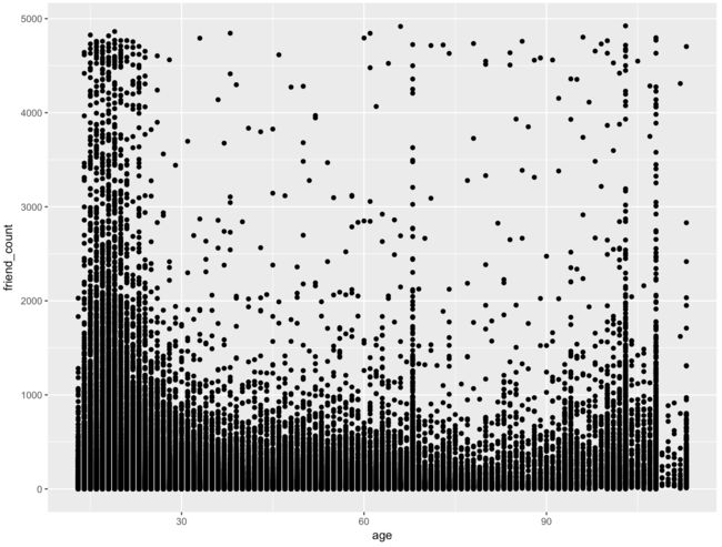
qplot(x = age, y = friend_count, data = pf)
qplot(age, friend_count, data = pf)

从上图中可以看出,年轻人有很多的朋友,很多的年轻人有几千个朋友,同时也看到一些不正常的现象,比如65岁左右也有那么多朋友,还有的人的年龄显示是超过100岁了,可能是年轻人谎报的年龄或者是假账号。
上面的散点图比较丑陋,我们准备改进,之前我们作图都是用qplot,现在我们要开始用ggplot作图了:
qplot(x = age, y = friend_count, data = pf)

与上面散点图等效的ggplot代码是:
ggplot(aes(x = age, y = friend_count), data = pf) + geom_point()
因为我们的X轴是age, 现在我们检查一下age的统计量
summary(pf$age)

看起来min值为13岁还是很合理的,但是最大年龄为113岁应该不真实。手工设置age的限制为13-90岁;同时,看到这些离散点,太大太重复,现在调成绘图:
3.2 Overplotting 过度绘制
在同一个地方有太多的点,即overplotted,运用alpha值来调整:
通常alpha值设置成1/20或者0.05
ggplot(aes(x = age, y = friend_count), data = pf) +
geom_point(alpha = 1/20) +
xlim(13, 90)

或者,我们也可以增加一些抖动jitter:
ggplot(aes(x = age, y = friend_count), data = pf) +
geom_jitter(alpha = 1/20) +
xlim(13, 90)

我们发现,增加抖动之后,20个点绘制成一个圆点,现在再来看,会发现年轻人其实绝大多数朋友数还是集中在1000以下。
3.3 coord_trans()
Coord_trans Solution
ggplot(aes(x = age, y = friend_count), data = pf) +
geom_point(alpha = 1/20) +
xlim(13, 90) +
coord_trans(y = 'sqrt')

可见,经过调整之后的散点图更加的清晰。
3.4 Alpha and Jitter Solution
Explore the relationship between friends initiated vs age.
研究年龄和朋友发起数之间的关系
Build up in layers
这是另外一种加上jitter的方法:
ggplot(aes(x = age, y = friendships_initiated), data = pf) +
geom_point(alpha = 1/10, position = 'jitter')

然而我们还是看到了很多值较大的点,现在考虑加上 coord_trans()进行调整:
同时,也考虑到某些用户的朋友发起数为0,如果0再开平方,然后再抖动,可能会抖动到某个很小的负数
为了解决这个问题,我们用jitter的position来调整:
ggplot(aes(x = age, y = friendships_initiated), data = pf) +
geom_jitter(alpha = 1/10, position = position_jitter(h = 0)) +
coord_trans(y = 'sqrt')

3.5 Conditional Means条件均值
install.packages('dplyr')
library(dplyr)
方法1:
age_groups <- group_by(pf, age)
pf.fc_by_age <- summarise(age_groups,
friend_count_mean = mean(friend_count),
friend_count_median = median(friend_count),
n = n())
pf.fc_by_age <- arrange(pf.fc_by_age, age)
head(pf.fc_by_age)

方法2:以下代码达到同样的效果:
pf.fc_by_age <- pf %.%
group_by(age) %.%
summarise(friend_count_mean = mean(friend_count),
friend_count_median = median(friend_count),
n = n()) %.%
arrange(age)
head(pf.fc_by_age, 20)

3.6 Conditional Means Solution
ggplot(aes(age, friend_count_mean), data = pf.fc_by_age) +
geom_point()

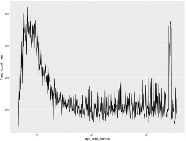
可以用线图来改善:
ggplot(aes(age, friend_count_mean), data = pf.fc_by_age) +
geom_line()

可见,年轻人的朋友数还是相当多的,30-60岁的用户朋友数量较小大都在100个左右徘徊,90岁以上的朋友数波动较大。
3.7 Overlaying Summarises with Raw Data Solution
将摘要与原始数据叠加:
original plot:
ggplot(aes(x = age, y = friend_count), data = pf) +
xlim(13, 90) +
geom_point(alpha = 0.05,
position = position_jitter(h = 0),
color = 'orange')

加上摘要值:
ggplot(aes(x = age, y = friend_count), data = pf) +
xlim(13, 90) +
geom_point(alpha = 0.05,
         position = position_jitter(h = 0),
         color = 'orange') +
coord_trans(y = 'sqrt') +
geom_line(stat = 'summary', fun.y = mean) +
geom_line(stat = 'summary', fun.y = quantile, fun.args = list(probs = .1),
linetype = 2, color = 'blue') +
geom_line(stat = 'summary', fun.y = quantile, fun.args = list(probs = .5),
color = 'blue') +
geom_line(stat = 'summary', fun.y = quantile, fun.args = list(probs = .9),
linetype = 2, color = 'blue')
通过上图,我们发现用户数多于1000个的真的是太少了,即便年轻人,达到1000个以上也已经peak值了。90%的人的朋友数都是少于1000个的。
接下来使用coord_cartesian图层来放大这个图形:
ggplot(aes(x = age, y = friend_count), data = pf) +
coord_cartesian(xlim = c(13, 70), ylim = c(0, 1000)) +
geom_point(alpha = 0.05,
position = position_jitter(h = 0),
color = 'orange') +
coord_trans(y = 'sqrt') +
geom_line(stat = 'summary', fun.y = mean) +
geom_line(stat = 'summary', fun.y = quantile, fun.args = list(probs = .1),
linetype = 2, color = 'blue') +
geom_line(stat = 'summary', fun.y = quantile, fun.args = list(probs = .5),
color = 'blue') +
geom_line(stat = 'summary', fun.y = quantile, fun.args = list(probs = .9),
linetype = 2, color = 'blue')
3.8 Correlation相关性
What is the correlation between age and friend count? Round to three decimal places.
?cor.test
我们目前选择使用pearson相关性:
方法1:
cor.test(pf$age, pf$friend_count)
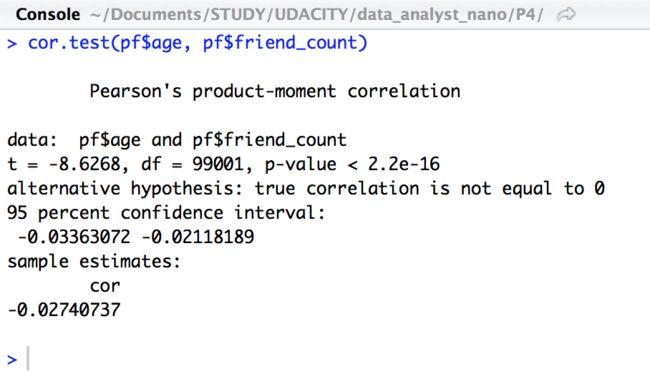
可见,两个变量之间并没有实质的关系
相关性:0.3以下没有或者很小,0.5中等,0.7较大
方法2:
with(pf, cor.test(age, friend_count, method = 'pearson'))

3.9 Correlation on Subsets 子集的相关性
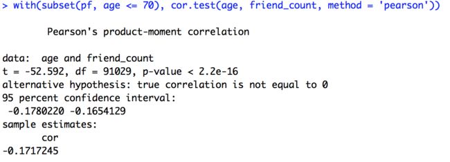
只看小于70岁以下的用户的情况
with(subset(pf, age <= 70), cor.test(age, friend_count, method = 'pearson'))
以下不指定method的话,效果等价,因为cor.test()默认就是pearson
with(subset(pf, age <= 70), cor.test(age, friend_count))

从得到的结果中,发现,相关性系数和之前的完全不同了
可见,我们的图形并不具有单调性,
我们用spearman方法专门去看单调性的问题,
with(subset(pf, age <= 70), cor.test(age, friend_count,
method = 'spearman'))

- 我们发现spearman相关系数和之前计算出来的pearson系数完全不一样的值
- 像这样的单个数字的系数是有用的,但是不能替代观察散点图以及计算条件汇总
- 通过观察这类散点图,比如这个friend_count与年龄的关系,我们可以获得更深入的理解
3.10 练习任务:创建散点图:
likes_received与www_likes_received之间的散点图:
summary(pf$likes_received)

ggplot(aes(x = likes_received, y = www_likes_received), data = pf) +
geom_point()

也可以两者互换作为x,y轴:
ggplot(aes(x = www_likes_received, y = likes_received), data = pf) +
xlim(0, 1000) +
ylim(0, 1000) +
geom_point()

我们来调整一下原图,让视野更清晰,只看95%内的:
ggplot(aes(x = www_likes_received, y = likes_received), data = pf) +
geom_point() +
xlim(0, quantile(pf$www_likes_received, 0.95)) +
ylim(0, quantile(pf$likes_received, 0.95))

通过添加smoother来观察:
ggplot(aes(x = www_likes_received, y = likes_received), data = pf) +
geom_point() +
xlim(0, quantile(pf$www_likes_received, 0.95)) +
ylim(0, quantile(pf$likes_received, 0.95)) +
geom_smooth(method = 'lm', color = 'red')

再来查一下这2个变量之间的相关系数:
cor.test(pf$www_likes_received, pf$likes_received)

具有强相关,相关系数高达0.948
3.11 More Caution with Correlation相关系数的更多注意事项
library(alr3)
data(Mitchell)
?Mitchell
summary(Mitchell)

Mitchell是关于某地区的土地温度的记录
创造temp和month之间的散点图:
噪音散点图Noisy scatter plot
ggplot(aes(x = Month, y = Temp), data = Mitchell) +
geom_point()

同样的图也可以通过qplot来创建:
qplot(data = Mitchell, Month, Temp)

来查一下Temp和Month之间的相关系数:
cor.test(Mitchell$Month, Mitchell$Temp)

结果为0.0575,非常小
Making Sense of Data Solution
考虑将月份1-12月做出来,而不是像原始数据那样一直追加
那样的话,我们需要加入一个层:
range(Mitchell$Month)
得到203
ggplot(aes(x = Month, y = Temp), data = Mitchell) +
geom_point() +
scale_x_continuous(breaks = seq(0, 203, 12))

调整后的图形略有改善。
看起来,图形的像是sin/cos的图形。
3.12 Understanding Noise: Age to Age Months Solution
了解噪声:年龄到月龄
pf$age_with_months <- pf$age + (12 - pf$dob_month) / 12
My task:创建一个新的data frame called pf.fc_by_age_months
age_month_groups <- group_by(pf, age_with_months)
pf.fc_by_age_months <- summarise(age_month_groups,
friend_count_mean = mean(friend_count),
friend_count_median = median(friend_count),
n = n())
pf.fc_by_age_months <- arrange(pf.fc_by_age_months, age_with_months)
head(pf.fc_by_age_months)

Noise in Conditional Means Solution 无平滑条件均值
ggplot(aes(x = age_with_months, y = friend_count_mean),
data = subset(pf.fc_by_age_months, age_with_months < 71)) +
geom_line()

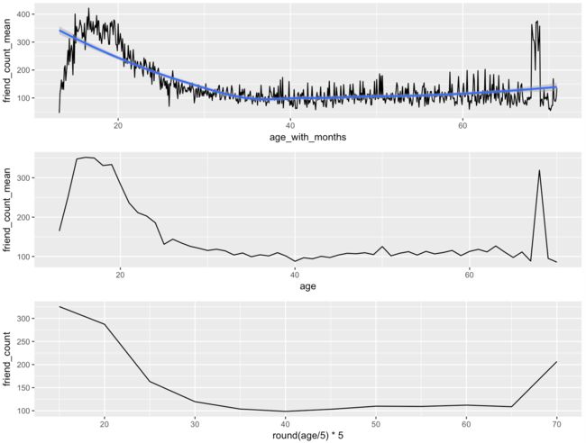
Smoothing Conditional Means 平滑条件均值
p1 <- ggplot(aes(x = age, y = friend_count_mean),
data = subset(pf.fc_by_age, age < 71)) +
geom_line()

p2 <- ggplot(aes(x = age_with_months, y = friend_count_mean),
data = subset(pf.fc_by_age_months, age_with_months < 71)) +
geom_line()
好好地观察一下这两幅图,把它们放在一起看:
library(gridExtra)
grid.arrange(p2, p1, ncol = 1)

可见,上图具有的噪音比较大,如何降低噪音呢?
用四舍五入的办法取整
p3 <- ggplot(aes(x = round(age / 5) * 5, y = friend_count),
data = subset(pf, age < 71)) +
geom_line(stat = 'summary', fun.y = mean)

grid.arrange(p2, p1, p3, ncol = 1)
可见,最后一张图更平滑,但是同时也损失掉一些信息
R中自动带有平滑function
接下来给p1, p2加上smoother 默认的平滑器
p1 <- ggplot(aes(x = age, y = friend_count_mean),
data = subset(pf.fc_by_age, age < 71)) +
geom_line() +
geom_smooth()
p2 <- ggplot(aes(x = age_with_months, y = friend_count_mean),
data = subset(pf.fc_by_age_months, age_with_months < 71)) +
geom_line() +
geom_smooth()
回顾(Review):
- 截至目前为止,我们学习了散点图, 条件平均和相关系数, 平滑器,怎样减少重叠(用jitter)
- Scatter plots, Conditional means, Correlation coefficient, Geom smoother, Jitter and Alpha
author: 快乐自由拉菲犬Celine Zhang