WPF系列-CheckBox
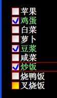
自定义样式1
效果:
代码:
        <!--

            CheckBox的样式

        -->

        <Style TargetType="{x:Type CheckBox}">

            <Setter Property="OverridesDefaultStyle" Value="True"/>

            <Setter Property="FocusVisualStyle" Value="{StaticResource FocusStyle}"/>

            <Setter Property="SnapsToDevicePixels" Value="True"/>

            <Setter Property="Foreground" Value="White"/>

            <Setter Property="FontSize" Value="16"/>

            <Setter Property="Template">

                <Setter.Value>

                    <ControlTemplate TargetType="{x:Type CheckBox}">

                        <BulletDecorator FlowDirection="LeftToRight" VerticalAlignment="Center">

                            <BulletDecorator.Bullet>

                                <Border x:Name="bd"

                                        BorderThickness="1"

                                        BorderBrush="Red"

                                        MinHeight="15"

                                        MinWidth="15"

                                        VerticalAlignment="Center">

                                    <Border.Background>

                                        <LinearGradientBrush StartPoint="0,0"

                                                             EndPoint="1,1">

                                            <GradientStop Color="LightGray" Offset="0.2"/>

                                            <GradientStop Color="White" Offset="1"/>

                                        </LinearGradientBrush>

                                    </Border.Background>

                                    <Path x:Name="cp" Width="12" Height="12"

                                          Stroke="Blue"

                                          StrokeThickness="3"/>

                                </Border>

                            </BulletDecorator.Bullet>

                            <ContentPresenter Margin="2,0"/>

                        </BulletDecorator>

                        <!--

                            控件触发器

                        -->

                        <ControlTemplate.Triggers>

                            <Trigger Property="IsChecked" Value="True">

                                <!-- 画上一个勾 -->

                                <Setter TargetName="cp" Property="Data"

                                        Value="M 0,6 L 6,12 12,0"/>

                                <Setter Property="Foreground" Value="LightGreen"/>

                            </Trigger>

                            <Trigger Property="IsMouseOver" Value="True">

                                <Setter TargetName="bd" Property="Background">

                                    <Setter.Value>

                                        <LinearGradientBrush StartPoint="0,0" EndPoint="1,1">

                                            <GradientStop Color="Orange" Offset="0.12"/>

                                            <GradientStop Color="Yellow" Offset="0.92"/>

                                        </LinearGradientBrush>

                                    </Setter.Value>

                                </Setter>

                            </Trigger>

                        </ControlTemplate.Triggers>

                    </ControlTemplate>

                </Setter.Value>

            </Setter>

        </Style>
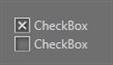
自定义样式2
效果:
代码:
<Style TargetType="CheckBox">

            <Setter Property="SnapsToDevicePixels" Value="False" />

            <Setter Property="OverridesDefaultStyle" Value="true" />

            <Setter Property="FocusVisualStyle" Value="{x:Null}" />

            <Setter Property="BorderBrush" Value="LightGray" />

            <Setter Property="Template">

                <Setter.Value>

                    <ControlTemplate TargetType="CheckBox">

                        <BulletDecorator Background="Transparent">

                            <BulletDecorator.Bullet>

                                <Border x:Name="Border"

                                        Width="15"

                                        Height="15"

                                        Background="{TemplateBinding Background}"

                                        BorderBrush="{TemplateBinding BorderBrush}"

                                        BorderThickness="1"

                                        ClipToBounds="True">

                                    <Border.Effect>

                                        <DropShadowEffect BlurRadius="5" ShadowDepth="2" />

                                    </Border.Effect>

                                    <Path x:Name="CheckMark"

                                          Width="8"

                                          Height="8"

                                          HorizontalAlignment="Center"

                                          VerticalAlignment="Center"

                                          Data="M 0 0 L 8 8 M 0 8 L 8 0"

                                          Stretch="Fill"

                                          Stroke="LightGray"

                                          StrokeEndLineCap="Round"

                                          StrokeStartLineCap="Round"

                                          StrokeThickness="2" />

                                </Border>

                            </BulletDecorator.Bullet>

                            <ContentPresenter Margin="4,0,0,0"

                                              HorizontalAlignment="Left"

                                              VerticalAlignment="Center"

                                              RecognizesAccessKey="True" />

                        </BulletDecorator>

                        <ControlTemplate.Triggers>

                            <Trigger Property="IsChecked" Value="false">

                                <Setter TargetName="CheckMark" Property="Visibility" Value="Collapsed" />

                            </Trigger>

                            <Trigger Property="IsFocused" Value="true">

                                <Setter Property="BorderBrush" Value="White" />

                            </Trigger>

                            <Trigger Property="IsEnabled" Value="false">

                                <Setter Property="BorderBrush" Value="Gray" />

                                <Setter TargetName="CheckMark" Property="Stroke" Value="Gray" />

                            </Trigger>

                        </ControlTemplate.Triggers>

                    </ControlTemplate>

                </Setter.Value>

            </Setter>

        </Style>