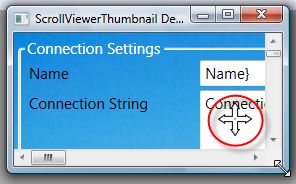
Controllerizing the ScrollViewer Thumbnail
In the last post we created a ScrollViewer Thumbnail feature using a just a bit of Xaml and databinding magic.
Since it's a pretty useful feature, it makes sense to 'Controllerize' it and make it more reusable. Originally, I was just planning to do this using a UserControl as this is a very lightweight way to Controllerize a bit of Xaml. However, creating a full custom control isn't much harder so it makes sense go that route.
We need to add a bunch of files to our new class library to get this started. First, we need a simple class that inherits from Control
public class ScrollViewerThumbnail : Control
{
static ScrollViewerThumbnail()
{
DefaultStyleKeyProperty.OverrideMetadata(typeof(ScrollViewerThumbnail), newFrameworkPropertyMetadata(typeof(ScrollViewerThumbnail)));
}
public ScrollViewer ScrollViewer
{
get { return (ScrollViewer)GetValue(ScrollViewerProperty); }
set { SetValue(ScrollViewerProperty, value); }
}
// Using a DependencyProperty as the backing store for ScrollViewer. This enables animation, styling, binding, etc...
public static readonly DependencyProperty ScrollViewerProperty =
DependencyProperty.Register("ScrollViewer", typeof(ScrollViewer), typeof(ScrollViewerThumbnail), newUIPropertyMetadata(null));
}
There's only two things going on in there. One is a new dependency property of type ScollViewer. We'll use this to specify the ScrollViewer whose content we should thumbnail. The other part is a static constructor that overrides the default style key so we can find our default template.
Next, we need a Generic.xaml file that should sit inside a 'Themes' folder:

Note: the Generic.xaml file's build action must be set to Page in the properties panel.
And here's the contents of our Generic.xaml file - it's just a resource dictionary with a single style that targets our ScrollViewerThumbnail type.
<ResourceDictionary
xmlns="http://schemas.microsoft.com/winfx/2006/xaml/presentation"
xmlns:x="http://schemas.microsoft.com/winfx/2006/xaml"
xmlns:Controls="clr-namespace:TheJoyOfCode.Wpf.Controls">
<Style TargetType="{x:Type Controls:ScrollViewerThumbnail}">
<Setter Property="Template">
<Setter.Value>
<ControlTemplate TargetType="{x:Type Controls:ScrollViewerThumbnail}">
<Viewbox DataContext="{TemplateBinding ScrollViewer}" Stretch="Uniform">
<Grid>
<Rectangle
Width="{Binding Content.ActualWidth}"
Height="{Binding Content.ActualHeight}">
<Rectangle.Fill>
<VisualBrush Visual="{Binding Content}" />
</Rectangle.Fill>
</Rectangle>
<Border
Background="{TemplateBinding HighlightFill}"
Width="{Binding ViewportWidth}"
Height="{Binding ViewportHeight}"
HorizontalAlignment="Left"
VerticalAlignment="Top">
<Border.RenderTransform>
<TranslateTransform
X="{Binding HorizontalOffset}"
Y="{Binding VerticalOffset}" />
</Border.RenderTransform>
</Border>
</Grid>
</Viewbox>
</ControlTemplate>
</Setter.Value>
</Setter>
</Style>
</ResourceDictionary>
This style has only one Setter that sets the Template of the control to a new ControlTemplate. From then on the xaml (inside the ControlTemplate) is almost identical to the previous example with two notable differences.
1. The DataContext of the Viewbox is now a TemplateBinding instead of a normal binding. This directly targets the ScrollViewer dependency property we created earlier.
2. The Background of the highlight is also a TemplateBinding that uses the HighlightFill property of our ScrollViewerThumbnail. Mmmm, but we didn't have a HighlightFill property. We better create that now (inside the ScrollViewerThumbnail class):
public Brush HighlightFill
{
get { return (Brush)GetValue(HighlightFillProperty); }
set { SetValue(HighlightFillProperty, value); }
}
public static readonly DependencyProperty HighlightFillProperty =
DependencyProperty.Register("HighlightFill",
typeof(Brush),
typeof(ScrollViewerThumbnail),
new UIPropertyMetadata(new SolidColorBrush(Color.FromArgb(128,255,255,0))));
Done. Notice that we specified a default fill of transparent yellow. Cool.
We're almost done. One really important last thing: You must add the following code to your assemblyinfo.cs file so WPF knows where to go looking for our default template:
[assembly: ThemeInfo(
ResourceDictionaryLocation.None, //where theme specific resource dictionaries are located
//(used if a resource is not found in the page,
// or application resource dictionaries)
ResourceDictionaryLocation.SourceAssembly //where the generic resource dictionary is located
//(used if a resource is not found in the page,
// app, or any theme specific resource dictionaries)
)]
Using the new ScrollViewerThumbnail control
... couldn't be easier!
<Grid>
<ScrollViewer x:Name="scrollViewer" HorizontalScrollBarVisibility="Auto">
<!-- Your ScrollViewer content here as normal -->
</ScrollViewer>
<Controls:ScrollViewerThumbnail ScrollViewer="{Binding ElementName=scrollViewer}"
Width="150" Height="150"
HorizontalAlignment="Right" VerticalAlignment="Bottom"
Margin="10" />
</Grid>
We just bind the ScrollViewer proprety of the ScrollViewerThumbnail to a ScrollViewer. Done.
Next we'll look at making the ScrollViewerThumbnail interactive.
=============================================================================
In the last post we took the simple ScrollViewer thumbnail and controllerized it. This time, we're going to make it interactive.
And, because WPF totally rocks, it's stupidly easy to do.
Normally, we'd do lots of mouse capture, remember the original location and the new location to calculate the delta etc etc. With WPF, we can simply use the Thumb control that fires a DragDelta event if the user makes a drag gesture over the control. Huzzah.
So, we need to quickly change the ScrollViewerThumbnail's template in Generic.xaml to look like this:
<ControlTemplate TargetType="{x:Type Controls:ScrollViewerThumbnail}">
<Viewbox DataContext="{TemplateBinding ScrollViewer}" Stretch="Uniform">
<Grid>
<Rectangle
Width="{Binding Content.ActualWidth}"
Height="{Binding Content.ActualHeight}">
<Rectangle.Fill>
<VisualBrush Visual="{Binding Content}" />
</Rectangle.Fill>
</Rectangle>
<Thumb Name="PART_Highlight"
Background="{TemplateBinding HighlightFill}"
Width="{Binding ViewportWidth}"
Height="{Binding ViewportHeight}"
HorizontalAlignment="Left"
VerticalAlignment="Top">
<Thumb.RenderTransform>
<TranslateTransform
X="{Binding HorizontalOffset}"
Y="{Binding VerticalOffset}" />
</Thumb.RenderTransform>
<Thumb.Template>
<ControlTemplate TargetType="Thumb">
<Border Background="{TemplateBinding Background}" />
</ControlTemplate>
</Thumb.Template>
</Thumb>
</Grid>
</Viewbox>
</ControlTemplate>
Note that we've changed the highlight from a Border to a Thumb. We've named it PART_Highlight and I've given the thumb a ControlTemplate that is a simple Border (Thumbs can't have content).
Next, we need to find the PART_Highlight in our ScrollViewerThumbnail template and attach a handler to it's DragDelta event. We can't just use this.FindName("PART_Highlight") because it's part of a template. We have to override the OnApplyTemplate method of the ScrollViewerThumbnail class and use this.Template.FindName("PART_Highlight"):
private const string PART_Highlight = "PART_Highlight";
public override void OnApplyTemplate()
{
base.OnApplyTemplate();
var partHighlight = (Thumb)this.Template.FindName(PART_Highlight, this);
partHighlight.DragDelta += partHighlight_DragDelta;
}
Next, we need to move the ScrollViewer when the DragDelta event occurs.
void partHighlight_DragDelta(object sender, DragDeltaEventArgs e)
{
ScrollViewer.ScrollToVerticalOffset(ScrollViewer.VerticalOffset + e.VerticalChange);
ScrollViewer.ScrollToHorizontalOffset(ScrollViewer.HorizontalOffset + e.HorizontalChange);
}
And we're done. Seriously! I'm blown away that this can be achieved with just four-ish lines of code.

Just click on the Arrows icon to display a popup showing the ScrollViewer thumbnail.
PS - you can use the mouse wheel to change the size of the ScrollViewerThumbnail control too.