The automobile industry is the pillar industry of the national economy. Since the reform and opening up, China's automotive output has been continuously rising. After joining the World Trade Organization, more foreign companies chose to enter the Chinese automotive market and occupied most of the market with great advantages.
Judging from the changes in China's automotive consumption in recent years, automotive consumption has gradually become a consumer hot spot. According to the annual statistics of the National Bureau of Statistics of the People's Republic of China, the number of private cars in China continues to grow. In 2016, the number of private cars in China reached 163.30 million units, a year-on-year increase of 15.8%. In 1997, the number of private cars in China was only 3.58 million units, a cumulative increase of 159.72 million units in 20 years, and the growth rate reached a staggering 45.6 times. (Figure 1)
Since the 1997-2001 data in China's private car ownership data is incomplete, filter out relevant data for 2002-2016, and readjust formatting and typesetting.
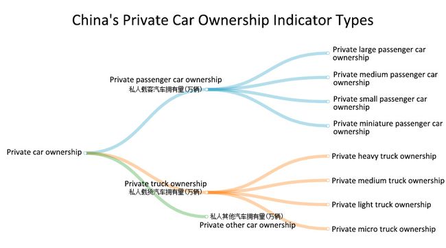
Among the data (Figure 2), the indicators of private car ownership is composed of the number of private passenger car ownership, private truck ownership, and private other car ownership. The number of private passenger car ownership is divided into the number of private large, medium, small and mini car ownership. The number of private truck ownership is divided into the number of private heavy, medium, light and micro truck ownership. Below, I will discuss several research issues through the data on China's private car ownership in 2002-2016:
1. Data visualization steps:
(1) First of all, we need to clarify the issue that need to be studied. The data set contains a lot of data, it is not possible to compare all the data together. We need to filter out useful data and specify which data to graph. We cannot draw multiple variables of different types in a single graph.
(2) After confirming the visualization goal, the next step is to establish a basic graph. It may be a pie chart, a line chart, a scatter chart, a map, a network diagram, etc. When clarifying the core information of the chart, the following points should be considered:
▪ What variables do I need to draw?
▪ What the X and Y axes represent?
▪ What is the meaning of the data point size?
▪ What is the meaning of color?
▪ Need to determine whether there is a trend or a relationship between time.
For example, a line chart is best suited to show the trend of a variable versus time, or the potential relationship between two variables. When the number of data points in a data set is excessive, visualization using a scatter plot is more aesthetically pleasing.
(3) To determine the most informative indicators, the most critical step in the visualization process is to fully understand the meaning of the database and each variable, and it is necessary to select the indicators in the data set that best provide readers with information.
(4) Select the correct chart type and apply the most suitable icon type to the selected indicator.
(5) Focus attention on key information. Some data are similar. It is difficult to see the difference when viewing the chart. At this time, you can help readers identify key information by adding auxiliary lines, adding data labels, or changing the color of shapes.
2. Various approaches in information design and visualization:
Traditional methods of data visualization include tables, histograms, scatter plots, line charts, bar charts, pie charts, area charts, flowcharts, bubble charts, etc., as well as multiple data series or combinations of charts, such as timelines, Venn diagrams, data flow diagram, entity relationship diagram and so on. These traditional visualizations are often used for the opening of business analysis and government data. In addition, there are parallel coordinates, tree diagrams, cone-shaped tree diagrams, word clouds, etc.
Visualization is not just static but it should be interactive. Interactive visualizations can be outlined in detail using methods such as zooming. It has the following steps:
▪ Select: Interactively select the data entity or the complete data set and its subset based on the user's interest.
▪ Links: Find useful information in multiple views.
▪ Filtering: Help the user to adjust the amount of information displayed, reduce the amount of information, and focus on the information that the user is interested in.
▪ Rearrangement or remapping: Spatial layout is the most important visual mapping, and the spatial layout of the rearranged information is very effective for generating different insights.
3. Sketches of the visualization:
In China’s 2002-2016 private car ownership data I selected, different levels of charts were drawn based on the classification of private car ownership.
In figure 3, the polyline in the chart represents the growth trend of China's private car ownership from 2002 to 2016. The three types of car ownership are all represented by columns, it can be seen that the number of yellow columns are the largest, its growth is the most obvious, and the growth rate and quantity are consistent with the total private car ownership.
In figure 4, among the four types of private passenger cars, private small cars have been the most in possession and have grown year by year, while the other three types of private passenger cars do not dominate the mainstream, and the number of possessions has declined year by year.
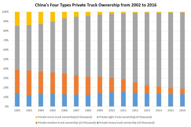
In figure 5, among the four types of private trucks, private light trucks occupy the main position, and the number of possessions has increased year by year. The number of private heavy trucks remain basically the same. The number of medium trucks and micro trucks decreased year by year.
According to figure 6, the sector diagram, the number of private passenger car ownership in China accounted for 90% of the total in 2016, while the combined of the number of private truck ownership and other car ownership amounts to less than 10%.
4. Description of the technical aspects of this project:
In this data visualization project, I mainly used dydata and excel. I first screened and reformatted valid data through excel and then plotted it with dydata and excel. The pictograms, tree diagrams, and mixed charts in the figure above are drawn by dydata, and histograms and pie charts are drawn by excel. Although dydata's chart type and appearance are more beautiful than excel's, it lacks data labels for many charts, while similar data requires data labels for readers to read better, so traditional charts of excel are as good as dydata.
5. Data visualization challenges I foresee:
Extensiveness and dynamic analysis are two of the most important challenges in data visualization. Due to my limited technology, my operations on data visualization are still in a static form, which makes readers and data less interactive.
In addition, the visualization results have the problem of information loss. Some visualizations are only for some data sets. At this time, only a part of the data sets can be reduced. This will result in the loss of information and information data.
Finally, there are problems with performance and efficiency. Although static visualization has almost no these two requirements, if you do dynamic data visualization, the complexity and dimensions of data will also increase. This requires the visualization software to have high performance and high efficiency requirements.
From:谢淑娟 网络与新媒体1502 20151302906


