所有特征在不同分类之间、 train和test之间的列分布差异(图形绘制)
代码来自:
https://www.kaggle.com/ragnar123/e-d-a-and-baseline-mix-lgbm
代码本身有bug,下面已经修正
----------所有特征在不同分类之间的概率分布差异---------------
代码如下:
def plot_feature_distribution(df1, df2, label1, label2, features):
    i = 0
    sns.set_style('whitegrid')
    plt.figure()
    fig, ax = plt.subplots(68,5,figsize=(18,220))#68行,每行6个图,因为总共有339个特征


    for feature in features:
        print("feature=",feature)
        i += 1
        plt.subplot(68,5,i)
        try:
            sns.kdeplot(np.log(df1[feature]), bw=0.5,label=label1)
            print("---------------------1------------------------------")
            sns.kdeplot(np.log(df2[feature]), bw=0.5,label=label2)
            print("---------------------2------------------------------")
            plt.xlabel(feature, fontsize=9)
            locs, labels = plt.xticks()
            plt.tick_params(axis='x', which='major', labelsize=6, pad=-6)
            plt.tick_params(axis='y', which='major', labelsize=6)
        except:
            print("特征%s绘制异常"%feature)
    print("绘制失败的特征有:",fail_list)
    plt.show();
V=["V"+f"{i+1}"for i in range(339)]
#下面是特征在train中关于isFraud=1,以及isFradu=0的分布
t0 = train[train['isFraud']==0]
t1 = train[train['isFraud']==1]
first = V[0:339]
print("first=",first)
plot_feature_distribution(t0, t1, '0', '1', first)
运行结果为:
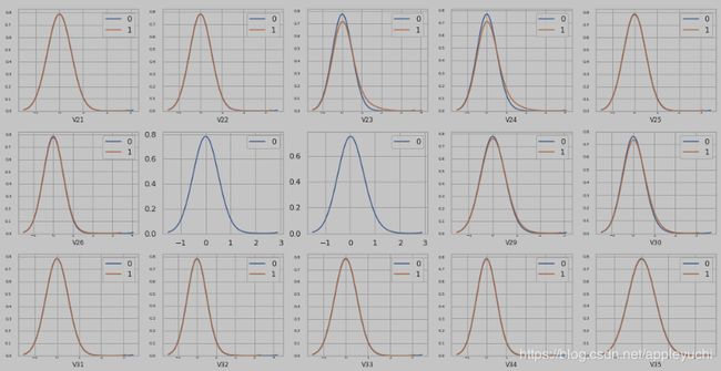
这面这个图总共有339个子图,但是因为csdn对图片大小有限制,所以这里只截图一小部分。
339个V特征中, V27,V28,V68,V89绘制失败(和特征取值有关)
----------所有特征在train和test之间的概率分布差异-----------------------
然后,依然使用上面的plot_feature_distribution,我们改下入口参数:
t0 = train
t1 = test

first = V[0:339]
print("first=",first)
plot_feature_distribution(t0, t1, 'train', 'test', first)
得到结果为:
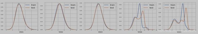
同样的,有339个子图,由于csdn的上传图片大小限制,所以这里只截取了一小部分
######################补充#############################
上面的图都比较小,所以来个大图绘制代码,但是大图绘制代码不能把339个特征全部放入到一张图中。
代码如下:
def plot_feature_one(train,test,feature,log,fail_list):
    pass
    df1_0 = train[train['isFraud']==0]
    df1_1 = train[train['isFraud']==1]
    fig, (ax1, ax2) = plt.subplots(2,1, figsize=(13,9))


#不同分类值之间,观测概率分布的不同
    try:
        if log == True:
            sns.kdeplot(np.log(df1_0[feature]), bw=0.001,shade = True, label = 'Not Fraud', ax = ax1)
            sns.kdeplot(np.log(df1_1[feature]), bw=0.001,shade = True, label = 'Fraud', ax = ax1)

            ax1.set_title(feature)
            plt.title(feature,fontsize='large',fontweight='bold')
        else:

            sns.kdeplot(df1_0[feature], bw=0.001,shade = True, label = 'Not Fraud', ax = ax1)
            sns.kdeplot(df1_1[feature], bw=0.001,shade = True, label = 'Fraud', ax = ax1)

            ax1.set_title(feature)
            plt.title(feature,fontsize='large',fontweight='bold')
    except:
        fail_list.append(feature)


#在train和test之间,观测概率分布的不同
    try:
        if log == True:
            sns.kdeplot(np.log(train[feature]),bw=0.001, shade = True, label = 'Train', ax = ax2)
            sns.kdeplot(np.log(test[feature]),bw=0.001, shade = True, label = 'Test', ax = ax2)
            ax2.set_title(feature)
            plt.title(feature,fontsize='large',fontweight='bold')
        else:
            sns.kdeplot(train[feature], bw=0.001,shade = True, label = 'Train', ax = ax2)
            sns.kdeplot(test[feature], bw=0.001,shade = True, label = 'Test', ax = ax2)
            ax2.set_title(feature)
            plt.title(feature,fontsize='large',fontweight='bold')
    except:
        fail_list.append(feature)


    plt.show();
V=["V"+f"{i+1}"for i in range(339)]
fail_list=[]
for feature in V[0:339]:
    print(feature)
    plot_feature_one(train,test,feature,True,fail_list)