QML ListView中section分组属性的基本使用,以及设计一个分组导航
1.看文档
QML中的ListView提供了一组section属性,可以看作是对Model内容的分组/分节展示。根据文档,section有四个属性:
section.property
该属性指定了以Model Item的哪个属性来进行分组;
section.criteria
该属性有两个枚举值:
ViewSection.FullString(默认值):根据section.property对应的字符串值分组
ViewSection.FirstCharacter:根据section.property对应的字符串首字母分组(不区分大小写)
section.delegate
相当于分组的标题Item,默认堆叠顺序2;
section.labelPositioning
确定当前和/或下一分组是否粘贴到视图的开始/结束,以及标签是否以行内显示。该值可以是以下各项的组合:
ViewSection.InlineLabels(默认值):section delegate像普通的item一样嵌入在对应分组最前方
ViewSection.CurrentLabelAtStart:当前section的delegate会粘连在View的顶部,其他的section delegate不显示
ViewSection.NextLabelAtEnd:下一个section delegate粘连在View末尾
列表中的每个Item都有附加命名属性ListView.section,ListView.previousSection和ListView.nextSection。
如果一个section穿插在Model的不同位置,ListView不会将一个分组内的元素放到一起,而是会显示多个相同的section,所以我们需要提前根据section排序好。也可以嵌套多个ListView来展示每个分组的内容。
2.简单的section应用

import QtQuick 2.12
import QtQuick.Controls 2.12

//ListView导航页
ListView {
    id: control

    //表头
    header: Rectangle{
        width: ListView.view.width
        height: 35
        color: "black"
        //标题
        Text {
            anchors.centerIn: parent
            text: "Item Count: "+control.count
            color: "white"
        }
    }

    //选项
    delegate: Rectangle{
        id: item
        width: ListView.view.width
        height: 35
        color: mousearea.containsMouse?"gray":"white"
        //底部横线
        Rectangle{
            anchors.bottom: parent.bottom
            width: parent.width
            height: 1
            color: "black"
        }
        //左侧黑方块表示选中
        Rectangle{
            height: parent.height
            width: 10
            color: "black"
            visible: item.ListView.isCurrentItem
        }
        //文本内容
        Text {
            anchors.centerIn: parent
            text: name //对应model的name属性
        }
        MouseArea{
            id: mousearea
            hoverEnabled: true
            anchors.fill: parent
            onClicked: {
                control.currentIndex=index
            }
        }
    }

    //分组/分节
    section{
        //以哪个属性分组
        property: "group"
        //可以指定为完全字符串匹配或者首字母匹配
        criteria: ViewSection.FullString
        //分组标题
        delegate: Rectangle{
            width: ListView.view.width
            height: 35
            color: Qt.rgba(0.3,0.3,0.3,1.0)
            //底部横线
            Rectangle{
                anchors.bottom: parent.bottom
                width: parent.width
                height: 1
                color: "black"
            }
            //文本内容
            Text {
                anchors.centerIn: parent
                text: section //对应section.property指定的字段
                color: "white"
            }
        }
        //位置
        labelPositioning: ViewSection.InlineLabels
    }

    //有焦点时才能按键切换
    focus: true
    //竖向滚动条
    ScrollBar.vertical: ScrollBar{}

    //数据
    model: ListModel{
        ListElement{ group:"A"; name:"1"; }
        ListElement{ group:"A"; name:"2"; }
        ListElement{ group:"A"; name:"3"; }
        ListElement{ group:"B"; name:"1"; }
        ListElement{ group:"B"; name:"2"; }
        ListElement{ group:"C"; name:"1"; }
    }
}
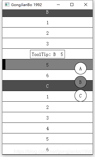
3.增加分组导航
如果选项过多,就可以增加导航了,这里设计了一个简单的导航条。感觉嵌套ListView来展示分组子项的话,导航更好做点,因为一级ModelItem本来就是分组项,直接拿来做导航的Model就行了。在ListView接口中没看到有返回section列表的,所以我就自己遍历了一遍Model。
参考:https://blog.csdn.net/shado_walker/article/details/61202539
import QtQuick 2.12
import QtQuick.Controls 2.12

//ListView导航页
ListView {
    id: control

    //在item初始化时填充
    //分组列表
    property var groupList: []
    //分组列表对应的一个item的index
    property var indexList: []

    //表头
    header: Rectangle{
        width: ListView.view.width
        height: 35
        color: "black"
        //标题
        Text {
            anchors.centerIn: parent
            text: "Item Count: "+control.count
            color: "white"
        }
    }

    //选项
    delegate: Rectangle{
        id: item
        width: ListView.view.width
        height: 35
        color: mousearea.containsMouse?"gray":"white"
        //底部横线
        Rectangle{
            anchors.bottom: parent.bottom
            width: parent.width
            height: 1
            color: "black"
        }
        //左侧黑方块表示选中
        Rectangle{
            height: parent.height
            width: 10
            color: "black"
            visible: item.ListView.isCurrentItem
        }
        //文本内容
        Text {
            anchors.centerIn: parent
            text: name //对应model的name属性
        }
        MouseArea{
            id: mousearea
            hoverEnabled: true
            anchors.fill: parent
            onClicked: {
                control.currentIndex=index
            }
        }
        ToolTip.text: "ToolTip: "+group+"  "+name
        ToolTip.visible: mousearea.containsMouse
        //在构建时填充导航栏的model
        Component.onCompleted: {
            if(control.groupList.length>0){ //与上一个section不一样就添加
                if(control.groupList[control.groupList.length-1]!==group){
                    control.groupList.push(group)
                    control.indexList.push(index)
                }
            }else{
                control.groupList.push(group)
                control.indexList.push(index)
            }
            if(index===control.count-1){
                //最后设置导航的model
                repeater.model=control.groupList
            }
        }
    }

    //分组/分节
    section{
        //以哪个属性分组
        property: "group"
        //可以指定为完全字符串匹配或者首字母匹配
        criteria: ViewSection.FullString
        //分组标题
        delegate: Rectangle{
            width: ListView.view.width
            height: 35
            color: Qt.rgba(0.3,0.3,0.3,1.0)
            //底部横线
            Rectangle{
                anchors.bottom: parent.bottom
                width: parent.width
                height: 1
                color: "black"
            }
            //文本内容
            Text {
                anchors.centerIn: parent
                text: section //对应section.property指定的字段
                color: "white"
            }
        }
        //位置
        labelPositioning: ViewSection.InlineLabels
    }

    //有焦点时才能按键切换
    focus: true
    //跟随当前项移动,默认为true
    highlightFollowsCurrentItem: true
    //竖向滚动条
    ScrollBar.vertical: ScrollBar{}

    Column{
        anchors.right: parent.right
        anchors.verticalCenter: parent.verticalCenter
        anchors.rightMargin: 20
        spacing: 5
        //最简单的还是listview两级嵌套,第一级为分组,第二级为item
        //这里只是玩下
        Repeater{
            id: repeater
            //初始为空,在构建完后设置
            //model: control.groupList
            delegate: Rectangle{
                width: 40
                height: 40
                color: control.currentSection===modelData?"gray":"white"
                border.color: "black"
                radius: 20
                Text {
                    anchors.centerIn: parent
                    text: modelData
                }
                MouseArea{
                    anchors.fill: parent
                    onClicked: {
                        control.positionViewAtIndex(control.indexList[index],ListView .Beginning)
                    }
                }
            }
        }
    }

    //数据
    model: ListModel{
        ListElement{ group:"A"; name:"1"; }
        ListElement{ group:"A"; name:"2"; }
        ListElement{ group:"A"; name:"3"; }
        ListElement{ group:"A"; name:"4"; }
        ListElement{ group:"A"; name:"5"; }
        ListElement{ group:"A"; name:"6"; }
        ListElement{ group:"B"; name:"1"; }
        ListElement{ group:"B"; name:"2"; }
        ListElement{ group:"B"; name:"3"; }
        ListElement{ group:"B"; name:"4"; }
        ListElement{ group:"B"; name:"5"; }
        ListElement{ group:"B"; name:"6"; }
        ListElement{ group:"C"; name:"1"; }
        ListElement{ group:"C"; name:"2"; }
        ListElement{ group:"C"; name:"3"; }
        ListElement{ group:"C"; name:"4"; }
        ListElement{ group:"C"; name:"5"; }
        ListElement{ group:"C"; name:"6"; }
        //ListElement{ group:"b"; name:"test"; }
    }
}