Accessibility Handbook
文章目录
- 1. Overall duty of all parties (for details please refer to the checklist)
- 1.1 Role: FE
- 1.2 Role: BE
- 1.3 Role: CE
- 1.4 Role: QA
- 2. Checklist
- 2.1 Checkpoint: Language
- 2.2 Checkpoint: Page Title
- 2.3 Checkpoint: Landmark
- 2.4 Checkpoint: Skip links
- 2.5 Checkpoint: Breadcrumb
- 2.6 Checkpoint: Heading
- 2.7 Checkpoint: Image
- 2.8 Checkpoint: Button
- 2.9 Checkpoint: Link
- 2.10 Checkpoint: List
- 2.11 Checkpoint: Carousel
- 2.12 Checkpoint: Tab Index
- 2.13 Checkpoint: Navigation
- 2.14 Checkpoint: Accordion
- 2.15 Checkpoint: Modal/Popup
- 2.16 Checkpoint: Outline
- 2.17 Checkpoint: Table
- 2.18 Checkpoint: Form
- 2.19 Checkpoint: Quote
- 2.20 Checkpoint: Reading order
- 2.21 Checkpoint: Unique Element ID
- 2.22 Checkpoint: Iframe
- 2.23 Checkpoint: Color contrast
- 2.24 Checkpoint: Select
By Joyce, Frank and Shirley
1. Overall duty of all parties (for details please refer to the checklist)
1.1 Role: FE
Implement the correct HTML and attributes, for dynamic parts, use a placeholder to make BE aware of the necessity of creating CMS fields or apply translations.
Use “#BE” as the placeholder text whenever the accessibility related content is dynamic:
image alt text e.g. 
aria-label e.g. Learn More
id and aria-controls e.g.
<h3>
  <button aria-controls="#BE1" id="#BE2" aria-expanded="true" class="Accordion-trigger">
    <span class="Accordion-title">
      Personal Information
      <span class="Accordion-icon">span>
    span>
  button>
h3>
<div id="#BE1" role="region" aria-labelledby="#BE2" class="Accordion-panel">
The placeholder can also be used in comments to make a more detailed explanation:
e.g.
A Jira ticket can be created to track integration issues between FE and BE
Never hardcode accessibility-related text without BE placeholder, otherwise, they will likely be neglected.
1.2 Role: BE
Once BE receive HTML from FE, search for all BE placeholders “#BE”, replace them with dynamic logic.
for any CMS fields, make CE aware of the necessity of populating the content. There should be something like a CMS manual to list all accessibility-related CMS fields to be provided to the CE.
others things to check (details can be found in the following checklist) :
headings (h1, h2, h3…) may need to be configurable in case they are in the flexible modules
external links can be configured correctly
when a list (ul or ol) contains only one item, it should be changed to div
the page title is dynamic, iframe titles are editable
1.3 Role: CE
CE should understand that accessibility-related content is usually not visible, but is as important as regular copy deck, hence we should actively chase the front office/client if it’s missing.
Before the dev work, CE should find out the aria-labels and alt texts which are needed from the design and ask the creative team to provide.
1.4 Role: QA
In order to conduct a complete test, QA needs to understand the knowledge of web accessibility to the same level as developers and then use Web Accessibility Checklist (Dev/Content/Design) and the following checklist to check the website. QA should do a search of the code for stray #BE etc tags before sending the pages to ADA for review.
2. Checklist
2.1 Checkpoint: Language
Solution
Make sure lang=“xx-xx” is specified with the “Html” tag
For any content within the page that are not in the page-wise language, it needs to be explicitly marked.
Example:
<html lang="en-US">
  ...
  <p>Hello Worldp>
  <span title="Spanish">
    <a lang="es" href="qa-html-language-declarations.es">Española>
  span>
  ...
<html>
Reference:
https://www.w3.org/International/questions/qa-html-language-declarations
Visual Examples
Language selection items should have corresponding lang attribute:
 Who should care
FE: use placeholder to tell BE if the language list needs to be dynamically populated.
BE: if the content in a foreign language is populated by BE logic, such as a dynamic language selection dropdown, make sure the lang attribute is specified for each language.
CE: For any content within the page that are not in the page-wise language, it needs to be explicitly marked with a lang attribute.
2.2 Checkpoint: Page Title
Solution
Best practice: the content in the title tag should match the content in the H1 tag.
Visual Examples

Who should care
FE: include page title as example in the HTML
BE: provide ways to input page title in CMS
CE: Provide a meaningful and unique title for each web page to enable users to identify the web page content.
2.3 Checkpoint: Landmark
Solution
-
Make sure all key landmarks exist:
-
for page header, it should not be nested in other landmarks like main
- can have multiple on a single page- can have one on a single page
(footer can represent the conteninfo role when its context is the body element.)
- for footer, as the tag is not supported in legacy browsers/ screen readers, we define both the contentinfo role and the tag as:
-
https://www.w3.org/TR/wai-aria-practices/examples/landmarks/contentinfo.html
- For landmark which appears multiple times on a page, use aria-label to mark them
for example, header nav, footer nav, and breadcrumbs
- When using the
Visual Examples
header landmark, should not be nested in main:

header landmark, should not be nested in main:
2.4 Checkpoint: Skip links
Solution
-
Skip links should be added for keyboard users to jump to main content and footer
-
They should be put at the beginning of the page, usually right after the opening
tag, and before navigation. -
They should be hidden by default (screen reader only style, not display: none) and display while focused through the keyboard tab key.
-
The skip link target should not be set font-size: 0; otherwise, the focus will not move on the target. (If the font size of HTML element has been set).
-
According to the TC-92 solution, the content of the skip link content can be reduced to avoid the situation where the screen reader is tuned to the anchor position to repeatedly read the content.
-
The wrapper element should be adding the attribute tabindex = “-1”, otherwise, the screen reader can’t read out the target’s value when the IOS environment.
Reason: This is caused by a bug in Android that stops the focus event from being triggered. Please refer here for details
https://www.nomensa.com/blog/2004/what-are-skip-links
<body>
  <div class="skip-links-nav">
    <a class="l-offscreen" href="#kp-main">
      Skip to page main content
    a>
    <a class="l-offscreen" href="#kp-footer">
      Skip to page footer
    a>
  div>


  <main class="main-container">
    <a class="l-offscreen" id="kp-main" tabindex="-1">
      Main
    a>
  main>

  <footer class="footer" role="contentinfo">
    <a class="l-offscreen" id="kp-footer" tabindex="-1">
      Footer
    a>
  footer>
body>
.l-offscreen {
  opacity: 0;
  position: absolute;
  left: -9999px;
  -ms-filter: "progid:DXImageTransform.Microsoft.Alpha(Opacity=0)";
  &:focus {
    opacity: 1;
    left: 0;
    z-index: 1;
    -ms-filter: none;
  }
}
Who should care
FE: create skip links and corresponding anchors and leave comments to BE with #BE placeholder so that they know to put the anchors in the BE template.
BE: make sure the skip links and corresponding anchors are correctly included in the layout templates.
2.5 Checkpoint: Breadcrumb
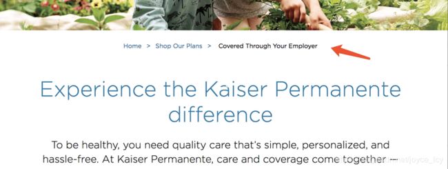
Solution
-
Breadcrumb is navigation, hence it should be wrapped with landmark nav
-
As there will likely be other navigation elements, aria-label should be used to describe it.
-
Items inside the breadcrumb should be held by a
-
Links in a breadcrumb are usually separated by arrows. If images or icon fonts are used for the separators, they need to be used in an accessible way.
-
The breadcrumb item which associates with the current page is not a link. It should use
tag, and be marked asaria-current="page".
be careful about the grey color used for current page link, it should meet the contrast ratio requirement (>4.5:1)
Visual Examples
Who should care
FE: follow the breadcrumb rules, make the aria-label="#BE"
BE: make the aria-label=“Breadcrumb” text dynamic (mainly for translation purpose)
2.6 Checkpoint: Heading
Solution
- If some text looks structurally like a heading, then just use heading tags.
eg.
Some section title
-
Generally, it is a best practice to ensure that the beginning of a page’s main content starts with an h1 element, and also to ensure that the page contains only one h1 element.
If there is no obvious h1, report it as a design issue.
-
headings should only appear in ascending, continuous rank order. Usually, the best practice is to start the main content of a web page with a level 1 heading (h1), with no other headings before this high-level heading. Mark the sub-sections of the page as level 2 headings (h2). If the level 2 sections contain sub-sections, mark these children as level 3 sections (h3) and so on.
-
It is okay for other h tags to be before the h1. The h1 normally marks the beginning of the main content area but it doesn’t need to be the first h tag on the page. (eg The h tag on an alert bar in
Visual Examples
Title in a name card should be wrapped in a heading element:

These content below should be a heading tag:


Who should care
FE: follow the heading rules
BE: for flexible modules which will potentially have different heading levels, make sure the heading tags are configurable in CMS
CE:
make sure heading tags are used correctly in the rich text editors.
when building the page with dynamic modules, make sure the heading order is valid and there is one and only one h1 tag on the page.
2.7 Checkpoint: Image
Solution
- Avoid using background-image unless the image is indeed background or only for presentation purposes, which does not require alt text (Figure 1).
- Do not use CSS to display non-decorative images, which disappear in Firefox and IE when Windows High Contrast mode is activated
- For img tags, they should always have an “alt” attribute (Figure 2), if an image is not meaningful (decoration picture or icon pictures beside meaning text node), leave the alt attribute blank (alt=" ").
-
Circumstances in which it is appropriate to use an empty alt attribute:
(1) An image is purely decorative
(2) An image is not meant to be visible by any users
(3) An image consists of text that is repeated as text or a graphical symbol whose meaning is conveyed as text, immediately before or after the image
-
The image is part of a group of images that form a single larger picture and one of the other images in the group has a text alternative that serves as the text alternative for the single larger picture.
-
linked image should use alt text to describe the link, in this case, no aria-label is needed on the link, similar logic should be applied to the image button
-
When the button contains an image, the image does not need to add an alt attribute.
-
if the whole image and the below description is a link, the image should be adding aria-hidden=“true” and tabindex="-1" attribute on the image tag. (Figure 3)
Visual Examples
The difference of background-image in high contrast mode:

Figure 1
informative images should always have meaningful alt text:

Figure 2

Figure 3
Who should care
FE: always include the alt attribute with images, and use #BE placeholder to mark the alt text that needs BE attention. If the alt should be empty, leave alt=" ", no need to add #BE
BE: make sure to provide alt text input fields in CMS
CE: give images descriptive alt text, in case of a linked image, make sure the alt text describes the link. Ask for the alt text from the front office, when the design is ready. No need to wait till dev work is done.
*FE and CE will need to judge if an image is decorative or not, for example, we used to give the following image alt text “person organizing papers”, which causes an issue in accessibility test which said the image is just decorative hence should have empty alt text.
2.8 Checkpoint: Button
Solution
-
whenever some elements have the button-like behavior – do something on click, then we must use the button tag.
-
aria-expanded is often used on menu buttons, which means the button toggles a menu’s open/collapsed state, it’s often accompanied by aria-haspopup and aria-controls. Example use cases:
-
desktop menu item which has a submenu
-
mobile hamburger menu button
-
accordion toggle buttons
-
aria-label should be used if the button’s text is not descriptive enough, such as “Learn More”, Can also add aria-labelledby to concatenate a label from separate divs: eg (we prefer to use aria-label in KP project as discussed the effort of FE, BE and CE)
-
image button should not be defined as CSS background image, instead we should use img tag with alt text to describe the button, in this case, the aria-label on the button should be removed to avoid redundancy
-
disabled attribute should be used for buttons that are not clickable, this will remove them from the tab sequence as well. Also, remember to adjust the styles accordingly. Also, add aria-disabled=" true" for the screen reader users.
-
The ‘aria-selected’ property is not suitable for buttons. If you want to indicate that a button is selected, use aria-disabled=" true" or " aria-current=" true".
-
When the button contains an image, the image does not need to add an alt attribute.
Visual Examples
The “share” element will open a dropdown on click, it should be a button, not a link:
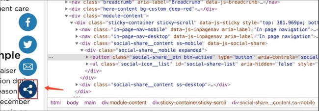
add aria-expanded, as the button is used to toggle a menu

Who should care
FE: follow the button rules, use #BE to place-hold aria-label and alt text, if there are aria-controls which needs dynamic element ids, also mark them for BE, and you can add role=" button" to a div, but that is more work.
BE:
make sure button related aria-label and alt text can be edited in CMS
make sure the controlled elements’ ids are dynamically populated
CE: populate button related aria-label/alt text whenever needed
2.9 Checkpoint: Link
Solution
-
Whenever some elements have the link-like behavior – navigate to other pages or other regions in the same page on click, then we must use the
tag. -
Aria-label should be used if the link’s text is not descriptive enough, such as “Read More”, “Download” or “Click Here”. (Figure 1, 2)
-
If you have a link that isn’t self-descriptive, or the link destination could benefit from being explained in more detail, you can add information to a link using the title attribute. (Figure 3)
-
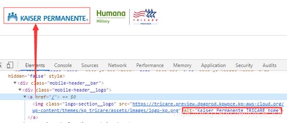
The linked image should use alt text to describe the link, in this case, no aria-label is needed on the link, similar logic should be applied to the image button. (Figure 4)
-
Use aria-current=" page" to mark the current page link on navigation. If it’s just indicating the current section as opposed to a specific page, you can use aria-current=“true”. And ensure that the visual marker is not rendered using CSS background or some other way that will not be visible in high contrast mode. (Figure 5)
-
Underline style should always be applied to a focused, hovered or active link. (Figure 6, Figure 7)
-
Lengthy link text: big paragraph should not be part of a link, this can be tricky sometimes. If it’s unavoidable to have a really long link text for these block links, try to include the most important information at the start of the link. (Figure 8)
-
External links: three things are needed. (Figure 9)
-
Visual icon, must use
-
Invisible label to tell the screen reader users that the link is external.
-
Open new tab/window using target="_blank", with rel=“noopener noreferrer” to ensure security.
-
If adding aria-label to external links, the screen reader can’t read external link content. The solution is adding full desc for the aria-label.
- Social share link:
-
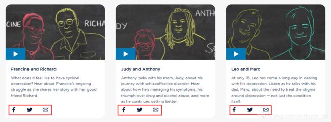
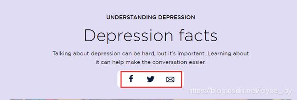
On one page, these social links with the same text lead to different destinations, which are read out as simply ‘Facebook, Twitter, Email’. Screen reader users have no way to know what each set of links pertains to.
-
Should add an informative aria-label on the
(1) Video links: aria-label="Share [name of video] video " (Figure 10)
(2) Article links: aria-label=“Share page” (Figure 11)
(3) Footer links: aria-label=“Kaiser Permanente social media” (Figure 12)
Visual Examples
These links should have aria-label “Read more about XXX”:

(Figure 1,2)

(Figure 3)
(Figure 4)

(Figure 5)
Active state:

(Figure 6)
Hover state:

(Figure 7)
The whole card is wrapped within a link, which leads to lengthy link text, in this case we should only wrap the image and heading in a link (despite the visual design may suggest a different structure):
Who should care
FE:
-
Follow the link rules, use ‘#BE’ to place-hold aria-label and alt text, if there are aria-controls which needs dynamic element ids, also mark them for BE.
-
Need designer provide the hover state to the dev.
BE:
-
Make sure link related aria-label and alt text can be edited in CMS.
-
Add aria-current=“page” logic on the nav links.
-
Make sure any external links can be marked with :
-
icon
-
screen reader only text
-
target="_blank" rel=“noopener noreferrer”
CE: Populate link related aria-label/alt text whenever needed.
2.10 Checkpoint: List
Solution
-
if similar items are listed together, make them a list, examples include social icons and search results.
-
ordered list should be ol, not ul. examples include numbered bullet points or breadcrumbs.
-
when there is only a single item in a list, it should not be a list, this needs dynamic BE logic
-
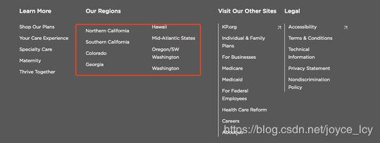
sometimes the design displays a list in multiple columns (e.g. footer), use CSS3 Column to achieve this without breaking the HTML semantics
-
CSS3 Column is not supported in IE9, but it should be OK as IE9 is basically dropped in our tests and it won’t break the functionality nevertheless.
Visual Examples
if similar items are listed together, make them a list, examples include social icons and search results:

when there is only a single item in a list, it should not be a list, this needs dynamic BE logic:

items which logically belong to a single list should be put in a single ul or ol container:
ordered list should be ol, not ul:

breadcrumbs are ordered lists too, hence they should be ol:

Two-column lists:

ul{
  column-count: 2;
}
li {
  -webkit-column-break-inside: avoid;
  page-break-inside: avoid;
  break-inside: avoid;
}
Who should care
FE: Follow the list rules.
BE: Search for all ul and ol elements, make sure there is logic to change them to div when there is only one item, also the single item should not be li in this case.
CE: Bullet points in the rich-text editor should be wrapped by ul or ol.
2.11 Checkpoint: Carousel
Solution
- .slider:
-
avoid using ul as the root container as slick creates nested div which breaks the semantic.
-
remove role=“toolbar” because it’s not relevant here. Sliders are no toolbars.
- .slick-prev/.slick-next:
-
Remove the role=“button” as you already use the button element.
-
(Add aria-disabled=“true” to any disabled first and last previous and next buttons (when the slick isn’t loop)
- .slick-list:
-
Don’t apply aria-live=“polite” to the carousel’s root container, this attribute makes the screen readers to read the updated content, but the same paragraph can be read many times.
-
Since the slick will auto add tabindex=“0” to the current slide, we should programmatically move the focus to the current slide upon switching.
- .slick-track:
-
Remove the role=“Listbox” and role=“option”.
-
Remove role=" tablist" and role=“tab”.( you can use role=“listitem” if you want a to provide list semantic but will make only sense if you have multiple items per slide.)
- .slick-slide:
-
Remove this aria-describedby/labelledby when there is no dots navigation.
-
Remove role=“option” and role=”tabpanel”.
-
Replace aria-describedby by aria-labelledby because label inside corresponding dot is more a label than a description.
- slick dots:
-
Remove role=“tablist” from the
-
tag.
-
Remove role=“presentation” from
- tag.
-
Slick auto-add tabindex="-1" to the inactive dots button, so the user can’t use tab key to switch the dots, should remove tabindex and role=" button".
-
On the button which has .slick-active add aria-current=" true", this dot need also to visually be bigger than others otherwise there is information by color only.
-
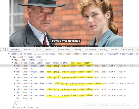
Slide names are preferable to numbers if each slide has a unique name. If slide numbers are used, by default I recommend using “Slide x” where x= number as the content inside button because it’s more understandable for users than 1,2,3, etc. Adding “role=group” 'aria-roledescription=slide" and “aria-label=1(current index) of 6(total)” attribute for slick-slide.
-
By default, I recommend moving focus on the new active slide when the user activates button especially when there are focusable elements inside an active slide.
-
Adding attr “aria-current=true” for selected dots.
- autoplay:
- Any carousel set on autoplay has to have an accessible pause/play button available.
Visual Examples
Example using tab design pattern: https://a11y.nicolas-hoffmann.net/carrousel/.
Example not using tab design pattern (autoplay but does not have dot controls): https://www.w3.org/TR/wai-aria-practices/examples/carousel/carousel-1.html?moreaccessible
A good overview of different options: https://www.w3.org/TR/wai-aria-practices/examples/carousel/carousel-1.html#
Who should care
2.12 Checkpoint: Tab Index
Solution
-
In general, tabindex is often unnecessary.
-
Valid use case:
- Give tabindex="-1" to elements that are not focusable by default, then we can use JavaScript to focus on that element.
-
tabindex=“0” or positive numbers can make elements focusable by default (press tab on the keyboard). In most cases, they should be avoided.
-
Focusable element (link, button, input) should not have redundant tabindex attribute.
Visual Examples
Requirement:
The new hidden content appears above the ‘Read more / Read less’ button. When screen reader and keyboard-only users hit the ‘Read More’ button, move focus back up to the newly revealed content using JavaScript.

The has a tabindex="-1", which can be focused when click read more button by JavaScript.

HTML Source Code:

Who should care
FE:
Follow the tabindex rules.
Notice: tabindex="-1" will trigger outline on mouse click, remove outline if necessary.
2.13 Checkpoint: Navigation
Solution
-
Menubar presents a site navigation system, it is wrapped in a navigation region implemented with a nav element that has an aria-label that matches the label on the menubar.
-
In the
should have a -
Each menu item should be a link with role=“menuitem”, and be wrapped in
with role=“none”.
-
aria-haspopup=“true” indicates the menu item has a submenu.
-
aria-expanded=“true” indicates the submenu is open.
-
aria-expanded=“false” indicates the submenu is closed.
- If in the menu item has a submenu, the submenu should be a
-
aria-hidden=“false” indicates the submenu is open.
-
aria-hidden=“true” indicates the submenu is closed.
Keyboard:
-
Tab: move the focus from the first menu item to its submenu and to the next menu item.
-
Right Arrow: moves focus to the next item. If the focus is on the last item, move focus to the first item.
-
Left Arrow: Moves focus to the previous item. If the focus is on the first item, move focus to the last item.
-
Down Arrow: Moves focus to the first item in the submenu, then to the next subitem. If the focus is on the last item, move focus to the first item.
-
Up Arrow: Moves focus to the last item in the submenu, then to the previous subitem. If the focus is on the first item, move focus to the last item.
-
Escape: Closes submenu, and moves focus to parent menubar item.
Example:
https://www.w3.org/TR/wai-aria-practices/examples/menubar/menubar-1/menubar-1.html
<nav aria-label="Main menu">
  <ul role="menubar" aria-label="Main menu">
    <li role="none">
      <a role="menuitem" aria-haspopup="true" aria-expanded="false" href="#">Menu item 1a>
      <ul role="menu" aria-label="Menu item 1">
        <li role="none">
          <a role="menuitem" href="#">Sub menu item 1a>
        li>
        <li role="none">
          <a role="menuitem" href="#">Sub menu item 2a>
        li>
      ul>
    li>
    <li role="none">
      <a role="menuitem" aria-haspopup="true" aria-expanded="false" href="#">Menu item 2a>
      <ul role="menu" aria-label="Menu item 2">
        <li role="none">
          <a role="menuitem" href="#">Sub menu item 3a>
        li>
        <li role="none">
          <a role="menuitem" href="#">Sub menu item 4a>
        li>
      ul>
    li>
  ul>
nav>
2.14 Checkpoint: Accordion
Solution
-
Accordion header use a heading tag, each accordion header element contains a button that controls the visibility of its content panel.
-
Button:
-
aria-expanded=" true" indicates the accordion panel is expanded, otherwise set to false.
-
aria-controls=“ID” points to the ID of the panel which the header controls.
-
aria-labelledby=“ID REF” references the accordion header.
-
aria-disabled=" true" If the accordion panel is expanded and is not allowed to be collapsed, then set to true.
- Accordion panel:
-
id=“ID” references the accordion header button that expands and collapses the region.
-
aria-hidden=“true” indicates accordion panel is collapsed, otherwise set to false.
Example:
https://www.w3.org/TR/wai-aria-practices/examples/accordion/accordion.html
https://scottaohara.github.io/a11y_accordions/
Visual Examples
The whole heading tag can be clicked:

HTML Source Code:
<ul>
  <li>
    <h3>
      <button aria-hidden="panel_1" id="panel_1_trigger"
        aria-expanded="false" aria-diaabled="false"> Chapter1
      button>
    h3>
    <div id="panel_1" aria-hidden="true">xxxxxxdiv>
  li>
  <li>
    <h3>
      <button aria-hidden="panel_2" id="panel_2_trigger"
        aria-expanded="false" aria-diaabled="false"> Chapter1
      button>
    h3>
    <div id="panel_2" aria-hidden="true">xxxxxxdiv>
  li>
ul>
2.15 Checkpoint: Modal/Popup
Solution
-
The dialog overlay should be a separate element, preferably a child of the
element. -
The modal container must have role=“dialog” , otherwise when screen reader on, use up/down key will active reading command and read out other content outside the modal on this page.
-
Make sure that there is a label for the dialog, provided using the aria-labelledby and optionally the aria-describedby attributes.
-
When the modal is open, page parts other than the modal should be aria-hidden=“true” to remove them from the screen reader scope.
-
When the modal is closed, it should be aria-hidden=“true”, and other sections should be aria-hidden=“false”.
-
Applying the aria-modal=”true” to the dialog element replaces the technique of using aria-hidden on the background for informing assistive technologies that content outside a dialog is inert. As a new property, screen reader users may experience varying degrees of support for it.
-
Tab key navigation should be trapped within the modal while it’s open:
-
On Dialog Open, set Focus on the first close button.
-
On Dialog Close, return Focus to Last Focused Element.
-
While Open, Prevent Mouse Clicks Outside the Dialog.
-
While Open, Prevent Tabbing to Outside the Dialog (use JS to set the focus back, please check the post for references).
-
Allow the ESC Key to Close the Dialog.
- The dialog’s the first element is a “Close dialog” button.
-
Upon opening the dialog, the focus is set on this button, which announces its caption; this way users immediately know they are in a dialog now.
-
The button has a visible SVG icon.
-
Upon clicking it, the dialog is closed and focus is set on the dialog toggler again button, which makes screen readers announce its caption; this way users immediately know they are out of the dialog now.
- The dialog’s last element is a “Confirm” button.
-
Upon clicking it, the dialog is closed and focus is set on the dialog toggler again button, which makes screen readers announce its caption; this way users immediately know they are out of the dialog now.
-
In YouTube video player popup, there is no confirm button, just add a focusable element that can be sent focus return to the close button.
Example:
https://bitsofco.de/accessible-modal-dialog/
https://www.w3.org/TR/wai-aria-practices/examples/dialog-modal/dialog.html
Visual Examples

HTML Source Code:

2.16 Checkpoint: Outline
Solution
Use the below outline CSS unless suggested by the design team otherwise
outline: 2px solid red;
Visual Examples
button with an obvious outline on focus:

Who should care
FE: apply the obvious outline to focused/active link, button and form input.
2.17 Checkpoint: Table
Solution
Tables should be used for data and not simply layout purposes.
If data is present and a table is “visually” represented, ensure that it is structured as a data table for best access.
-
Header cells must be marked up with
, and data cells with to make tables accessible. Tables with two headers define the direction of each header by setting the scope attribute to color row.
give id to the cells and headers to corresponding data cells to help understand the table structure, especially when the table structure is complicated.
check this link for detailed references:
https://www.w3.org/WAI/tutorials/tables/
Visual Examples
HTML Source Code:<table> <thead> <tr> <td>td> <th id="col-1" scope="col">column title 1th> <th id="col-2" scope="col">column title 2th> tr> thead> <tbody> <tr> <th id="sub-1" colspan="3" scope="colgroup">subtitle 1th> tr> <tr> <th headers="sub-1" id="row1">row title 1th> <td headers="sub-1 row1 col-1">item-1-1td> <td headers="sub-1 row1 col-2">item-1-2td> tr> <tr> <th id="sub-2" colspan="3" scope="colgroup">subtitle 2th> tr> <tr> <th headers="sub-2" id="row2">row title 2th> <td headers="sub-2 row2 col-1">item-2-1td> <td headers="sub-2 row2 col-2">item-2-2td> tr> tbody> table>

Who should care
FE: follow the table rulesCE: follow the table rules in rich text editor
2.18 Checkpoint: Form
Solution
- Ensure form elements always have a correctly associated label:
-
If there is a visible label for a form element, give id to the form element, assign for=“id” to the label.
-
If there is no visible label for a form element, use aria-label to add descriptive text to it.
-
Use fieldset to group form elements which have a logical connection, and use a legend to serve as a group level label.
-
Interaction with form elements:
-
Enter (or Esc): enter (or exit) focus mode (a distinctive beep sound is played).
(1) Only available when focusing on an interactive element.
(2) In NVDA, NVDA + Space is an alternative way of toggling interaction modes (regardless where the cursor is at the moment).
-
Space: toggle checkbox and expand/collapse Combobox, activate buttons
-
Enter: activate button (or submit the form when focusing on certain form elements).
-
Up / Down (and sometimes Left / Right): Select radio button value. Select element in Combobox.
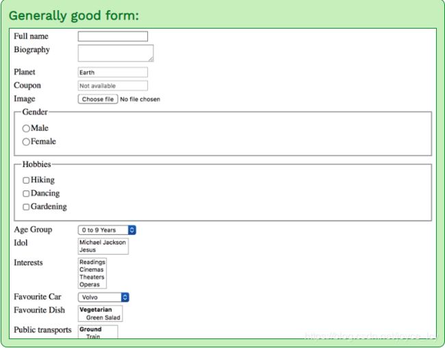
Example: https://www.accessibility-developer-guide.com/examples/forms/good-example/_examples/generally-good-form/?gender=on
- Form validation :
-
Use aria-required= “true” on required field.
-
Use aria-invalid to indicate input error state.
-
Use role=" alert" or aria-live=“assertive” to trigger error notification, aria-describedby can be used to link input to error message so the error message can be repeated per the user’s wish.
-
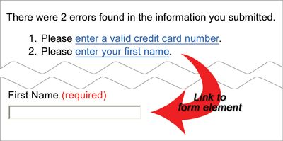
The best practice is to send screen readers to the list of errors on the page, and then provide a link within the error message that will set focus to the appropriate form control.
-
Inline errors: set focus to them immediately. The error messages must be associated with their respective controls, via aria-label or aria-describedby. It may be helpful to set focus to the first control that needs attention.
2.19 Checkpoint: Quote
Solution
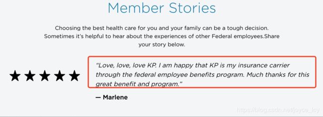
Quotes should be wrapped by q, this will automatically put before and after quote marks.<p> someone says: <q> always use q element to quote q> p><blockquote> <p>"Love, love, love KP. I am happy that KP is my insurance carrier through the federal employee benefits ......"p> <footer>—Marlenefooter> blockquote>Who should care
FE: follow the quote rulesCE: in the rich text editor, put quotes in q element
2.20 Checkpoint: Reading order
Solution
-
DOM order should match the visual order.
-
Avoid using CSS to reorder the HTML elements as screen readers only follow the HTML order and have no sense of CSS.
Example: https://www.w3.org/TR/WCAG20-TECHS/C27
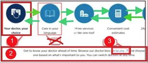
As below screenshot, the actual position of the tab and content in the Html code should be reversed from the presentation, that is, the tab should be at the front of the code.

Visual Examples
Incorrect reading order caused by an invalid DOM structure:
The tab list pattern on that W3C page has the tab order as follows:-
The active tab button.
-
The whole active tab panel.
-
If there was any focusable content in the tab panel it would then get a tab stop.
-
Off the panel.
2.21 Checkpoint: Unique Element ID
Solution
DOM element ids should always be unique within the same page.a typical violation case is the accordion widget, the accordion toggle buttons need to have aria-controls which refers to the toggled content part with a corresponding id. As the accordion items are usually dynamically pulled from CMS, these ids need to be dynamically generated and not hardcoded.
Visual Examples
FE: make sure all dynamic ids are marked with #BE comments and ensure static ids are unique.BE: Ensure dynamic element ids are unique, maybe use the index or CMS node id.
2.22 Checkpoint: Iframe
Solution
Iframe should always have a descriptive title, an example is the youtube iframe needs to include the title of the video.
Visual Examples

Who should care
FE: add #BE placeholder for the iframe title.BE: make sure the iframe title is editable in CMS, in the youtube video case this means to provided a video title field alongside the video link/id.
CE: populate the iframe title.
2.23 Checkpoint: Color contrast
Solution
-
WCAG 2.0 level AA requires a contrast ratio of at least 4.5:1 for normal text and 3:1 for large text.
-
WCAG 2.1 requires a contrast ratio of at least 3:1 for graphics and user interface components (such as icon buttons, focus indicators and form input borders) (would be considered a best practice at WCAG 2.0, not a violation)
-
Large text is defined as 14 point (typically 18.66px) and bold or larger, or 18 point (typically 24px) or larger.
-
MP: As more and more people use mobile devices, considering 4.5:1 contrast ratio as the minimum for everything is recommended.
check tool: https://webaim.org/resources/contrastchecker/
Visual Examples

Who should care
QA: check the color contrast and report the violation to designers2.24 Checkpoint: Select
Solution
selecting an option in a single select Listbox:-
Deselect the previously selected option, setting the aria-selected to false, or removing the attribute altogether, changing the appearance of the newly unselected option to appear not selected.
-
Select the newly selected option, setting aria-selected=“true” on the option and changing the appearance of the newly selected option to appear selected.
-
Update the aria-activedescendant value on the Listbox to the id of the newly selected option.
-
Visually handle the blur, focus, and selected states of the option.
Visual Examples
<p id="listbox1label" role="label">Select a color:p> <div role="listbox" tabindex="0" id="listbox1" aria-labelledby="listbox1label" onclick="return listItemClick(event);" onkeydown="return listItemKeyEvent(event);" onkeypress="return listItemKeyEvent(event);" aria-activedescendant="listbox1-1"> <div role="option" id="listbox1-1" class="selected" aria-selected="true">Greendiv> <div role="option" id="listbox1-2">Orangediv> <div role="option" id="listbox1-3">Reddiv> <div role="option" id="listbox1-4">Bluediv> <div role="option" id="listbox1-5">Violetdiv> <div role="option" id="listbox1-6">Periwinklediv> div>你可能感兴趣的:(Accessbility)


