html基本常见组件和效果设置
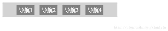
导航栏列表
<html>
<head lang="en">
    <meta charset="UTF-8">
    <title>CSS3_最简单的导航栏title>

    <style type="text/css">
    /*垂直导航栏,不需要更改html代码*/
    /*
    ul {
        list-style-type: none;
        margin:0;
        padding:0;
    }
    a:link, a:visited {
        text-decoration: none;
        color: white;
        background-color: chocolate;
        display: block;
        width:50px;
        text-align: center;
    }
    a:active,a:hover {
        background-color: green;
    }
    */

    /*水平导航栏*/
    ul {
        list-style-type: none;
        margin:0;
        padding:10px;
        background-color: lightgray;
        width: 300px;
        text-align: center;
    }
    li {
        display: inline;
        padding: 5px;
    }
    a:link, a:visited {
        font-weight:normal;
        text-decoration: none;
        color: white;
        background-color: gray;
        width:50px;
        padding: 5px;
        text-align: center;
    }
    a:active,a:hover {
        background-color: green;
    }
    style>
head>
<body>
    <ul>
        <li><a href="#">导航1a>li>
        <li><a href="#">导航2a>li>
        <li><a href="#">导航3a>li>
        <li><a href="#">导航4a>li>
    ul>
body>
html>
效果图:
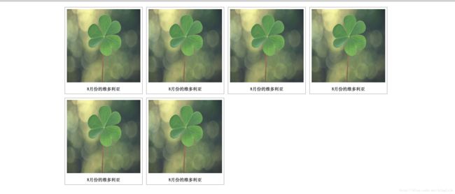
图片列导航
<html>
<head lang="en">
    <meta charset="UTF-8">
    <title>CSS3_图片列导航title>

    <style type="text/css">
    body {
        margin: 10px auto;
        width:70%;
        height:auto;
    }
    .image {
        border:1px solid darkgray;
        width:auto;
        height:auto;
        float: left;
        text-align:center;
        margin:5px;
    }
    img {
        margin: 5px;
        opacity: 0.9; /*透明度*/
    }
    .text {
        font-size: 12px;
        margin-bottom: 5px;
    }
    style>
head>
<body>
    <div class="image">
        <a href="#">
            <img src="image1.jpg" alt="风景" width="200px" height="200px" onerror="xxx.xxx">
        a>
        <div class="text">8月份的维多利亚div>
    div>
    <div class="image">
        <a href="#">
            <img src="image1.jpg" alt="风景" width="200px" height="200px">
        a>
        <div class="text">8月份的维多利亚div>
    div>
    <div class="image">
        <a href="#">
            <img src="image1.jpg" alt="风景" width="200px" height="200px">
        a>
        <div class="text">8月份的维多利亚div>
    div>
    <div class="image">
        <a href="#">
            <img src="image1.jpg" alt="风景" width="200px" height="200px">
        a>
        <div class="text">8月份的维多利亚div>
    div>
    <div class="image">
        <a href="#">
            <img src="image1.jpg" alt="风景" width="200px" height="200px">
        a>
        <div class="text">8月份的维多利亚div>
    div>
body>
html>
布局效果:
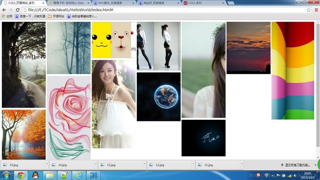
图片瀑布流
<html>
<head lang="en">
    <meta charset="UTF-8">
    <title>CSS3_页面特效_多列title>
    <link href="mysyle.css" rel="stylesheet">
head>
<body>
    <div class="container">
        <div><img src="4.jpg">div>
        <div><img src="5.jpg">div>
        <div><img src="6.jpg">div>
        <div><img src="7.jpg">div>
        <div><img src="8.jpg">div>
        <div><img src="9.jpg">div>
        <div><img src="10.jpg">div>
        <div><img src="11.jpg">div>
        <div><img src="12.jpg">div>
        <div><img src="13.jpg">div>
        <div><img src="14.jpg">div>
        <div><img src="15.jpg">div>
    div>
body>
html>


//mystyle.css
div.container {
    width:100%;
    column-width: 250px;
    -webkit-column-width:170px;
    column-gap: 5px;
    -webkit-column-gap: 10px;
}

div.container div {
    margin-top:0;
    margin-bottom: 5px;
}

img {
    width:250px;
}
效果图:
内容多列
<html>
<head lang="en">
<meta charset="UTF-8">
<title>CSS3_多列title>
<style type="text/css">
/*多列参数介绍:
colomn-count:指定列数
column-gap:指定列间距
column-rule:指定列与列之间的线
*/
div.content {
column-count: 4;
-webkit-column-count: 4;
column-gap: 50px;
-webkit-column-gap: 50px;
column-rule: 5px outset lightgray;
-webkit-column-rule: 5px outset lightgray;
}
style>
head>
<body>
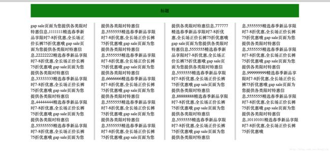
<div style="width:80%;margin:0 auto;">
<div style="height:50px;background-color:green;margin-bottom:20px;text-align:center;line-height:50px">标题div>
<div class="content">
gap sale页面为您提供各类限时特惠信息,1111111精选春季新品享限时7-8折优惠,全长场正价长裤75折优惠哦
gap sale页面为您提供各类限时特惠信息,22222222精选春季新品享限时7-8折优惠,全长场正价长裤75折优惠哦
gap sale页面为您提供各类限时特惠信息,33333333精选春季新品享限时7-8折优惠,全长场正价长裤75折优惠哦
gap sale页面为您提供各类限时特惠信息,44444444精选春季新品享限时7-8折优惠,全长场正价长裤75折优惠哦
gap sale页面为您提供各类限时特惠信息,55555555精选春季新品享限时7-8折优惠,全长场正价长裤75折优惠哦
gap sale页面为您提供各类限时特惠信息,5555555精选春季新品享限时7-8折优惠,全长场正价长裤75折优惠哦
gap sale页面为您提供各类限时特惠信息,5555555精选春季新品享限时7-8折优惠,全长场正价长裤75折优惠哦
gap sale页面为您提供各类限时特惠信息,6666666精选春季新品享限时7-8折优惠,全长场正价长裤75折优惠哦
gap sale页面为您提供各类限时特惠信息,5555555精选春季新品享限时7-8折优惠,全长场正价长裤75折优惠哦
gap sale页面为您提供各类限时特惠信息,5555555精选春季新品享限时7-8折优惠,全长场正价长裤75折优惠哦
gap sale页面为您提供各类限时特惠信息,777777精选春季新品享限时7-8折优惠,全长场正价长裤75折优惠哦
gap sale页面为您提供各类限时特惠信息,5555555精选春季新品享限时7-8折优惠,全长场正价长裤75折优惠哦
gap sale页面为您提供各类限时特惠信息,5555555精选春季新品享限时7-8折优惠,全长场正价长裤75折优惠哦
gap sale页面为您提供各类限时特惠信息,88888888精选春季新品享限时7-8折优惠,全长场正价长裤75折优惠哦
gap sale页面为您提供各类限时特惠信息,5555555精选春季新品享限时7-8折优惠,全长场正价长裤75折优惠哦
gap sale页面为您提供各类限时特惠信息,5555555精选春季新品享限时7-8折优惠,全长场正价长裤75折优惠哦
gap sale页面为您提供各类限时特惠信息,5555555精选春季新品享限时7-8折优惠,全长场正价长裤75折优惠哦
gap sale页面为您提供各类限时特惠信息,999999999精选春季新品享限时7-8折优惠,全长场正价长裤75折优惠哦
gap sale页面为您提供各类限时特惠信息,5555555精选春季新品享限时7-8折优惠,全长场正价长裤75折优惠哦
gap sale页面为您提供各类限时特惠信息,10110101精选春季新品享限时7-8折优惠,全长场正价长裤75折优惠哦
div>
div>
body>
html>效果图:
HTML5音频、视频、文档预览
<html>
<head>
<meta charset="utf-8">
<title>Html文件测试title>
<meta name="viewport" content="width=device-width, initial-scale=1.0">
<meta name="description" content="">
<meta name="author" content="">
<script type="text/javascript" src="http://sources.ikeepstudying.com/js/jquery-1.8.3.min.js">script>
<script type="text/javascript" src="http://sources.ikeepstudying.com/jquery.media/jquery.media.js">script>
<script type="text/javascript">
$(function() {
$('a.media').media({width:800, height:600});
});
script>
head>
<body>
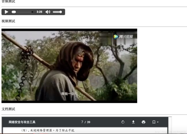
<p>音频测试p>
<hr>
<audio src="http://nginxweb/2016068.mp3" controls="controls" loop="loop" style="display:block;">
<source src="http://nginxweb/2016068.mp3" type="audio/ogg">
<source src="http://nginxweb/2016068.mp3" type="audio/mpeg">
Your browser does not support the audio tag.
audio>
<p>视频测试p>
<hr>
<video controls="controls" autoplay="autoplay" loop="loop" style="display:block;" width="640" height="352">
<source src="http://nginxweb/mp4test.mp4" type="video/ogg"/>
<source src="http://nginxweb/mp4test.mp4" type="video/mp4"/>
<embed src="http://nginxweb/mp4test.mp4" type="application/x-shockwave-flash"
width="320" height="240" allowscriptaccess="always" allowfullscreen="true">embed>
Your browser does not support the video tag.
video>
<p>文档测试p>
<hr>
<a class="media" href="http://nginxweb/attack.pdf">PDF Filea>
body>
html>效果预览