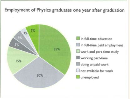
The pie chart gives information about the employment of physics graduates one year after graduation.
The high figure can be seen those students who have full-time education, the figure is about 35%. And 30% of students have full-time paid employment, it is interestingly found that 15% students work and part-time study, it's also worth noticing that 5% students work part time or do unpaid job. And it's also worth noticing that 3% students are not available for work, and 7% of students are still unemployed one year after graduation.
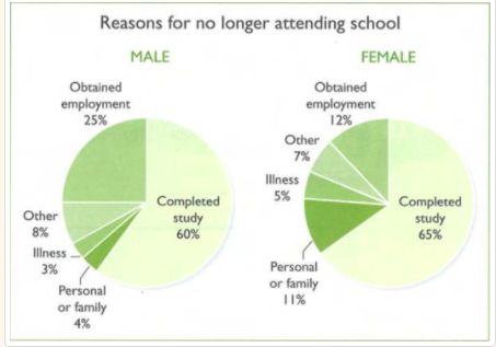
The graph is about the reasons why male and female no longer attending school.
There are several reasons involved completed study, obtained employment, personal of family reasons, illness, and other factors.
Recording to the graph, we can see that the most popular reason for males and females no longer attending school, because they have completed study
The second reason is because they obtained employed for both males and females.
It is also worth noting that illness accounts for smallest numbers for both of males and females refusing to attend school.
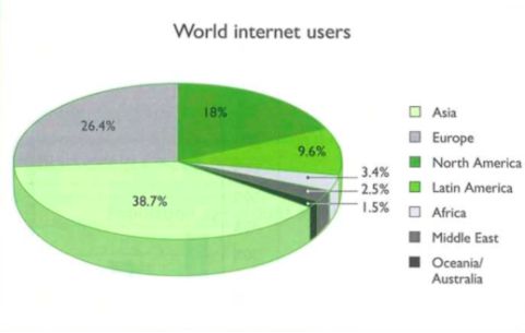
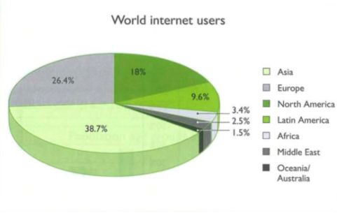
The graph is about the percentage of world internet users.
Recording to the graph, we can see that the largest proportion is Asian Internet users, at 38.7 percent, it's followed by European users, at 26.4 percent, the third is North America users, at 18% percent.
It is also worth noting that Latin American Internet users contribute 9.6 percent.
Finally, Africa, Middle East, and Oceania Internet users at 3.4 percent, 2.5 percent,1.5 percent, respectively.
To conclude, the smallest number of Internet users can be seen in Oceania.
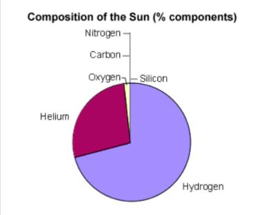
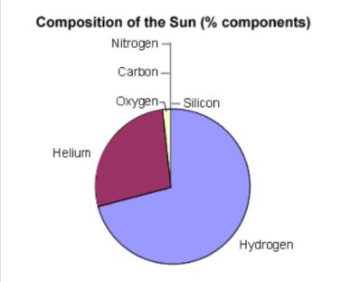
This pie chart is about the composition of the Sun.
There are several elements involved Hydrogen, Helium, Nitrogen, Carbon and so on.
Recording to the graph, we can see that Hydrogen occupied almost three-quarters of the composition of the Sun, which is the largest part of all components.
The second most component is Helium, accounting for around 33 percent.
Other components, such as Nitrogen, Carbon, Oxygen, and Silicon only represent a small share of the total composition.
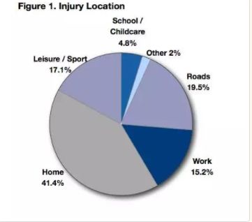
This pie chart describes the injury location of children including home, work,roads,leisure,sport,schools,childcare, and other places.
Among these places, home is the most injuries can be found, accounting for 41.4%, roads,leisure,andsport, and work followed, which occupied 19.5%, 17.1%and15.2%, respectively.
Surprisingly, only 4.8% injuries happened in school and childcare, and the rest of 2% happened in other places.
So we can see teachers provide better childcare than parents.
The pie chart shows the survey of means of transport used by commuters living outside the city.
Recording to the chart, we can find several means of transport including car, underground, train, bus, taxi, and more than one.
Most people usetrainto transport, which accounts for 32% and 29% of people travel by using more thansinglemean of transport, 27% of people travel by car, and then 10% of people in total uses underground and bus, finally, there is only 2% people travellingby taxi.
The pie chart shows where people get news from, on the diagram, it can be classified into 4 categories, includes Newspapers, TV, Internet, and Other.
Around 40% of People who get news from TV, which is the most popular one, this is followed by newspapers, with 36% of people. Also, we can find about 15% of people get news from Internet, lastly, 9% of people get news from other sources.
To conclude, we can say newspapers is the most popular way for most people while others are least popular way.
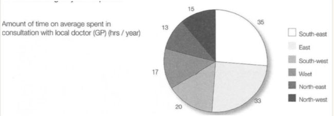
The pie shows the amount of time of average spent with local doctors in hours per year.
On this pie chart, it can be divided into several areas including south-east, east, south-west, west, North-east and North-west.
People living in South-east spent the most time with local doctors or GP around 35 hours per year, it was followed by the east, 33 hours per year. People living in the north-east spent the smallest time with local doctors around 13 hours per year.
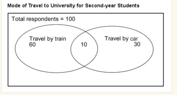
This diagram shows how a selection a hundred university student travel touniversity.
60 students of them travel by train, while 30 students of them travel by car, and only 10 students of them travel by both car and train.
Most of the respondents travel to university by train, a minority travel by car, while a small number of respondents only 10 percents travel by both train and car.
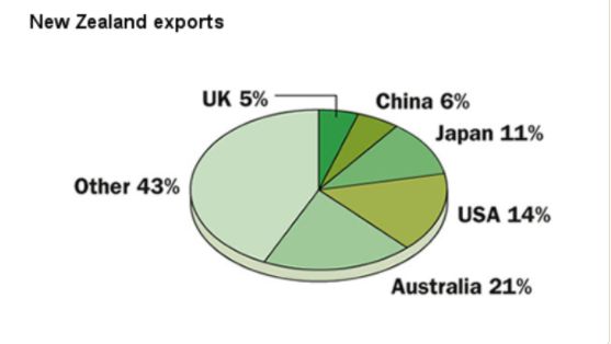
New Zealand main export markets are Australia, the USA, Japan, China, and the UK.
Export to Australia accounts for around 21 percent of all exports from New Zealand, the USA accounts for 14 percent, Japan, 11 percent, China 6 percent, respectively, which is followed by the UK, at 5 percent.
The graph indicates that another 43 percent of total exports go to a range of other destinations.
This pie chart describes the composition of the Sun, Hydrogen occupied almost three-quarters of the composition of the Sun, which is the largest part of all components.
Helium, the second most component, accounts for around 33 percent.
Other components, such as Nitrogen, Carbon, Oxygen, and Silicon only represent a small share of the total composition.
The pie gives information about the percentage of world internet users.
The largest proportion we can see is Asian Internet users, at 38.7 percent, and the second is European users, at 26.4 percent, the third is North America users, at 18% percent.
It is also worth noting that Latin American Internet users contribute 9.6 percent.
Finally, Africa, Middle East, and Oceania Internet users at 3.4 percent, 2.5 percent,1.5 percent, respectively.
So the smallest number of Internet users can be seen in Oceania.
The graph is about the reasons why male and female no longer attending school, the five reasons involved completed study, obtained employment, personal of family reasons, illness, and other factors.
Recording to the graph, we can see that the most popular reason for males and females no longer attending school, because they have completed study, the second reason because they obtained employed for both males and females, it is also worth noting that illness accounts for smallest numbers for both of males and females refusing to attend school.
