数据可视化漫谈(一)
声明:版权所有,转载请联系作者并注明出处 http://blog.csdn.net/u013719780?viewmode=contents
博主简介:风雪夜归子(Allen),机器学习算法攻城狮,喜爱钻研Meachine Learning的黑科技,对Deep Learning和Artificial Intelligence充满兴趣,经常关注Kaggle数据挖掘竞赛平台,对数据、Machine Learning和Artificial Intelligence有兴趣的童鞋可以一起探讨哦,个人CSDN博客:http://blog.csdn.net/u013719780?viewmode=contents
数据可视化有助于理解数据,在机器学习项目特征工程阶段也会起到很重要的作用,因此,数据可视化是一个很有必要掌握的武器。本系列博文就对数据可视化进行一些简单的探讨。本文使用matplotlib对数据进行可视化。
In [1]:
%matplotlib inline


import matplotlib.pyplot as plt
import pandas as pd
import numpy as np

import seaborn as sns
sns.set()
sns.set_context('notebook', font_scale=1.5)
cp = sns.color_palette()
In [2]:
ts = pd.read_csv('data/ts.csv')

ts = ts.assign(dt = pd.to_datetime(ts.dt))
ts.head()
Out[2]:
In [3]:
dfp = ts.pivot(index='dt', columns='kind', values='value')
dfp.head()
Out[3]:
In [4]:
fig, ax = plt.subplots(1, 1,
                       figsize=(7.5, 5))

for k in ts.kind.unique():
    tmp = ts[ts.kind == k]
    ax.plot(tmp.dt, tmp.value, label=k)

ax.set(xlabel='Date',
       ylabel='Value',
       title='Random Timeseries')

ax.legend(loc=2)
fig.autofmt_xdate()

In [5]:
fig, ax = plt.subplots(1, 1,
                       figsize=(7.5, 5))

ax.plot(dfp)

ax.set(xlabel='Date',
       ylabel='Value',
       title='Random Timeseries')

ax.legend(dfp.columns, loc=2)
fig.autofmt_xdate()

In [6]:
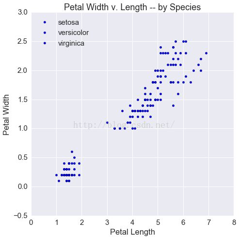
fig, ax = plt.subplots(1, 1, figsize=(7.5, 7.5))

def scatter(group):
    plt.plot(group['dt'],
             group['value'],
             label=group.name)

ts.groupby('kind').apply(scatter)

ax.set(xlabel='Petal Length',
       ylabel='Petal Width',
       title='Petal Width v. Length -- by Species')

ax.legend(loc=2)
Out[6]:

In [7]:
df = pd.read_csv('data/iris.csv')
df.head()
Out[7]:
In [8]:
fig, ax = plt.subplots(1, 1, figsize=(7.5, 7.5))

for i, s in enumerate(df.species.unique()):
    tmp = df[df.species == s]
    ax.scatter(tmp.petalLength, tmp.petalWidth,
               label=s)

ax.set(xlabel='Petal Length',
       ylabel='Petal Width',
       title='Petal Width v. Length -- by Species')

ax.legend(loc=2)
Out[8]:
In [9]:
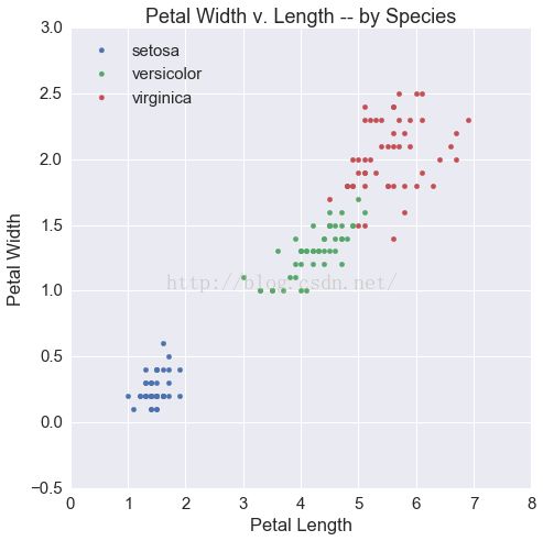
fig, ax = plt.subplots(1, 1, figsize=(7.5, 7.5))

for i, s in enumerate(df.species.unique()):
    tmp = df[df.species == s]
    ax.scatter(tmp.petalLength, tmp.petalWidth,
               label=s, color=cp[i])

ax.set(xlabel='Petal Length',
       ylabel='Petal Width',
       title='Petal Width v. Length -- by Species')

ax.legend(loc=2)
Out[9]:
In [10]:
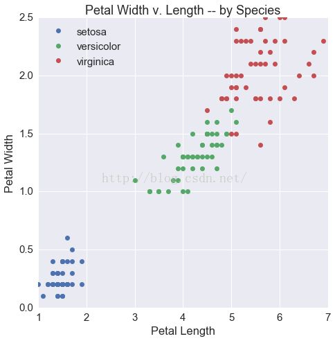
fig, ax = plt.subplots(1, 1, figsize=(7.5, 7.5))

def scatter(group):
    plt.plot(group['petalLength'],
             group['petalWidth'],
             'o', label=group.name)

df.groupby('species').apply(scatter)

ax.set(xlabel='Petal Length',
       ylabel='Petal Width',
       title='Petal Width v. Length -- by Species')

ax.legend(loc=2)
Out[10]:
In [11]:
fig, ax = plt.subplots(2, 2, figsize=(10, 10))
tmp = ts[ts.kind == 'A']
ax[0][0].plot(tmp.dt, tmp.value, label=k, c=cp[0])
ax[0][0].set(xlabel='Date', ylabel='Value', title="A")

tmp = ts[ts.kind == 'B']
ax[0][1].plot(tmp.dt, tmp.value, label=k, c=cp[1])
ax[0][1].set(xlabel='Date', ylabel='Value', title='B')

tmp = ts[ts.kind == 'C']
ax[1][0].plot(tmp.dt, tmp.value, label=k, c=cp[2])
ax[1][0].set(xlabel='Date', ylabel='Value', title='C')

tmp = ts[ts.kind == 'D']
ax[1][1].plot(tmp.dt, tmp.value, label=k, c=cp[3])
ax[1][1].set(xlabel='Date', ylabel='Value', title='D')


fig.autofmt_xdate()
fig.tight_layout()

In [12]:
fig, ax = plt.subplots(2, 2, figsize=(10, 10))

for i, k in enumerate(ts.kind.unique()):
    ax = plt.subplot(int('22' + str(i + 1)))
    tmp = ts[ts.kind == k]
    ax.plot(tmp.dt, tmp.value, label=k, c=cp[i])

    ax.set(xlabel='Date',
           ylabel='Value',
           title=k)

fig.autofmt_xdate()
fig.tight_layout()

In [13]:
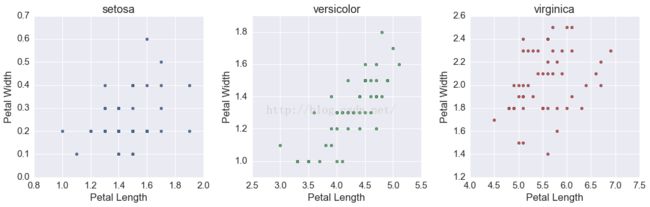
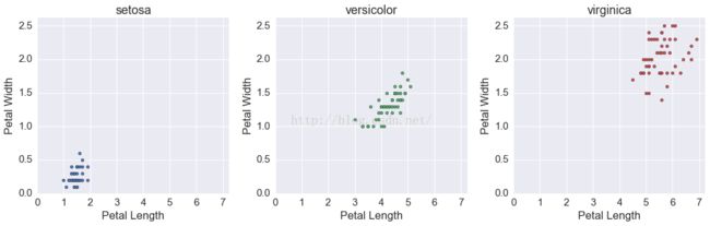
fig, ax = plt.subplots(1, 3, figsize=(15, 5))

for i, s in enumerate(df.species.unique()):
    tmp = df[df.species == s]

    ax[i].scatter(tmp.petalLength, tmp.petalWidth, c=cp[i])

    ax[i].set(xlabel='Petal Length',
              ylabel='Petal Width',
              title=s)

fig.tight_layout()
In [14]:
fig, ax = plt.subplots(1, 3, figsize=(15, 5))

for i, s in enumerate(df.species.unique()):
    tmp = df[df.species == s]

    ax[i].scatter(tmp.petalLength,
                  tmp.petalWidth,
                  c=cp[i])

    ax[i].set(xlabel='Petal Length',
              ylabel='Petal Width',
              title=s)

    ax[i].set_ylim(bottom=0, top=1.05*np.max(df.petalWidth))
    ax[i].set_xlim(left=0, right=1.05*np.max(df.petalLength))

fig.tight_layout()
In [15]:
tmp_n = df.shape[0] - df.shape[0]/2

df['random_factor'] = np.random.permutation(['A'] * tmp_n + ['B'] * (df.shape[0] - tmp_n))
df.head()
Out[15]:
In [16]:
fig, ax = plt.subplots(2, 3, figsize=(15, 10))

# this is preposterous -- don't do this
for i, s in enumerate(df.species.unique()):
    for j, r in enumerate(df.random_factor.sort_values().unique()):
        tmp = df[(df.species == s) & (df.random_factor == r)]

        ax[j][i].scatter(tmp.petalLength,
                         tmp.petalWidth,
                         c=cp[i+j])

        ax[j][i].set(xlabel='Petal Length',
                     ylabel='Petal Width',
                     title=s + '--' + r)

        ax[j][i].set_ylim(bottom=0, top=1.05*np.max(df.petalWidth))
        ax[j][i].set_xlim(left=0, right=1.05*np.max(df.petalLength))

fig.tight_layout()
#fig.suptitle('Allen.Tan', horizontalalignment='left')

In [17]:
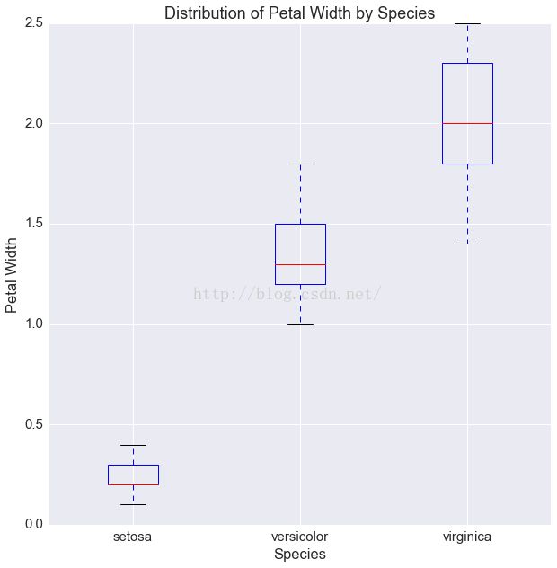
fig, ax = plt.subplots(1, 1, figsize=(10, 10))

ax.boxplot([df[df.species == s]['petalWidth'].values
                for s in df.species.unique()])

ax.set(xticklabels=df.species.unique(),
       xlabel='Species',
       ylabel='Petal Width',
       title='Distribution of Petal Width by Species')
Out[17]:
In [18]:
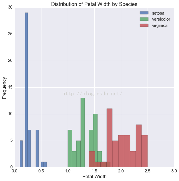
fig, ax = plt.subplots(1, 1, figsize=(10, 10))

for i, s in enumerate(df.species.unique()):
    tmp = df[df.species == s]
    ax.hist(tmp.petalWidth, label=s, alpha=.8)

ax.set(xlabel='Petal Width',
       ylabel='Frequency',
       title='Distribution of Petal Width by Species')

ax.legend(loc=1)
Out[18]:
In [19]:
df = pd.read_csv('data/titanic.csv')
df.head()
Out[19]:
In [20]:
dfg = df.groupby(['survived', 'pclass']).agg({'fare': 'mean'})
dfg
Out[20]:
In [21]:
died = dfg.loc[0, :]
died
Out[21]:
In [22]:
survived = dfg.loc[1, :]
survived
Out[22]:
In [23]:
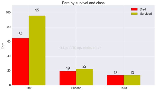
# more or less copied from matplotlib's own
# api example
fig, ax = plt.subplots(1, 1, figsize=(12.5, 7))

N = 3

ind = np.arange(N)  # the x locations for the groups
width = 0.35        # the width of the bars

rects1 = ax.bar(ind, died.fare, width, color='r')
rects2 = ax.bar(ind + width, survived.fare, width, color='y')

# add some text for labels, title and axes ticks
ax.set_ylabel('Fare')
ax.set_title('Fare by survival and class')
ax.set_xticks(ind + width)
ax.set_xticklabels(('First', 'Second', 'Third'))

ax.legend((rects1[0], rects2[0]), ('Died', 'Survived'))


def autolabel(rects):
    # attach some text labels
    for rect in rects:
        height = rect.get_height()
        ax.text(rect.get_x() + rect.get_width()/2., 1.05*height,
                '%d' % int(height),
                ha='center', va='bottom')

ax.set_ylim(0, 110)

autolabel(rects1)
autolabel(rects2)

plt.show()
In [24]:
# more or less copied from matplotlib's own
# api example
fig, ax = plt.subplots(1, 1, figsize=(12.5, 7))

N = 3

ind = np.arange(N)  # the x locations for the groups
width = 0.35        # the width of the bars

rects1 = ax.bar(ind, died.fare, width, color='r')
rects2 = ax.bar(ind + width, survived.fare, width, color='y')


ax.legend((rects1[0], rects2[0]), ('Died', 'Survived'))


ax.set(xticks=(ind + width),
       ylabel='Fare',
       title='Fare by survival and class',
       xticklabels=('First', 'Second', 'Third'))


def autolabel(rects):
    # attach some text labels
    for rect in rects:
        height = rect.get_height()
        ax.text(rect.get_x() + rect.get_width()/2., 1.05*height,
                '%d' % int(height),
                ha='center', va='bottom')

ax.set_ylim(0, 110)

autolabel(rects1)
autolabel(rects2)

plt.show()
