python金融大数据分析笔记----第五章(数据可视化)3 ---【金融学图表】
1.绘制股票数据图(蜡烛图)
学习借鉴自:
-
5.2 金融学图表
-
matplotlib.finance没有了
-
mpl_finance模块使用
# -*- coding: utf-8 -*-
"""
Created on Mon Oct  7 15:27:08 2019

@author: qwy
"""
import mpl_finance as mpf
import matplotlib.pyplot as plt
import tushare as ts
import datetime
from matplotlib.pylab import date2num
plt.rcParams['font.sans-serif']='Lisu'
plt.rcParams['axes.unicode_minus']=False

start = '2018-05-31'
end = '2018-06-30'
k_d = ts.get_k_data('600118', start, end, ktype='D')
print(k_d.head())
k_d.date = k_d.date.map(lambda x: date2num(datetime.datetime.strptime(x, '%Y-%m-%d')))
quotes = k_d.values

#---------------------------------------

fig, ax = plt.subplots(figsize=(8, 5))
fig.subplots_adjust(bottom=0.2)
mpf.candlestick_ochl(ax, quotes, width=0.6, colorup='r', colordown='g', alpha=0.8)
plt.grid(True)
ax.xaxis_date()
# dates on the x-axis
ax.autoscale_view()
plt.setp(plt.gca().get_xticklabels(), rotation=30)
运行得:
           date    open   close    high     low   volume    code
98   2018-05-31  20.900  20.920  21.000  20.711  51514.0  600118
99   2018-06-01  20.910  20.970  21.477  20.781  56831.0  600118
100  2018-06-04  20.970  21.039  21.169  20.930  38909.0  600118
101  2018-06-05  20.990  21.308  21.368  20.980  45981.0  600118
102  2018-06-06  21.258  21.268  21.368  21.129  35788.0  600118
Out[9]: [None, None, None, None, None, None, None, None, None, None]

1.1关于plt.setp(plt.gca().get_xticklabels(), rotation=30)
将x轴标签旋转30度,为此使用了plt.gca函数,该函数返回当前的figure函数,然后调用get_xticklabels方法提供图形的x轴刻度标签
1.2关于 mpf.candlestick_ochl(ax, quotes, width=0.6, colorup=‘r’, colordown=‘g’, alpha=0.8)
中 mpf.candlesticks函数不同参数说明
| 参数 | 描述 |
|---|---|
| ax | 绘制使用的Axes实例 |
| quotes | 绘制使用金融数据(时间、开盘价、收盘价、最高价、最低价) |
| width | 矩形宽度代表的长度 |
| colorup | 收盘价大于等于开盘价时的矩形颜色 |
| colordown | 收盘价小于开盘价时的矩形颜色 |
| alpha | 矩形的alpha级别 |
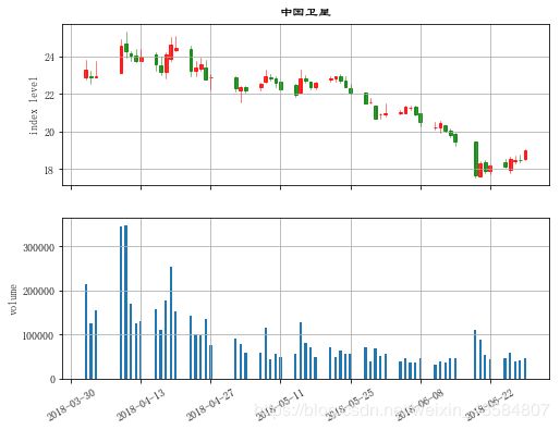
2.蜡烛图和成交量柱状图组合而成的图表(股票数据和成交量数据的结合)
import mpl_finance as mpf
import matplotlib.pyplot as plt
import tushare as ts
import datetime
from matplotlib.pylab import date2num
plt.rcParams['font.sans-serif']='Lisu'
plt.rcParams['axes.unicode_minus']=False

start = '2018-05-31'
end = '2018-06-30'
k_d = ts.get_k_data('600118', start, end, ktype='D')
print(k_d.head())
k_d.date = k_d.date.map(lambda x: date2num(datetime.datetime.strptime(x, '%Y-%m-%d')))
quotes = k_d.values

#---------上面这部分代码与第1点的前半部分代码同---------

fig, (ax1, ax2) = plt.subplots(2, sharex=True, figsize=(8, 6))
mpf.candlestick_ochl(ax1, quotes, width=0.6, colorup='r', colordown='g', alpha=0.8)
ax1.set_title('中国卫星')
ax1.set_ylabel('index level')
ax1.grid(True)
ax1.xaxis_date()
plt.bar(quotes[:,0],quotes[:,5],width=0.5)
ax2.set_ylabel('volume')
ax2.grid(True)
plt.setp(plt.gca().get_xticklabels(), rotation=30)
plt.show()
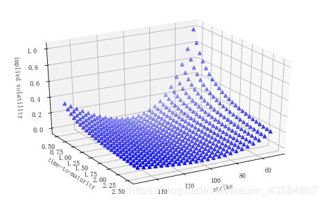
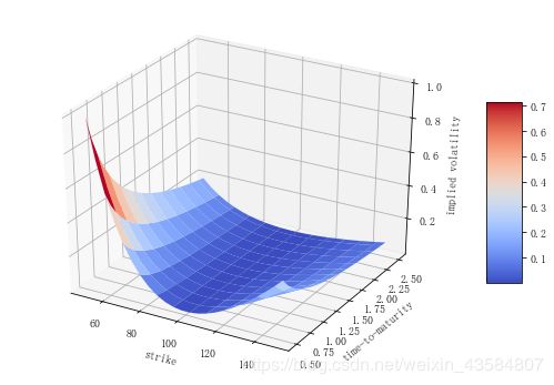
3. 3D&波动率
金融在3D可视化的获益领域不是很多,但是波动率平面却是3D可视化的一个应用领域,它可以同时展示许多到期日和行权价的隐含波动率
from mpl_toolkits.mplot3d import Axes3D
import matplotlib.pyplot as plt
import numpy as np
plt.rcParams['font.sans-serif']='Lisu'
plt.rcParams['axes.unicode_minus']=False

strike = np.linspace(50, 150, 24)
ttm = np.linspace(0.5, 2.5, 24)
strike, ttm = np.meshgrid(strike, ttm)
iv = (strike - 100) ** 2 / (100 * strike) / ttm
# generate fake implied volatilities

fig = plt.figure(figsize=(9, 6))
ax = fig.gca(projection='3d')

'''同上面两行代码
fig = plt.figure(figsize=(12, 8))
ax = Axes3D(fig)
'''

surf = ax.plot_surface(strike, ttm, iv, rstride=2,
                       cstride=2, cmap=plt.cm.coolwarm,
                       linewidth=0.5, antialiased=True)
ax.set_xlabel('strike')
ax.set_ylabel('time-to-maturity')
ax.set_zlabel('implied volatility')
fig.colorbar(surf, shrink=0.5, aspect=5)
关于plot_surface参数
| 参数 | 描述 |
|---|---|
| X,Y,Z | 2D数组形式的数据值 |
| rstride | 数组行距(步长大小) |
| cstride | 数组列距(步长大小) |
| color | 曲面块颜色 |
| cmap | 曲面块颜色映射 |
| facecolors | 单独曲面块表面颜色 |
| norm | 将值映射为颜色的 Nonnalize实例 |
| vmin | 映射的最小值 |
| vmax | 映射的最大值 |
#(模拟)隐含波动率的 3D 散点图
fig = plt.figure(figsize=(8, 5))
ax = fig.add_subplot(111,projection='3d')
ax.view_init(30,60)
ax.scatter(strike, ttm, iv, zdir='z',s=25,c='b',marker='^')
ax.set_xlabel('strike')
ax.set_ylabel('time-to-maturity')
ax.set_zlabel('implied volatility')