微信小程序开发学习笔记一 布局
Practice.wxml代码如下:
<text>123text>
<view style="flex-direction:row">
<viewclass="flex-itembc_green">1view>
<viewclass="flex-itembc_red">2view>
<viewclass="flex-itembc_blue">3view>
view>
Practice.wxss代码如下:
.bc_green{
background-color:#7FFFAA
}
.bc_red{
background-color:#DC143C
}
.bc_blue{
background-color:#0000FF
}
显示如图: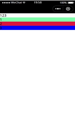
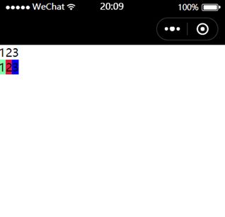
下面用弹性布局:
.wxml:
<text>123text>
<view class="flex-wrp"style="flex-direction:row">
<viewclass="flex-itembc_green">1view>
<viewclass="flex-itembc_red">2view>
<viewclass="flex-itembc_blue">3view>
view>
.wxss:
.bc_green{
background-color:#7FFFAA
}
.bc_red{
background-color:#DC143C
}
.bc_blue{
background-color:#0000FF
}
.flex-wrp{
display:flex
}
无非在class属性中添加“flex-wrp”并在wxss中表示之“display:flex”
结果如图:
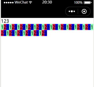
刚刚所采用的是简单横向排列,如果很多个view如此排列,则每个view会被压缩以适应设备宽度。如何折行呢?
此时要用class属性的“flex-wrap:wrap”
先展示一套方法:
代码如下:
<text>123text>
<view class="flex-wrp"style="flex-direction:row;flex-wrap:wrap">
<viewclass="flex-itembc_green">1view>
<viewclass="flex-itembc_red">2view>
<viewclass="flex-itembc_blue">3view>
<viewclass="flex-itembc_green">1view>
<viewclass="flex-itembc_red">2view>
<viewclass="flex-itembc_blue">3view>
<viewclass="flex-itembc_green">1view>;
<viewclass="flex-itembc_red">2view>
<viewclass="flex-itembc_blue">3view>
.
.
.
view>
或者在wxss,将flex-wrap添加到flex-row中
此时都能如愿折行:
.wxml:
<text>123text>
<view class="flex-wrpflex-row">
<viewclass="flex-itembc_green">1view>
<viewclass="flex-itembc_red">2view>
<viewclass="flex-itembc_blue">3view>
view>
.wxss:
在原有基础上添加:
.flex-row{
flex-wrap:wrap;
flex-direction:row
}
同样的道理,如果将flex-direction的值设置为column,则会竖向排列。
水平排列中:
向style属性中加入justify-content:flex-start;
justify-content:flex-end;
justify-content:center;
则会实现左对齐,右对齐,中心对齐(默认左对齐)
justify-content的对齐方式和主轴的方向有关,下图以flex-direction为row,主轴方式是从左到右,描述jstify-content5个值的显示效果:
该段引用自:https://blog.csdn.net/qq_34281962/article/details/52729215
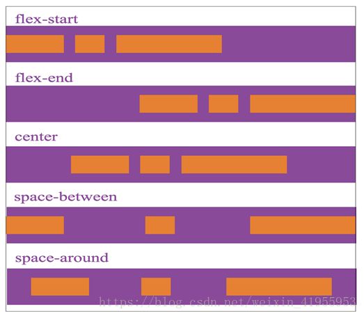
以上是水平排列的的情况
对于垂直排列来说,需要使用align-items属性(默认左对齐)
即将水平排列中的justify-content改为align-items相应的值不变
附加内容:stretch 填充整个容器(默认值)
baseline 以子元素的第一行文字对齐