Email Marketing Strategy Optimization
Goal
Optimizing marketing campaigns is one of the most common data science tasks. Among the many possible marketing tools, one of the most efficient is using emails.
Emails are great cause they are free and can be easily personalized. Email optimization involves personalizing the text and/or the subject, who should receive it, when should be sent, etc. Machine Learning excels at this.
Challenge Description
The marketing team of an e-commerce site has launched an email campaign. This site has email addresses from all the users who created an account in the past.
They have chosen a random sample of users and emailed them. The email let the user know about a new feature implemented on the site. From the marketing team perspective, a success is if the user clicks on the link inside of the email. This link takes the user to the company site.
You are in charge of figuring out how the email campaign performed and were asked the following questions:
-
What percentage of users opened the email and what percentage clicked on the link within the email?
-
The VP of marketing thinks that it is stupid to send emails to a random subset and in a random way. Based on all the information you have about the emails that were sent, can you build a model to optimize in future email campaigns to maximize the probability of users clicking on the link inside the email?
-
By how much do you think your model would improve click through rate ( defined as # of users who click on the link / total users who received the email). How would you test that?
-
Did you find any interesting pattern on how the email campaign performed for different segments of users? Explain.
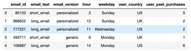
Columns:
email_id : the Id of the email that was sent. It is unique by email
email_text : there are two versions of the email: one has “long text” (i.e. has 4 paragraphs) and one has “short text” (just 2 paragraphs)
email_version : some emails were “personalized” (i.e. they had the name of the user receiving the email in the incipit, such as “Hi John,”), while some emails were “generic” (the incipit was just “Hi,”).
hour : the user local time when the email was sent.
weekday : the day when the email was sent.
user_country : the country where the user receiving the email was based. It comes from the user ip address when she created the account.
user_past_purchases : how many items in the past were bought by the user receiving the email
import warnings
warnings.simplefilter('ignore')

import numpy as np
import pandas as pd
import seaborn as sns
import matplotlib.pyplot as plt
from sklearn.metrics import auc, roc_curve, classification_report

%matplotlib inline
load data
# read email_table.csv
email_table = pd.read_csv('email_table.csv')
email_table.head()
email_table.info()

# read email_opened_table.csv
email_opened = pd.read_csv('email_opened_table.csv')
email_opened.head()

email_opened.info()
# read link_clicked_table.csv
link_clicked = pd.read_csv('link_clicked_table.csv')
link_clicked.head()
link_clicked.info()

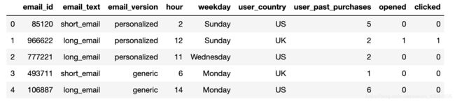
# merge link_clicked_table and email_open_table into email_table
email_opened['opened']=1
link_clicked['clicked']=1
data = pd.merge(left = email_table,right=email_opened,how ='left',on='email_id')
data = pd.merge(left = data,right = link_clicked,how='left',on='email_id')
data = data.fillna(value = 0)
data['opened'] = data['opened'].astype(int)
data['clicked'] = data['clicked'].astype(int)
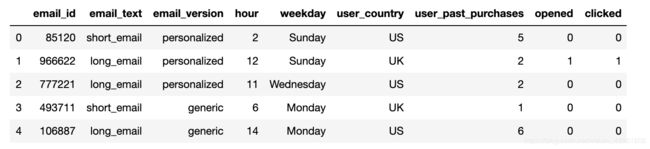
data.head()
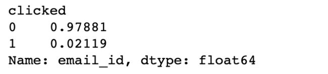
1. What percentage of users opened the email and what percentage clicked on the link within the email?
print ('{} {}%'.format('Opened user percentage',data['opened'].mean()*100))
print ('{} {}%'.format('clicked user percentage',data['clicked'].mean()*100))
Opened user percentage 10.345%
clicked user percentage 2.119%
2. The VP of marketing thinks that it is stupid to send emails to a random subset and in a random way. Based on all the information you have about the emails that were sent, can you build a model to optimize in future email campaigns to maximize the probability of users clicking on the link inside the email?
Before we build the model, let’s do some EDA
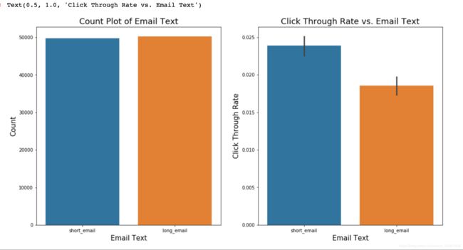
### Visualization of `email_text`
fig,ax = plt.subplots(nrows=1,ncols=2,figsize=(20,8))

sns.countplot(data=data,x='email_text',ax=ax[0])
ax[0].set_xlabel('Email Text',fontsize=15)
ax[0].set_ylabel('Count',fontsize=15)
ax[0].set_title('Count Plot of Email Text', fontsize=18)

sns.barplot(data=data,x='email_text',y = 'clicked',ax=ax[1])
ax[1].set_xlabel('Email Text',fontsize=15)
ax[1].set_ylabel('Click Through Rate',fontsize=15)
ax[1].set_title('Click Through Rate vs. Email Text', fontsize=18)
### Visualization of `email_version`
fig,ax = plt.subplots(nrows=1,ncols=2,figsize=(20,8))

sns.countplot(data=data,x='email_version',ax=ax[0])
ax[0].set_xlabel('Email Version',fontsize=15)
ax[0].set_ylabel('Count',fontsize=15)
ax[0].set_title('Count Plot of Email Version', fontsize=18)

sns.barplot(data=data,x='email_version',y = 'clicked',ax=ax[1])
ax[1].set_xlabel('Email Version',fontsize=15)
ax[1].set_ylabel('Click Through Rate',fontsize=15)
ax[1].set_title('Click Through Rate vs. Email Version', fontsize=18)

### Visualization of `hour`
fig,ax = plt.subplots(nrows=1,ncols=2,figsize=(20,8))

sns.countplot(data=data,x='hour',ax=ax[0])
ax[0].set_xlabel('Hour',fontsize=15)
ax[0].set_ylabel('Count',fontsize=15)
ax[0].set_title('Count Plot of Hour', fontsize=18)

sns.barplot(data=data,x='hour',y = 'clicked',ax=ax[1])
ax[1].set_xlabel('Hour',fontsize=15)
ax[1].set_ylabel('Click Through Rate',fontsize=15)
ax[1].set_title('Click Through Rate vs. Hour', fontsize=18)

### Visualization of `weekday`
fig,ax = plt.subplots(nrows=1,ncols=2,figsize=(20,8))

sns.countplot(data=data,x='weekday',ax=ax[0])
ax[0].set_xlabel('Weekday',fontsize=15)
ax[0].set_ylabel('Count',fontsize=15)
ax[0].set_title('Count Plot of Weekday', fontsize=18)

sns.barplot(data=data,x='weekday',y = 'clicked',ax=ax[1])
ax[1].set_xlabel('Weekday',fontsize=15)
ax[1].set_ylabel('Click Through Rate',fontsize=15)
ax[1].set_title('Click Through Rate vs. Weekday', fontsize=18)

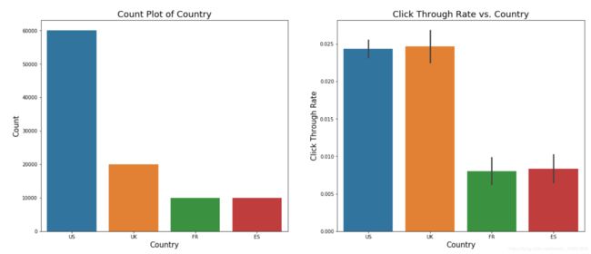
### Visualization of `user_country`
fig,ax = plt.subplots(nrows=1,ncols=2,figsize=(20,8))

sns.countplot(data=data,x='user_country',ax=ax[0])
ax[0].set_xlabel('Country',fontsize=15)
ax[0].set_ylabel('Count',fontsize=15)
ax[0].set_title('Count Plot of Country', fontsize=18)

sns.barplot(data=data,x='user_country',y = 'clicked',ax=ax[1])
ax[1].set_xlabel('Country',fontsize=15)
ax[1].set_ylabel('Click Through Rate',fontsize=15)
ax[1].set_title('Click Through Rate vs. Country', fontsize=18)
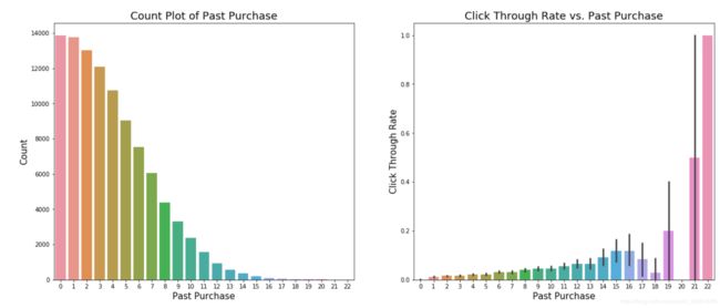
### Visualization of `user_past_purchases`
fig,ax = plt.subplots(nrows=1,ncols=2,figsize=(20,8))

sns.countplot(data=data,x='user_past_purchases',ax=ax[0])
ax[0].set_xlabel('Past Purchase',fontsize=15)
ax[0].set_ylabel('Count',fontsize=15)
ax[0].set_title('Count Plot of Past Purchase', fontsize=18)

sns.barplot(data=data,x='user_past_purchases',y = 'clicked',ax=ax[1])
ax[1].set_xlabel('Past Purchase',fontsize=15)
ax[1].set_ylabel('Click Through Rate',fontsize=15)
ax[1].set_title('Click Through Rate vs. Past Purchase', fontsize=18)
Build Predictive Model
I will build a model to predict whether a user will open the email and click the link inside it.Based on our findings in this section hopefully we can come up with new email sending strategy that maximize the probability of clicking
data.groupby('clicked')['email_id'].count()/len(data)
from sklearn.preprocessing import LabelEncoder
from sklearn.metrics import classification_report,roc_curve,precision_score,recall_score,auc,precision_recall_curve
from sklearn.model_selection import train_test_split
import xgboost as xgb
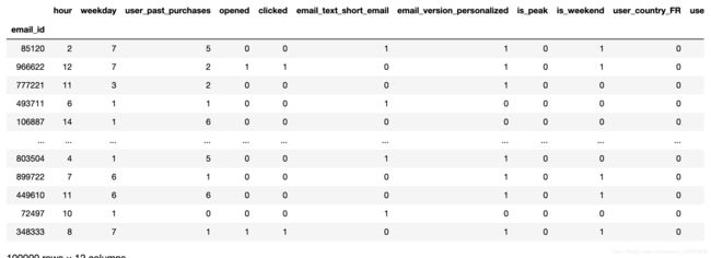
X = data.copy()
X.head()
feature engineering guidelines
- email_text long/short binary
- email_version personalized/generic binary
- hour peak 22-24 /off-peak binary
- weekday weekend/not weekend binary
- user_country categorical
# 1. email_text long/short binary
X = pd.get_dummies(X,columns=["email_text"],drop_first=True)
#2. email_version personalized/generic binary
X = pd.get_dummies(X,columns=["email_version"],drop_first=True)
#3. hour peak 22-24 /off-peak binary
X['is_peak'] = (X.hour>=22).astype(int)
#4. weekday  weekend/not weekend binary
weekday2index = {"Monday":1,"Tuesday":2,"Wednesday":3,"Thursday":4,"Friday":5,"Saturday":6,"Sunday":7}
X["weekday"] = data.weekday.map(weekday2index)
X['is_weekend'] = (X.weekday>=5).astype(int)
#5. user_country categorical
X = pd.get_dummies(X,columns=["user_country"],drop_first=True)
X.set_index('email_id')
# target label
y =(X.clicked == 1).astype(int)
# features
x=X.drop(['hour','weekday','opened','clicked'],axis= 1).set_index('email_id')
# split for training and testing
Xtrain,Xtest,ytrain,ytest = train_test_split(x,y,test_size=0.33333)
print ('Train set shape: {}, positive ratio={:.3f}'.format(Xtrain.shape,ytrain.mean()))
print ('Test set shape: {}, positive ratio={:.3f}'.format(Xtest.shape,ytest.mean()))
Train set shape: (66667, 8), positive ratio=0.022
Test set shape: (33333, 8), positive ratio=0.020
Train the model
train_matrix = xgb.DMatrix(Xtrain,ytrain)
test_matrix = xgb.DMatrix(Xtest)
params = {}
params['objective'] = 'binary:logistic'  # output probabilities
params['eval_metric'] = 'auc'
params["num_rounds"] = 300
params["early_stopping_rounds"] = 30
params['max_depth'] = 6
params['eta'] = 0.1
params["subsample"] = 0.8
params["colsample_bytree"] = 0.8

cv_results = xgb.cv(params,train_matrix,
                    num_boost_round = params["num_rounds"],
                    nfold = params.get('nfold',5),
                    metrics = params['eval_metric'],
                    early_stopping_rounds = params["early_stopping_rounds"],
                    verbose_eval = True,
                    seed = seed)
n_best_trees = cv_results.shape[0]
print ("best number of trees: {}".format(n_best_trees))
watchlist = [(train_matrix, 'train')]
gbt = xgb.train(params, train_matrix, n_best_trees,watchlist)
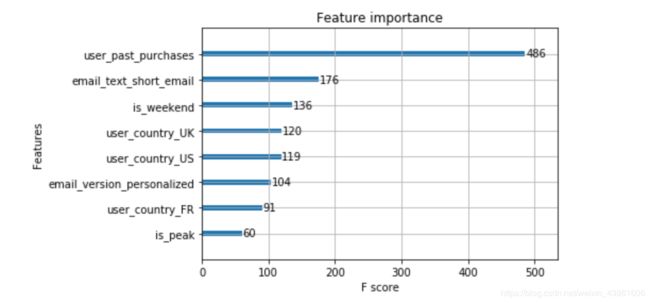
# plot feature importances
xgb.plot_importance(gbt)
Plot ROC curve and choose better probability threshold
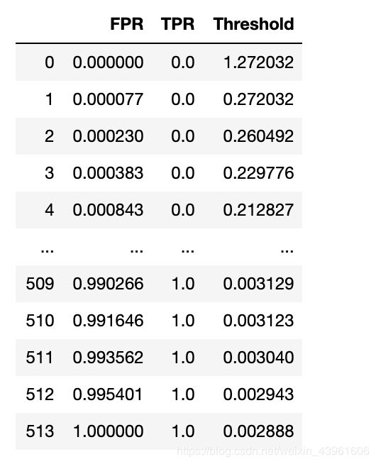
since the data is highly imbalanced (positive examples is only 2% of the total examples), if using default probability threshold (0.5), the model just classify every example as negative, so we need to plot the ROC curve and choose a better probability threshold.
But ROC cannot be plot on either training set or test set. so I split the original train set into ‘training’ and ‘validation’ sets, re-train on ‘training set’ and plot ROC on ‘validation set’.
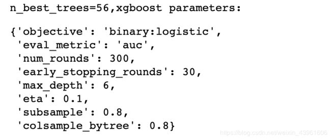
print ("n_best_trees={},xgboost parameters: ".format(n_best_trees))
params
# define a function, avoid pollute the current namespace
def validation_roc():
    Xtrain_only,Xvalid,ytrain_only,yvalid = train_test_split(Xtrain,ytrain,test_size=0.2,random_state=seed)

    train_only_matrix = xgb.DMatrix(Xtrain_only,ytrain_only)
    valid_matrix = xgb.DMatrix(Xvalid)

    # retrain on training set
    gbt_train_only = xgb.train(params, train_only_matrix, n_best_trees)

    # predict on validation set
    yvalid_probas = gbt_train_only.predict(valid_matrix, ntree_limit=n_best_trees)

    d = {}
    d['FPR'],d['TPR'],d['Threshold'] = roc_curve(yvalid,yvalid_probas)
    return pd.DataFrame(d)
roc_results = validation_roc()
roc_results
plt.plot(roc_results.FPR,roc_results.TPR)
plt.xlabel('FPR')
plt.ylabel('TPR')

import math
Youden = [1-roc_results['FPR'][i]+roc_results['TPR'][i] for i in range(len(roc_results))]
Youden.index(max(Youden))
roc_results['Threshold'][256]
# choose a threshold based on ROC
# use Youden Index, choose ROC where maximize specificity + sensitivity, and select its threshold.
pos_prob_threshold = roc_results['Threshold'][256]

def adjust_predict(matrix):
    y_probas = gbt.predict(matrix, ntree_limit=n_best_trees)
    return (y_probas > pos_prob_threshold).astype(int)
ytrain_pred = adjust_predict(train_matrix)
print (classification_report(ytrain,ytrain_pred))

ytest_pred = adjust_predict(test_matrix)
print (classification_report(ytest,ytest_pred))

more accurate Precision and Recall
print ("test precision: {:.2f}%".format(precision_score(ytest,ytest_pred) * 100))
print ("test recall: {:.2f}%".format(recall_score(ytest,ytest_pred) * 100))
test precision: 3.86%
test recall: 69.97%
n_emails_old_sent = ytest_pred.shape[0]
n_emails_new_sent = ytest_pred.sum()
saving_percentage = 100 - n_emails_new_sent * 100.0/n_emails_old_sent
pd.Series({'#emails sent in old way': n_emails_old_sent,
           '#emails sent in new way': n_emails_new_sent,
           'saving percentage (%)': saving_percentage})
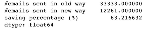
according to its predictive result on test set
my model only need to send 37% of the old email amount, saving 63% amount.
my model will cover 70% of valued users which will click the link.
3.86% of the receiver will open email and click the link. compare with old strategy, whose click rate is 2.12%, my new strategy can double the click rate.
3. By how much do you think your model would improve click through rate ( defined as # of users who click on the link / total users who received the email). How would you test that?
I have build a Gradient Boosting Tree model in previous section which predicts whether a user will click the link or not. Then the new email campaign strategy will be: only send email to users which my GBM model predicts positive.
To test my conclusion, we need to perform a A/B test:
- randomly assign users to two groups, Control group and Experiment group.
- in Control group, still use the old email-campaign strategy, i.e., just send emails to all users in Control group.
- in Experiment group, use my model to predict whether the user will click the link or not. and only send emails to those users whose predictive result is positive.
- then we preform a one-tail unpaired t-test to test whether Experiement group’s population proportion is higher than Control group’s population proportion.
4. Did you find any interesting pattern on how the email campaign performed for different segments of users? Explain.
from above explorary analysis, I can find some interesting patterns listed below:
The more item a certain user purchased in the past, the more likely that user will click the link
Users from English-speaking coutries are more likely to click the link, which may be caused by some translation issue.
Personalized email is more likely to be opened and clicked
Emails sent at weekends is less likely to be opened and clicked
Sending hour and #Paragraphs are not very important features to affect click rate