VUE模态框-XModal,消息弹框
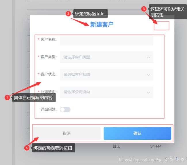
HTML部分:绑定title、宽度、高度、确定取消按钮等…
<template>
<modal :name="this.name" :width="this.width" :height="this.height" :minWidth="this.minWidth" :minHeight="this.minHeight" :maxWidth="this.maxWidth" :maxHeight="this.maxHeight" :pivotX="this.pivotX" :pivotY="this.pivotY" :delay="this.delay" :adaptive="this.adaptive" :resizable="this.resizable" :draggable="this.draggable" :scrollable="this.scrollable" :clickToClose="this.closeOnDimmer" @before-open="beforeOpen" @before-close="beforeClose" @opened="opened" @closed="closed">
    <div class="modal">
        <div v-if="this.title" class="tit">
            <div>
                {{ this.title }}
            </div>
            <div class="cross" v-if="this.showCrossBtn">
                <i class="hiFont hi-close-thin" @click="onCancel"></i>
            </div>
        </div>
        <div class="ctn">
            <slot></slot>
        </div>
        <div class="bottom" v-if="this.cancelBtnText || this.confirmBtnText">
            <a class="cancel" :class="{loading:loadCancel}" v-if="this.cancelBtnText" @click="onCancel">
                <span v-if="loadCancel"><i class="el-icon-loading"></i>提交中...</span>
                <span v-if="!loadCancel">{{ this.cancelBtnText }}</span>
            </a>
            <a class="confirm" :class="{loading:loadConfirm}" v-if="this.confirmBtnText" @click="onConfirm">
                <span v-if="loadConfirm"><i class="el-icon-loading"></i>提交中...</span>
                <span v-if="!loadConfirm">{{ this.confirmBtnText }}</span>
            </a>
        </div>
    </div>
</modal>
</template>
数据方法部分:
<script>
export default {
    name: "xModal",
    props: {
        //模态窗的唯一标识(不能与其他模态框重复)
        name: {
            type: String,
            default: ""
        },

        //模态窗的标题
        title: {
            type: String,
            default: ""
        },

        //当存在标题时可显示右上角是否存在关闭按钮
        showCrossBtn: {
            type: Boolean,
            default: false
        },

        //取消按钮的内容(为空则没有按钮)
        cancelBtnText: {
            type: String,
            default: ""
        },

        //确认按钮的内容(为空则没有按钮)
        confirmBtnText: {
            type: String,
            default: ""
        },

        //宽度
        width: {
            type: String | Number,
            default: 600
        },

        //高度
        height: {
            type: String | Number,
            default: "auto"
        },

        //最小宽度
        minWidth: {
            type: Number,
            default: 0
        },

        //最小高度
        minHeight: {
            type: Number,
            default: 0
        },

        //最大宽度
        maxWidth: {
            type: Number,
            default: 99999999
        },

        //最大高度
        maxHeight: {
            type: Number,
            default: 99999999
        },

        //模态框X轴(0-1.0)
        pivotX: {
            type: Number,
            default: 0.5
        },

        //模态框Y轴(0-1.0)
        pivotY: {
            type: Number,
            default: 0.5
        },

        //自定义样式(如果没有v--modal则模态框就透明背景了)
        classes: {
            type: String | Array,
            default: "v--modal"
        },

        //打开模态窗的延迟,单位:秒
        delay: {
            type: Number,
            default: 0
        },

        //是否自适应宽度
        adaptive: {
            type: Boolean,
            default: true
        },

        //是否可以拉伸大小
        resizable: {
            type: Boolean,
            default: false
        },

        //是否可以自由拖拽
        draggable: {
            type: Boolean,
            default: false
        },

        //如果height属性为auto,并且模式高度超过窗口高度,则可以滚动
        scrollable: {
            type: Boolean,
            default: function () {
                return this.height == "auto";
            }
        },

        //点击遮罩层是否关闭弹窗
        closeOnDimmer: {
            type: Boolean,
            default: true
        },

        //点击确认按钮是否能关闭模态框,默认点击不会关闭
        isConfirmClose: {
            type: Boolean,
            default: false
        },

        //点击取消按钮是否能关闭模态框,默认点击就关闭
        isCancelClose: {
            type: Boolean,
            default: true
        },

        //打开模态框后需要改变的路由链接,默认为空,不改变
        url: {
            type: String,
            default: ""
        }
    },
    data() {
        return {
            lastUrl: "",
            isFirstOpen: true,
            loadCancel: false,
            loadConfirm: false,
        };
    },
    watch: {
        url(val) {
            if (this.url && !this.isFirstOpen) {
                history.replaceState(null, "", val);
            }
        }
    },
    methods: {
        //点击确认
        onConfirm() {
            if(this.loadConfirm)
                return;

            if (this.isConfirmClose) {
                this.$modal.hide(this.name);
            }
            this.$emit("onConfirm", false);
        },

        //点击取消
        onCancel() {
            if(this.loadCancel)
                return;

            if (this.isCancelClose) {
                this.$modal.hide(this.name);
            }
            this.$emit("onCancel", false);
        },

        //打开前
        beforeOpen(e) {
            this.$emit("beforeOpen", false);
        },

        //关闭前
        beforeClose(e) {
            this.$emit("beforeClose", false);
        },

        //打开后
        opened(e) {
            if (this.url) {
                this.lastUrl = this.$GetUrlRelativePath();
                history.replaceState(null, "", this.url);
                this.isFirstOpen = false;
            }
            this.$emit("opened", false);
        },

        //关闭后
        closed(e) {
            if (this.url) {
                history.replaceState(null, "", this.lastUrl);
            }
            this.$emit("closed", false);
        },

        /**
         * 切换提交按钮的加载状态
         * @param {Boolean} bool true变为加载,false恢复原样
         */
        loadBtn(bool) {
            if (this.confirmBtnText) {
                this.loadConfirm = bool;
            } else if (this.cancelBtnText) {
                this.loadCancel = bool;
            }
        }
    }
};
</script>
css样式部分:
<style lang="less" scoped>
@import "../assets/variable.less";

.modal {
    display: flex;
    flex-direction: column;
    justify-content: space-between;
    height: 100%;
}

.tit {
    height: 6rem;
    line-height: 6rem;
    text-align: center;
    width: 100%;
    position: relative;
    font-size: 2.2rem;
    font-weight: 600;
    color: @color_blue;

    .cross {
        position: absolute;
        top: 2rem;
        line-height: 2rem;
        right: 0.5rem;
        border-left: 1px solid #eee;
        color: #9b9b9b;

        i {
            padding: 0 1rem;
            display: block;
            font-size: 2rem;
            cursor: pointer;
            transition: color 0.3s ease;
            color: @color_black_light;

            &:hover {
                color: @color_blue;
            }
        }
    }
}

.ctn {
    height: 100%;
    padding: 1rem;
    position: relative;
}

.bottom {
    padding-top: 1rem;
    margin-bottom: 1rem;
    width: 100%;
    display: flex;
    box-sizing: border-box;

    a {
        border-radius: 4px;
        flex: 1;
        display: block;
        height: 4rem;
        line-height: 4rem;
        font-size: 1.5rem;
        text-align: center;
        margin: 0 1rem;
        cursor: pointer;

        &.loading {
            cursor: default;
            opacity: 0.6 !important;
        }

        &:last-child {
            margin-left: 0;
        }

        &:first-child {
            margin-left: 1rem;
        }

        &>span>i {
            margin-right: 5px;
        }
    }

    .confirm {
        background: linear-gradient(134deg,
                rgba(97, 193, 254, 1) 0%,
                rgba(66, 139, 244, 1) 100%);
        color: #fff;
    }

    .confirm:hover {
        opacity: 0.9;
    }

    .cancel {
        background: rgba(242, 242, 242, 1);
        color: #9b9b9b;
    }

    .cancel:hover {
        background-color: rgba(233, 233, 233, 1);
    }
}
</style>
具体页面应用:
<button @click="openAdd"></button>
<XModal name="contactAdd" title="添加联系人" :scrollable="true" :showCrossBtn="true" cancelBtnText="取消" confirmBtnText="确定" @onCancel="handleCancel" @onConfirm='handleConfirm'>
////components引入模态框组件
<script>
import XModal from '@/components/XModal';
export default {
components: {
XModal,
}
}
//点击按钮,显示弹框
methods:{
	openAdd() {
	            this.$modal.show("contactAdd");
	        },
	//点击取消按钮时关闭弹窗,同时也可以在其中编写关闭后需要做什么操作
	handleCancel() {
	            this.$modal.hide("contactAdd");
	        },
	//点击确定按钮时关闭弹窗,同时也可以在其中编写关闭后需要做什么操作
	handleConfirm() {
	           this.$modal.hide("contactAdd");
	        },
}
实现效果: