【Flutter】二、按钮详解
【Flutter】二、按钮详解
- 一、RaisedButton
- 1.1 RaisedButton构造器
- 1.2 RaisedButton属性说明
- 1.2.1 Button.shape
- 二、FlatButton
- 2.1 FlatButton构造器
- 2.2 FlatButton属性说明
- 三、OutlineButton
- 3.1 OutlineButton构造器
- 3.2 OutlineButton属性说明
- 四、IconButton
- 4.1 IconButton构造器
- 4.2 IconButton属性说明
- 五、FloatingActionButton
- 5.1 FloatingActionButton构造器
- 5.2 FloatingActionButton属性说明
- 六、ButtonBar
- 6.1 ButtonBar构造器
- 6.2 属性说明
- 七、DropdownButton
- 7.1 DropdownButton构造器
- 7.2 DropdownButton属性说明
- 八、PopupMenuButton
- 8.1 PopupMenuButton构造器
- 8.2 PopupMenuButton属性说明
- 测试示例
Flutter中常用按钮有:RaisedButton(凸起按钮)、FlatButton(扁平化按钮)、IconButton(图标按钮)、OutlineButton(边框annual)、FloatingActionButton(浮动按钮)、ButtonBar(按钮组)、DropdownButton(下拉按钮)、PopupMenuButton(弹出菜单按钮)。
一、RaisedButton
1.1 RaisedButton构造器
const RaisedButton({
    Key key,
    @required VoidCallback onPressed,
    ValueChanged<bool> onHighlightChanged,
    ButtonTextTheme textTheme,
    Color textColor,
    Color disabledTextColor,
    Color color,
    Color disabledColor,
    Color focusColor,
    Color hoverColor,
    Color highlightColor,
    Color splashColor,
    Brightness colorBrightness,
    double elevation,
    double focusElevation,
    double hoverElevation,
    double highlightElevation,
    double disabledElevation,
    EdgeInsetsGeometry padding,
    ShapeBorder shape,
    Clip clipBehavior,
    FocusNode focusNode,
    MaterialTapTargetSize materialTapTargetSize,
    Duration animationDuration,
    Widget child,
  }) : assert(elevation == null || elevation >= 0.0),
       assert(focusElevation == null || focusElevation >= 0.0),
       assert(hoverElevation == null || hoverElevation >= 0.0),
       assert(highlightElevation == null || highlightElevation >= 0.0),
       assert(disabledElevation == null || disabledElevation >= 0.0),
       super(
         key: key,
         onPressed: onPressed,
         onHighlightChanged: onHighlightChanged,
         textTheme: textTheme,
         textColor: textColor,
         disabledTextColor: disabledTextColor,
         color: color,
         disabledColor: disabledColor,
         focusColor: focusColor,
         hoverColor: hoverColor,
         highlightColor: highlightColor,
         splashColor: splashColor,
         colorBrightness: colorBrightness,
         elevation: elevation,
         focusElevation: focusElevation,
         hoverElevation: hoverElevation,
         highlightElevation: highlightElevation,
         disabledElevation: disabledElevation,
         padding: padding,
         shape: shape,
         clipBehavior: clipBehavior,
         focusNode: focusNode,
         materialTapTargetSize: materialTapTargetSize,
         animationDuration: animationDuration,
         child: child,
       );
1.2 RaisedButton属性说明
| 属性 | 说明 |
|---|---|
| VoidCallback onPressed | 点击事件 |
| ValueChanged onHighlightChanged | 高亮变化监听 |
| ButtonTextTheme textTheme | 控制文本主题 ButtonTextTheme.normal: 文本颜色为黑色或白色,取决于ThemeData.brightness,可在MaterialApp下设置theme:ThemeData(brightness: Brightness.light);黑暗模式或高亮模式 ButtonTextTheme.accent: 文本颜色取决于ThemeData.accentColor ButtonTextTheme.primary:文本颜色基于ThemeData.primaryColor*设置ThemeData.primaryColor按钮文本一直为黑色 |
| Color textColor | 文本颜色 |
| Color disabledTextColor | 按钮不可点击时的文本颜色,不设置onPressed属性可触发该属性 |
| Color color | 按钮背景色 |
| Color disabledColor | 按钮不可点击时的背景色 |
| Color focusColor | |
| Color hoverColor | |
| Color highlightColor | 高亮颜色,按钮按下时会显示为该颜色 |
| Color splashColor | 水波纹颜色 |
| Brightness colorBrightness | 按钮的主题亮度,当设置了textColor、color颜色,此值无效!未设置textColor、color颜色时可使用Brightness.dark与Brightness.light |
| double elevation | 阴影扩散范围 |
| double focusElevation | |
| double hoverElevation | |
| double highlightElevation | 高亮阴影扩散范围,按钮按下时显示 |
| double disabledElevation | 按钮不可点击时阴影扩散范围 |
| EdgeInsetsGeometry padding | 内边距 例:padding: EdgeInsets(15.0) |
| ShapeBorder shape | 设置按钮边框或形状 参考1.2.1 Button.shape |
| Clip clipBehavior | 剪裁内容 Clip.hardEdge Clip.antiAlias Clip.antiAliasWithSaveLayer Clip.none |
| FocusNode focusNode | |
| MaterialTapTargetSize materialTapTargetSize | |
| Duration animationDuration | 水波纹动画持续时间 例如:Duration(milliseconds: 300) //持续300ms |
| Widget child | 定义子节点 |
1.2.1 Button.shape
1.只设置边框
shape: Border.all(
	color: Colors.blue,
	width: 2.0,
	style: BorderStyle.solid
)
2.设置形状及边框
1.BeveledRectangleBorder顶端斜角
shape: BeveledRectangleBorder(
side: BorderSide(
color: Colors.blue,
width: 1.0,
style: BorderStyle.solid
),
borderRadius: BorderRadius.all(
Radius.circular(12.0)
)
)
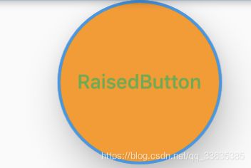
2.CircleBorder圆形
shape: CircleBorder(
side: BorderSide(
color: Colors.blue,
width: 2.0,
style: BorderStyle.solid
)
)
3.RoundedRectangleBorder圆角
shape: RoundedRectangleBorder(
borderRadius: BorderRadius.circular(10.0),
side: BorderSide(
color: Colors.blue,
width: 1.0,
style: BorderStyle.solid
)
)
4.StadiumBorder半圆角(RoundedRectangleBorder若将borderRadius设置大一点也可实现这种效果)
shape: StadiumBorder(
side: BorderSide(
color: Colors.blue,
width: 1.0,
style: BorderStyle.solid
)
)
以上四种效果分别为:


二、FlatButton
2.1 FlatButton构造器
const FlatButton({
    Key key,
    @required VoidCallback onPressed,
    ValueChanged<bool> onHighlightChanged,
    ButtonTextTheme textTheme,
    Color textColor,
    Color disabledTextColor,
    Color color,
    Color disabledColor,
    Color focusColor,
    Color hoverColor,
    Color highlightColor,
    Color splashColor,
    Brightness colorBrightness,
    EdgeInsetsGeometry padding,
    ShapeBorder shape,
    Clip clipBehavior,
    FocusNode focusNode,
    MaterialTapTargetSize materialTapTargetSize,
    @required Widget child,
  }) : super(
         key: key,
         onPressed: onPressed,
         onHighlightChanged: onHighlightChanged,
         textTheme: textTheme,
         textColor: textColor,
         disabledTextColor: disabledTextColor,
         color: color,
         disabledColor: disabledColor,
         focusColor: focusColor,
         hoverColor: hoverColor,
         highlightColor: highlightColor,
         splashColor: splashColor,
         colorBrightness: colorBrightness,
         padding: padding,
         shape: shape,
         clipBehavior: clipBehavior,
         focusNode: focusNode,
         materialTapTargetSize: materialTapTargetSize,
         child: child,
      );
2.2 FlatButton属性说明
参考RaisedButton属性说明
三、OutlineButton
3.1 OutlineButton构造器
const OutlineButton({
    Key key,
    @required VoidCallback onPressed,
    ButtonTextTheme textTheme,
    Color textColor,
    Color disabledTextColor,
    Color color,
    Color focusColor,
    Color hoverColor,
    Color highlightColor,
    Color splashColor,
    double highlightElevation,
    this.borderSide,
    this.disabledBorderColor,
    this.highlightedBorderColor,
    EdgeInsetsGeometry padding,
    ShapeBorder shape,
    Clip clipBehavior,
    FocusNode focusNode,
    Widget child,
  }) : assert(highlightElevation == null || highlightElevation >= 0.0),
       super(
         key: key,
         onPressed: onPressed,
         textTheme: textTheme,
         textColor: textColor,
         disabledTextColor: disabledTextColor,
         color: color,
         focusColor: focusColor,
         hoverColor: hoverColor,
         highlightColor: highlightColor,
         splashColor: splashColor,
         highlightElevation: highlightElevation,
         padding: padding,
         shape: shape,
         clipBehavior: clipBehavior,
         focusNode: focusNode,
         child: child,
       );
3.2 OutlineButton属性说明
参考RaisedButton属性说明
四、IconButton
4.1 IconButton构造器
const IconButton({
    Key key,
    this.iconSize = 24.0,
    this.padding = const EdgeInsets.all(8.0),
    this.alignment = Alignment.center,
    @required this.icon,
    this.color,
    this.focusColor,
    this.hoverColor,
    this.highlightColor,
    this.splashColor,
    this.disabledColor,
    @required this.onPressed,
    this.focusNode,
    this.tooltip,
  }) : assert(iconSize != null),
       assert(padding != null),
       assert(alignment != null),
       assert(icon != null),
       super(key: key);
4.2 IconButton属性说明
| 属性 | 说明 |
|---|---|
| Widget icon | 指定图标 |
| double iconSize | 指定图标大小 |
| AlignmentGeometry alignment | 图标对齐方式 Alignment.center: 居中对齐,默认 Alignment.topLeft Alignment.topCenter Alignment.topRight Alignment.centerLeft Alignment.centerRight Alignment.bottomLeft Alignment.bottomCenter Alignment.bottomRight 或使用Alignment(double x, double y):以中心为原点Alignment(-1.0, 1.0)对应Alignment.topLeft |
| String tooltip | 提示信息,按钮长按可显示,显示1500ms |
其余属性参考RaisedButton属性。
五、FloatingActionButton
5.1 FloatingActionButton构造器
const FloatingActionButton({
    Key key,
    this.child,
    this.tooltip,
    this.foregroundColor,
    this.backgroundColor,
    this.focusColor,
    this.hoverColor,
    this.heroTag = const _DefaultHeroTag(),
    this.elevation,
    this.focusElevation,
    this.hoverElevation,
    this.highlightElevation,
    this.disabledElevation,
    @required this.onPressed,
    this.mini = false,
    this.shape,
    this.clipBehavior = Clip.none,
    this.focusNode,
    this.materialTapTargetSize,
    this.isExtended = false,
  }) : assert(elevation == null || elevation >= 0.0),
       assert(focusElevation == null || focusElevation >= 0.0),
       assert(hoverElevation == null || hoverElevation >= 0.0),
       assert(highlightElevation == null || highlightElevation >= 0.0),
       assert(disabledElevation == null || disabledElevation >= 0.0),
       assert(mini != null),
       assert(isExtended != null),
       _sizeConstraints = mini ? _kMiniSizeConstraints : _kSizeConstraints,
       super(key: key);
5.2 FloatingActionButton属性说明
| 属性 | 说明 |
|---|---|
| Color foregroundColor | 图标或文本颜色 |
| Color backgroundColor | 背景色 |
| bool mini | mini模式 |
其余属性参考RaisedButton属性。
六、ButtonBar
6.1 ButtonBar构造器
const ButtonBar({
    Key key,
    this.alignment = MainAxisAlignment.end,
    this.mainAxisSize = MainAxisSize.max,
    this.children = const <Widget>[],
  }) : super(key: key);
6.2 属性说明
| 属性 | 说明 |
|---|---|
| mainAxisSize | 主轴大小,默认MainAxisSize.max |
七、DropdownButton
7.1 DropdownButton构造器
DropdownButton({
    Key key,
    @required this.items,
    this.value,
    this.hint,
    this.disabledHint,
    @required this.onChanged,
    this.elevation = 8,
    this.style,
    this.underline,
    this.icon,
    this.iconDisabledColor,
    this.iconEnabledColor,
    this.iconSize = 24.0,
    this.isDense = false,
    this.isExpanded = false,
  }) : assert(items == null || items.isEmpty || value == null || items.where((DropdownMenuItem<T> item) => item.value == value).length == 1),
       assert(elevation != null),
       assert(iconSize != null),
       assert(isDense != null),
       assert(isExpanded != null),
       super(key: key);
7.2 DropdownButton属性说明
| 属性 | 说明 |
|---|---|
| List |
下拉菜单项 |
| T value | 被选中的value值 |
| Widget hint | value属性为空时显示 |
| Widget disabledHint | 当下拉按钮不能使用时显示,不指定onChange事件即可;同时指定disabledHint与hint,hint优先级高 |
| ValueChanged onChanged | 下拉按钮改变事件 |
| int elevation | 下拉菜单弹出式的阴影范围,可选值1, 2, 3, 4, 6, 8, 9, 12,默认为8 |
| TextStyle style | 文本样式,该样式同时应用于按钮及下拉菜单 |
| Widget underline | 按钮的下划线 例:Container(height: 1.0,color: Colors.red,) 显示红色下划线 |
| Widget icon | 指定下拉按钮icon,默认使用Icons.arrow_drop_down |
| Color iconDisabledColor | 下拉按钮无法点击下拉时icon的颜色 |
| Color iconEnabledColor | 下拉按钮可使用时icon的颜色 |
| double iconSize | icon大小,默认24.0 |
| bool isDense | 降低按钮高度,如果为true按钮高度是item高度的一半 |
| bool isExpanded |
八、PopupMenuButton
8.1 PopupMenuButton构造器
const PopupMenuButton({
    Key key,
    @required this.itemBuilder,
    this.initialValue,
    this.onSelected,
    this.onCanceled,
    this.tooltip,
    this.elevation = 8.0,
    this.padding = const EdgeInsets.all(8.0),
    this.child,
    this.icon,
    this.offset = Offset.zero,
    this.enabled = true,
  }) : assert(itemBuilder != null),
       assert(offset != null),
       assert(enabled != null),
       assert(!(child != null && icon != null)), // fails if passed both parameters
       super(key: key);
8.2 PopupMenuButton属性说明
| 属性 | 说明 |
|---|---|
| PopupMenuItemBuilder |
弹出菜单项的生成器,该方法返回List |
| T initialValue | 设置弹出菜单默认选中项的值 |
| PopupMenuItemSelected |
弹出菜单被选择事件 |
| PopupMenuCanceled onCanceled | 没用任何菜单被选择时触发,即点击空白处触发 |
| String tooltip | 与IconButton一样 |
| double elevation | 弹出菜单的阴影范围,默认为8 |
| EdgeInsetsGeometry padding | 设置button和弹出菜单的内边距,默认为8 |
| Widget child | 设置按钮子节点,不能与icon同时设置 |
| Icon icon | 设置按钮图标 |
| Offset offset | 设置下拉菜单偏移量 |
| bool enabled | 是否可使用 |
测试示例
源码
import 'package:flutter/material.dart';
class ButtonDemo extends StatefulWidget{
@override
_ButtonDemoState createState() => _ButtonDemoState();
}
class _ButtonDemoState extends State<ButtonDemo>{
final buttonItems = ['item1', 'item2', 'item3', 'item4'];
final popupMenuItems = ['menu1', 'menu2', 'menu3'];
String _selectedItem;
List<DropdownMenuItem> _buildDropdownMenuItem(){
return buttonItems.map((item){
return DropdownMenuItem(
value: item,
child: Text('$item'),
);
}).toList();
}
@override
void initState() {
_selectedItem = _buildDropdownMenuItem()[0].value;
super.initState();
}
@override
Widget build(BuildContext context) {
return Row(
mainAxisAlignment: MainAxisAlignment.center,
children: <Widget>[
Column(
children: <Widget>[
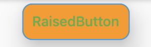
RaisedButton(
child: Text('RaisedButton'),
onPressed: () => print('click RaisedButton'),
onHighlightChanged: (item){
print(item);
},
textTheme: ButtonTextTheme.accent,
textColor: Colors.green,
disabledTextColor: Colors.black26,
color: Colors.orange,
disabledColor: Colors.grey,
highlightColor: Colors.greenAccent,
splashColor: Colors.yellow,
elevation: 20.0,
focusElevation: 30.0,
hoverElevation: 40.0,
highlightElevation: 10.0,
disabledElevation: 50.0,
padding: EdgeInsets.all(10.0),
shape: StadiumBorder(
side: BorderSide(
color: Colors.blue,
width: 1.0,
style: BorderStyle.solid
)
),
clipBehavior: Clip.antiAlias,
animationDuration: Duration(
milliseconds: 300
),
materialTapTargetSize: MaterialTapTargetSize.padded,
// shape: RoundedRectangleBorder(
// borderRadius: BorderRadius.circular(10.0),
// side: BorderSide(
// color: Colors.blue,
// width: 1.0,
// style: BorderStyle.solid
// )
// ),
// shape: CircleBorder(
// side: BorderSide(
// color: Colors.blue,
// width: 2.0,
// style: BorderStyle.solid
// )
// )
// shape: BeveledRectangleBorder(
// side: BorderSide(
// color: Colors.blue,
// width: 1.0,
// style: BorderStyle.solid
// ),
// borderRadius: BorderRadius.all(
// Radius.circular(12.0)
// )
// ),
// shape: Border.all(
// color: Colors.blue,
// width: 2.0,
// style: BorderStyle.none
// )
// focusColor: Colors.cyanAccent,
// hoverColor: Colors.green,
),
FlatButton(
child: Text('FlatButton'),
color: Theme.of(context).primaryColor,
textColor: Colors.white,
splashColor: Colors.grey,
onPressed: () => print('click FlatButton'),
),
OutlineButton(
child: Text('OutlineButton'),
onPressed: () => print('click OutlineButton'),
),
IconButton(
alignment: Alignment.center,
tooltip: 'tooltip',
icon: Icon(Icons.add_box),
onPressed: () => print('click IconButton'),
),
FloatingActionButton(
foregroundColor: Colors.red,
mini: true,
tooltip: 'tooltip',
child: Icon(Icons.add),
onPressed: () => print('click FloatingActionButton'),
),
ButtonBar(
mainAxisSize: MainAxisSize.min,
children: <Widget>[
RaisedButton(
child: Text('ButtonBar1'),
onPressed: () => print('click ButtonBar1'),
),
RaisedButton(
child: Text('ButtonBar2'),
onPressed: () => print('click ButtonBar2'),
),
],
),
DropdownButton(
value: _selectedItem,
hint: Text('value为空'),
disabledHint: Icon(Icons.home),
elevation: 12,
style: TextStyle(
color: Colors.greenAccent
),
underline: Container(
height: 1.0,
color: Colors.red,
),
icon:Icon(Icons.settings),
iconDisabledColor: Colors.grey,
iconEnabledColor: Colors.green,
iconSize: 20.0,
isDense: true,
items: _buildDropdownMenuItem(),
onChanged: (item){
setState(() {
_selectedItem = item;
});
},
),
PopupMenuButton(
icon: Icon(Icons.share),
itemBuilder: (context){
return popupMenuItems.map((item) =>
PopupMenuItem(
child: Text('$item'),
value: '$item',
)
).toList();
},
initialValue: popupMenuItems[1],
onSelected: (item) {
print(item);
},
onCanceled: (){
print('cancel');
},
tooltip: 'tooltip',
elevation: 50,
padding: EdgeInsets.all(20.0),
offset: Offset(-1.0, 10),
enabled: true,
// child: Text('下拉菜单'),
),
],
),
],
);
}
}
效果展示
