matplotlib plot pie
来自https://matplotlib.org/gallery/pie_and_polar_charts/pie_demo2.html#sphx-glr-gallery-pie-and-polar-charts-pie-demo2-py
import matplotlib.pyplot as plt
"""
demo1
"""
# Pie chart, where the slices will be ordered and plotted counter-clockwise:
# labels = 'Frogs', 'Hogs', 'Dogs', 'Logs'
# sizes = [15, 30, 45, 10]
# explode = (0, 0.1, 0, 0) # only "explode" the 2nd slice (i.e. 'Hogs')
#
# fig1, ax1 = plt.subplots()
# ax1.pie(sizes, explode=explode, labels=labels, autopct='%1.1f%%',
# shadow=True, startangle=90)
# # ax1.axis('equal') # Equal aspect ratio ensures that pie is drawn as a circle.
#
# plt.show()
'''
demo2
'''
import matplotlib.pyplot as plt
# Some data
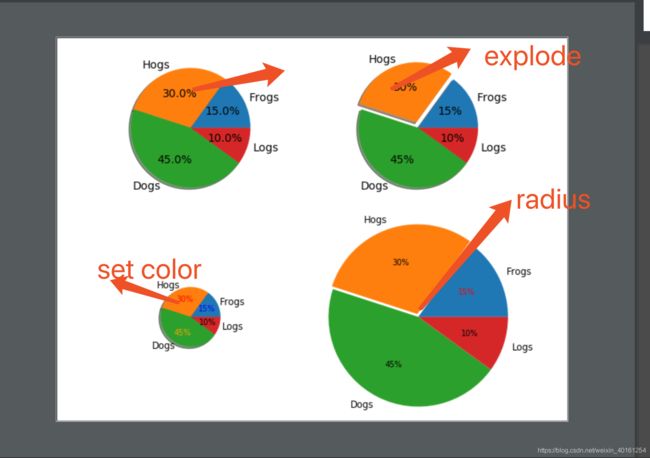
labels = 'Frogs', 'Hogs', 'Dogs', 'Logs'
fracs = [15, 30, 45, 10]
# Make figure and axes
fig, axs = plt.subplots(2, 2)
# A standard pie plot
axs[0, 0].pie(fracs, labels=labels, autopct='%1.1f%%', shadow=True)
# Shift the second slice using explode
axs[0, 1].pie(fracs, labels=labels, autopct='%.0f%%', shadow=True,
explode=(0, 0.1, 0, 0))
# Adapt radius and text size for a smaller pie
patches, texts, autotexts = axs[1, 0].pie(fracs, labels=labels,
autopct='%.0f%%',
textprops={'size': 'smaller'},
shadow=True, radius=0.5)
# Make percent texts even smaller
plt.setp(autotexts, size='x-small')
autotexts[0].set_color('blue')
autotexts[1].set_color('red')
autotexts[2].set_color('orange')
# Use a smaller explode and turn of the shadow for better visibility
patches, texts, autotexts = axs[1, 1].pie(fracs, labels=labels,
autopct='%.0f%%',
textprops={'size': 'smaller'},
shadow=False, radius=1.5,
explode=(0, 0.05, 0, 0))
plt.setp(autotexts, size='x-small')
autotexts[0].set_color('red')
plt.show()