Python:绘制简单的折线图
来源:《Python编程:从入门到实践》
对于matplotlib的安装可以参照这里
查看使用matplotlib制作的各种example,可访问http://matplotlib.org/
文章目录
- 1 绘制简单的折线图
- 1.1 修改标签文字和线条粗细
- 1.2 校正图形
- 1.3 使用scatter()绘制散点图并设置其样式
- 1.4 使用scatter()绘制一系列点
- 1.5 自动计算数据
- 1.6 删除数据点的轮廓
- 1.7 自定义颜色
- 1.8 使用颜色映射
- 1.9 自动保存图表
- 2 练习
1 绘制简单的折线图
- 下面使用matplotlib绘制一个简单的折线图,并对其进行定制,以实现信息更丰富的数据可视化
- 使用1、4、9、16和25来绘制这个图表
- 只需向matplotlib提供如下数字,matplotlib就能完成其他的工作
mpl_squares.py
import matplotlib.pyplot as plt

squares = [1, 4, 9, 16, 25]
plt.plot(squares)
plt.show()
- 首先导入了
模块pyplot,pyplot包含很多用于生成图表的函数 - 将创建的列表传递给函数
plot()——这个函数尝试根据这些数字绘制出有意义的图形 plt.show()打开matplotlib查看器,并显示绘制的图形

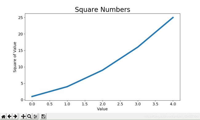
1.1 修改标签文字和线条粗细
- 上面的图形表明数字是越来越大的,但标签文字太小,线条太细
- 所幸matplotlib能够调整可视化的各个方面
mpl_squares.py
import matplotlib.pyplot as plt

squares = [1, 4, 9, 16, 25]
plt.plot(squares, linewidth=5)

# 设置图表标题,并给坐标轴加上标签
plt.title("Square Numbers", fontsize=24)
plt.xlabel("Value", fontsize=14)
plt.ylabel("Square of Value", fontsize=14)

# 设置刻度标记的大小
plt.tick_params(axis='both', labelsize=14)

plt.show()
参数linewidth决定了plot()绘制的线条的粗细函数title()给图表指定标题参数fontsize指定了图表中文字的大小函数xlabel()和ylabel()为每条轴设置标题函数tick_params()设置刻度的样式,其中指定的实参将影响x和y轴上刻度(axis=‘both’),并将刻度标记的字号设置为14(labelsize=14)
1.2 校正图形
- 然后现在出现了问题:折线图4.0的平方是25!下面修复这个问题
向plot()提供一系列数字时,它假设第一个数据点对应的x坐标值为0,但我们第一个对应的x值为1为改变这种默认行为,给plot()同时提供输入值和输出值
mpl_squares.py
import matplotlib.pyplot as plt

input_values = [1, 2, 3, 4, 5]
squares = [1, 4, 9, 16, 25]
plt.plot(input_values, squares, linewidth=5)
--snip--
- 现在plot()正确绘制数据,因为同时提供了输入值和输出值,它无需对输出值的生成方式做出假设

- 使用plot()时可指定各种实参,还可使用众多函数对图形进行定制
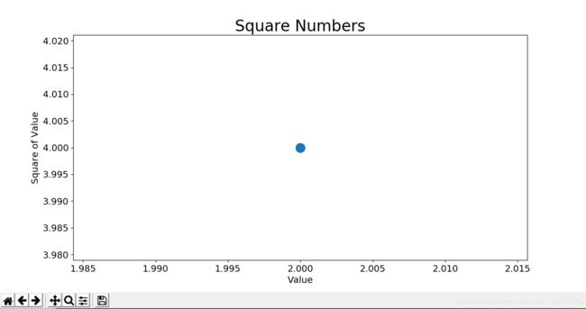
1.3 使用scatter()绘制散点图并设置其样式
- 绘制散点图&设置各个数据点的样式
- 要绘制单个点,可使用函数scatter(),向它传递一对x&y坐标,它将在指定位置绘制一个点
scatter_squares.py
import matplotlib.pyplot as plt

plt.scatter(2, 4)
plt.show()
- 下面来设置输出的形式:添加标题,给轴加上标签,确保所有文本都大到能看清
import matplotlib.pyplot as plt

plt.scatter(2, 4, s=200)

# 设置图表标题 & 给坐标轴加上标签
plt.title("Square Numbers", fontsize=24)
plt.xlabel("Value", fontsize=14)
plt.ylabel("Square of Value", fontsize=14)

# 设置刻度标记的大小
plt.tick_params(axis='both', which='major', labelsize=14)

plt.show()
- 调用scatter(),使用实参s设置了点的尺寸
- 现在运行scatter_squares.py
1.4 使用scatter()绘制一系列点
scatter_squares.py
import matplotlib.pyplot as plt

x_values = [1, 2, 3, 4, 5]
y_values = [1, 4, 9, 16, 25]

plt.scatter(x_values, y_values, s=100)

# 设置图表标题 & 给坐标轴加上标签
--snip--
- 将上面两个列表传递给scatter()时,matplotlib依次从每个列表中读取一个值来绘制一个点

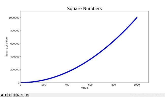
1.5 自动计算数据
- 手工计算效率低下,需要绘制的点很多时尤其如此
- Python循环完成计算包含点坐标的列表
scatter_squares.py
import matplotlib.pyplot as plt

x_values = list(range(1, 1001))
y_values = [x**2 for x in x_values]

plt.scatter(x_values, y_values, s=40)

# 设置图表标题 & 给坐标轴加上标签
--snip--

# 设置每个坐标轴的取值范围
plt.axis([0, 1100, 0, 1100000])

plt.show()
- 首先使用
list()生成一个包含x值(1~1000)的列表 - 接着,一个生成y值的
列表解析 - 这个数据集较大,所以将点设置得较小
- 使用
函数axis()指定了每个坐标轴的取值范围。它要求提供四个值:x & y轴的最小值和最大值

1.6 删除数据点的轮廓
- matplotlib允许你给散点图中的各个点指定颜色;默认为蓝色点和黑色轮廓
- 在散点图的数据点不多时效果很好;但很多点时,黑色轮廓可能会粘连在一起
- 要删除数据点的轮廓,可调用scatter()传递实参
edgecolor='none'
plt.scatter(x_values, y_values, edgecolor='none', s=40)
1.7 自定义颜色
- 修改数据点的颜色,可向scatter()传递参数c,并将其设置为要使用的颜色的名称,如:
plt.scatter(x_values, y_values, c='red', edgecolor='none', s=40)
- 还可以使用RGB颜色模式自定义颜色:传递参数c,将其设置为一个元组,其中包含三个0~1之间的小数值,分别表示红色、绿色和蓝色分量
plt.scatter(x_values, y_values, c=(0, 0, 0.8), edgecolor='none', s=40)
值越接近0,指定的颜色越深,值越接近1,指定的颜色越浅
1.8 使用颜色映射
- 颜色映射(colormap)是一系列颜色,它们从起始颜色渐变的结束颜色
- 在可视化中,颜色映射用于突出数据的规律,例如用浅颜色显示较小的值,深颜色显示较大的值
- 模块pyplot内置了一组颜色映射
- 下面演示如何根据每个点的y值来设置其颜色:
scatter_squares.py
import matplotlib.pyplot as plt

x_values = list(range(1, 1001))
y_values = [x**2 for x in x_values]

plt.scatter(x_values, y_values, c=y_values, cmap=plt.cm.Blues,
    edgecolor='none', s=40)

# 设置图表标题 & 给坐标轴加上标签
--snip--
- 将参数c设置成了一个y值列表,使用参数cmap告诉pyplot使用哪个颜色映射
注意 pyplot所有的颜色映射,可访问http://matplotlib.org,Examples -> Color Examples -> colormaps_reference

1.9 自动保存图表
- 让程序自动将图表保存到文件中,可将plt.show()替换为plt.savefig()
# 第一个实参:文件名,然后存储到scatter_squares.py所在的目录中
# 第二个实参:将图表多余的空白区域裁剪掉,
plt.savefig('squares_plot.png', bbox_inches='tight')
2 练习
15-1 立方:数字的三次方被称为其立方。请绘制一个图形,显示前5个整数的立方值,再绘制一个图形,显示前5000个整数的立方值
1-5整数的立方:
import matplotlib.pyplot as plt

x_values = list(range(1, 6))
y_values = [x**3 for x in x_values]

plt.scatter(x_values, y_values, edgecolor='none', s=40)

# 设置图表标题 & 给坐标轴加上标签
plt.title("Cubic Numbers", fontsize=24)
plt.xlabel("Value", fontsize=14)
plt.ylabel("Cubic of Value", fontsize=14)

# 设置刻度标记的大小
plt.tick_params(axis='both', which='major', labelsize=14)

plt.show()

5000整数的立方:
import matplotlib.pyplot as plt

x_values = list(range(1, 5001))
y_values = [x**3 for x in x_values]

plt.scatter(x_values, y_values, edgecolor='none', s=40)

# 设置图表标题 & 给坐标轴加上标签
plt.title("Cubic Numbers", fontsize=24)
plt.xlabel("Value", fontsize=14)
plt.ylabel("Cubic of Value", fontsize=14)

# 设置刻度标记的大小
plt.tick_params(axis='both', which='major', labelsize=14)

# 设置每个坐标轴的取值范围
plt.axis([0, 5100, 0, 5100**3])

plt.show()

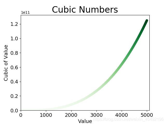
15-2 彩色立方:给你前面绘制的立方图指定颜色映射
import matplotlib.pyplot as plt

x_values = list(range(1, 5001))
y_values = [x**3 for x in x_values]

plt.scatter(x_values, y_values, c=y_values, cmap=plt.cm.Greens,
    edgecolor='none', s=40)

# 设置图表标题 & 给坐标轴加上标签
plt.title("Cubic Numbers", fontsize=24)
plt.xlabel("Value", fontsize=14)
plt.ylabel("Cubic of Value", fontsize=14)

# 设置刻度标记的大小
plt.tick_params(axis='both', which='major', labelsize=14)

# 设置每个坐标轴的取值范围
plt.axis([0, 5100, 0, 5100**3])

plt.show()