flex 、 table 、 float 、position 页面布局
表格布局
这是一种比较老的布局方式,就是采用表格进行网页布局,这种布局方式在一些小型网站中用起来比较方便,如果是大型网站,仅仅采用表格布局肯定有点力不从心。你也可以在网站的某一个部分采用表格布局。
<html>
<head>
<title>
表格布局
title>
<style>
table {
width: 800px;
}
td {
height: 100px;
border: 1px solid rgba(0, 0, 0, 0.2);
}
style>
head>
<body>
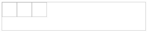
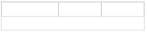
<table cellspacing="0">
<tr>
<td rowspan="2">td>
<td>td>
<td rowspan="3">td>
tr>
<tr>
<td>td>
tr>
<tr>
<td colspan="2">td>
tr>
<tr>
<td colspan="3">td>
tr>
table>
body>
html>
当然也可以用 div 模拟表格
<html>
<head>
<title>
表格布局
title>
<style>
.table {
display: table; /*让元素看起来像是一个 table*/
width: 800px;
}
.table-row {
display: table-row; /*让元素看起来像是一个 tr*/
}
.table-cell {
display: table-cell; /*让元素看起来像是一个 td*/
height: 100px;
border: 1px solid rgba(0, 0, 0, 0.2);
}
style>
head>
<body>
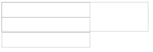
<div class="table">
<div class="table-row">
<div class="table-cell">div>
<div class="table-cell">div>
<div class="table-cell">div>
div>
<div class="table-row">
<div class="table-cell">div>
<div class="table-cell">div>
<div class="table-cell">div>
div>
div>
body>
html>
布局属性
先解释几种元素特性:
- 行内元素 : 行内元素的宽高仅仅由其内容决定,自定义宽高无效,一般情况下,行内元素只能包含数据和其他行内元素
-
块级元素 : 一般而言块级元素会独占一行区域,可以自定义宽高,可以包含行内元素和其他块级元素
-
行内块元素 : 这种元素对外看起来像是一个 行内元素,对内看起来像是一个块级元素,一般而言这种元素会根据内容撑起宽高,但是我们也可以自己指定宽高。
<html>
  <head>
    <title>
      布局属性
    title>
    <style>
      div {
        border: 1px solid;
        height: 100px;
      }
      .inline {
        display: inline;
      }
      .block {
        display: block;
      }
      .inline-block {
        display: inline-block;
      }
    style>
  head>
  <body>
    <div class="inline">
      行内元素
    div>

    <div class="inline-block">
      行内块元素
    div>
    <div class="block">
      块级元素
    div>
  body>
html>
定位
-
static
这是一种默认的定位方式,按照正常的文档流布局
div { position: static; /* 这是默认值,可以不写 */ } -
relative (相对定位)
根据元素本身的位置进行偏移,不会改变原来的布局
div {
  position: relative;
  /* 进行位置的偏移不会影响原来的布局 */
  left: 20px;
  top: -20px;
}
-
absolute (绝对定位)
脱离文档流,不会对页面中的元素布局造成影响,进行偏移的时候,是相对于其最近的祖先元素中设置了 relative 或者 absolute 定位的元素而定的,如果其祖先元素中都没有设置定位,那么将会以 body 文档对象的位置而定
div { position: absolute; /* 进行位置的偏移需要参考祖先元素中设置了 relative 或者 absolute 的元素位置而定,如果祖先元素中都没有设置,那么就相对于 body 元素进行偏移*/ left: 20px; top: -20px; } -
fixed(固定定位)
保持在页面中可视区域的位置
div {
  position: fixed;
  /* 这个偏移的位置是根据可视区域的位置而定的,而且始终保持 */
  left: 20px;
  top: 100px;
}
层叠
默认是按照顺序进行层叠,我们可以设置 z-index 属性指定相关元素的层叠次序,前提是需要进行 z-index 层叠的元素一定设置了 relative 或者 absolute 定位,否则 z-index 的设置无效。
div {
  position: relative;
  z-index: 3; /* 值越大,层叠次序越靠前 */
}
弹性布局
所谓弹性布局说的是盒子是可以伸缩的,盒子的宽窄并不会影响布局效果。
在父元素中设置弹性布局,在子元素中调整布局。
<html>
  <head>
    <title>
      布局属性
    title>
    <style>
      div {
        border: 1px solid rgba(0, 0, 0, 0.3);
      }

      .son {
        width: 50px;
        height: 50px;
      }

      .father {
        width: 500px;
        height: 100px;
        display: flex; /*设置弹性布局*/
      }
    style>
  head>
  <body>
    <div class="father">
      <div class="son">div>
      <div class="son">div>
      <div class="son">div>
    div>
    <br />
  body>
html>
在父元素中设置 flex 弹性布局,子元素默认是左右排布,而且注意子元素中的 div 并不会表现出块级元素特性。
.father {
  width: 500px;
  height: 100px;
  /*弹性布局中,默认是将子元素横向排布(不管你是不是块级元素)*/
  display: flex; /*设置弹性布局*/
}
如果同时设置排布方向,如果父元素的空间不够存放,会自动的挤压子元素
.father {
  width: 500px;
  height: 100px;
  /*弹性布局中,默认是将子元素横向排布(不管你是不是块级元素)*/
  display: flex; /*设置弹性布局*/
  flex-direction: column; /*设置纵向布局*/
}

我们也可以自己设置如果父元素存放不下子元素的时候,子元素的表现形式
.father {
  width: 500px;
  height: 100px;
  display: flex; /*设置弹性布局*/
  flex-direction: row; /*设置横向布局*/

  /*flex-wrap:no-wrap;表示不换行,但可以压缩子元素*/
  flex-wrap: wrap; /*设置如果父元素的空间放不下子元素,那么换行显示,而不是压缩子元素*/
}
.son {
  width: 300px;
  height: 50px;
}
接下来设置子元素的排布方式
.father {
  width: 500px;
  height: 100px;
  display: flex; /*设置弹性布局*/

  /*space-between 将子元素排布整个空间,而且平居瓜分这块区域*/
  /*space-around 子元素也是平居瓜分这块区域,但是左右留有间距*/
  /*center 子元素居中显示*/
  /*flex-start 子元素从左到右排布*/
  /*flex-start 子元素从右到左排布*/
  justify-content: space-between;
}
子元素在另一个方向上的表现,如果父元素中设置了子元素需要横向布局,那么 align-items 就表现为纵向排布。如果父元素中设置了子元素需要纵向布局,那么 align-items 就表现为横向排布。
.father {
  width: 500px;
  height: 100px;
  display: flex; /*设置弹性布局*/

  /*center 表示居中*/
  /*flex-start 表示排列在左侧*/
  /*flex-end 表示排列在右侧*/
  align-items: flex-end;
}
定制子元素
.father {
  width: 500px;
  height: 100px;
  display: flex; /*设置弹性布局*/
}
.son {
  width: 300px;
  height: 50px;
}
一般而言只要在父元素中设置了弹性布局,那么子元素中的宽度其实就成了一种比列,并不会按照你设置的宽度去表现。
<div class="father">
  <div class="son" style="width: 400px;">div>
  <div class="son">div>
  <div class="son">div>
div>
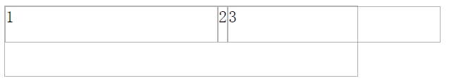
设置 flex:none 表示不受弹性布局限制。可以按照上面设定的 .son {width: 300px;} 显示,而没有设置 flex:none 的子元素就只有占据剩余的区域
<div class="father">
  <div class="son" style="flex: none;">1div>
  <div class="son">2div>
  <div class="son" style="flex: none;">3div>
div>
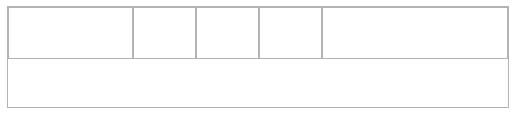
还可以自已设置每一个子元素所占据的比列
.father {
  width: 500px;
  height: 100px;
  display: flex; /*设置弹性布局*/
}
.son {
  width: 50px;
  height: 50px;
}
<div class="father">
  <div class="son" style="flex: 2;">div>
  <div class="son" style="flex: 1;">div>
  <div class="son" style="flex: 1;">div>
  <div class="son" style="flex: 1;">div>
  <div class="son" style="flex: 3;">div>
div>
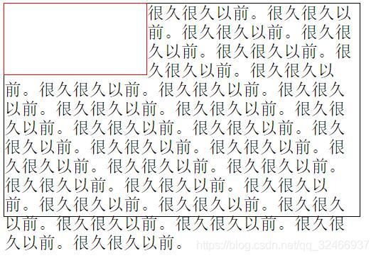
浮动
元素浮动以后会脱离文档流,不会对其他元素的布局造成影响。但是不会脱离文本流,会对文本的内容展示造成影响。同时 float 会形成一个行内块元素。
<html>
  <head>
    <style>
      .p1 {
        width: 200px;
        height: 100px;
        border: 1px solid red;
        float: left; /* 而且会产生一个块,从而可以设置宽高 */
      }
      .p2 {
        width: 500px;
        height: 300px;
        border: 1px solid;
      }
    style>
  head>

  <body>

    <span class="p1">span>
    <div class="p2">
      很久很久以前。很久很久以前。很久很久以前。很久很久以前。很久很久以前。很久很久以前。很久很久以前。很久很久以前。很久很久以前。很久很久以前。很久很久以前。很久很久以前。很久很久以前。很久很久以前。很久很久以前。很久很久以前。很久很久以前。很久很久以前。很久很久以前。很久很久以前。很久很久以前。很久很久以前。很久很久以前。很久很久以前。很久很久以前。很久很久以前。很久很久以前。很久很久以前。很久很久以前。很久很久以前。很久很久以前。
    div>
  body>
html>
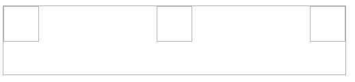
浮动元素默认会往左上方向排布,如果一行放不下会自动换到下一行
<html>
  <head>
    <style>
      .p1 {
        width: 200px; /*在控制台尝试改变宽度看看对比*/
        height: 100px;
        border: 1px solid red;
        float: left;
      }
    style>
  head>

  <body>
    <div style="width: 550px; border: 1px solid;">
      <span>文字对比span>
      <span class="p1">span>
      <span class="p1">span>
    div>
  body>
html>
浮动对其他元素的影响
针对 父元素而言,如果子元素设置了浮动,那么父元素会出现高度塌陷,因为浮动已经脱离了文档流(前提是没有其他子元素撑起父元素的高度,而且父元素自己也没有指定高度)
清除浮动影响一:在父元素中设置 overflow
<html>
  <head>
    <style>
      .p1 {
        border: 1px solid red;
        overflow: hidden; /*auto 也可以*/
      }
      .p2 {
        width: 200px;
        height: 100px;
        border: 1px solid;
        float: left;
      }
    style>
  head>

  <body>

    <div class="p1">
      <div class="p2">div>
    div>
  body>
html>
清除浮动二: clear:both
<html>
  <head>
    <style>
      .p1 {
        border: 1px solid red;
      }
      .p2 {
        width: 200px;
        height: 100px;
        border: 1px solid;
        float: left;
      }
      .p1::after {
        content: "";
        display: block;
        clear: both;
        height: 0;
      }
    style>
  head>

  <body>
    <div class="p1">
      <div class="p2">div>
    div>
    <div style="border: 1px solid; height: 50px;">aaadiv>
  body>
html>
浮动布局
<html>
<head>
<style>
div {
width: 200px;
height: 100px;
box-sizing: border-box;
}
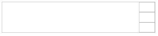
.p1 {
border: 1px solid red;
float: left;
}
.p2 {
border: 1px solid;
margin-left: 200px;
margin-right: 200px;
}
.p3 {
border: 1px solid blue;
float: right;
}
style>
head>
<body>
<div style="width: 600px;">
<div class="p1">左div>
<div class="p3">右div>
<div class="p2" style="height:auto">中div>
div>
body>
html>
inline-block 布局(包括行内元素、行内块元素的间距处理)
不仅仅是 inline-block ,包括行内元素在内,只要排在一起都会出现间隙。产生间隙的原因是文字与文字之间是有间隙的。
由于间距的产生是文字的间距导致的(包括空格)。那么我们可以设置字体大小来控制,父元素中字体大小设置为零,子元素中重新设置回来
<html>
  <head>
    <style>
      div {
        border: 1px solid;
        font-size: 0;
      }
      span {
        border: 1px solid red;
        font-size: 20px;
      }
    style>
  head>
  <body>
    <div>
      <span>左span>
      <span>右span>
    div>
  body>
html>
第二种方式,我们把默认的空格取消
<html>
  <head>
    <style>
      div {
        border: 1px solid;
      }
      span {
        border: 1px solid red;
      }
    style>
  head>
  <body>
    <div><span>左span><span>右span>div>
  body>
html>
第三种方式,使用弹性布局
<html>
  <head>
    <style>
      div {
        border: 1px solid;
        display: flex;
      }
      span {
        border: 1px solid red;
      }
    style>
  head>
  <body>
    <div>
      <span>左span>
      <span>右span>
    div>
  body>
html>