五种方法实现前端PC页面三栏布局(圣杯布局)
写在前面
做PC端的小伙伴肯定遇到过需要实现三栏布局,即左右两侧宽度固定,中奖宽度自适应,而且这也是面试中经常会问到的问题,一般现在用到的会有五种解决方案,包括:浮动布局、绝对定位布局、flexbox布局、表格布局、网格布局
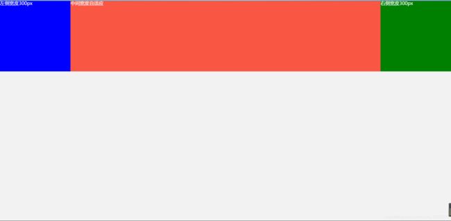
显示效果
代码实现
这里我们将左右两侧宽度固定为300px,高度300px
第一种——浮动布局
优点:兼容性好
缺点:有高度坍塌的问题,需清除浮动
	// HTML
	<div class="block">
     <div class="left">左侧宽度300px</div>
     <div class="right">右侧宽度300px</div>
     // 中间区域写在左右两个区域之后
     <div class="center">
       <h1>中间宽度自适应</h1>
     </div>
   </div>

	// less
	.block{
	    color: #fff;
	    font-size: 20px;
	    div{
	      height: 300px;
	    }
	    .left, .right{
	      width: 300px;
	    }
	    .left{
	      background: blue;
	      float: left; // 左浮
	    }
	    .right{
	      background: green;
	      float: right; // 右浮
	    }
	    .center{
	      background: #f95644;
	    }
	  }
第二种——绝对定位布局
优点:快捷,不易出现问题
缺点:脱离文档流,子元素也将脱离文档流,可使用性比较差
	// HTML
	<div class="block">
     <div class="left">左侧宽度300px</div>
  	     <div class="center">
       <h1>中间宽度自适应</h1>
     </div>
     <div class="right">右侧宽度300px</div>
   </div>

	// less
	.block{
	    color: #fff;
	    font-size: 20px;
	    div{
	      height: 300px;
	      position: absolute;
	    }
	    .left, .right{
	      width: 300px;
	    }
	    .left{
	      background: blue;
	      left: 0;
	    }
	    .right{
	      background: green;
	      right: 0;
	    }
	    .center{
	      background: #f95644;
	      left: 300px;
	      right: 300px;
	    }
	  }
第三种——flexbox布局
优点:css3新增的布局方式,就是为了解决第一种和第二种布局的不足出现的,推荐使用
缺点:存在兼容问题
	// HTML
	<div class="block">
     <div class="left">左侧宽度300px</div>
  	     <div class="center">
       <h1>中间宽度自适应</h1>
     </div>
     <div class="right">右侧宽度300px</div>
   </div>

	// less
	.block{
	    color: #fff;
	    font-size: 20px;
	    display: flex;
	    div{
	      height: 300px;
	    }
	    .left, .right{
	      width: 300px;
	    }
	    .left{
	      background: blue;
	    }
	    .right{
	      background: green;
	    }
	    .center{
	      background: #f95644;
	      flex: 1;
	    }
	  }
第四种——表格布局
优点:兼容性最好,felxbox无法解决的问题可以使用表格布局
缺点:代码繁琐
	// HTML
	<div class="block">
     <div class="left">左侧宽度300px</div>
  	     <div class="center">
       <h1>中间宽度自适应</h1>
     </div>
     <div class="right">右侧宽度300px</div>
   </div>

	// less
	.block{
	    color: #fff;
	    font-size: 20px;
	    display: table; // 设置父元素表格布局
	    width: 100%;
	    div{
	      height: 300px;
	      display: table-cell; // 使子元素成为表格单元格
	    }
	    .left, .right{
	      width: 300px;
	    }
	    .left{
	      background: blue;
	    }
	    .right{
	      background: green;
	    }
	    .center{
	      background: #f95644;
	    }
	  }
第五种——网格布局
优点:新技术
	// HTML
	<div class="block">
     <div class="left">左侧宽度300px</div>
  	     <div class="center">
       <h1>中间宽度自适应</h1>
     </div>
     <div class="right">右侧宽度300px</div>
   </div>

	// less
	.block{
	    color: #fff;
	    font-size: 20px;
	    width: 100%;
	    display: grid; // 设置网格布局
	    grid-template-rows: 300px; // 网格行高300px
	    grid-template-columns: 300px auto 300px; // 网格左300px,中自适应,右300px
	    .left{
	      background: blue;
	    }
	    .right{
	      background: green;
	    }
	    .center{
	      background: #f95644;
	    }
	  }
其他问题——中间高度不固定,自动
高度不固定的情况下,各种布局都会有变化:
一、浮动布局:超出300px后,两侧会出现文字环绕的问题
二、绝对定位布局:中间区域超出,两侧高度不变
三、flexbox布局:左中右高度相同,左右两侧高度自动撑开
四、表格布局:左中右高度相同,左右两侧高度自动撑开
五、网格布局:中间区域高度无法超出300px
综上所述,在中间区域高度不固定的情况下,flexbox布局和表格布局是最好的
你还有更好的解决方案吗?留言一起探讨吧!