HTML5+CSS3学习总结(完结)
一、HTML5
1)什么是HTML5
1. HTML5简介
万维网的核心语言、标准通用标记语言下的一个应用超文本标记语言(HTML)的第五次重大修改,作为HTML语言,具有新的元素、属性和行为。
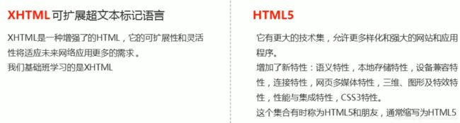
2. 广义的HTML5
- 广义的HTML5是HTML5本身 + CSS3 + JavaScript
- 这个集合有时称为HTML5和朋友,通常缩写为HTML5
- 虽然HTML5的一些特性仍然不被某些浏览器支持,但是它是一种发展趋势
- HTML5 MDN介绍:
2)H5新增语义化标签
以前布局,我们基本用div来做,div对于搜索引擎来说,是没有语义的

新增语义化标签
header— 头部标签nav— 导航标签article— 内容标签section— 块级标签aside— 侧边栏标签footer— 尾部标签
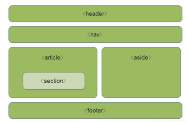
注意
- 这种语义化标签主要针对搜索引擎的
- 这些新标签在页面中可以使用多次
- 在
IE9浏览器中,需要把这些语义化标签都转换为块级元素- 语义化标签,在移动端支持比较友好
3)H5新增多媒体标签
多媒体标签包含两个:
- 音频:
- 视频:
1.
HTML5在不使用插件的情况下也可以原生的支持音频格式文件的播放,当然支持格式是有限的。
- 音频格式
当前,
<audio src='media/test.mp3 ' controls='controls'>audio>
因为不同浏览器支持不同格式,我们采取的解决方案是我们为这个音频准备多个格式
	<audio controls="controls">
	<source src="media/test.mp3" type="audio/mpeg">
	<source src="media/test.mp3" type="audio/ogg">
	audio>
	您的浏览器不支持audio标签播放音频
2.
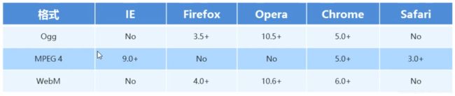
- 语法格式:
<video src='media/video.mp4 ' controls='controls'>video>
- 总结:
- 音频标签和视频标签使用基本一致
- 浏览器支持情况不同
- 谷歌浏览器把音频和视频自动播放禁止了
- 我们可以给视频标签添加muted属性可以自定义播放视频,音频不可以
- 视频标签是重点,我们经常设置自动播放,不使用controls控件,循环和设置大小属性
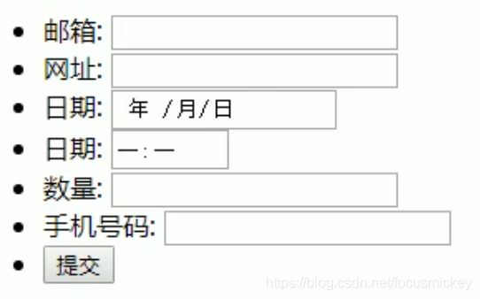
4)、HTML5新增input表单、表单属性

	<ul>
	<li>邮箱:<input type="email" />li>
	<li>网址:<input type="url" />li>
	<li>日期:<input type="date" />li>
	<li>时间:<input type="date" />li>
	<li>数量:<input type="number" />li>
	<li>手机号码:<input type="tel" />li>
	<li>搜索:<input type="search" />li>
	<li>颜色:<input type="color" />li>
	<input type="submit" value="提交">
	ul>

	<form action="">
		用户名:<input type="text" required="required" placeholder="请输入用户名" autofocus="autofocus" name="username" autocomplete="off" >
		<input type="submit" value="提交">
		上传头像:<input type="file" name="" id="" multiple="multiple">
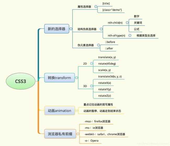
二、CSS3
CSS3现状
- 在CSS2的基础上新增(扩展)样式
- 移动端支持优于PC端
- 不断改进中
- 应用相对广泛
1. CSS3属性(结构)选择器

2. CSS3结构伪类选择器

nth-child 详解
-
注意:本质上就是选中第几个子元素
-
n 可以是数字、关键字、公式
-
n 如果是数字,就是选中第几个
-
常见的关键字有
even偶数、odd奇数 -
常见的公式如下(如果 n 是公式,则从 0 开始计算)
-
但是第 0 个元素或者超出了元素的个数会被忽略

nth-child和nt-of-type的区别 -
nth-child选择父元素里面的第几个子元素,不管是第几个类型 -
nt-of-type选择指定类型的元素
3. CSS3伪元素选择器

注意事项:
before和after必须有content属性before在内容前面,after 在内容后面before和after创建的是一个元素,但是属于行内元素- 创建出来的元素在
Dom中查找不到,所以称为伪元素 - 伪元素和标签选择器一样,权重为 1
典型应用:
添加字体图标
p {
   width: 220px;
   height: 22px;
   border: 1px solid lightseagreen;
   margin: 60px;
   position: relative;
}
p::after {
  content: '\ea50';
  font-family: 'icomoon';
  position: absolute;
  top: -1px;
  right: 10px;
}
4. CSS3过渡(非常重要)
过渡动画:是从一个状态渐渐的过渡到另外一个状态,IE9以下不支持,经常和:hover一起搭配使用
语法格式:
transition:要过渡的属性 花费时间 运动曲线 何时开始
| 属性 | 描述 | CSS |
|---|---|---|
| transition | 简写属性,用于在一个属性中设置四个过渡属性。 | 3 |
| transition-property | 规定应用过渡的 CSS 属性的名称。属性就是你想要变化的 css 属性, 宽度高度 背景颜色 内外边距都可以 。如果想要所有的属性都变化过渡, 写一个all 就可以。 | 3 |
| transition-duration | 定义过渡效果花费的时间(必须写单位)。默认是 0。 | 3 |
| transition-timing-function | 规定过渡效果的时间曲线。默认是 “ease”。 | 3 |
| transition-delay | 规定过渡效果何时开始,可以设置 延迟触发时间。默认是 0,鼠标触发就立即开始。 | 3 |
运动曲线示意图:

样例:
div {
		width: 200px;
		height: 100px;
		background-color: pink;
		/* transition: 要过渡的属性  花费时间  运动曲线  何时开始; */
		/* transtion 过渡的意思  这句话写到div里面而不是 hover里面
		过渡写到本身上,谁做动画,给谁加*/
		transition: width 0.6s ease 0s, height 0.3s ease-in 1s;


}
div:hover {  /* 鼠标经过盒子,我们的宽度变为400 */

			width: 600px;
			height: 300px
}

transition: all 0.6s;  /* 所有属性都变化用all 就可以了  后面俩个属性可以省略 */
常见效果:
按钮变换底色 图片移动 小米效果 (阴影效果) 传智导航栏效果 等等
5. CSS3 2D转换
转换(transform)是CSS3中具有颠覆性的特征之一,可以实现元素的位移、旋转、缩放等效果。
转换(transform)可以简单理解为变形
- 移动:translate
- 旋转:rotate
- 缩放:scale
1)二维坐标系
2D转换是改变标签在二维平面上的位置和形状的一种技术,
2)2D转换之移动translate
2D移动是2D转换里的一种功能,可以改变元素在页面中的位置,类似定位

- 语法:
	transform: translate(x, y);
            /* 或者分开写 */
    transform: translateX(x);
    transform: translateY(y);
- 重点
- 定义2D转换中的移动,沿着X和Y轴移动元素
- translate最大的优点:不会影响到其他元素的位置
- translate中的百分比单位是相对于自身元素的translate:(50%, 50%);
- 对行内标签没有效果
3)2D转换之旋转rotate
2D旋转指的是让元素在2维平面内顺时针旋转或者逆时针旋转。

- 语法
transform: rotate(度数);
- 重点
- rotate里面跟度数,单位是deg比如rotate(45deg)
- 角度为正时为顺时针,负时为逆时针
- 默认旋转的中心点是元素的中心点
案例:三角形
<html lang="en">

<head>
    <meta charset="UTF-8">
    <meta name="viewport" content="width=device-width, initial-scale=1.0">
    <title>三角形title>
    <style>
        div {
            position: relative;
            width: 249px;
            height: 35px;
            border: 1px solid #000;
        }

        div::after {
            content: "";
            position: absolute;
            top: 8px;
            right: 15px;
            width: 10px;
            height: 10px;
            border-bottom: 1px solid #000;
            border-right: 1px solid #000;
            transform: rotate(45deg);
            transition: all 0.2s;
        }
        /* 鼠标经过div 里面的三角旋转 */
        div:hover::after {
            transform: rotate(225deg);
        }
    style>
head>

<body>
    <div>div>
body>

html>
结果如图:
4)2D转换中心点transform-origin
我们可以设置元素转换的中心点
- 语法
transform-origin: x y;
- 重点
- 注意后面的参数x和y用空格隔开
- x y默认的中心点是元素的中心点(50% 50%)
- 还可以给x y设置像素或者方位名词(top bottom left right center)
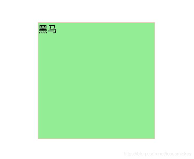
案例:旋转案例
<html lang="en">

<head>
    <meta charset="UTF-8">
    <meta name="viewport" content="width=device-width, initial-scale=1.0">
    <title>旋转案例title>
    <style>
        div {
            width: 200px;
            height: 200px;
            border: 1px solid pink;
            margin: 100px auto;
            overflow: hidden;
        }

        div::before {
            content: "黑马";
            display: block;
            width: 200px;
            height: 200px;
            background-color: lightgreen;
            transform: rotate(180deg);
            transform-origin: left bottom;
            transition: all 0.2s;
        }
        /* 鼠标经过div 里面的before复原 */

        div:hover::before {
            transform: rotate(0deg);
        }
    style>
head>

<body>
    <div>div>
body>

html>
结果如图:

5)2D转换之缩放scale
可以放大和缩小,只要给元素添加上了这个属性就能控制它放大还是缩小

- 语法
transform: scale(x, y);
- 注意
- 注意其中的x和y用逗号分隔,里面的数字不跟单位就是倍数
- transform: scale(1, 1):宽和高都放大一倍,相当于没有放大
- transform: scale(2, 2):宽和高都放大了2倍
- transform: scale(2):只写一个参数,第二个参数则和第一个参数一样
- transform: scale(0.5, 0.5):缩小
- scale缩放最大的优势:可以设置转换中心点缩放,默认以中心点缩放的,而且不影响其他盒子
案例:图片放大
<html lang="en">

<head>
    <meta charset="UTF-8">
    <meta name="viewport" content="width=device-width, initial-scale=1.0">
    <title>图片放大title>
    <style>
        div {
            overflow: hidden;
            float: left;
            margin: 10px;
        }

        div img {
            transition: all .4s;
        }

        div img:hover {
            transform: scale(1.1);
        }
    style>
head>

<body>
    <div>
        <a href="#"><img src="media/scale.jpg" alt="">a>
    div>
    <div>
        <a href="#"><img src="media/scale.jpg" alt="">a>
    div>
    <div>
        <a href="#"><img src="media/scale.jpg" alt="">a>
    div>
body>

html>
结果如图:

案例:分页按钮
<html lang="en">

<head>
    <meta charset="UTF-8">
    <meta name="viewport" content="width=device-width, initial-scale=1.0">
    <title>分页按钮案例title>
    <style>
        li {
            float: left;
            width: 30px;
            height: 30px;
            line-height: 30px;
            text-align: center;
            margin-left: 10px;
            margin-top: 20px;
            border-radius: 50%;
            list-style: none;
            border: 1px solid green;
            cursor: pointer;
            transition: all .4s;
        }

        li:hover {
            transform: scale(1.2);
        }
    style>
head>

<body>
    <div>
        <ul>
            <li>1li>
            <li>2li>
            <li>3li>
            <li>4li>
            <li>5li>
            <li>6li>
            <li>7li>
        ul>
    div>
body>

html>
结果如图:

6)2D转换综合写法
注意:
- 同时使用多个转换,其格式为:transform: translate() rotate() scale()……等
- 其顺序会影响转换的效果(先旋转会改变坐标轴的方向)
- 当我们同时有位移和其他属性的时候,记得要将位移放到最前面
6. CSS3动画
动画(animation)是CSS3中具有颠覆性的特征之一,可通过设置多个节点来精确控制一个或一组动画,常用来实现复杂的动画效果。
相比较过渡,动画可以实现更多的变化,更多的控制,连续自动播放等效果。
1)动画的基本使用
制作动画分为两步:
- 先用keyframes定义动画(类似定义类选择器)
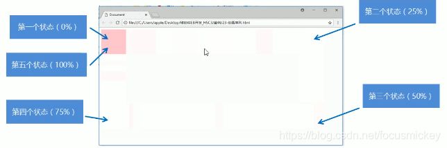
动画序列
- 0%是动画的开始,100%是动画的完成,这样的规则就是动画序列
- 在**@keyframes**中规定某项CSS样式,就能创建由当前样式逐渐改为新样式的动画效果
- 动画是使元素从一种样式逐渐便化为另一种样式的效果,你可以改变任意多的样式任意多的次数。
- 请用百分比来规定变化发生的时间,或用关键词 " form " 和 ‘’ to " ,等同于0%和100%
	@keyframes 动画名称 {
		0%{
			width: 100px;
		}
		100%{
			width: 200px;
		}
	}
- 再使用(调用)动画
  div{
       width: 200px;
       height: 200px;
       background-color: green;
       margin: 100px auto;
       /* 调用动画 */
       animation-name: 动画名称;
       /* 持续时间 */
       animation-duration: 持续时间;
   }
2)动画常用属性
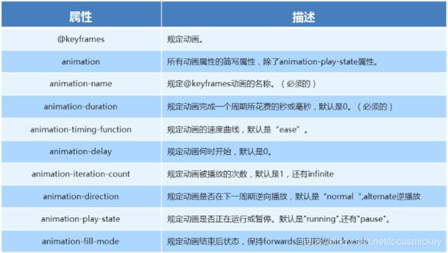
3)动画简写属性
animation:动画名称 持续时间 运动曲线 何时开始 播放次数 是否反方向 动画起始或者结束的状态;
animation: name duration timing-function delay iteration-count direction fill-mode;
- 简写属性里面不包含animation-play-state,如需使用,单独写
- 暂停动画:animation-play-state:puased;经常和鼠标经过等其他配合使用
- 想要动画走回来,而不是直接就回来:animation-direction: alternate
- 盒子动画结束后,停在结束位置:animation-fill-mode: forwards
案例:热点图
<html lang="en">
<head>
    <meta charset="UTF-8">
    <meta name="viewport" content="width=device-width, initial-scale=1.0">
    <title>热点图title>
    <style>
        body{
            background-color: #333;
        }
        .map{
            position: relative;
            width: 747px;
            height: 616px;
            margin: 0 auto;
            background: url('media/map.png') no-repeat;
        }
        .city{
            position: absolute;
            top: 227px;
            right: 191px;
        }
        .tb{
            top: 499px;
            right: 80px;
        }
        .dotted{
            width: 8px;
            height: 8px;
            border-radius: 50%;
            background-color: #09f;
        }
        div[class^='pulse']{
            position: absolute;
            top: 50%;
            left: 50%;
            width: 10px;
            height: 10px;
            transform: translate(-50%, -50%);
            border-radius: 50%;
            box-shadow: 0 0 12px #009dfd;
            animation: pulse 1.2s linear infinite;
        }
        .city .pulse2{
            animation-delay: 0.4s;
        }
        .city .pulse3{
            animation-delay: 0.8s;
        }
        @keyframes pulse {
            0%{}
            70%{
                /* 用scale会导致阴影也放大 */
                /* transform: scale(2); */
                width: 40px;
                height: 40px;
                opacity: 1;
            }
            100%{
                width: 70px;
                height: 70px;
                opacity: 0;
            }
        }
    style>
head>
<body>
    <div class="map">
        <div class="city">
            <div class="dotted">
                <div class="pulse1">div>
                <div class="pulse2">div>
                <div class="pulse3">div>
            div>
        div>
        <div class="city tb">
            <div class="dotted">
                <div class="pulse1">div>
                <div class="pulse2">div>
                <div class="pulse3">div>
            div>
        div>
    div>
body>
html>
结果如图:

如果用scale结果如图:

4)速度曲线细节
animation-timing-function:规定动画的速度曲线,默认是ease

<html lang="en">
<head>
    <meta charset="UTF-8">
    <meta name="viewport" content="width=device-width, initial-scale=1.0">
    <title>速度曲线案例title>
    <style>
        div{
            width: 0;
            height: 20px;
            background-color: lightgreen;
            font-size: 12px;
            /* 让文字强制一行显示 */
            white-space: nowrap;
            /* steps就是分几步来完成动画 */
            animation: move 5s steps(8) forwards;

        }
        @keyframes move {
            0%{
                width: 0;
            }
            100%{
                width: 100px;
            }
        }
    style>
head>
<body>
    <div>
        是日前端欢迎您!
    div>
body>
html>
案例:奔跑的熊
<html lang="en">
<head>
    <meta charset="UTF-8">
    <meta name="viewport" content="width=device-width, initial-scale=1.0">
    <title>奔跑的熊title>
    <style>
        body{
            background: url('media/bg1.png') no-repeat;
            animation: bgback 6s steps(8) infinite;
        }
        div{
            position: absolute;
            width: 200px;
            height: 100px;
            background: url('media/bear.png') no-repeat;
            animation: bear 0.4s steps(8) infinite, move 2s steps(8) forwards;
        }
        @keyframes bear {
            0%{
                background-position: 0 0;
            }
            100%{
                background-position: -1600px 0;
            }
        }
        @keyframes move {
            0%{
                left: 0;
                top: 200px;
            }
            100%{
                left: 50%;
                top: 200px;
                transform: translateX(-50%);
            }
        }
        @keyframes bgback {
            0%{
                background-position: 0 0;
            }
            100%{
                background-position: -1600px 0;
            }
        }
    style>
head>
<body>
    <div>div>
body>
html>
结果如图:

7. 3D转换

特点
- 近大远小
- 物体后面遮挡不可见
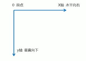
1. 三维坐标系
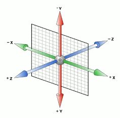
三维坐标系其实就是指立体空间,立体空间是由3个轴共同组成的。
- x轴:水平向右 注意:x右边是正值
- y轴:垂直向下 注意:y下面是正值
- z轴:垂直屏幕 注意:往外面是正值
2. 3D移动 translate3d
3D移动在2D移动的基础上多加了一个可以移动的方向,就是z轴方向
- transform: translateX(100px):仅仅是在X轴上移动
- transform: translateY(100px):仅仅是在Y轴上移动
- transform: translateZ(100px):仅仅是在Z轴上移动(注意:translateZ一般用px单位)
- transform: translate3d(x,y,z):其中x、y、z分别要移动的轴的方向的距离(x、y、z没有不可省略,写0)
3. 透视perspective(一般给父盒子添加)

在2D平面产生近大远小视觉立体,但是只是效果是二维的
- 如果想要在网页产生3D效果需要透视(可理解成3D物体投影在2D平面内)
- 模拟人类的视觉位置,可认为安排一只眼睛去看
- 透视也称为视距:视距就是人的眼睛到屏幕的距离
- 距离视觉点越近的在电脑平面成像就越大,越远成像就越小
- 透视的单位是像素
透视写在被观察元素的父盒子上面的
d:就是视距,视距就是一个距离人的眼睛到屏幕的距离
z:就是z轴,物体距离屏幕的距离,z轴越大(正值)我们看到的物体就越大。
4. translateZ(一般给里面的盒子添加)
transform: translateZ(100px):仅仅是在Z轴上移动,有了透视,就能看到translateZ引起的变化了。
5. 3D旋转rotate3d
3D旋转指可以让元素在三维平面内沿着x轴,y轴,z轴或者自定义轴进行旋转。
语法
- transform: rotateX(45deg):沿着x轴正方向旋转45度
- transform: rotateY(45deg):沿着y轴正方向旋转45度
- transform: rorateZ(45deg):沿着z轴正方向旋转45deg
- transform: rotate3d(x, y, z, deg):沿着自定义轴旋转,deg为角度(了解)
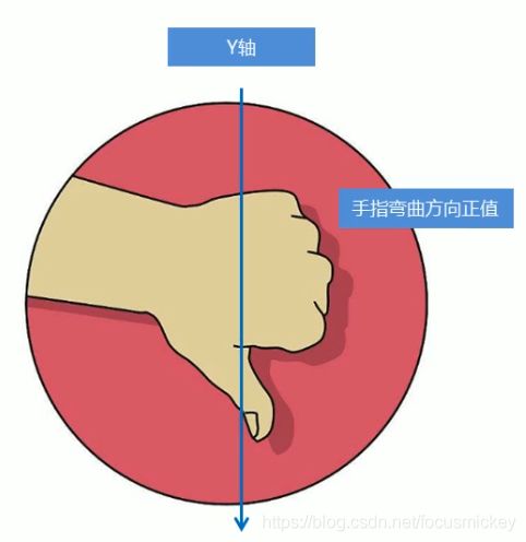
沿x轴旋转:单杠

对于元素旋转的方向的判断,需要用到左手准则
左手准则 - 左手的手拇指指向x轴的正方向
- 其余手指的弯曲方向就是该元素沿着x轴旋转的方向

沿y轴旋转:钢管舞

对于元素旋转的方向的判断,需要用到左手准则
左手准则
- 左手的手拇指指向y轴的正方向
- 其余手指的弯曲方向就是该元素沿着y轴旋转的方向(正值)
沿z轴旋转:抽奖转盘

transform: rotate3d(x, y, z, deg):沿着自定义轴旋转deg为角度(了解即可)
xyz是表示旋转轴的矢量,是标识你是否希望沿着该轴旋转,最后一个标示旋转的角度。
6. 3D呈现transform-style

- 控制子元素是否开启三维立体环境
- transform-style: flat子元素不开启3d立体空间,默认的
- transform-style: preserve-3d;子元素开启立体空间
- 代码写给父级,但是影响的是子盒子
- 这个属性很重要
案例:两面翻转的盒子
实现步骤
- 搭建HTML结构
- box父盒子里面包含两个子盒子
- box是翻转的盒子,front是前面盒子,back是后面盒子
- CSS样式
- box指定大小,切记要添加3d呈现
- back盒子要沿着Y轴翻转180度
- 最后鼠标经过box沿着Y旋转180deg
<html lang="en">

<head>
    <meta charset="UTF-8">
    <meta name="viewport" content="width=device-width, initial-scale=1.0">
    <title>3D导航栏title>
    <style>
        body {
            perspective: 400px;
        }

        .box {
            position: relative;
            width: 300px;
            height: 300px;
            margin: 200px auto;
            transition: all .5s;
            /* 让背面的盒子保留立体空间,给父级添加 */
            transform-style: preserve-3d;
        }

        .front,
        .back {
            position: absolute;
            left: 0;
            top: 0;
            width: 100%;
            height: 100%;
            border-radius: 50%;
            font-size: 24px;
            text-align: center;
            line-height: 300px;
        }

        .front {
            background-color: lightcoral;
            z-index: 1;
        }

        .back {
            background-color: lightgreen;
            /* 像手机一样背靠背旋转 */
            transform: rotateY(180deg);
        }

        .box:hover {
            transform: rotateY(180deg);
        }
    style>
head>

<body>
    <div class="box">
        <div class="front">是日前端div>
        <div class="back">在这里等你div>
    div>
body>

html>
案例:3D导航栏
实现步骤:
- 搭建HTML结构
- li做导航栏
- .box是翻转的盒子,front是前面的盒子,bottom是底下的盒子
思路:

<html lang="en">

<head>
    <meta charset="UTF-8">
    <meta name="viewport" content="width=device-width, initial-scale=1.0">
    <title>3D导航栏title>
    <style>
        li {
            list-style: none;
            perspective: 500px;
        }

        ul {
            margin: 100px;
        }

        ul li {
            float: left;
            width: 100px;
            height: 50px;
            margin-left: 10px;
        }

        .box {
            position: relative;
            width: 100%;
            height: 100%;
            transition: all .5s;
            transform-style: preserve-3d;
        }

        .front,
        .bottom {
            position: absolute;
            top: 0;
            left: 0;
            width: 100%;
            height: 100%;
            line-height: 50px;
            text-align: center;
        }

        .front {
            background-color: lightgreen;
            transform: translateZ(25px);
        }

        .bottom {
            background-color: yellowgreen;
            /* 这里的x轴一定是负值 */
            /* 如果有移动或者其他样式,必须先写移动 */
            transform: translateY(25px) rotateX(-90deg);
        }

        .box:hover {
            transform: rotateX(90deg);
        }
    style>
head>

<body>
    <ul>
        <li>
            <div class="box">
                <div class="front">是日前端div>
                <div class="bottom">在这里等你div>
            div>
        li>
        <li>
            <div class="box">
                <div class="front">是日前端div>
                <div class="bottom">日拱一卒div>
            div>
        li>
        <li>
            <div class="box">
                <div class="front">是日前端div>
                <div class="bottom">在这里等你div>
            div>
        li>
    ul>
body>

html>
结果如图:

H5C3综合案例:旋转木马
<html lang="en">
<head>
    <meta charset="UTF-8">
    <meta name="viewport" content="width=device-width, initial-scale=1.0">
    <title>旋转木马title>
    <style>
        body{
            perspective: 800px;
        }
        section{
            position: relative;
            width: 300px;
            height: 200px;
            margin: 100px auto;
            transform-style: preserve-3d;
            animation: rotate 8s linear infinite;
            background: url(images/pig.jpg) no-repeat;
        }
        section div {
            position: absolute;
            top: 0;
            left: 0;
            width: 100%;
            height: 100%;
            background: url(images/dog.jpg) no-repeat;
        }
        section div:first-child{
            transform: rotateY(0deg) translateZ(300px);
        }
        section div:nth-child(2){
            transform: rotateY(60deg) translateZ(300px);
        }
        section div:nth-child(3){
            transform: rotateY(120deg) translateZ(300px);
        }
        section div:nth-child(4){
            transform: rotateY(180deg) translateZ(300px);
        }
        section div:nth-child(5){
            transform: rotateY(240deg) translateZ(300px);
        }
        section div:last-child{
            transform: rotateY(320deg) translateZ(300px);
        }
        section:hover{
            animation-play-state: paused;
        }
        @keyframes rotate {
            0%{
                transform: rotateY(0);
            }
            100%{
                transform: rotateY(360deg);
            }
        }
    style>
head>
<body>
    <section>
        <div>div>
        <div>div>
        <div>div>
        <div>div>
        <div>div>
        <div>div>
    section>
body>
html>
结果如图:

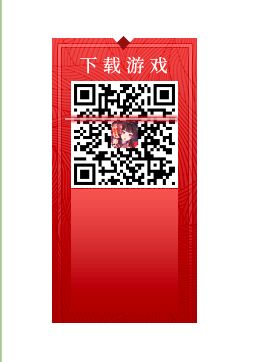
练习1

HTML结构:
<html lang="en">
<head>
    <meta charset="UTF-8">
    <meta name="viewport" content="width=device-width, initial-scale=1.0">
    <title>01.《阴阳师》二维码title>
    <link rel="stylesheet" href="css/index.css">
head>
<body>
    <div class="scan">
        <img class="qrcode" src="images/57b280b496dee47507111c56NRN73rVj.png" alt="">
        <img class="line" src="images/line_dd0b705.png" alt="">
    div>
body>
html>
CSS样式:
*{
    margin: 0;
    padding: 0;
}
body{
    padding: 50px;
}
.scan{
    position: relative;
    /* margin: 50px; */
    width: 145px;
    height: 297px;
    background: url(../images/index_z_71df05e.png) 0 0 no-repeat;
}
.qrcode{
    position: absolute;
    display: block;
    left: 19px;
    top: 45px;
    width: 107px;
}
.line{
    position: absolute;
    left: 9px;
    top: -3px;
    width: 120px;
    height: 15px;
    -webkit-animation: sao 4s linear infinite;
    -moz-animation: sao 4s linear infinite;
    -ms-animation: sao 4s linear infinite;
    animation: sao 4s linear infinite;
}
@keyframes sao{
    0%{
        top: 42px;
    }
    50%{
        top: 145px;
    }
    100%{
        top: 42px;
    }
}
结果如图:
练习2
7. 浏览器私有前缀
浏览器私有前缀是为了兼容老版本的写法,比较新版本的浏览器无需添加。
7.1 私有前缀
- -moz-:代表firefox浏览器私有属性
- -ms-:代表ie浏览器私有属性
- -webkit-:代表safari、chrome私有属性
- -o-:代表Opera私有属性
7.2 提倡的写法
