Matplotlib学习笔记
文章目录
- 1、引入包
- 2、基本用法
- 3、Figure
- 4、修改图片的横纵坐标值
- 5、修改坐标轴的位置
- 6、显示图例
- 7、添加注解
- 8、调整刻度背景
- 9、画散点图
- 10、画柱状图
- 11、绘制等高线
- 12、打印图像
- 13、3D数据图
- 14、多个图
- 15、图中图
- 16、箱型图
- 17、参考链接
1、引入包
import numpy as np
import matplotlib.pyplot as plt
import matplotlib.gridspec as gridspec
2、基本用法
def show1():
    """
    基本用法
    """
    x= np.linspace(-1,1,50) #把数据拆分成50份
    y = 2 * x + 1
    plt.plot(x, y)
    plt.show()

3、Figure
def show2():
    """
    1、figure,一个figure一个图像
    2、可以在一个figure上画多条线
    """
    x = np.linspace(-1,1,50)
    y1 = 2 * x + 1
    y2 = x**2

    plt.figure()
    plt.plot(x,y1)

    plt.figure(num=3,figsize=(8,5)) #num是指定出来的图名称(用命令行可以看见),figsize是图片大小
    plt.plot(x,y2)
    plt.plot(x,y1,color='red',linewidth=1.0,linestyle='--')

    plt.show()

4、修改图片的横纵坐标值
def show3():
    """
    修改图片的x轴和y轴
    """
    x = np.linspace(-3,3,50) #将-3,3直接的数分成50份
    y1 = 2 * x + 1
    y2 = x**2

    plt.figure()
    plt.plot(x,y2)
    plt.plot(x,y1,color='red',linewidth=1.0,linestyle='--')

    plt.xlim(-1,2) #设置x轴范围
    plt.ylim(-2,3) #设置y轴范围
    plt.xlabel("I am x")
    plt.ylabel("I am y")

    new_ticks = np.linspace(-1,2,5)
    plt.xticks(new_ticks) # 替换原有标签
    # plt.yticks([-2,-1.8,-1,1.22,3],['really bad','bad','normal','good','really good']) #指定位置替换原有标签
    plt.yticks([-2, -1.8, -1, 1.22, 3], ['$really \ bad$', '$bad$', '$normal$', '$good$', '$really \ good$'])  #变成好看的英文字体
    plt.show()
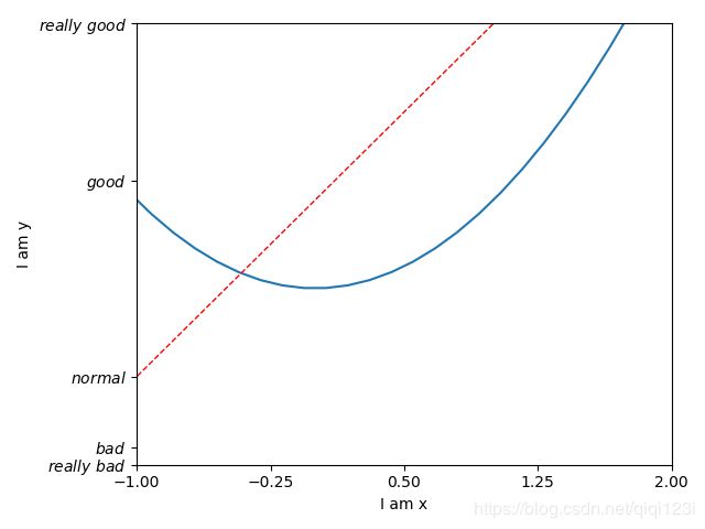
5、修改坐标轴的位置
def show4():
    """
    修改坐标轴的位置,类似设置坐标原点
    """
    x = np.linspace(-3, 3, 50)
    y1 = 2 * x + 1
    y2 = x ** 2

    plt.figure()
    plt.plot(x, y2)
    plt.plot(x, y1, color='red', linewidth=1.0, linestyle='--')

    plt.xlim(-1, 2)  # 设置x轴范围
    plt.ylim(-2, 3)  # 设置y轴范围
    plt.xlabel("I am x")
    plt.ylabel("I am y")

    new_ticks = np.linspace(-1, 2, 5)
    plt.xticks(new_ticks)  # 替换原有标签
    # plt.yticks([-2,-1.8,-1,1.22,3],['really bad','bad','normal','good','really good']) #指定位置替换原有标签
    plt.yticks([-2, -1.8, -1, 1.22, 3],
               ['$really \ bad$', '$bad$', '$normal$', '$good$', '$really \ good$'])  # 变成好看的英文字体

    #gca = 'get current axis‘ 得到当前的axis
    ax = plt.gca() #可以得到上下左右4条axis
    ax.spines['right'].set_color('none') #设置上面和右边的两条axis消失
    ax.spines['top'].set_color('none')
    ax.xaxis.set_ticks_position('bottom') #设置x轴和y轴分别是哪两条边
    ax.yaxis.set_ticks_position('left')
    ax.spines['bottom'].set_position(('data',0)) #设置axis的位置,这里为原点
    ax.spines['left'].set_position(('data',0))

    plt.show()

6、显示图例
def show5():
    """
    显示图例
    handles = [线1的名称,线2的名称]
    labels = [线1的标签,线2的标签]
    """
    x = np.linspace(-3, 3, 50)
    y1 = 2 * x + 1
    y2 = x ** 2

    plt.figure()
    l1, = plt.plot(x, y2, label='up')  # label是图例显示的内容
    l2, = plt.plot(x, y1, color='red', linewidth=1.0, linestyle='--', label='down')

    plt.xlim(-1, 2)  # 设置x轴范围
    plt.ylim(-2, 3)  # 设置y轴范围
    plt.xlabel("I am x")
    plt.ylabel("I am y")

    new_ticks = np.linspace(-1, 2, 5)
    plt.xticks(new_ticks)  # 替换原有标签
    plt.yticks([-2, -1.8, -1, 1.22, 3],
               ['$really \ bad$', '$bad$', '$normal$', '$good$', '$really \ good$'])  # 变成好看的英文字体

    # plt.legend() #显示图例,简单版本
    plt.legend(handles=[l1,l2,],labels=['aaa','bbb'],loc='best') #显示图例,个性版本,直接指定label
    plt.show()

7、添加注解
def show6():
    """
    1、添加text
    2、添加annotation
    """
    x = np.linspace(-3, 3, 50)
    y1 = 2 * x + 1

    plt.plot(x, y1) #画直线

    # gca = 'get current axis‘ 得到当前的axis
    ax = plt.gca()  # 可以得到上下左右4条axis
    ax.spines['right'].set_color('none')  # 设置上面和右边的两条axis消失
    ax.spines['top'].set_color('none')
    ax.xaxis.set_ticks_position('bottom')  # 设置x轴和y轴分别是哪两条边
    ax.yaxis.set_ticks_position('left')
    ax.spines['bottom'].set_position(('data', 0))  # 设置axis的位置,这里为原点
    ax.spines['left'].set_position(('data', 0))

    x0 = 1
    y0 = 2 * x0 + 1
    plt.scatter(x0,y0,s=50,color='b') #size,color
    plt.plot([x0,x0],[y0,0],'k--',lw=2.5) #lw是线宽,k是颜色,--是线形,[x0,x0]是两个点的横坐标,[y0,0]是两个点的纵坐标
    #method 1
    plt.annotate(r'$2x+1=%s$' % y0, xy=(x0, y0), xycoords='data', xytext=(+30, -30),
                 textcoords='offset points', fontsize=16,
                 arrowprops=dict(arrowstyle='->', connectionstyle="arc3,rad=.2"))

    #method 2
    plt.text(-3.7,3,r'$This\ is\ the\ some\ text.\ $')

    plt.show()

8、调整刻度背景
def show7():
    """
    调整刻度背景
    """
    x = np.linspace(-3, 3, 50)
    y1 = 2 * x + 1

    plt.plot(x, y1,linewidth=10,zorder=1)  # 画直线,如果需要设置label的透明度,要设置zorder

    # gca = 'get current axis‘ 得到当前的axis
    ax = plt.gca()  # 可以得到上下左右4条axis
    ax.spines['right'].set_color('none')  # 设置上面和右边的两条axis消失
    ax.spines['top'].set_color('none')
    ax.xaxis.set_ticks_position('bottom')  # 设置x轴和y轴分别是哪两条边
    ax.yaxis.set_ticks_position('left')
    ax.spines['bottom'].set_position(('data', 0))  # 设置axis的位置,这里为原点
    ax.spines['left'].set_position(('data', 0))

    for label in ax.get_xticklabels() + ax.get_yticklabels():
        label.set_fontsize(12)
        label.set_bbox(dict(facecolor='white',edgecolor='None',alpha=0.7)) #alpha 透明
    plt.show()

9、画散点图
def show8():
    """
    画散点图
    """
    n = 1024
    X = np.random.normal(0,1,n) # 生成n个均值为0,方差为1的点
    Y = np.random.normal(0,1,n)
    T = np.arctan2(Y,X) #for color value
    plt.scatter(X,Y,s=75,c=T,alpha=0.5) #s是size,c是颜色map到T,alpha是透明度
    plt.xlim(-1.5,1.5)
    plt.ylim(-1.5,1.5)
    plt.xticks(())
    plt.yticks(()) #将标签设置为空
    plt.show()

from sklearn import datasets
import matplotlib.pyplot as plt
X,y = datasets.make_classification(n_samples=300,n_features=2,n_redundant=0,n_informative=2,random_state=22,n_clusters_per_class=1,scale=10)
print(y[0:10])
plt.scatter(X[:,0],X[:,1],c=y) #注意这个c,因为y是label,不同的label就是不同颜色的
plt.show()

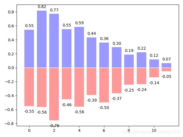
10、画柱状图
def show9():
    """
    柱状图
    """
    n = 12
    X = np.arange(n) #0-11个数字
    Y1 = (1 - X/float(n)) * np.random.uniform(0.5,1.0,n)
    Y2 = (1 - X/float(n)) * np.random.uniform(0.5,1.0,n)
    plt.bar(X,+Y1,facecolor='#9999ff',edgecolor='white') #向上的柱状图
    plt.bar(X,-Y2,facecolor='#ff9999',edgecolor='white')

    #增加标签
    for x,y in zip(X,Y1):
        plt.text(x+0.02,y+0.02,'%.2f' % y,ha='center',va='bottom') #ha:横向对齐方式,纵向对齐方式

    for x,y in zip(X,Y2):
        plt.text(x+0.02,-y-0.05,'-%.2f' % y,ha='center',va='top') #ha:横向对齐方式,纵向对齐方式
    plt.show()
11、绘制等高线
def show10():
    """
    绘制等高线
    """
    def f(x,y):
        return (1 - x / 2 + x ** 5 + y ** 3) * np.exp(-x ** 2 - y ** 2)

    n = 256
    x = np.linspace(-3,3,n)
    y = np.linspace(-3,3,n)
    X,Y = np.meshgrid(x,y)

    plt.contourf(X,Y,f(X,Y),8,alpha=0.75,cmap=plt.cm.hot) #X,Y,颜色,cmap 找对应数字是什么颜色(hot 的颜色),8是指分成多少份

    #画等高线
    C = plt.contour(X,Y,f(X,Y),8,colors='black',linewidths=1.5)

    #加label
    plt.clabel(C,inline=True,fontsize=10)
    plt.show()

12、打印图像
def show11():
    """
    打印图像
    """
    a = np.array([0.313660827978, 0.365348418405, 0.423733120134,
                  0.365348418405, 0.439599930621, 0.525083754405,
                  0.423733120134, 0.525083754405, 0.651536351379]).reshape(3, 3)
    plt.imshow(a,interpolation='nearest',cmap='bone',origin='lower') #interpolation产生的样式
    plt.colorbar(shrink=0.9) #shrink是压缩的长度
    plt.xticks(())
    plt.yticks(())
    plt.show()

13、3D数据图
def show12():
    """
    3D数据
    """
    from mpl_toolkits.mplot3d import Axes3D
    fig = plt.figure()
    ax = Axes3D(fig)

    X = np.arange(-4,4,0.25)
    Y = np.arange(-4,4,0.25)
    X,Y = np.meshgrid(X,Y)
    R = np.sqrt(X ** 2 + Y ** 2)
    Z = np.sin(R)

    ax.plot_surface(X,Y,Z,rstride=1,cstride=1,cmap=plt.get_cmap('rainbow'))
    ax.contourf(X,Y,Z,zdir='z',offset=-2,cmap='rainbow') #等高线
    ax.set_zlim(-2,2)
    plt.show()

14、多个图
def show13():
    """
    画多个小图在一张图里面
    """
    #第一张图
    plt.figure()
    plt.subplot(2,2,1) #2行2列,第1个图
    plt.plot([0,1],[0,1]) #第一个是两个点的横坐标,第二个是两个点的纵坐标

    plt.subplot(2, 2, 2) #2行2列第2个图
    plt.plot([0, 1], [0, 2])

    plt.subplot(223) #2行2列第3个图
    plt.plot([0, 1], [0, 3])

    plt.subplot(224) #2行2列第4个图
    plt.plot([0, 1], [0, 4])

    #第二张图 有点作弊的感觉,序号接上
    plt.figure()
    plt.subplot(2, 1, 1) #两行1列,第一个图
    plt.plot([0, 1], [0, 1])  # 第一个是两个点的横坐标,第二个是两个点的纵坐标

    plt.subplot(2, 3, 4) #两行3列,第4个图。因为上面那个图占了三个图
    plt.plot([0, 1], [0, 2])

    plt.subplot(235)
    plt.plot([0, 1], [0, 3])

    plt.subplot(236)
    plt.plot([0, 1], [0, 4])
    plt.show()


15、图中图
def show14():
    """
    图中图
    """
    fig = plt.figure()
    x = [1,2,3,4,5,6,7]
    y = [1,3,4,5,6,7,8]
    left,bottom,width,height = 0.1,0.1,0.8,0.8 #定位置
    ax1 = fig.add_axes([left,bottom,width,height])
    ax1.plot(x,y,'r')
    ax1.set_xlabel('x')
    ax1.set_ylabel('y')
    ax1.set_title('title')

    left, bottom, width, height = 0.2, 0.6, 0.25, 0.25  # 定位置
    ax1 = fig.add_axes([left, bottom, width, height])
    ax1.plot(x, y, 'r')
    ax1.set_xlabel('x')
    ax1.set_ylabel('y')
    ax1.set_title('title')
    plt.show()

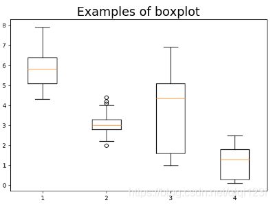
16、箱型图

def show15():
    """
    箱型图
    :return:
    """
    from sklearn.datasets import load_iris
    import matplotlib.pyplot as plt
    iris = load_iris()
    X,y = iris.data,iris.target
    print(X[0:5])
    box_1,box_2,box_3,box_4 = X[:,0],X[:,1],X[:,2],X[:,3]
    plt.boxplot([box_1,box_2,box_3,box_4])
    plt.title('Examples of boxplot', fontsize=20)  # 标题,并设定字号大小
    plt.show()
17、参考链接
Matplotlib Python 画图教程 (莫烦Python) - 视频版
Matplotlib Python 画图教程 (莫烦Python) - 文字版