R语言echarts4r包图表类型(中)
文章目录
- 载入包
- K线图
- 漏斗图
- 桑基图
- 热力图
- 平行图
载入包
library(tidyverse)
-- Attaching packages --------------------------------------- tidyverse 1.3.0 --
√ ggplot2 3.3.1     √ purrr   0.3.4
√ tibble  3.0.1     √ dplyr   1.0.0
√ tidyr   1.1.0     √ stringr 1.4.0
√ readr   1.3.1     √ forcats 0.5.0
-- Conflicts ------------------------------------------ tidyverse_conflicts() --
x dplyr::filter() masks stats::filter()
x dplyr::lag()    masks stats::lag()
library(echarts4r)
K线图
library(Tushare)
bar <- Tushare::pro_bar(token = ‘yourself’)
data <- bar(ts_code = "000001.SZ", start_date = "20171010", end_date = "20181010")
head(data) %>% as_tibble()
# A tibble: 6 x 11
  ts_code trade_date  open  high   low close pre_close change

1 000001~ 20181010    10.5  10.7  10.4  10.4      10.6 -0.11
2 000001~ 20181009    10.5  10.7  10.4  10.6      10.4 0.11
3 000001~ 20181008    10.7  10.8  10.4  10.4      11.0 -0.6
4 000001~ 20180928    10.8  11.3  10.8  11.0      10.7 0.31
5 000001~ 20180927    10.6  10.8  10.6  10.7      10.7 0.03
6 000001~ 20180926    10.6  10.9  10.5  10.7      10.6 0.16
# ... with 3 more variables: pct_chg , vol ,
#   amount
data %>%
    e_chart(trade_date) %>%
    e_candle(open,close,low,high,name='平安银行') %>%
    e_datazoom(type = 'slider') %>%
    e_y_axis(scale = TRUE) %>%
    e_title('平安银行股价','20171010-20181010')
token为私人秘钥,如果想尝试绘制金融数据这里可以自己去tushare上注册申请获得。
另一个获取证券数据的quantmod包不太适合国内情况,一些财务数据信息不全面。
e_datazoom函数选择缩放数据方式。e_y_axis函数sacle参数为TRUE用来响应y轴变化。
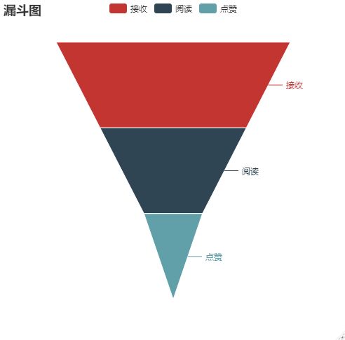
漏斗图
dou <- tibble(
    stage = c('接收','阅读','点赞'),
    value = c(80,50,20)
)
dou
# A tibble: 3 x 2
  stage value

1 接收     80
2 阅读     50
3 点赞     20
dou %>%
    e_charts() %>%
    e_funnel(value,stage) %>%
    e_title("漏斗图")
e_charts函数为空不传入轴标签,e_funnel函数绘制漏斗图。
桑基图
sangji <- tibble(
    soure = c('a','b','c','c'),
    target = c('b','c','e','e'),
    value = c(10,11,9,11)
)
sangji %>%
    e_charts() %>%
    e_sankey(soure,target,value) %>%
    e_title('桑基图')
e_sankey函数绘图
热力图
reli <- tibble(
    x = sample(v,200,replace = TRUE),
    y = sample(v,200,replace = TRUE),
    z = rnorm(200,10,1)
) %>%
    group_by(x,y) %>%
    summarise(z = sum(z)) %>%
    ungroup()
reli %>%
    e_charts(x) %>%
    e_heatmap(y,z) %>%
    e_visual_map(z) %>%
    e_title('热力图')
参考了官网数据。e_visual_map函数规定左下角图例数据
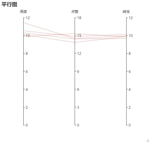
平行图
df <- tibble(
    阅读 = rnorm(5, 10),
    点赞 = rnorm(5, 15),
    转发 = rnorm(5,10)
)
df
# A tibble: 5 x 3
   阅读  点赞  转发

1 11.4   14.5  9.95
2  9.88  15.3  9.85
3 10.5   14.8 10.1
4 10.3   14.4  9.67
5 10.1   13.8  9.88
df %>%
    e_charts() %>%
    e_parallel(阅读,点赞,转发) %>%
    e_title('平行图')