制作时间:15:30 - 18:00
抛弃之前测试用的三个方框,正式制作漂亮的界面。测试环境只是用Chrome,所以浏览器兼容性还没有考虑到。
html代码:


最终要实现的页面是这样的:
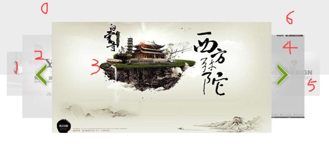
Paste_Image.png
为这几张图片添加红色标注,便于理解。根据规律,第3张图的两边其实是对称的,大小啊,透明度啊,层级关系啊都是一样的。
那我来一步一步添加css代码。
首先添加基本的 css 代码:
@charset "UTF-8";
body,h1,h2,h3,p,ul,img,a {margin:0;padding:0;}
body{background:#FFFFFF url(../images/hxd_bg.gif) repeat-x;}
ul{ list-style: none; }
a{ text-decoration:none; }
img{ border: none; }

#lunbo{
    width:970px;
    height: 344px;
    margin: 98px auto 0;
    position: relative;
}
#lunbo ul{ width: 970px; height: 344px;position:absolute;left:0;top:0; }
接下来的每一步是:
- 修改图片透明度
#lunbo .pos_0 img, #lunbo .pos_6 img{ opacity: 0; }
#lunbo .pos_1 img, #lunbo .pos_5 img{ opacity: 0.6; }
#lunbo .pos_2 img, #lunbo .pos_4 img{ opacity: 0.8; }
2.图片位置和层级设置
#lunbo ul li{ position: absolute; }
#lunbo ul .pos_0 { left:0; top: -104px; z-index: 1; }
#lunbo ul .pos_6 { right:0; top: -104px; z-index: 1; }
#lunbo ul .pos_1 { left:0; top:92px; z-index:2; }
#lunbo ul .pos_5 { right:0; top:92px; z-index:2; }
#lunbo ul .pos_2 { left:48px; top:40px; z-index:3; }
#lunbo ul .pos_4 { right:48px; top:40px; z-index:3; }
#lunbo ul .pos_3 { left:140px; top:0; z-index:4; }
3.图片大小和宽度设置
#lunbo .pos_3 img {width:680px;}
#lunbo .pos_2 img, #lunbo .pos_4 img {width:510px;}
#lunbo .pos_1 img, #lunbo .pos_5 img, #lunbo .pos_6 img {width:270px;}
#lunbo .pos_0 img {width:100px;}
4.向前向后按钮
#lunbo a.btn {width:120px;height:110px;position:absolute;z-index:5;cursor:pointer;}
#lunbo a.prev{left:72px;top:108px;}
#lunbo a.next{right:81px;top:108px;}
#lunbo a.btn span{width:76px;height:110px;position:absolute;}
#lunbo a.prev .icon{left:0;top:0;background:url(../images/hxd_btn_1.png) no-repeat left top;}
#lunbo a.next .icon{right:0;top:0;background:url(../images/hxd_btn_1.png) no-repeat left bottom;}
css代码结束
js开始
过程:获取元素的对象 -> 数组切换 -> 元素属性重新赋值。
跟第一版不同的地方:
1. 更改的属性变多了。
2. 因为向前和向后按钮实现的功能差不多,所以可以调用同一个函数,只是参数不同。
代码如下:
var $oDiv = $("#lunbo");
    var $oUl = $("ul");
    var $aLi = $("li");
    var $aLnk = $("ul a");
    var $aImg = $("img");
    var $oPrevBtn = $("a.prev");
    var $oNextBtn = $("a.next");
    var $oPrevIcon = $(".prev.icon");
    var $oNextIcon = $(".next.icon");

    var arr = [];

    for(var i=0; i < $aLi.length; i++){
        var $inow = $aLi.eq(i);
        var iPos = $inow.position();
        var iLeft = iPos.left;
        var iTop = iPos.top;
        var iZindex = $inow.css("z-index");
        var iOpacity = $aImg.eq(i).css("opacity")*100;
        var iWidth = parseInt($aImg.eq(i).css("width"));
        arr.push([iPos, iLeft, iTop, iZindex, iOpacity, iWidth]);

    }

    $oPrevBtn.click(function(){
        imgSwitch(true);
    });

    $oNextBtn.click(function(){
        imgSwitch(false);
    });

    function imgSwitch(isPrev){
        if(isPrev){
            arr.push(arr.shift());
        }else{
            arr.unshift(arr.pop());
        }

        for(var i=0; i < $aLi.length; i++){
            var $inow = $aLi.eq(i);
            $inow.css("z-index",arr[i][3]);
            $inow.animate( { "left":arr[i][1], "top":arr[i][2] } );
            $aImg.eq(i).animate({"opacity":arr[i][4]/100,"width":arr[i][5]});
        }
    }
})
注意:animate对opacity属性作动画,值的范围得是0-100,所以
css("opacity")通过取值后要*100。最后赋值的时候再/ 100即可。
其实还可以添加一些效果,比如可以设定成自动轮播的,鼠标移到图上时暂停自动轮播等其他你能想得到的效果。那今天这个效果就做到这里了。
不积跬步无以至千里