matplotlib.pyplot.scatter的使用
plt.scatter()的参数说明
matplotlib.pyplot.scatter(x, y, s=None, c=None, marker=None, cmap=None, norm=None, vmin=None, vmax=None, alpha=None, linewidths=None, verts=None, edgecolors=None, *, plotnonfinite=False, data=None, **kwargs)
- x,y:表示散点的x,y坐标,即点的位置。类型分别为 shape(n,) 的数组。
- s:表示散点形状(marker)的大小(size)。类型为 标量 或 shape(n,) 的数组,可选,默认20.
- c:表示散点的颜色。可以是色彩或颜色序列,如 r(red),g(green),b(blue),可选。
- marker:表示散点的形状。默认’o’,详情参阅marker属性,可选。
- cmap:Colormap,可选,仅在c为数组或浮点类型时才使用,详情参阅colormap属性,可选。
- norm:Normalize实例用于将亮度数据缩放为0,1。仅当c是浮点数组时才使用norm,可选。
- vmin,vmax:亮度设置,vmin和vmax与norm结合使用以标准化亮度数据,可选。
- alpha:设置图标的透明度。介于0(透明)~1(不透明)之间,可选。
- linewidths:标记边缘的线宽。类型为标量或数组,可选。
- edgecolors:图标的边缘色。默认与表面颜色相同,即’face’,可选。
- plotnonfinite:boolean,用于设置非限定的c来绘制散点。
scatter的基本用法
plt.scatter()可用于绘制散点图。
以下实例转载自博客:https://blog.csdn.net/luoganttcc/article/details/64440091
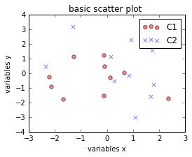
实例1:
# -*- coding: utf-8 -*-
#导入模块
from matplotlib import pyplot as plt
import numpy as np
#定义两个矩阵
A1=np.array([0,0])
B1=np.array(([2,0],[0,2]))
#以 A1为均值,B1为协方差矩阵,生成正态分布的随机数
C1=np.random.multivariate_normal(A1,B1,10)
C2=np.random.multivariate_normal(A1+0.2,B1+0.2,10)
#画布的大小为长8cm高6cm
plt.figure(figsize=(8,6))
#画图吧,s表示点点的大小,c就是color嘛,marker就是点点的形状哦o,x,*><^,都可以啦
#alpha,点点的亮度,label,标签啦
plt.scatter(C1[:,0],C1[:,1],s=30,c='red',marker='o',alpha=0.5,label='C1')
plt.scatter(C2[:,0],C2[:,1],s=30,c='blue',marker='x',alpha=0.5,label='C2')
#下面三行代码很简单啦
plt.title('basic scatter plot ')
plt.xlabel('variables x')
plt.ylabel('variables y')

plt.legend(loc='upper right')#这个必须有,没有你试试看

plt.show()#这个可以没有
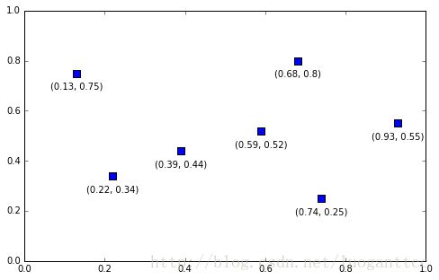
实例2
import matplotlib.pyplot as plt

x_coords = [0.13, 0.22, 0.39, 0.59, 0.68, 0.74, 0.93]
y_coords = [0.75, 0.34, 0.44, 0.52, 0.80, 0.25, 0.55]

fig = plt.figure(figsize=(8,5))
plt.scatter(x_coords, y_coords, marker='s', s=50)

for x, y in zip(x_coords, y_coords):
    plt.annotate(
        '(%s, %s)' %(x, y),
        xy=(x, y),
        xytext=(0, -10),
        textcoords='offset points',
        ha='center',
        va='top')

plt.xlim([0,1])
plt.ylim([0,1])
plt.show()
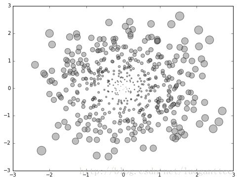
实例3
import numpy as np
import matplotlib.pyplot as plt

fig = plt.figure(figsize=(8,6))

# Generating a Gaussion dataset:
# creating random vectors from the multivariate normal distribution
# given mean and covariance
mu_vec1 = np.array([0,0])
cov_mat1 = np.array([[1,0],[0,1]])
X = np.random.multivariate_normal(mu_vec1, cov_mat1, 500)

R = X**2
R_sum = R.sum(axis=1)
plt.scatter(X[:, 0], X[:, 1],
            color='gray',
            marker='o',
            s=32. * R_sum,
            edgecolor='black',
            alpha=0.5)
plt.show()