echarts自定义y轴颜色(分段颜色) + 自定义y轴刻度值+自定义tooltip显示
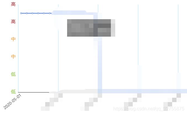
根据业务需求,设置你的数据范围,设置每个范围所对应的颜色和y轴刻度名称。
    yAxis:
   		{

          type: 'value',
          name:'程度',
          nameTextStyle:{

            padding:10,
            fontSize:14
         },
         nameLocation: 'end',
         axisLabel: {

            color: '#999',
            textStyle: {

              fontSize: 14,
              fontWeight:400,
              // 设置分段颜色
              color:function (value) {

                if(value>=0 && value<=0.3){

                  return 'rgba(140,198,63,1)'
                }
                else if (value>=0.4 && value<=0.7) {

                  return 'rgba(247,147,30,1)'
                }
                else if (value>=0.8 && value<=1) {

                  return 'rgba(193,39,45,1)'
                }
              }
          },
          formatter: function (value) {

              let texts = [];
              // 这个value值就是series的data数组里的每一项
              if(value>=0 && value<=0.3){

                texts.push('低');
              }
              else if (value>=0.4 && value<=0.7) {

                texts.push('中');
              }
              else if (value>=0.8 && value<=1) {

                texts.push('高');
              }
              return texts;
            }
          },
          splitLine: {

            show: false,
            lineStyle: {

              color: '#F3F4F4'
            }
          },
          axisTick: {

            show: false
          },
          axisLine: {

            show: false
          },
      },
      series: [
         {

           name: '程度',
           type: 'line',
           smooth: true,
           data: ['0.8','0.9','0.9','0.3','0.9','0.7','0.3','0.3','0.4','0.6','0.2',
            '0.4','0.2','0.4','0.6','0.5','0.3','0.6','0.6','0.6','0.5','0.7','0.6',
            '0.6','0.5','0.7','0.4','0.5','0.4','0.6','0.4','0.4','0.4','0.2','0.2']
         }
      ]
这个时候就希望tooltip也显示的是我们处理过的“高”,“中”,“低”三个等级,而不是数值,就可以再自定义一下tooltip即可
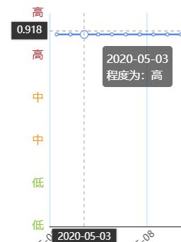
 tooltip: {

    formatter: function(params) {

      let res = params[0].name + '
程度为:'
      let texts = ''
      if (params[0].value>=0 && params[0].value<=0.3) {

        texts = '低'
      } else if (params[0].values>=0.4 && params[0].value<=0.7) {

        texts = '中'
      } else if (params[0].value>=0.8 && params[0].value<=1) {

        texts = '高'
      }
      res = res + texts;
      return res
    },
    trigger: 'axis',
    axisPointer: {

      type: 'cross',
      crossStyle: {

        color: '#999'
      },
      lineStyle: {

        type: 'dashed'
      }
    }
  },