Vue+echarts案例demo
最近在做一个vue配合图标的项目,期间看了很多案例,也修改了很多配置,期间把觉得几个比较好的图形分享给大家,这个网站比较多的案例,也可以参考Echarts官网
1.安装echarts
npm install echarts --s
2.在main.js中引入echarts,使echarts变成全局变量,通过this.$echarts引用
import echarts from 'echarts'
Vue.prototype.$echarts = echarts
部分图形案例如下
图形1(饼图-环形图)

代码如下
let myChart = this.$echarts.init(document.getElementById('alarm'));
      myChart.showLoading();
      var dataStyle = {

        normal: {

          label: {
     show:false},
          labelLine: {
     show:false}
        }
      };
      var placeHolderStyle = {

        normal : {

          color: 'rgba(0,0,0,0)',
          label: {
     show:false},
          labelLine: {
     show:false}
        },
        emphasis : {

          color: 'rgba(0,0,0,0)'
        }
      };
      let option = {

        title: {

        },
        tooltip : {

          show: true,
          formatter: "{a}
{b} : {c} ({d}%)"
        },
        color:['#50cb83','#1daec4','#f5c75a','#e1615c'],
        legend: {

          orient : 'vertical',
          x : document.getElementById('alarm').offsetWidth / 1.3,
          y : 55,
          itemGap:20,
          data:['非法刷卡','非法刷脸','陌生人预警','设备故障/离线'],
          textStyle:{
         //图例文字的样式
            color:'#00a8e8',  //文字颜色
            fontSize:12    //文字大小
          }
        },
        series : [
          {

            name:'1',
            type:'pie',
            clockWise:false,
            radius : [85, 100],
            itemStyle : dataStyle,
            data:[
              {

                value:68,
                name:'非法刷卡'
              },
              {

                value:32,
                name:'invisible',
                itemStyle : {

                  color:'#0e2743'
                }
              }
            ]
          },
          {

            name:'2',
            type:'pie',
            clockWise:false,
            radius : [60, 75],
            itemStyle : dataStyle,
            data:[
              {

                value:29,
                name:'非法刷脸'
              },
              {

                value:71,
                name:'invisible',
                itemStyle : {

                  color:'#0e2743'
                }
              }
            ]
          },
          {

            name:'3',
            type:'pie',
            clockWise:false,
            radius : [35, 50],
            itemStyle : dataStyle,
            data:[
              {

                value:15,
                name:'陌生人预警'
              },
              {

                value:85,
                name:'invisible',
                itemStyle : {

                  color:'#0e2743'
                }
              }
            ]
          },
          {

            name:'4',
            type:'pie',
            clockWise:false,
            radius : [5, 25],
            itemStyle : dataStyle,
            data:[
              {

                value:10,
                name:'设备故障/离线'
              },
              {

                value:90,
                name:'invisible',
                itemStyle : {

                  color:'#0e2743'
                }
              }
            ]
          }
        ]
      };
      myChart.hideLoading();
      myChart.setOption(option, true);
图形2(柱状图-无x,y轴以及刻度线)
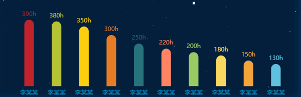
代码如下
 let myChart = this.$echarts.init(document.getElementById('visitimer'));
      myChart.showLoading();
      let option = {

        color: ['#3398DB'],
        tooltip : {

          trigger: 'item',
          formatter: '{a}
{b}:{c}h'
        },
        calculable: true,
        grid: {

          left: '3%',
          right: '4%',
          bottom: '3%',
          containLabel: true
        },
        xAxis : [
          {

            type : 'category',
            data : ['李某某', '李某某', '李某某', '李某某', '李某某', '李某某', '李某某','李某某', '李某某','李某某'],
            axisTick: {

              alignWithLabel: true
            },
            axisTick: {
      //x轴刻度线
              show: false
            },
            axisLine: {

              show: false,
              lineStyle: {

                color: '#0392c9',
              }
            }
          }
        ],
        yAxis : [
          {

            type : 'value',
            show: false,

          }
        ],
        series : [
          {

            name:'直接访问',
            type:'bar',
            itemStyle: {

              normal: {

                color: function(params) {

                  // build a color map as your need.
                  var colorList = [
                    '#C1232B','#B5C334','#FCCE10','#E87C25','#27727B',
                    '#FE8463','#9BCA63','#FAD860','#F3A43B','#60C0DD',
                    '#D7504B','#C6E579','#F4E001','#F0805A','#26C0C0'
                  ];
                  return colorList[params.dataIndex]
                },
                barBorderRadius:[16,16,0,0],
                label: {

                  show: true,
                  position: 'top',
                  formatter: '{c}h'
                }
              }
            },
            barWidth: '35%',
            data:[390,380,350,300,250,220,200,180,150,130]
          }
        ]
      };
        myChart.hideLoading();
      myChart.setOption(option, true);
图形3(柱状图-无y轴)
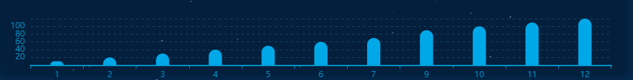
代码如下
let myChart = this.$echarts.init(document.getElementById('statis'));
      myChart.showLoading();
      let option = {

        tooltip: {

          axisPointer: {
                 // 坐标轴指示器,坐标轴触发有效
            type: 'shadow'        // 默认为直线,可选为:'line' | 'shadow'
          }
        },
        grid: {

          left: '3%',
          right: '4%',
          bottom: '3%',
          containLabel: true
        },
        color: '#00a8e8',
        xAxis: {

          data:[1,2,3,4,5,6,7,9,10,11,12],
          axisLine: {

            lineStyle: {

              color: '#0392c9',
              width: 2
            }
          }
        },
        yAxis: {

          name: '',
          type: 'value',
          axisTick: {
      //y轴刻度线
            show: false
          },
          splitLine :{
         //网格线
            lineStyle:{

              type:'dashed' ,
              color:'#144268'//设置网格线类型 dotted:虚线   solid:实线
            },
            show:true //隐藏或显示
          },
          axisLine: {

            show: false,
            lineStyle: {

              color: '#0392c9',
            }
          }
        },
        series: [{

          name: '来访人次',
          type: 'bar',
          barWidth: '25%',
          itemStyle: {

            normal: {

              barBorderRadius:[10,10,0,0],
            }
            },
          data:[10,20,30,40,50,60,70,90,100,110,120]
        }]
      }
      myChart.hideLoading();
      myChart.setOption(option, true);
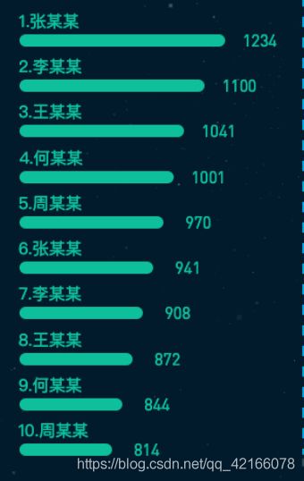
图形4(柱状图-y轴名称过长与x轴同一样式排列)
代码如下
 let myChart = this.$echarts.init(document.getElementById(id));
 let chartData=[1234,1100,1041,1001,970,941,908,872,844,814]
 let chartName=['李某某','李某某','李某某','李某某','李某某','李某某','李某某','李某某','李某某','李某某',]
        let option = {

          grid: {

            left: '2%',
            right: '10%',
            bottom: '-5%',
            containLabel: true
          },
          color: data.color,
          xAxis: [{

            show: false,
          },
            {

              show: false,
            }
          ],
          yAxis: {

            type: 'category',
            inverse: true,
            show: false
          },

          series: [
            //亮色条 百分比
            {

              show: true,
              type: 'bar',
              barGap: '-100%',
              barWidth: '30%',
              z: 2,
              itemStyle: {

                normal: {

                  barBorderRadius: 15,
                }
              },
              label: {

                normal: {

                  show: true,
                  textStyle: {

                    color: data.color,
                    fontSize: 13,
                  },
                  position: 'right',
                }
              },
              data:chartData ,
            },
            //年份
            {

              show: true,
              type: 'bar',
              xAxisIndex: 1, //代表使用第二个X轴刻度
              barGap: '-100%',
              barWidth: '30%',
              itemStyle: {

                normal: {

                  barBorderRadius: 15,
                  color: '#0ebf9c'
                }
              },
              label: {

                normal: {

                  show: true,
                  position: [0, '-20'],
                  textStyle: {

                    fontSize:14,
                    color:  '#0ebf9c'
                  },
                  formatter: function(data) {

                    return chartName[data.dataIndex];
                  }
                }
              },
              data: chartData
            }
          ]
        };
        myChart.setOption(option, true);