导读
以模拟数据为案例,总结ggplot柱形图绘图参数。内容如下方目录所示,一共包含1-9个部分。
目录:
一 输入数据
二 画图:基础调整
1 初始图
2 X轴排序
3 count列排序
4 XY轴标签
三 主题调整
1 经典主题(无框、无网格、透明背景)
2 BW主题(黑框、网格、透明背景)
3 自定义(黑框、无网格、透明背景)
四 颜色调整
1 数值取色
2 渐变色
3 RColorBrewer取色
4 分组字符取色
5 自定义柱色
6 柱边取色
7 自定义柱边色
五 Legend调整
1 修改legend title和text
2 移动legend(下方)
六 柱形调整
1 柱边粗细
2 柱间宽度/间距
3 翻转90度
七 字体调整
1 X Y Legend 标题加粗、加大
2 X Y Legend 文本加粗、加大
八 XY轴调整
1 坐标轴范围
2 柱距X轴距离
3 坐标轴线粗细
4 外框粗细
5 坐标轴刻度粗细
九 添加更多元素
1 加数字(大小、位置、颜色、字体)
2 加点(型号、大小、颜色)
3 加直线(线型、颜色、粗细)
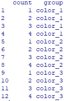
一、输入数据(含分组)
count = rep(1:4, 3)
group = paste("color", rep(1:3, each=4), sep="_")
data = data.frame(count, group)
二、画图:基础调整
1 初始图
library(ggplot2)
ggplot(data, mapping=aes(x=rownames(data), y=count)) +
geom_bar(stat="identity")
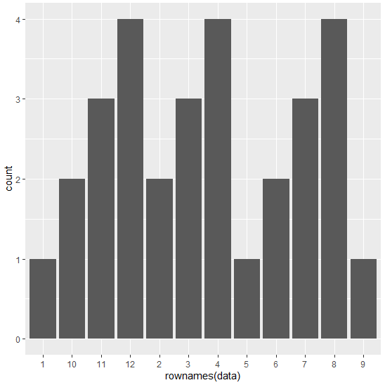
2 X轴排序
ggplot(data, mapping=aes(x=rownames(data), y=count)) +
geom_bar(stat="identity") +
scale_x_discrete(limits=factor(rownames(data)))
3 count列排序
tmp = data[order(data$count, decreasing=F),]
ggplot(tmp, mapping=aes(x=rownames(tmp), y=count)) +
geom_bar(stat="identity") +
scale_x_discrete(limits=factor(rownames(tmp)))

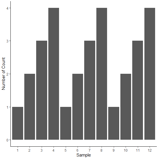
4 XY轴标签
ggplot(data, mapping=aes(x=rownames(data), y=count)) +
geom_bar(stat="identity") +
scale_x_discrete(limits=factor(rownames(data))) +
labs(x="Sample", y="Number of Count")

三、主题调整
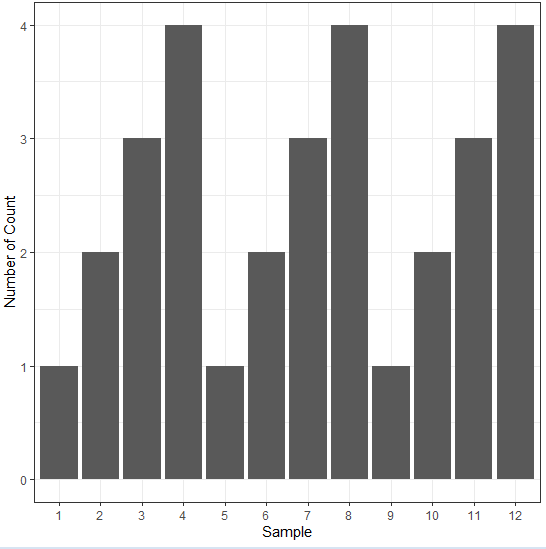
1 经典主题(无框、无网格、透明背景)
ggplot(data, mapping=aes(x=rownames(data), y=count)) +
geom_bar(stat="identity") +
scale_x_discrete(limits=factor(rownames(data))) +
labs(x="Sample", y="Number of Count") +
theme_classic()
2 BW主题(黑框、网格、透明背景)
ggplot(data, mapping=aes(x=rownames(data), y=count)) +
geom_bar(stat="identity") +
scale_x_discrete(limits=factor(rownames(data))) +
labs(x="Sample", y="Number of Count") +
theme_bw()
3 自定义(黑框、无网格、透明背景)
ggplot(data, mapping=aes(x=rownames(data), y=count)) +
geom_bar(stat="identity") +
scale_x_discrete(limits=factor(rownames(data))) +
labs(x="Sample", y="Number of Count") +
theme(panel.grid=element_blank(), panel.background=element_rect(color="black", fill="transparent"))

更多参考:https://ggplot2.tidyverse.org/reference/ggtheme.html
四、颜色调整
1 数值取色
ggplot(data, mapping=aes(x=rownames(data), y=count, fill=count)) +
geom_bar(stat="identity") +
scale_x_discrete(limits=factor(rownames(data))) +
labs(x="Sample", y="Number of Count") +
theme_bw()

2 渐变色
colors <- colorRampPalette(c("red", "black"))(12)
ggplot(data, mapping=aes(x=rownames(data), y=count)) +
geom_bar(stat="identity", fill=colors) +
scale_x_discrete(limits=factor(rownames(data))) +
labs(x="Sample", y="Number of Count") +
theme_bw()
3 RColorBrewer取色
library(RColorBrewer)
ggplot(data, mapping=aes(x=rownames(data), y=count)) +
geom_bar(stat="identity",  fill=brewer.pal(12, "Set3")) +
scale_x_discrete(limits=factor(rownames(data))) +
labs(x="Sample", y="Number of Count") +
theme_bw()

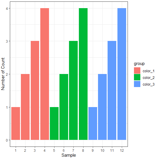
4 分组字符取色
ggplot(data, mapping=aes(x=rownames(data), y=count, fill=group)) +
geom_bar(stat="identity") +
scale_x_discrete(limits=factor(rownames(data))) +
labs(x="Sample", y="Number of Count") +
theme_bw()
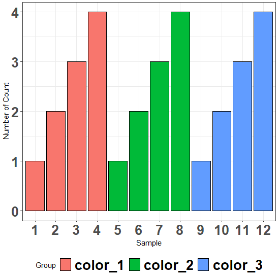
5 自定义柱色
ggplot(data, mapping=aes(x=rownames(data), y=count, fill=group)) +
geom_bar(stat="identity") +
scale_x_discrete(limits=factor(rownames(data))) +
labs(x="Sample", y="Number of Count") +
theme_bw() +
scale_fill_manual(
    values=c("color_1"="red", "color_2"="green", "color_3"="blue"),
    labels=c("red", "green", "blue"))

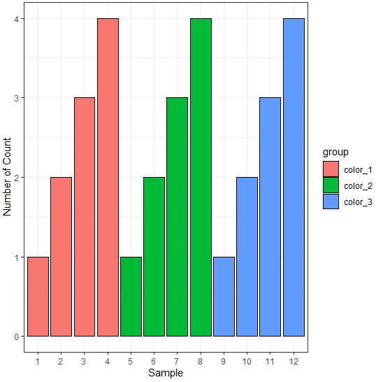
6 柱边取色
ggplot(data, mapping=aes(x=rownames(data), y=count, fill=group)) +
geom_bar(stat="identity", color="black") +
scale_x_discrete(limits=factor(rownames(data))) +
labs(x="Sample", y="Number of Count") +
theme_bw()
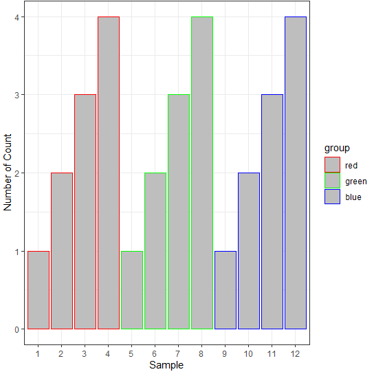
7 自定义柱边色
ggplot(data, mapping=aes(x=rownames(data), y=count, color=group)) +
geom_bar(stat="identity", fill="grey") +
scale_x_discrete(limits=factor(rownames(data))) +
labs(x="Sample", y="Number of Count") +
theme_bw() +
scale_color_manual(
    values=c("color_1"="red", "color_2"="green", "color_3"="blue"),
    labels=c("red", "green", "blue"))
五、Legend调整
1 修改legend title和text
ggplot(data, mapping=aes(x=rownames(data), y=count, fill=group)) +
geom_bar(stat="identity", color="black") +
scale_x_discrete(limits=factor(rownames(data))) +
labs(x="Sample", y="Number of Count", fill="Group") +
theme_bw() +
scale_fill_manual(
    values=c("color_1"="red", "color_2"="green", "color_3"="blue"),
    labels=c("G1", "G2", "G3"))

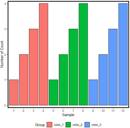
2 移动legend(下方)
ggplot(data, mapping=aes(x=rownames(data), y=count, fill=group)) +
geom_bar(stat="identity", color="black") +
scale_x_discrete(limits=factor(rownames(data))) +
labs(x="Sample", y="Number of Count", fill="Group") +
theme_bw() +
theme(legend.position="bottom")

六、柱形调整
1 柱边粗细
ggplot(data, mapping=aes(x=rownames(data), y=count, fill=group)) +
geom_bar(stat="identity", color="black", size=2) +
scale_x_discrete(limits=factor(rownames(data))) +
labs(x="Sample", y="Number of Count", fill="Group") +
theme_bw() +
theme(legend.position="bottom")

2 柱间宽度/间距
ggplot(data, mapping=aes(x=rownames(data), y=count, fill=group)) +
geom_bar(stat="identity", color="black", width=1) +
scale_x_discrete(limits=factor(rownames(data))) +
labs(x="Sample", y="Number of Count", fill="Group") +
theme_bw() +
theme(legend.position="bottom")

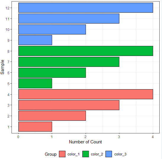
3 翻转90度
ggplot(data, mapping=aes(x=rownames(data), y=count, fill=group)) +
geom_bar(stat="identity", color="black") +
scale_x_discrete(limits=factor(rownames(data))) +
labs(x="Sample", y="Number of Count", fill="Group") +
theme_bw() +
theme(legend.position="bottom") +
coord_flip()
七、字体调整
1 X Y Legend 标题加粗、加大
ggplot(data, mapping=aes(x=rownames(data), y=count, fill=group)) +
geom_bar(stat="identity", color="black") +
scale_x_discrete(limits=factor(rownames(data))) +
labs(x="Sample", y="Number of Count", fill="Group") +
theme_bw() +
theme(legend.position="bottom") +
theme(legend.title=element_text(face="bold", size=20)) +
theme(axis.title.x=element_text(face="bold", size=20)) +
theme(axis.title.y=element_text(face="bold", size=20))
2 X Y Legend 文本加粗、加大
ggplot(data, mapping=aes(x=rownames(data), y=count, fill=group)) +
geom_bar(stat="identity", color="black") +
scale_x_discrete(limits=factor(rownames(data))) +
labs(x="Sample", y="Number of Count", fill="Group") +
theme_bw() +
theme(legend.position="bottom") +
theme(legend.text=element_text(face="bold", size=20)) +
theme(axis.text.x=element_text(face="bold", size=20)) +
theme(axis.text.y=element_text(face="bold", size=20))
八、XY轴调整
1 坐标轴范围
ggplot(data, mapping=aes(x=rownames(data), y=count, fill=group)) +
geom_bar(stat="identity", color="black") +
scale_x_discrete(limits=factor(rownames(data))) +
labs(x="Sample", y="Number of Count", fill="Group") +
theme_classic() +
theme(legend.position="bottom") +
ylim(c(0, 6))

2 柱距X轴距离
ggplot(data, mapping=aes(x=rownames(data), y=count, fill=group)) +
geom_bar(stat="identity", color="black") +
scale_x_discrete(limits=factor(rownames(data))) +
labs(x="Sample", y="Number of Count", fill="Group") +
theme_classic() +
theme(legend.position="bottom") +
scale_y_continuous(expand=c(0, 0))

3 坐标轴线粗细
ggplot(data, mapping=aes(x=rownames(data), y=count, fill=group)) +
geom_bar(stat="identity", color="black") +
scale_x_discrete(limits=factor(rownames(data))) +
labs(x="Sample", y="Number of Count", fill="Group") +
theme_classic() +
theme(legend.position="bottom") +
scale_y_continuous(expand=c(0, 0.1)) +
theme(axis.line = element_line(size = 2))
4 外框粗细
ggplot(data, mapping=aes(x=rownames(data), y=count, fill=group)) +
geom_bar(stat="identity", color="black") +
scale_x_discrete(limits=factor(rownames(data))) +
labs(x="Sample", y="Number of Count", fill="Group") +
theme_classic() +
theme(legend.position="bottom") +
scale_y_continuous(expand=c(0, 0.1)) +
theme(panel.background=element_rect(color="black", size=2))
5 坐标轴刻度粗细
ggplot(data, mapping=aes(x=rownames(data), y=count, fill=group)) +
geom_bar(stat="identity", color="black") +
scale_x_discrete(limits=factor(rownames(data))) +
labs(x="Sample", y="Number of Count", fill="Group") +
theme_classic() +
theme(legend.position="bottom") +
scale_y_continuous(expand=c(0, 0.1)) +
theme(axis.ticks = element_line(size = 2))
九、添加更多元素
1 添加标签(大小、位置、颜色、字体)
ggplot(data, mapping=aes(x=rownames(data), y=count, fill=group)) +
geom_bar(stat="identity", color="black") +
scale_x_discrete(limits=factor(rownames(data))) +
labs(x="Sample", y="Number of Count", fill="Group") +
theme_bw() +
theme(legend.position="bottom") +
geom_text(aes(label = count, y = count/2), size=5, color="white", family="serif")
2 加点(型号、大小、颜色)
ggplot(data, mapping=aes(x=rownames(data), y=count, fill=group)) +
geom_bar(stat="identity", color="black") +
geom_point(pch=21, aes(fill=group), color="black", size=2) +
scale_x_discrete(limits=factor(rownames(data))) +
labs(x="Sample", y="Number of Count", fill="Group") +
theme_bw() +
theme(legend.position="bottom") +
geom_text(aes(label = count, y = count/2), size=5)

3 加直线(线型、颜色、粗细)
ggplot(data, mapping=aes(x=rownames(data), y=count, fill=group)) +
geom_bar(stat="identity", color="black") +
geom_point(pch=21, aes(fill=group), color="black", size=2) +
geom_line(aes(group=group), linetype="dashed", color="skyblue", size=2) +
scale_x_discrete(limits=factor(rownames(data))) +
labs(x="Sample", y="Number of Count", fill="Group") +
theme_bw() +
theme(legend.position="bottom") +
geom_text(aes(label = count, y = count/2), size=5)
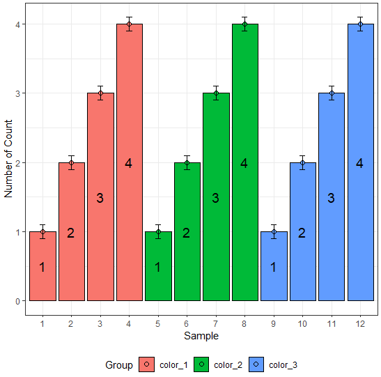
4 添加误差棒(宽度)
geom_errorbar(aes(ymax=x+sd,ymin=x-sd))
ggplot(data, mapping=aes(x=rownames(data), y=count, fill=group)) +
geom_bar(stat="identity", color="black") +
geom_point(pch=21, aes(fill=group), color="black", size=2) +
scale_x_discrete(limits=factor(rownames(data))) +
labs(x="Sample", y="Number of Count", fill="Group") +
theme_bw() +
theme(legend.position="bottom") +
geom_text(aes(label = count, y = count/2), size=5) +
geom_errorbar(aes(ymax = count+0.1, ymin = count-0.1), width=0.2)
5 添加X轴分组
给geom_bar geom_errorbar geom_text添加分组:position=position_dodge(1)
个人文件取色,配色:scale_fill_manual(values=value, labels=label)
文件准备:
color = read.table("group_color.list", header=F, comment.char="")
# 从个人文件中取色
data2 = data.frame(data, color=as.character(unique(data$count)))

个人文件取色:
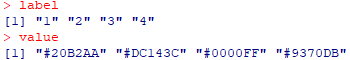
value = c()
label = c()
for(i in 1:length(unique(data$count)))
{
    label = c(label, as.character(data2$color)[i])
    value = c(value, as.character(color[,1])[i])
}
绘图:
ggplot(data2, aes(x=group, fill=color, y=count))+
geom_bar(stat="identity", position=position_dodge(1)) +
labs(x='', y='Count', fill="Color") +
scale_y_continuous(limits=c(0, max(data[,1])+max(data[,1])/2), expand=c(0, 0)) +
theme_classic() +
geom_errorbar(aes(ymax=count+0.5, ymin=count-0.5), width=0.2, position=position_dodge(1)) +
scale_fill_manual(values=value, labels=label) +
geom_text(aes(label=count, y=count+2*0.5), position=position_dodge(1))