library(tidyverse)
library(ggplot2)
查看mpg数据结构
## 采用ggplot2自带的数据mpg来探索引擎与燃油效率之间的关系
## 变量displ:引擎的大小   hwy: 燃油的效率
View(mpg)

image.png
简单可视化
ggplot(data = mpg) +
  geom_point(mapping = aes(x = displ, y = hwy))
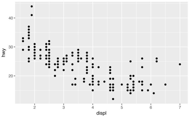
image.png
ggplot2画图结构
ggplot(data = ) +
  (mapping = aes())
Exercises
- Run ggplot(data = mpg). What do you see?
- How many rows are in mtcars? How many columns?
- What does the drv variable describe? Read the help for ?mpg to
find out. - Make a scatterplot of hwy versus cyl.
- What happens if you make a scatterplot of class versus drv? Why is the plot not useful?
1、 运行后得到的只是灰色的画布,我们并没有指定变量

2、查看数据有多少行列?
> dim(mpg)  ## 表示得到数据的维度
[1] 234  11  ##表示234行 11列
> ncol(mpg) # 列
[1] 11
> nrow(mpg) # 行
[1] 234

3、查看变量drv代表什么?
> ?mpg
可以看到右边会显示得到如下结果
drv
f = front-wheel drive, r = rear wheel drive, 4 = 4wd

4、绘制一个hwy与cyl的散点图
ggplot(mpg) +
  geom_point(aes(x = hwy, y = cyl))

5、ggplot(mpg) +
  geom_point(aes(x = class, y = drv))

image.png
Aesthetic Mappings
将颜色映射到class上
> unique(mpg$class)
[1] "compact"    "midsize"    "suv"        "2seater"    "minivan"    "pickup"     "subcompact"
> ggplot(data = mpg) +
  geom_point(mapping = aes(x = displ, y = hwy, color = class))
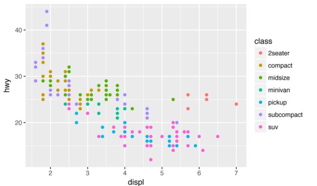
image.png
以点的大小来代表每一个类别
ggplot(data = mpg) +
  geom_point(mapping = aes(x = displ, y = hwy, size = class))
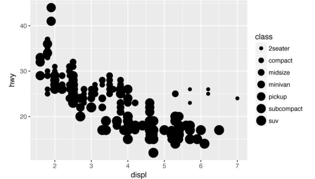
image.png
使用阴影程度来代表不同的类别
ggplot(data = mpg) +
  geom_point(mapping = aes(x = displ, y = hwy, alpha = class))

使用不同的形状来代表不同的类别
ggplot(data = mpg) +
  geom_point(mapping = aes(x = displ, y = hwy, shape = class))

image.png
如果想改变散点图中点的颜色?
ggplot(data = mpg) +
  geom_point(mapping = aes(x = displ, y = hwy), color = "blue")
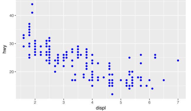
image.png
小结
- 参数shape定义形状、color定义颜色,可以指定颜色或者根据变量中的level自动填充、size以点的大小来表示,alpha可以定义阴影程度。
-
shape参数形状汇总
 image.png
Exercises
- What happens if you map an aesthetic to something other than
a variable name, like aes(color = displ < 5)?
ggplot(data = mpg) +
  geom_point(mapping = aes(x = displ, y = hwy, color = displ < 5))
## 表示按照条件来填充颜色,不符合小于5的为一种颜色,符合小于5的为一种颜色
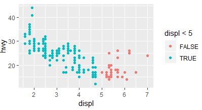
image.png
Facets (分面)
## 按照变量class里面不用的类来分面
ggplot(data = mpg) +
  geom_point(mapping = aes(x = displ, y = hwy)) +
  facet_wrap(~ class, nrow = 2) ##表示两行
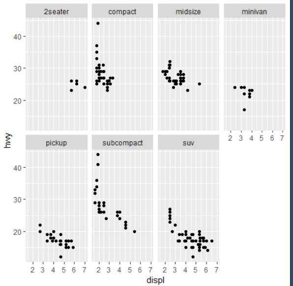
image.png
## 表示根据变量drv和cyl两个变量里面的类别进行排列组合即4*3=12个面
ggplot(data = mpg) +
  geom_point(mapping = aes(x = displ, y = hwy)) +
  facet_grid(drv ~ cyl)

image.png
ggplot(data = mpg) +
  geom_point(mapping = aes(x = displ, y = hwy)) +
  facet_grid(drv ~ .)  ## 表示以行展示
ggplot(data = mpg) +
  geom_point(mapping = aes(x = displ, y = hwy)) +
  facet_grid(. ~ drv) ##表示以列展示
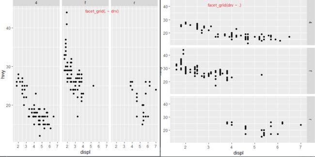
image.png
Geometric Objects
ggplot(data = mpg) +
  geom_smooth(mapping = aes(x = displ, y = hwy, linetype = drv))

image.png
ggplot(data = mpg) +
  geom_smooth(mapping = aes(x = displ, y = hwy, linetype = drv, color = drv))

image.png
ggplot(data = mpg, mapping = aes(x = displ, y = hwy)) +
  geom_point(mapping = aes(color = class)) +
  geom_smooth()
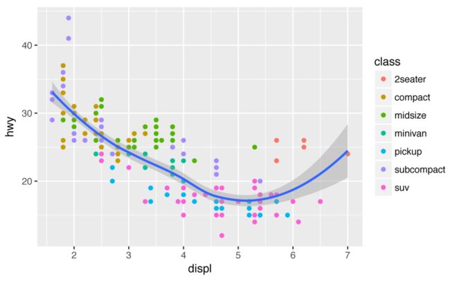
image.png
使用filter函数挑选某一类进行smooth
ggplot(data = mpg, mapping = aes(x = displ, y = hwy)) +
  geom_point(mapping = aes(color = class)) +
  geom_smooth(
    data = filter(mpg, class == "subcompact"),
    se = FALSE
  )

image.png
哈哈 中文版买了,现在开始就看中文版了
1.7 统计变换 (P19)
-
geom_bar() 统计变换的过程
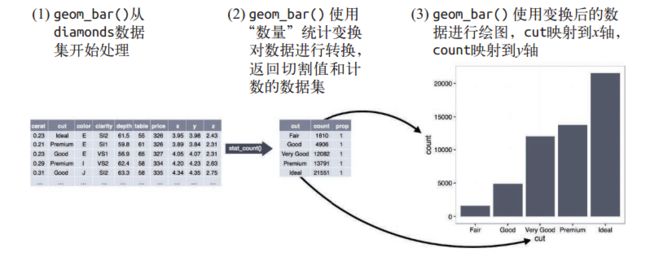 image.png
ggplot(data = diamonds) + geom_bar(mapping = aes(x = cut))
ggplot(data = diamonds) + stat_count(mapping = aes(x = cut))
这两句代码是等价的,在这里geom_bar()使用了stat_count()函数进行统计变换

image.png
如果你只想要显示比例而不是计数的话使用以下命令 ,y = ..prop..表示百分比的形式
ggplot(data = diamonds) + geom_bar(mapping = aes(x = cut, y = ..prop.., group = 1))
你可能想要在代码中强调统计变换。例如,你可以使用 stat_summary() 函数将人们的注意力吸引到你计算出的那些摘要统计量上。 stat_summary() 函数为 x 的每个唯一值计算 y 值的摘要统计:
ggplot(data = diamonds) + stat_summary(mapping = aes(x = cut, y = depth),
                                       fun.ymin = min,
                                       fun.ymax = max,
                                       fun.y = median
)
## 表示每一个变量对应的深度的值的分布,最大值、最小值、以及中位值,类似箱式图
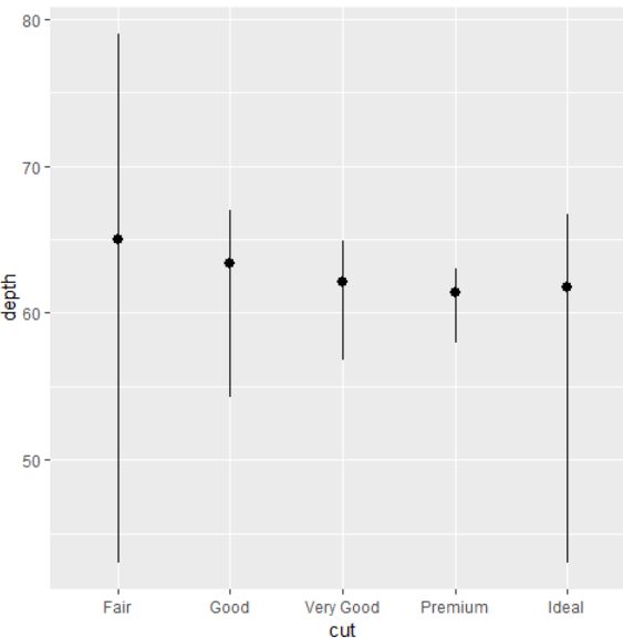
image.png
1.8、位置调整
添加柱状图边框的颜色
ggplot(data = diamonds) +
  geom_bar(mapping = aes(x = cut, color = cut))
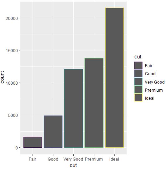
image.png
如果要设置柱状图填充的颜色,就需要使用fill参数
ggplot(data = diamonds) +
  geom_bar(mapping = aes(x = cut, fill = cut))

image.png
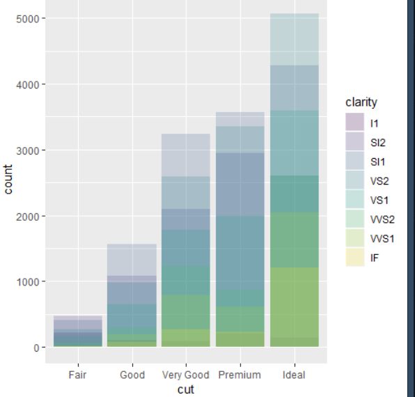
如果将 fill 图形属性映射到另一个变量(如 clarity),那么条形会自动分块堆叠起来。每个彩色矩形表示 cut 和 clarity 的一种组合。
ggplot(data = diamonds) +
  geom_bar(mapping = aes(x = cut, fill = clarity))

image.png
这种堆叠是由 position 参数设定的位置调整功能自动完成的。如果不想生成堆叠式条形图,你还可以使用以下 3 种选项之一: "identity"、 "fill" 和 "dodge"。
- position = "identity" 将每个对象直接显示在图中。这种方式不太适合条形图,因为
条形会彼此重叠。为了让重叠部分能够显示出来,我们可以设置 alpha 参数为一个较小
的数,从而使得条形略微透明;或者设定 fill = NA,让条形完全透明:
ggplot(data = diamonds,mapping = aes(x = cut, fill = clarity)) +
  geom_bar(alpha = 1/5, position = "identity")

ggplot(data = diamonds, mapping = aes(x = cut, color = clarity)) +
  geom_bar(fill = NA, position = "identity")
fill = clarity

fill = NA
- position = "fill" 的效果与堆叠相似,但每组堆叠条形具有同样的高度,因此这种条
形图可以非常轻松地比较各组间的比例:
ggplot(data = diamonds) +
  geom_bar(mapping = aes(x = cut, fill = clarity),position = "fill")
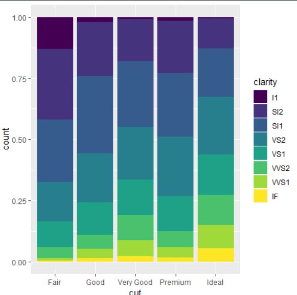
image.png
- position = "dodge" 将每组中的条形依次并列放置,这样可以非常轻松地比较每个条形
表示的具体数值:
ggplot(data = diamonds) +
  geom_bar(mapping = aes(x = cut, fill = clarity), position = "dodge")
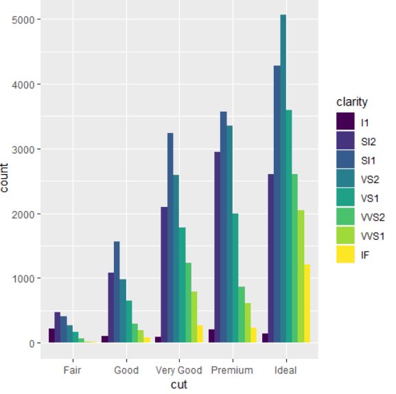
image.png
1.9、坐标系
坐标系可能是 ggplot2 中最复杂的部分。默认的坐标系是笛卡儿直角坐标系,可以通过其独立作用的 x 坐标和 y 坐标找到每个数据点。
- coord_flip() 函数可以交换 x 轴和 y 轴。
ggplot(data = mpg, mapping = aes(x = class, y = hwy)) +
  geom_boxplot()

ggplot(data = mpg, mapping = aes(x = class, y = hwy)) +
  geom_boxplot() +
  coord_flip()
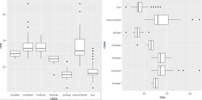
image.png
- coord_polar() 函数使用极坐标系。极坐标系可以揭示出条形图和鸡冠花图间的一种有趣联系:
bar <- ggplot(data = diamonds) +
  geom_bar(mapping = aes(x = cut, fill = cut), show.legend = FALSE,width = 1) +
  theme(aspect.ratio = 1) + labs(x = NULL, y = NULL)
bar
bar + coord_flip()
bar + coord_polar()
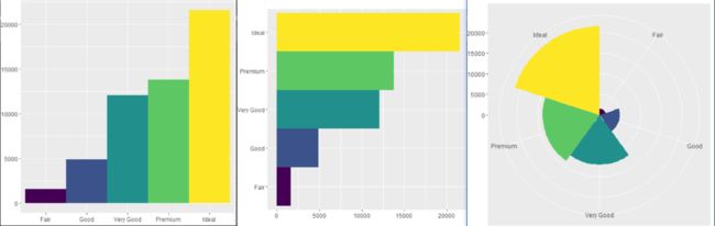
image.png