python大佬的可视化工具-HoloViews
欢迎关注公众号:pythonic生物人
holoviews是一个超级简洁的python可视化工具,后端为bokeh、matplotlib、datashader库,最擅长干的是一行代码搞定一张图(类似seaborn),如下文的河流图(Sankey);
HoloViews helps you understand your data better, by letting you work seamlessly with both the data and its graphical representation.
欢迎阅读类似文章(列出公众号的部分内容)
Python可视化44|画个“圣诞树”
Python可视化|Matplotlib40-LaTeX in Matplotlib和python
Python可视化|Matplotlib39-Matplotlib 1.4W+字教程(珍藏版)
Python可视化|Matplotlib38-Matplotlib官方Cheat sheet(上篇)
Python可视化35|matplotlib&seaborn-一些有用的图
Python可视化34|matplotlib-多子图绘制(为所欲为版)
Python可视化33|matplotlib-rcParams及绘图风格(style)设置详解
Python可视化32|matplotlib-断裂坐标轴(broken_axis)|图例(legend)详解
Python可视化31|matplotlib-图添加文本(text)及注释(annotate)
Python可视化30|matplotlib-辅助线(axhline|vlines|axvspa|axhspan)
Python可视化29|matplotlib-饼图(pie)
Python可视化28|matplotlib绘制韦恩图(2-6组数据)
Python可视化27|seaborn绘制线型回归图曲线
Python可视化26|seaborn绘制分面图(seaborn.FacetGrid)
Python可视化25|seaborn绘制矩阵图
Python可视化24|seaborn绘制多变量分布图(jointplot|JointGrid)
Python可视化23|seaborn.distplot单变量分布图(直方图|核密度图)
Python可视化22|Seaborn.catplot(下)-boxenplot|barplot|countplot图
Python可视化21|Seaborn.catplot(上)-小提琴图等四类图
Python可视化20|Seaborn散点图&&折线图
Python可视化19|seborn图形外观设置
Python可视化17seborn-箱图boxplot
Python可视化matplotlib&seborn16-相关性heatmap
Python可视化matplotlib&seborn15-聚类热图clustermap
Python可视化matplotlib&seborn14-热图heatmap
Python可视化|matplotlib13-直方图(histogram)详解
Python可视化|matplotlib12-垂直|水平|堆积条形图详解
Python可视化|matplotlib11-绘制折线图matplotlib.pyplot.plot
Python可视化|matplotlib10-绘制散点图scatter
Python可视化|matplotlib04-绘图风格(plt.style)大全
Python可视化|matplotlib03-一文掌握marker和linestyle使用
python可视化|matplotlib02-matplotlib.pyplot坐标轴|刻度值|刻度|标题设置
python可视化|matplotlib01-绘图方式|图形结构plotnine
Python可视化43|plotnine≈Python版ggplot2
pygal
Python可视化|pygal37-pygal用法及示例
颜色使用
Python可视化18|seborn-seaborn调色盘(六)
Python|R可视化|09-提取图片颜色绘图(五-颜色使用完结篇)
Python可视化|08-Palettable库中颜色条Colormap(四)
Python可视化|matplotlib07-自带颜色条Colormap(三)
Python可视化|matplotlib06-外部单颜色(二)
Python可视化|matplotlib05-内置单颜色(一)

目录
01 - 精彩demo
02 - 快速上手holoviews
holoviews安装
从scatter开始
使用“+”添加Layout
使用“*”添加Overlay
添加交互小部件
使用opts个性化图形设置
更多精彩
01 - 精彩demo

import pandas as pd
import holoviews as hv
hv.extension('matplotlib')
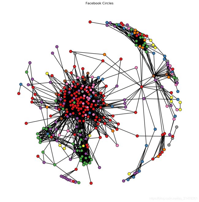
edges_df = pd.read_csv('fb_edges.csv')
nodes_df = pd.read_csv('fb_nodes.csv')
fb_nodes = hv.Nodes(nodes_df).sort()
fb_graph = hv.Graph((edges_df, fb_nodes), label='Facebook Circles') #绘图
fb_graph.opts(cmap='Set1',
node_color='circle',
fig_size=350,
show_frame=False,
xaxis=None,
yaxis=None,
node_size=10)
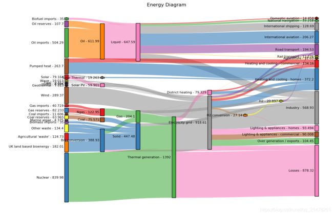
edges = pd.read_csv('energy.csv')  #导入数据
sankey = hv.Sankey(edges, label='Energy Diagram')  #绘图
sankey.opts(label_position='left',
            edge_color='target',
            node_color='index',
            cmap='set1')  #图形属性设置
hv.Sankey(edges, label='Energy Diagram') 一行代码搞定小面的河流图~~

# 矩阵图
import holoviews as hv
from holoviews import opts

hv.extension('bokeh')

from bokeh.sampledata.iris import flowers
from holoviews.operation import gridmatrix

ds = hv.Dataset(flowers)

grouped_by_species = ds.groupby('species', container_type=hv.NdOverlay)
grid = gridmatrix(grouped_by_species, diagonal_type=hv.Scatter)#绘图

grid.opts(opts.Scatter(tools=['hover', 'box_select'], bgcolor='#efe8e2', fill_alpha=0.2, size=4))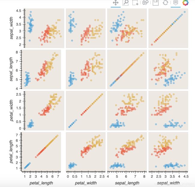
02 - 快速上手holoviews
holoviews安装
pip install holoviews -i https://pypi.tuna.tsinghua.edu.cn/simple从scatter开始
import pandas as pd
import numpy as np
import holoviews as hv
from holoviews import opts

hv.extension('bokeh', 'matplotlib')  #导入扩展'bokeh','matplotlib'
station_info = pd.read_csv('station_info.csv')
hv.Scatter(station_info, 'services', 'ridership')  #轻松绘制散点图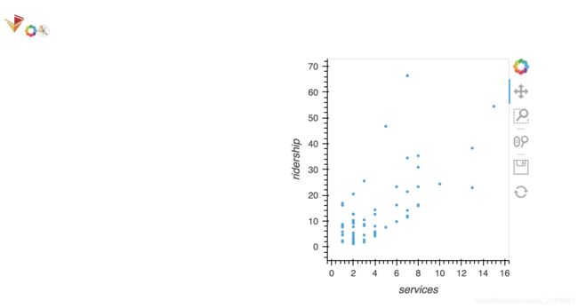
使用“+”添加Layout
# 使用“+”添加Layout
hv.Scatter(station_info, 'services', 'ridership') + \
hv.Histogram(
    np.histogram(station_info['opened'], bins=24), kdims=['opened'])+\
hv.Scatter(station_info, 'services', 'ridership')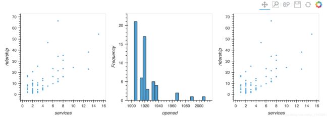
使用“*”添加Overlay
# 使用“*”添加Overlay
taxi_dropoffs = {
    hour: arr
    for hour, arr in np.load('hourly_taxi_data.npz').items()
}

bounds = (-74.05, 40.70, -73.90, 40.80)
image = hv.Image(taxi_dropoffs['0'], ['lon', 'lat'], bounds=bounds)
points = hv.Points(station_info, ['lon', 'lat'])
image + image * points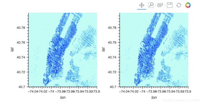
添加交互小部件
# 添加交互小部件
dictionary = {
    int(hour): hv.Image(arr, ['lon', 'lat'], bounds=bounds)
    for hour, arr in taxi_dropoffs.items()
}
hv.HoloMap(dictionary, kdims='Hour')
使用opts个性化图形设置
# 默认bokeh后端
spike_train = pd.read_csv('spike_train.csv.gz')
curve = hv.Curve(spike_train, 'milliseconds', 'Hertz')  # 折线图
spikes = hv.Spikes(spike_train, 'milliseconds', [])  # 条形码

layout = curve + spikes  #
layout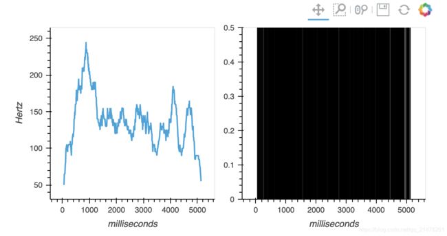
#opts个性化图形属性设置
layout.opts(
    #Options
    opts.Curve(height=200,
               width=900,
               xaxis=None,
               line_width=1.50,
               color='red',
               tools=['hover']),
    opts.Spikes(height=150,
                width=900,
                yaxis=None,
                line_width=0.25,
                color='grey')).cols(1)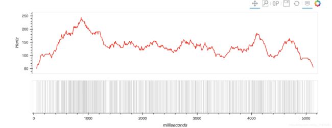
更多精彩
https://github.com/holoviz/holoviews