本项目难点在于对不同纬度数据进行归一化显示。
一、方案1:
1,显示效果:
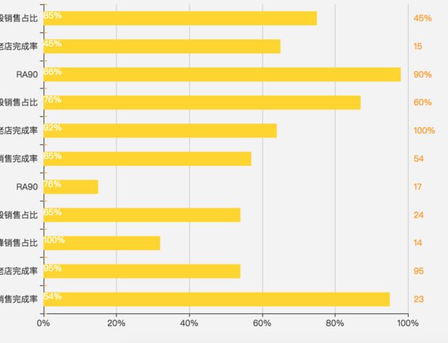
方案1
2, 实现代码:
var category =  ['新店销售完成率', '可比老店完成率', '高峰销售占比','高峰时段销售占比', 'RA90','新店销售完成率', '可比老店完成率', '高峰时段销售占比', 'RA90', '可比老店完成率', '高峰时段销售占比'];

var lineData = [23, 95, 14, 24,17, 54, '100%', '60%', '90%', 15, '45%'];

var barData = [95, 54, 32, 54,15, 57, 64, 87, 98, 65, 75];

var Data =[54, 95, 100, 65,76, 85, 92, 76, 66, 45, 85];

option = {

    xAxis: [

        {

        position:'bottom',

        axisLabel : {

formatter : '{value}%'

},

        axisPointer : {            // 坐标轴指示器,坐标轴触发有效

            type : 'shadow'        // 默认为直线,可选为:'line' | 'shadow'

        }

    },

    {

        position:'bottom',

        axisLabel : {

formatter : '{value}%'

},

        axisPointer : {            // 坐标轴指示器,坐标轴触发有效

            type : 'shadow'        // 默认为直线,可选为:'line' | 'shadow'

        }

    }

    ],

    yAxis: [

        //增加一列纵坐标表示标杆值

        {

        position:'right',

        axisLine: {

            lineStyle: {

                color: '#ff9a00'

            }

            },

        data: lineData,

    },

    {

        position:'top',

        data: category,

    }

    ],

    series: [

    //1,用来显示的填充值

    {

        type: 'bar',

        label: {

                normal: {

                    show: false,

                    color:'#ffffff',

                    position: 'inside',

                    formatter:'{c}%'

                }

            },

        itemStyle: {

            normal: {

                color: '#ffd500'

            }

        },

        barWidth: 20,

        barGap: '-100%', // Make series be overlap

        data: barData

    },

    // 2,实际数值

    {

        type: 'bar',

        label: {

                normal: {

                    show: true,

                    color:'#ffffff',

                    position: 'insideLift',

                    formatter:'{c}%'

                }

            },

        itemStyle: {

            normal: {

                color: '#00000000'

            }

        },

        barWidth: 20,

        barGap: '-100%', // Make series be overlap

        data: Data

    }

    ]

};
二、方案2:
1,显示效果:
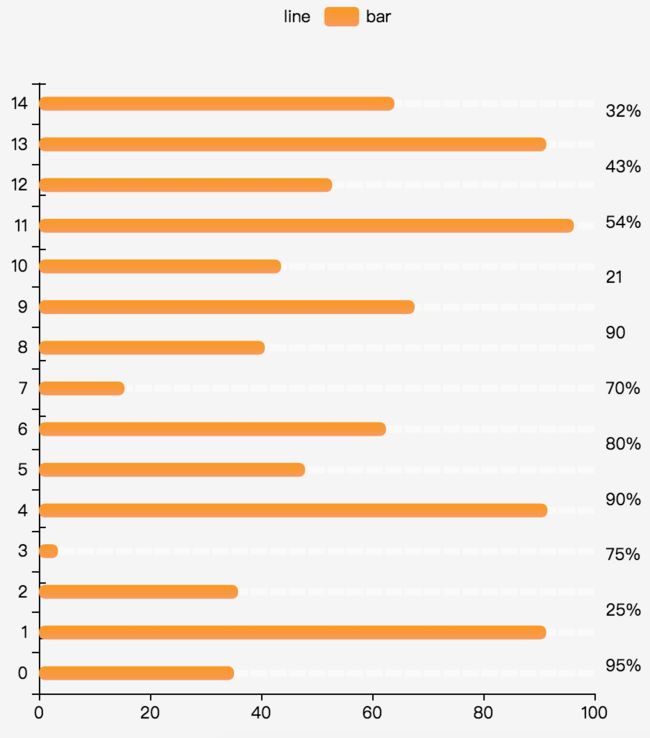
方案2
2,实现代码:
var category = [];

var dottedBase = +new Date();

var lineData = [];

var barData = [];

for (var i = 0; i < 15; i++) {

    category.push(i);

    barData.push(Math.random() * 100)

    lineData.push(100);

}

// option

option = {

    backgroundColor: '#f5f5f5',

    tooltip: {

        trigger: 'axis',

        axisPointer: {

            type: 'shadow',

            label: {

                show: true,

                backgroundColor: '#000000',

              formatter : '{value}%'

            }

        }

    },

    legend: {

        data: ['line', 'bar'],

        textStyle: {

            color: '#000000'

        }

    },

    xAxis:

            {

        splitLine: {show: false},

        axisLine: {

            lineStyle: {

                color: '#000000'

            }

        }

    },

    yAxis: [

    {

        data: category,

        axisLine: {

            lineStyle: {

                color: '#000000'

            }

        }

    },

    {

        splitLine: {show: false},

        position:'right',

        data: ['95%', '25%', '75%', '90%','80%', '70%', '90', '21', '54%', '43%', '32%'],

        axisLine: {

            lineStyle: {

                color: '#000000'

            }

        }

    }

    ],

    series: [ {

        name: 'bar',

        type: 'bar',

        barWidth: 10,

        itemStyle: {

            normal: {

                barBorderRadius: 5,

                color: new echarts.graphic.LinearGradient(

                    0, 0, 0, 1,

                    [

                        {offset: 0, color: '#fa9a00'},

                        {offset: 1, color: '#fa9a55'}

                    ]

                )

            }

        },

        data: barData

    },

    {

        name: 'line',

        type: 'bar',

        barGap: '-100%',

        barWidth: 10,

        itemStyle: {

            normal: {

                color: new echarts.graphic.LinearGradient(

                    0, 0, 0, 1,

                    [

                        {offset: 0, color: 'rgba(20,200,212,0.1)'},

                        {offset: 0, color: 'rgba(20,200,212,0.1)'},

                        {offset: 0, color: 'rgba(20,200,212,0)'}

                    ]

                )

            }

        },

        z: -12,

        data: lineData

    },

    {

        name: 'dotted',

        type: 'pictorialBar',

        symbol: 'rect',

        itemStyle: {

            normal: {

                color: '#fafafa'

            }

        },

        symbolRepeat: true,

        symbolSize: [12, 5],

        symbolMargin: 1,

        z: -10,

        data: lineData

    }

    ]

};