Final Project
Use Visualization Charts to Express Daily Steps
For a variety of reasons, college students spend less and less timein exercising. For example, I have hardly done any exercise because I am busywith classes and homework. The number of walking steps has become one of mystatistical standards for daily exercise. How much does my daily exercisechange? Is the amount of exercise per week up to the standard? In order to betterunderstand this, I collected the number of daily steps for 15 weeks from March11 to June 23 in the WeChat campaign.
However, the disadvantage of such a form is that it has too muchdata and it looks cluttered. So we can use visualization charts to expressdata.
Use Hierarchical Charts to RepresentData
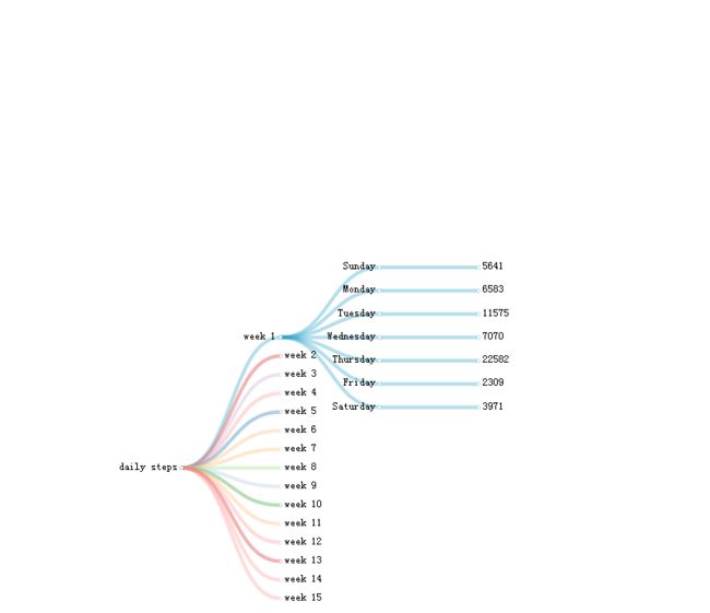
Using the table to show the number of daily steps, it iscomprehensive, but it is not easy to read quickly. At this time, we can usedifferent visual charts to represent different data types. For example, I use ahorizontal tree diagram to indicate the number of daily steps during this time.
In the horizontal weight tree diagram below, the "root" isthe number of daily steps, the second level is the number of weeks, and thenumber of days and corresponding number of daily steps is behind. Click on thecorresponding dot to expand the data, and then click once again to retract thedata. Such hierarchical charts can help us quickly find the data we want tosee. This is also the meaning of the visualization chart.
Use Line Chart to Analyze the Relationship betweenTime and Daily Steps
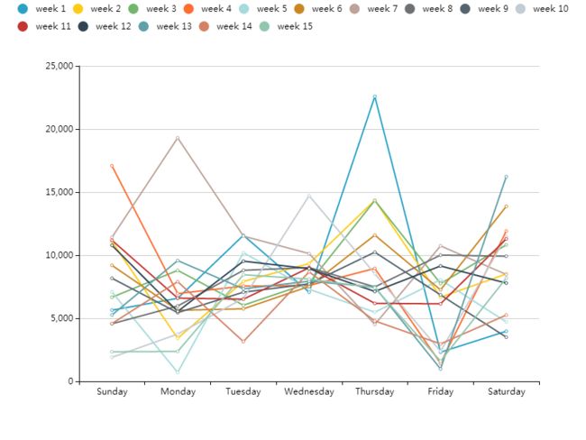
To solve the problem of whether the change in daily steps is relatedto time, it is necessary not only to compare daily steps from Monday to Sunday,but also to compare data between different weeks. What’s more, the data ofdifferent weeks may be added together to better see whether the changes in the dailysteps are regular and avoid extreme values affecting the conclusions. Tocompare the walking data in one week and compare the data in different weeks atthe same time, we can do this by making the Polyline Contrast Chart.
Here is a Polyline Contrast Chart. However, because of the exportproblem, there are many details that cannot be displayed here, such as the datafor each point and the number of weeks. The horizontal axis represents time,the vertical axis represents the number of steps, and different curvesrepresent different weeks. Among them, the number of daily steps on Tuesday andWednesday is relatively concentrated. Excluding individual extreme values, thenumber of daily steps is mainly distributed between 6000 and 9000 steps. Inother days, the number of daily steps has changed greatly.
On the other hand, within the same week, the change in the number ofsteps is also irregular. For example, the peak of the first week appears onTuesday, and the peak of the second week appears on Sunday and Wednesday.
Therefore, it is concluded that there is no strong relationship betweenthe change in the daily steps and the time.
Using Histogram to Show the Peaks and Average
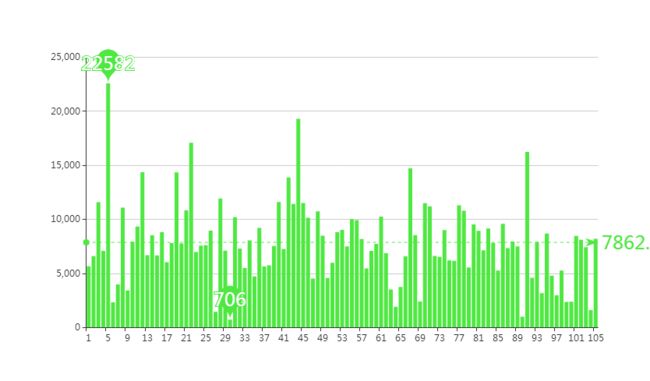
In dydata website, there is a histogram that shows both the peaksand the average. I make a histogram of all the daily steps, containing themaximum, minimum and average. So we don't have to compare one data by one. Wecan clearly see that the minimum of daily steps during this period is 706steps, the maximum is 22,582 steps, and the average is 7,862 steps.
Challenges or Obstacles thatI Foresee
1. The channels for downloading data are limited. It is difficult todownload data that I am interested in. Some are not allowed to download as Excel,some are abnormal after downloading. The number of daily steps of WeChat that Iused this time was collected and tabulated by myself.
2. When the amount of data is too large, it is difficult to select asuitable chart to express it clearly in the dydata website. Moreover, it is alittle troublesome to input a large amount of data in the unit.
3. Most of the websites that make the visualization need to pay,including dydata website, otherwise the pictures cannot be exported normally.And sometimes the exported pictures are static and cannot display animationeffects.
Feng Xiao'er
2018.6.26


