ggplot2的基本原理和使用方法
ggplot2是R语言第三方可视化扩展包,在某种程度上它基本代替了R可视化。该包是RStudio首席科学家Hadley Wickham读博期间的作品,它强大的画图逻辑使得它称为R最流行的包之一。更多知识分享请到 https://zouhua.top/。
Introduction
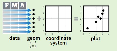
ggplot2 is based on the grammar of graphics, the idea that you can build every graph from the same few components: a data set, a set of geoms—visual marks that represent data points, and a coordinate system。
一张统计图形就是从数据到几何对象(geometric object,缩写geom)的图形属性(aesthetic attribute,缩写aes)的一个映射。此外,图形中还可能包含数据的统计变换(statistical transformation,缩写stats),最后绘制在某个特定的坐标系(coordinate system,缩写coord)中,而分面(facet)则可以用来生成数据不同子集的图形。
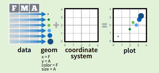
To display data values, map variables in the data set to aesthetic properties of the geom like size, color, and x and y locations
Basic concept
- 数据:data
- 统计变换:stats
- 几何对象:geom
- 图形属性:aes
- 标尺:scale
- 图层:layer
- 坐标系:coord
- 分面:facet
Data and Mapping
aesthetic map variables in data to graphic properties. mappings control the relationship between data and graphic properties.
Aesthetic mapping means "something you can see"
- position (x, y axes)
- color ("outside" color)
- fill ("inside", color)
- shape (points)
- linetype
- size
Each type of geom accepts only a subset of all aesthetics-refer to the geom help pages to see what mappings each geom accepts. Aesthetic mappings are set with the aes() function.
Scale
scales map values in the data space to values in the aesthetic space(color, size, shape ...). scales are reported on the plot using axes and legends. Control aesthetic mapping.
Scales are modified with a series of functions using a scale_
- position
- color and fill
- size
- shape
- line type
The following arguments are common to most scales in ggplot2:
- name: the first argument gives the axis or legend title
- limits: the minimum and maximum of the scale
- breaks: the points along the scale where labels should appear
- labels: the labels that appear at each break
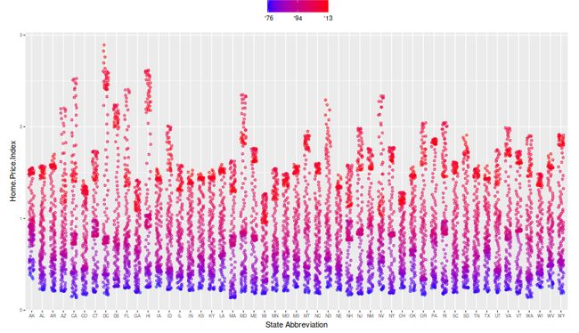
ggplot(housing,
       aes(x = State,
           y = Home.Price.Index)) +
       theme(legend.position="top",
             axis.text=element_text(size = 6))+
    geom_point(aes(color = Date),
               alpha = 0.5,
               size = 1.5,
               position = position_jitter(width = 0.25, height = 0)))+
  scale_color_continuous(name="",
                         breaks = c(1976, 1994, 2013),
                         labels = c("'76", "'94", "'13"),
                         low = muted("blue"), high = muted("red"))
Geometic Objects (geom)
geometric objects are the actual marks we put on a plot
- points (geom_points, scatter plot, dot plot)
- lines (geom_lines, time series)
- boxplot (geom_boxplot, boxplot, barplot)
A plot must have at least one geometric object, and there is no upper limit. adding a geom by using the + operator.
Statistical Transformations
It's often useful to transform your data before plotting, and that's what statistical transformations do.
| Statistic | Explanation |
|---|---|
| stat_bin | Statistics - (Discretizing|binning) (bin) |
| stat_smooth | Statistic - Smooth (Function Continuity) (Soft ?) |
| stat_density | Statistics - (Probability) Density Function (PDF) |
Every geom function has a default statistic:
- geom_histogram = stat_bin + bar
- geom_smooth = stat_smooth + ribbon
- geom_density = stat_density + ribbon
Themes
The ggplot2 theme system handles non-data plot elements such as
- Axis labels
- Plot background
- Facet label backround
- Legend appearance
Built-in themes include:
- theme_gray() (default)
- theme_bw()
- theme_classc()
create a new theme
theme_new <- theme_bw() +
  theme(plot.background = element_rect(size = 1, color = "blue", fill = "black"),
        text=element_text(size = 12, family = "Serif", color = "ivory"),
        axis.text.y = element_text(colour = "purple"),
        axis.text.x = element_text(colour = "red"),
        panel.background = element_rect(fill = "pink"),
        strip.background = element_rect(fill = muted("orange")))
Facet
- Faceting is ggplot2 parlance for small multiples
- The idea is to create separate graphs for subsets of data
- ggplot2 offers two functions for creating small multiples:
- facet_wrap(): define subsets as the levels of a single grouping variable
- facet_grid(): define subsets as the crossing of two grouping variables
- Facilitates comparison among plots, not just of geoms within a plot
library(ggrepel)
library(ggplot2)
library(scales)

dat <- read.csv("EconomistData.csv")
mR2 <- summary(lm(HDI ~ CPI + log(CPI), data = dat))$r.squared
mR2 <- paste0(format(mR2, digits = 2), "%")
ggplot(dat,
            mapping = aes(x = CPI, y = HDI)) +
    geom_point(mapping = aes(color = Region),
               shape = 1,
               size = 4,
               stroke = 1.5) +
    geom_smooth(mapping = aes(linetype = "r2"),
                method = "lm",
                formula = y ~ x + log(x), se = FALSE,
                color = "red") +
    geom_text_repel(mapping = aes(label = Country, alpha = labels),
                    data = transform(dat,
                                     labels = Country %in% c("Russia",
                                                             "Venezuela",
                                                             "Iraq",
                                                             "Mayanmar",
                                                             "Sudan",
                                                             "Afghanistan",
                                                             "Congo",
                                                             "Greece",
                                                             "Argentinia",
                                                             "Italy",
                                                             "Brazil",
                                                             "India",
                                                             "China",
                                                             "South Africa",
                                                             "Spain",
                                                             "Cape Verde",
                                                             "Bhutan",
                                                             "Rwanda",
                                                             "France",
                                                             "Botswana",
                                                             "France",
                                                             "US",
                                                             "Germany",
                                                             "Britain",
                                                             "Barbados",
                                                             "Japan",
                                                             "Norway",
                                                             "New Zealand",
                                                             "Sigapore"))) +
    scale_x_continuous(name = "Corruption Perception Index, 2011 (10=least corrupt)",
                       limits = c(1.0, 10.0),
                       breaks = 1:10) +
    scale_y_continuous(name = "Human Development Index, 2011 (1=best)",
                       limits = c(0.2, 1.0),
                       breaks = seq(0.2, 1.0, by = 0.1)) +
    scale_color_manual(name = "",
                       values = c("#24576D",
                                  "#099DD7",
                                  "#28AADC",
                                  "#248E84",
                                  "#F2583F",
                                  "#96503F"),
                       guide = guide_legend(nrow = 1)) +
    scale_alpha_discrete(range = c(0, 1),
                         guide = FALSE) +
    scale_linetype(name = "",
                   breaks = "r2",
                   labels = list(bquote(R^2==.(mR2))),
                   guide = guide_legend(override.aes = list(linetype = 1, size = 2, color = "red"))) +
    ggtitle("Corruption and human development") +
    theme_bw() +
    theme(panel.border = element_blank(),
          panel.grid = element_blank(),
          panel.grid.major.y = element_line(color = "gray"),
          axis.line.x = element_line(color = "gray"),
          axis.text = element_text(face = "italic"),
          legend.position = "top",
          legend.direction = "horizontal",
          legend.box = "horizontal",
          legend.text = element_text(size = 12),
          plot.title = element_text(size = 16, face = "bold"))
参考
- ggplot2
- ggplot2 packages
- ggplot2简介
参考文章如引起任何侵权问题,可以与我联系,谢谢。


