echarts 的雷达图,当显示数据的label时,极易出现文字与标线重合的问题。
但是雷达图的label又不支持如饼图一般的辅助引导线。

image.png
如何实现如下的辅助引导线呢?

image.png
通过思考,解决思路为用echarts的辅助线实现。
通过创建一个二维直角坐标系,然后使得直角坐标系与雷达图重合,计算每个点的坐标,再以此为起点绘制辅助引导线即可。
以官方实例为例,实现效果如下
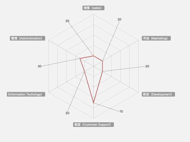
image.png
话不多说,直接上代码:
  const data = [20, 30, 20, 70, 20, 20];
option = {
    title: {
        text: '基础雷达图'
    },
    tooltip: {},
    legend: {
        data: ['预算分配(Allocated Budget)', '实际开销(Actual Spending)']
    },
    xAxis: [
      {
        type: 'value',
        max: 133,
        show: false,
        min: -133,
      },
    ],
    yAxis: [
      {
        type: 'value',
        max: 133,
        min: -133,
        show: false,
      },
    ],
    grid: {
      left: '10%',
      top: '10%',
      right: '10%',
      bottom: '10%',
      tooltip: {
        show: false,
      },
    },
    radar: {
        // shape: 'circle',
        radius: '60%',
        name: {
            textStyle: {
                color: '#fff',
                backgroundColor: '#999',
                borderRadius: 3,
                padding: [3, 5]
            }
        },
        splitArea: {
            show: false,
        },
        indicator: [
            { name: '销售(sales)', max: 100},
            { name: '管理(Administration)', max: 100},
            { name: '信息技术(Information Techology)', max: 100},
            { name: '客服(Customer Support)', max: 100},
            { name: '研发(Development)', max: 100},
            { name: '市场(Marketing)', max: 100}
        ]
    },
    series: [{
        name: '预算 vs 开销(Budget vs spending)',
        type: 'radar',
        // areaStyle: {normal: {}},
        data: [
            {
                value: data,
                name: '预算分配(Allocated Budget)',
            }
        ]
    },
    {
        name: '坐标系',
        type: 'line',
        areaStyle: {},
        data: [],
      },
      {
        name: '辅助线',
        type: 'lines',
        lineStyle: {
          color: '#000',
          type: 'solid',
          width: 1,
        },
        label: {
          show: true,
          textStyle: {
            color: '#000',
            backgroundColor: '#fff',
          },
        },
        coordinateSystem: 'cartesian2d',
        data: data.map((value, index) => {
            const baseD = (-Math.PI * (360 / data.length)) / 180;
            const d1 = baseD * index;
            const x = value * Math.sin(d1);
            const y = value * Math.cos(d1);
            const d2 = (baseD * (2 * index + 1)) / 2;
            const x2 = 100 * Math.sin(d2);
            const y2 = 100 * Math.cos(d2);
            return {
              value,
              coords: [
                [x, y],
                [x2, y2],
              ],
            };
          }),
      },]
};
需要注意的是,要保证直角坐标系的尺度与雷达图一致,如上代码是在容器为正方形的基础上实现的。。其余尺寸自行摸索。